
Contents
- 0. Environment Preparation
- 1. Hello World
- 1.1 Brief Introduction to API
- 1.2 Sample Code
- 1.3 Usage Notes
- 2. Buttons
- 2.1 Brief Introduction to API
- 2.2 Sample Code
- 2.3 Usage Notes
- Version Record
- 3. Matrix Keypad
- IV. Basic Objects
- 4.1 Modify the screen background color
- 4.2 Modify the position and size of the object
- 4.3 Modify Padding
- 4.4 Modify Transparency
- 4.4 Modify Background Color
- 4.5 Modify Border Color
- 4.6 Modify Border Width
- 4.7 Modify Border Opacity
- 4.8 Modify Shadow Width, Opacity and Offset
- 5. Labels
- 5.1 Modify Different Long Text Display Modes
- 5.2 Set Font
- 5.3 Set Font Color
- 6. Switches
- 6.1 Switch Linkage Label (Control Text Display / Color)
- 6.2 Complete Switch Configuration (Styles of Track and Slider)
- 7. Indicator Light LED
- 7.1 Multi-Color Water Flowing Lights with Automatic Brightness Adjustment
- 7.2 Switch Control for LED On/Off
- 8. Checkbox
- 8.1 Checkbox Font Customization Display
- 8.2 Control the LED by checking the checkbox
- IX. Arc
- 9.1 Setting Dimensions and Value Ranges
- 9.2 Adjustment Mode
- 9.3 Set Background Arc
- 9.4 Arc Integral Rotation
- 9.5 Curve Control of LED Brightness
- X. Slider
- 10.1 Modify Slider Mode
- 10.2 Modify Slider Direction
- 10.3 Using set_range in RANGE mode
- 10.4 Determine whether the slider is being dragged
- 11. Line Segments
- 12. Charts and Graphs
- 12.1 Line Chart
- 12.2 Bar Chart
- 12.3 Scatter Plot
- 13. Calendar
- 13.1 Basic Calendar Initialization
- 13.2 Highlighted Date Setting and Query
- 14. Text Box
- 14.1 Plain Text Box
- 14.2 Password Box
- 14.3 Text Box Allowing Numeric Input Only
- 15. Keyboard
- 15.1 General Single Text Box Input Keyboard
- 15.2 Plain Text Numeric Input Box with Keyboard Show/Hide Control
- 15.3 Dual Text Boxes (Standard + Numeric) Sharing a Virtual Keyboard
- 16. Drop-down List
- 16.1 Simple Dropdown List
- 16.2 Get the text of the selected item
- 16.3 Dynamically Add and Remove Options
- 16.4 Button Control for Dropdown List Expansion/Collapse
- 17. Scroll Wheel
- 17.1 Examples of Week Selection (Normal Mode) and Month Selection (Infinite Loop Mode)
- 17.2 Change the Number of Visible Rows
- 17.3 Read All Selections and Current Selection
- 18. Lists
- 18.1 Creating Simple Grouped Headings and Button Lists
- 18.2 Reading and Dynamically Modifying Button List Text
- 19. Tabs
- 19.1 Basic Tab
- 19.2 Get the active tab and set the default active option
- 19.3 Dynamically rename tabs and print the total number of tabs
- 19.4 Dynamically modify the position and size of the tab bar by clicking tabs
- 19.5 Obtain the content area and tab bar object and customize the style
- 20. Menu
- 21. Tables
- 21.1 Basic Table
- 21.2 Get the total number of rows in a table and the width of a specified column
- 21.3 Add Cell Control Properties
- 22. Displaying Images and Animated GIFs
- 22.1 Basic Display of Images and GIFs
- 22.2 Internal Icon Display
- Version Record
0. Environment Preparation
Note: The simulator only supports versions related to v9.0:
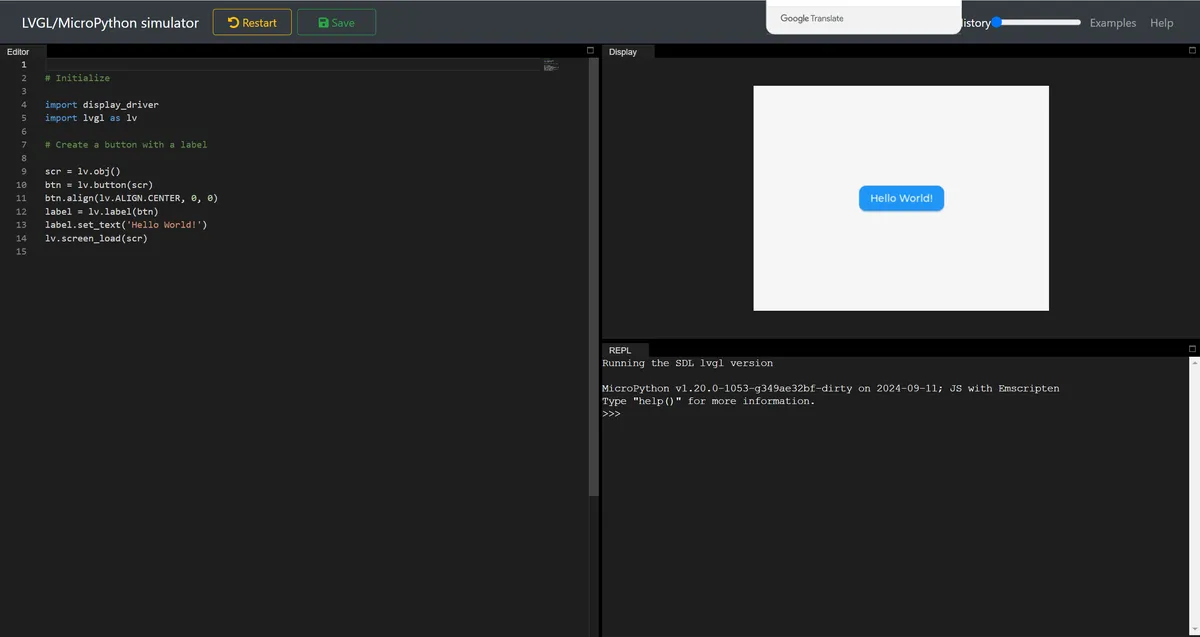
Simulator Address: https://sim.lvgl.io/v9.0/micropython/ports/webassembly
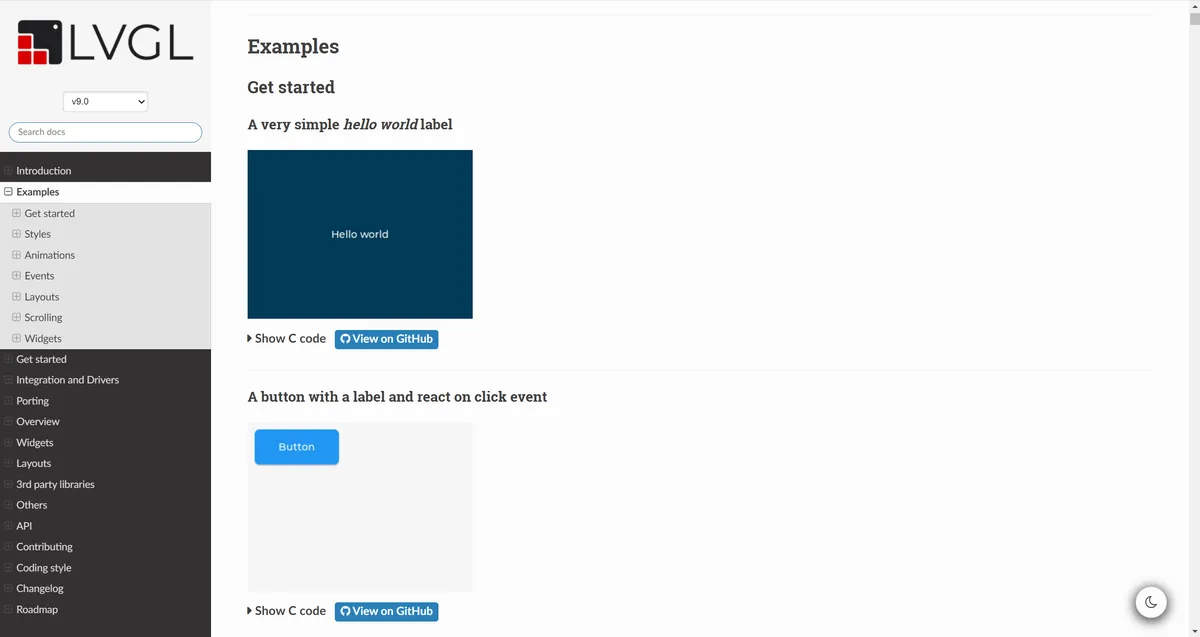
Reference code address: https://docs.lvgl.io/9.0/examples.html
1. Hello World
1.1 Brief Introduction to API
| MicroPython API | Function description | Usage example |
|---|---|---|
| lv.init() | Initialize the LVGL core engine | lv.init() |
| lv.screen_active() | Get the system default active screen | scr = lv.screen_active() |
| lv.color_hex(hex_val) | Generate a color value in hexadecimal RGB format | lv.color_hex(0x003a57) / lv.color_hex(0xffffff) |
| obj.set_style_bg_color(color, part) | Set the object background color (the main part PART.MAIN must be specified) | scr.set_style_bg_color(lv.color_hex(0x003a57), lv.PART.MAIN) |
| lv.label(parent) | Create a label widget (bound to the specified parent object) | label = lv.label(scr) |
| label.set_text(text) | Set the text displayed by the label | label.set_text("Hello world") |
| obj.set_style_text_color(color, part) | Set the object text color (the main part PART.MAIN must be specified) | scr.set_style_text_color(lv.color_hex(0xffffff), lv.PART.MAIN) |
| obj.align(align, x_off, y_off) | Set widget alignment (x/y are offsets) | label.align(lv.ALIGN.CENTER, 0, 0) |
| lv.screen_load(scr) | Load the specified screen as the currently displayed screen | lv.screen_load(scr) |
1.2 Sample Code
import display_driver
import lvgl as lv

lv.init()

# 1. Get the current active screen (replaces `scr = lv.obj()` in the original template; corresponds to `lv_screen_active()` in C)
scr = lv.screen_active()

# 2. Set the screen background color to 0x003a57 (dark blue); corresponds to `lv_obj_set_style_bg_color` in C
scr.set_style_bg_color(lv.color_hex(0x003a57), lv.PART.MAIN)

# 3. Create a label (parent object is the active screen)
label = lv.label(scr)
label.set_text("Hello world")

# 4. Set the screen's text color to white (0xffffff); corresponds to `lv_obj_set_style_text_color` in C
scr.set_style_text_color(lv.color_hex(0xffffff), lv.PART.MAIN)

# 5. Center-align the label (same as the original template)
label.align(lv.ALIGN.CENTER, 0, 0)

# 6. Load the screen (this step is required in the simulator for the interface to display)
lv.screen_load(scr)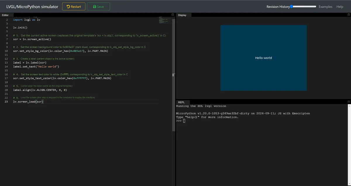
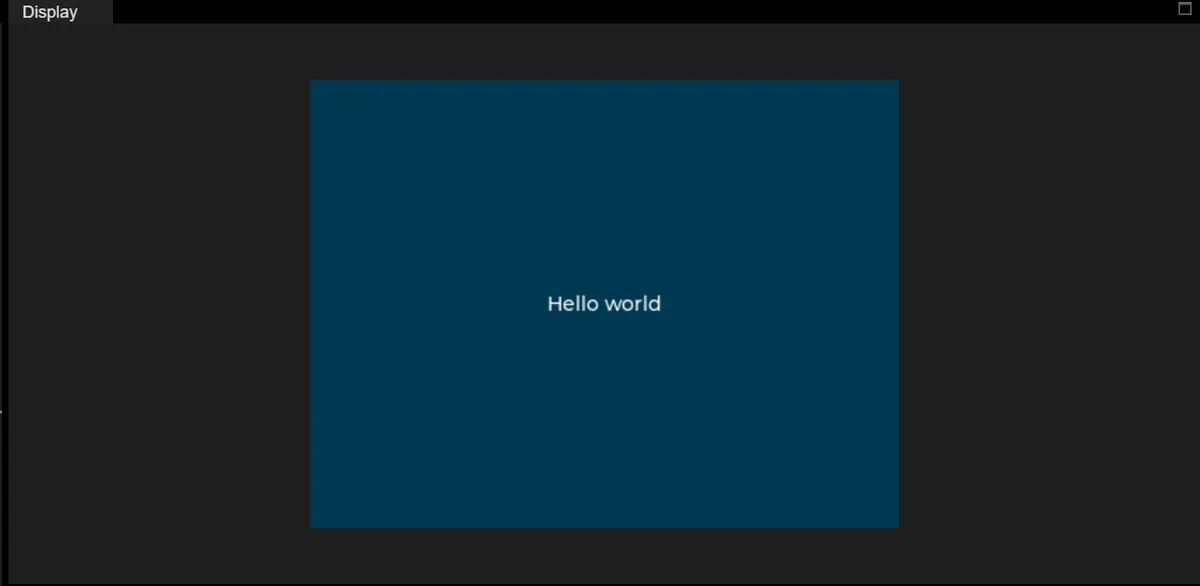
1.3 Usage Notes
- You must first execute
lv.init (): this is the initialization entry point for the LVGL core engine. All control creation, style configuration, and layout adjustments depend on this step; skipping it will directly trigger errors (such as failed control creation or invalid style application). - When creating a control, you must explicitly pass the parent control (for example,
lv.label (scr)). The underlying C layer will establish a "parent-to-child" linked list relationship to ensure the control is rendered, inherits styles, and has linked lifecycle behavior. - Style setting functions (such as
set_style_bg_color) must pass the second parameterlv.PART.MAIN:lv.PART.MAINrefers to the "core component" of a control (e. g., the screen background, the text area of a label); omitting it will cause the style to fail to take effect.- Corresponding to
LV_PART_MAINin C, it is changed to an enumerated attribute in MicroPython (hierarchical, more in line with Python style).
- Whether creating a new screen or modifying an active screen, you ultimately need to execute
lv.screen_load (scr)to trigger the LVGL rendering engine:- In simulators / embedded hardware, failure to perform this step will result in a blank interface;
- Only need to be performed once for the "screen to be displayed", and repeated execution will have no side effects.
2. Buttons
2.1 Brief Introduction to API
| MicroPython API | Function description | Usage example |
|---|---|---|
| lv.init() | Initialize the LVGL core engine | lv.init() |
| lv.screen_active() | Get the system default active screen | scr = lv.screen_active() |
| lv.button(parent) | Create a button widget (bound to the specified parent object) | btn = lv.button(scr) |
| obj.set_pos(x, y) | Set the widget's coordinate position (x/y are coordinates relative to the parent object) | btn.set_pos(10, 10) |
| obj.set_size(width, height) | Set the widget's width and height | btn.set_size(120, 50) |
| obj.add_event_cb(cb, event, user_data) | Register a callback function for the specified event type on the widget | btn.add_event_cb(btn_event_cb, lv.EVENT.PRESSED, None) |
| lv.label(parent) | Create a label widget (bound to the specified parent object) | label = lv.label(btn) |
| label.set_text(text) | Set the text displayed by the label | label.set_text("Button") |
| obj.center() | Center the widget within its parent object | label.center() |
| lv.screen_load(scr) | Load the specified screen as the currently displayed screen | lv.screen_load(scr) |
2.2 Sample Code
import display_driver
import lvgl as lv

lv.init()

# 1. Get the currently active screen object (corresponds to lv_screen_active() in C)
scr = lv.screen_active()

# 2. Create a button (corresponds to lv_button_create(lv_screen_active()) in C)
btn = lv.button(scr)

# 3. Set the button position (x=10, y=10) (corresponds to lv_obj_set_pos(btn, 10, 10) in C)
btn.set_pos(10, 10)

# 4. Set the button size (width 120, height 50) (corresponds to lv_obj_set_size(btn, 120, 50) in C)
btn.set_size(120, 50)

# 5. Define the button interaction callback function (corresponds to btn_event_cb in C)
def btn_event_cb(e):
    print("Button clicked!")

# 6. Register the button interaction callback function
btn.add_event_cb(btn_event_cb, lv.EVENT.PRESSED, None)

# 7. Create the label inside the button (corresponds to lv_label_create(btn) in C)
label = lv.label(btn)

# 8. Set the label text (corresponds to lv_label_set_text(label, "Button") in C)
label.set_text("Button")

# 9. Center the label inside the button (corresponds to lv_obj_center(label) in C)
label.center()

# 10. Load the screen (this step is required in the simulator for the interface to display)
lv.screen_load(scr)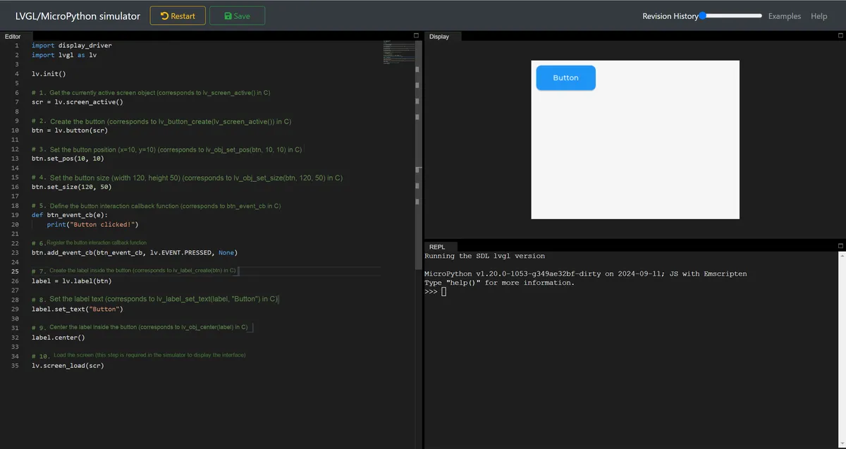
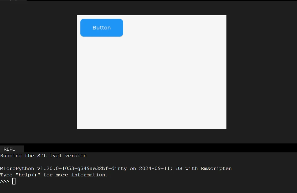
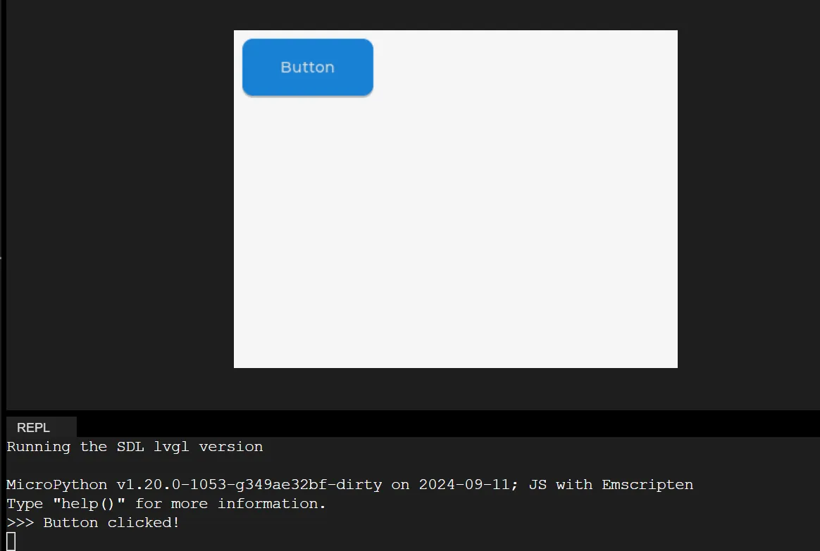
First initialize the LVGL core engine, obtain the currently active screen object, then create a 120×50 sized button at the top-left corner of the screen (coordinates 10,10), register a press event callback function for the button (which prints "Button clicked!" to the Console when pressed), create a label displaying the text "Button" centered inside the button, and finally load the screen to complete the interface rendering.
2.3 Usage Notes
btn.add_event_cb ()requires specifying the event type and callback function explicitly;label.center ()centers the element relative to the button (the parent object), not the entire screen.
Version Record
Version Number | Modifier | Time | Content |
v1.0 | Li Zisheng | 2026/03/23 | Initialize the document. |
3. Matrix Keypad
Sample Code:
import display_driver
import lvgl as lv

lv.init()

#Get the currently active screen object
scr = lv.screen_active()
#Set the screen background color to black
scr.set_style_bg_color(lv.color_hex(0x000000), 0)

#Create a button matrix
btnm = lv.buttonmatrix(scr)
#Set 3 buttons
btnm_map = ["A1", "A2", "A3"]
btnm.set_map(btnm_map)
#Center it
btnm.center()

#Interaction callback function
def btnm_event_cb(e):
    #Get the index of the clicked button
    pressed_btn = btnm.get_selected_button()
    if pressed_btn != -1:
        #Get the text of the button at the corresponding index
        text_btn = btnm.get_button_text(pressed_btn)
        print(f"Button {text_btn} is clicked")  # Only this line is modified, output in English only
#Register the interaction callback function. For more states see the "class EVENT" section of api.py
btnm.add_event_cb(btnm_event_cb, lv.EVENT.CLICKED, None)

# Load the screen
lv.screen_load(scr)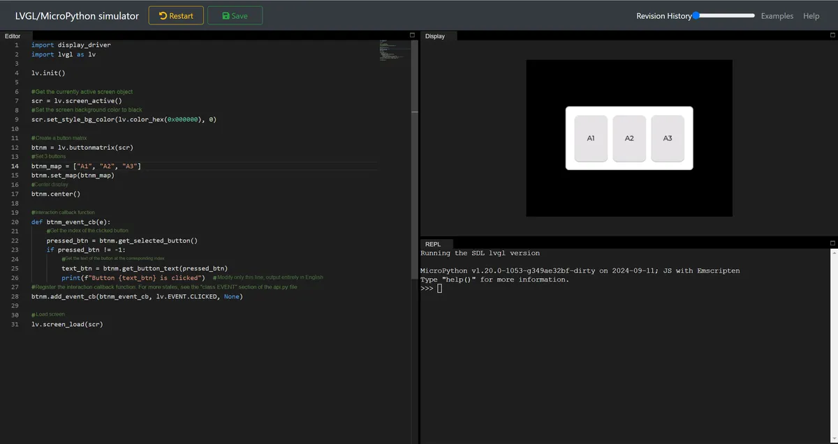
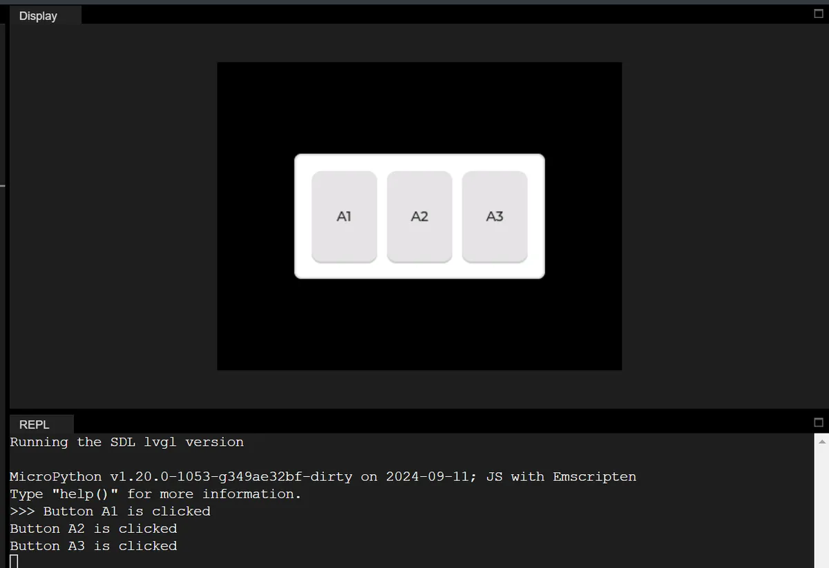
First, initialize the LVGL core engine, obtain the currently active screen object and set its background color to black. Next, create a matrix button control containing three buttons "A1", "A2" and "A3" and make it displayed centered on the screen. Bind a click event callback function to this matrix button: when any button is clicked, acquire the index and corresponding text of the clicked button, and print a fully English button click prompt in the Console (e. g., "Button A1 is clicked"). Finally, load the screen to complete the rendering of the entire interface.
IV. Basic Objects
The following code implements a rectangular control with a custom visual style: after initializing LVGL, set the screen background to black, create a 100×100 pixel square object at the screen coordinate (100,100), configure styles such as red background, green border, and green semi-transparent shadow for this object, and finally load the screen to complete the rendering, and a red square with green border and shadow will be displayed on the screen in the end.
import display_driver
import lvgl as lv

lv.init()

#Get the currently active screen object
scr = lv.screen_active()
#Set the screen background color to black
scr.set_style_bg_color(lv.color_hex(0x000000), 0)

#Create the object
obj = lv.obj(scr)
#Set the object position and size
obj.set_pos(100, 100)   #Set the top-left coordinates of the object
obj.set_size(100, 100)  #Set the width and height of the object

#Create a style
style_obj = lv.style_t()
#Border and background
style_obj .set_pad_all(10)    #Set padding in all four directions
#style_obj  .set_pad_left(10)   #Set left padding
#style_obj .set_pad_right(10)  #Set right padding
#style_obj .set_pad_top(10)    #Set top padding
#style_obj  .set_pad_bottom(10) #Set bottom padding
style_obj .set_bg_opa(255)  #Set background opacity; 0 is fully transparent
style_obj .set_bg_color(lv.color_hex(0xFF0000))   #Set background color
style_obj .set_border_color(lv.color_hex(0x00FF00))   #Set border color
style_obj  .set_border_width(2)   #Set border width
style_obj .set_border_opa(255)   #Set border opacity; 0 is fully transparent
#Shadow style
style_obj .set_shadow_color(lv.color_hex(0x00FF00))#Set shadow color
style_obj .set_shadow_width(10)#Set shadow width (shadow spread range)
style_obj .set_shadow_opa(50)#Set shadow opacity
style_obj .set_shadow_offset_x(10)#Set shadow horizontal offset
style_obj .set_shadow_offset_y(10)#Set shadow horizontal offset
#Apply the style
obj.add_style(style_obj , lv.STATE.DEFAULT)

# Load the screen
lv.screen_load(scr)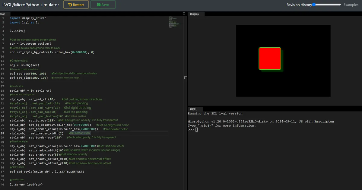
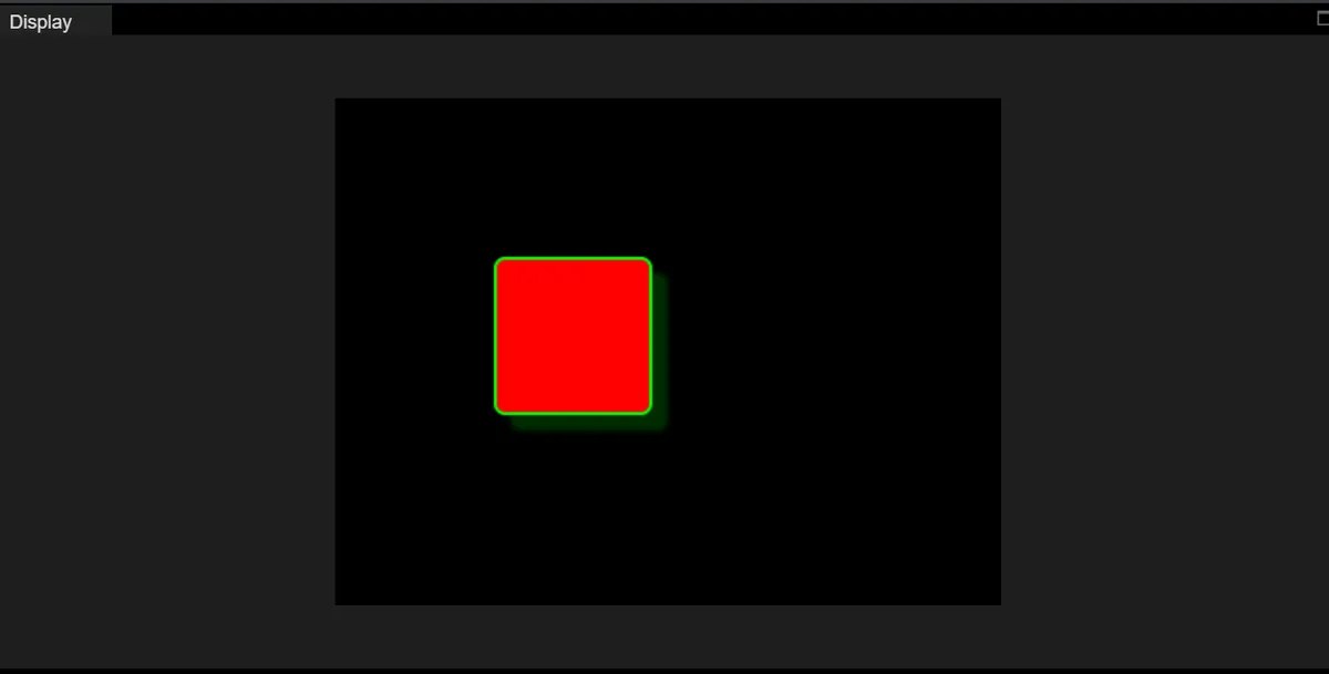
4.1 Modify the screen background color
#Set the screen background color to black
scr.set_style_bg_color(lv.color_hex(0x09999), 0)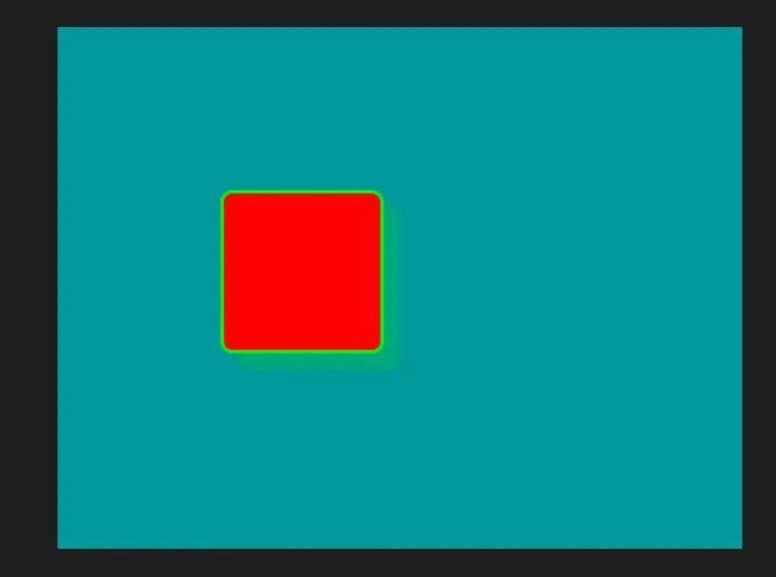
4.2 Modify the position and size of the object
#Set the object position and size
obj.set_pos(150, 150)   #Set the top-left coordinates of the object
obj.set_size(120, 120)  #Set the width and height of the object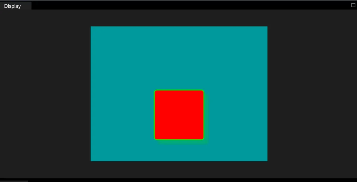
4.3 Modify Padding
Padding refers to the space between the "inner content area" and the "border" of a control, similar to the gap reserved between an item inside a box and the inner wall of the box. The larger the padding, the farther the content is from the border.
Next, we will add a Label object to the base object; the Label will be displayed inside the red square obj rather than directly on the screen. After that, we will try adjusting the padding and set the Label to be centered:
import display_driver
import lvgl as lv

lv.init()

#Get the currently active screen object
scr = lv.screen_active()
#Set the screen background color to black
scr.set_style_bg_color(lv.color_hex(0x009999), 0)

#Create the object
obj = lv.obj(scr)
#Set the object position and size
obj.set_pos(150, 150)   #Set the top-left coordinates of the object
obj.set_size(120, 120)  #Set the width and height of the object

#Create a style
style_obj = lv.style_t()
#Border and background
style_obj .set_pad_all(10)    #Set padding in all four directions
# style_obj  .set_pad_left(20)   #Set left padding
# style_obj .set_pad_right(5)  #Set right padding
# style_obj .set_pad_top(8)    #Set top padding
# style_obj  .set_pad_bottom(10) #Set bottom padding

style_obj .set_bg_opa(255)  #Set background opacity; 0 is fully transparent
style_obj .set_bg_color(lv.color_hex(0xFF0000))   #Set background color
style_obj .set_border_color(lv.color_hex(0x00FF00))   #Set border color
style_obj  .set_border_width(2)   #Set border width
style_obj .set_border_opa(255)   #Set border opacity; 0 is fully transparent
#Shadow style
style_obj .set_shadow_color(lv.color_hex(0x00FF00))#Set shadow color
style_obj .set_shadow_width(10)#Set shadow width (shadow spread range)
style_obj .set_shadow_opa(50)#Set shadow opacity
style_obj .set_shadow_offset_x(10)#Set shadow horizontal offset
style_obj .set_shadow_offset_y(10)#Set shadow horizontal offset
#Apply the style
obj.add_style(style_obj , lv.STATE.DEFAULT)

# 1. Create a Label widget with obj as the parent (the Label is displayed inside obj)
label = lv.label(obj)
# 2. Set the text displayed by the Label
label.set_text("Test Label")
# 3. Center the Label inside obj (using the blank area left by the padding)
label.center()
# 4. Optional: set the text color to white (clearer on a red background)
label.set_style_text_color(lv.color_hex(0x11111), lv.STATE.DEFAULT)

# Load the screen
lv.screen_load(scr)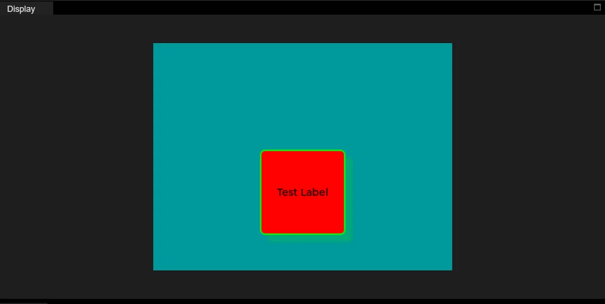
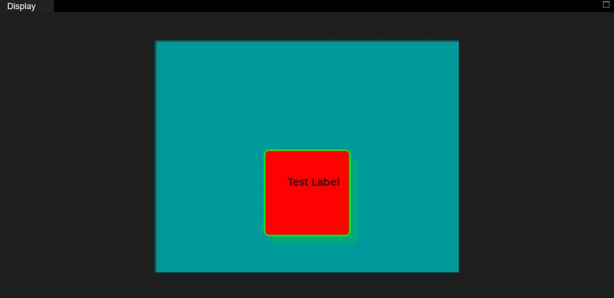
Next, let's modify the padding:
#Border and background
# style_obj .set_pad_all(10)    #Set padding in all four directions
style_obj  .set_pad_left(20)   #Set left padding
style_obj .set_pad_right(1)  #Set right padding
style_obj .set_pad_top(1)    #Set top padding
style_obj  .set_pad_bottom(30) #Set bottom padding
Displayed as follows:
4.4 Modify Transparency
style_obj .set_bg_opa(100) #Set background opacity; 0 is fully transparent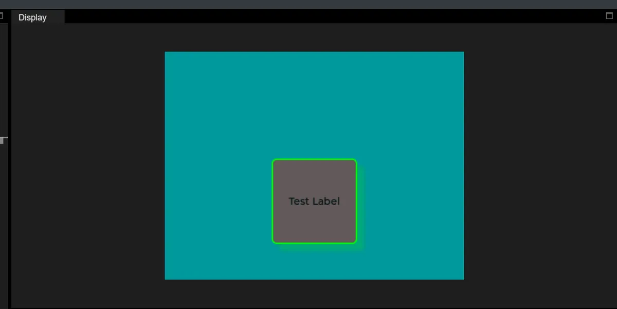
4.4 Modify Background Color
style_obj .set_bg_color(lv.color_hex(0x000000)) #Set background color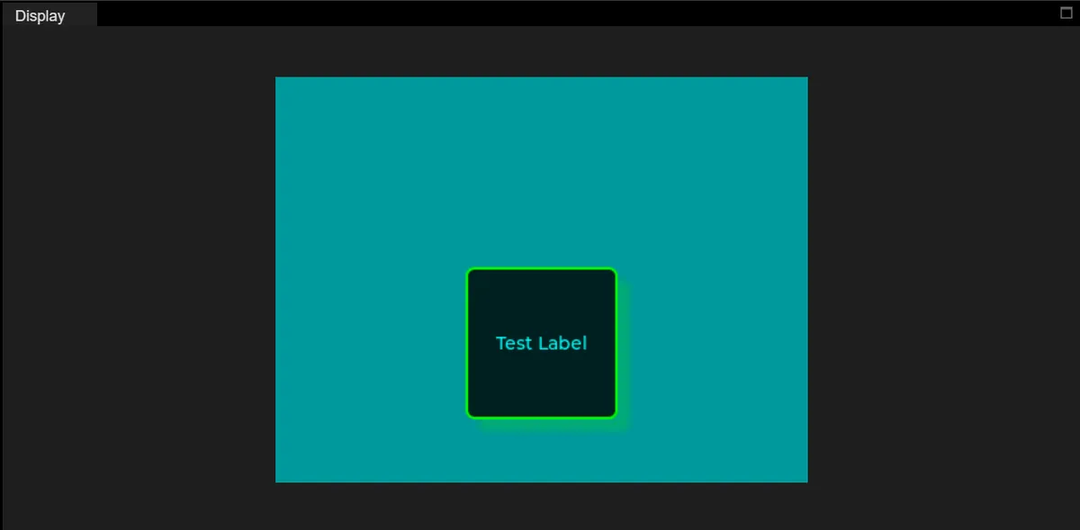
4.5 Modify Border Color
style_obj .set_border_color(lv.color_hex(0x00FFFF)) #Set border color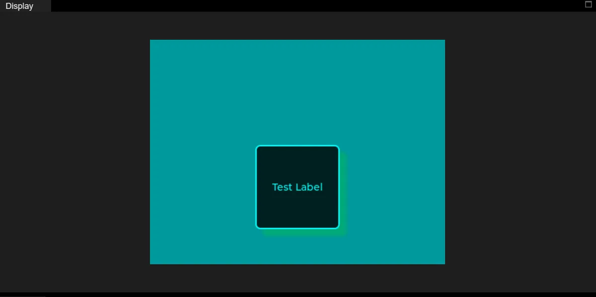
4.6 Modify Border Width
style_obj .set_border_width(5) #Set border width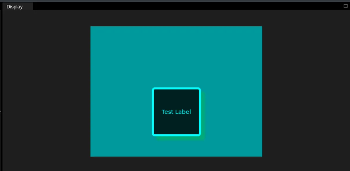
4.7 Modify Border Opacity
style_obj .set_border_opa(160) #Set border opacity; 0 is fully transparent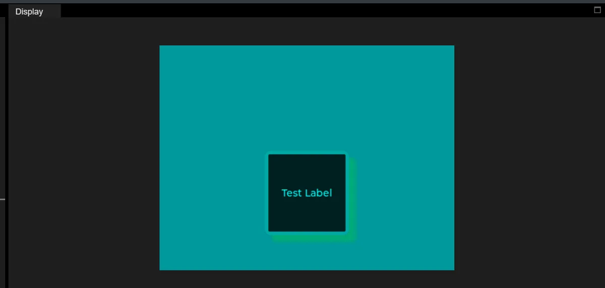
4.8 Modify Shadow Width, Opacity and Offset
import display_driver
import lvgl as lv

lv.init()

#Get the currently active screen object
scr = lv.screen_active()
#Set the screen background color to black
scr.set_style_bg_color(lv.color_hex(0x009999), 0)

#Create the object
obj = lv.obj(scr)
#Set the object position and size
obj.set_pos(100, 100)   #Set the top-left coordinates of the object
obj.set_size(100, 100)  #Set the width and height of the object

#Create a style
style_obj = lv.style_t()
#Border and background
style_obj .set_pad_all(10)    #Set padding in all four directions
#style_obj  .set_pad_left(10)   #Set left padding
#style_obj .set_pad_right(10)  #Set right padding
#style_obj .set_pad_top(10)    #Set top padding
#style_obj  .set_pad_bottom(10) #Set bottom padding
style_obj .set_bg_opa(255)  #Set background opacity; 0 is fully transparent
style_obj .set_bg_color(lv.color_hex(0xFF0000))   #Set background color
style_obj .set_border_color(lv.color_hex(0x00FF00))   #Set border color
style_obj  .set_border_width(2)   #Set border width
style_obj .set_border_opa(255)   #Set border opacity; 0 is fully transparent
#Shadow style
style_obj .set_shadow_color(lv.color_hex(0x00FF00))#Set shadow color
style_obj .set_shadow_width(100)#Set shadow width (shadow spread range)
style_obj .set_shadow_opa(250)#Set shadow opacity
style_obj .set_shadow_offset_x(50)#Set shadow horizontal offset
style_obj .set_shadow_offset_y(10)#Set shadow horizontal offset
#Apply the style
obj.add_style(style_obj , lv.STATE.DEFAULT)

# Load the screen
lv.screen_load(scr)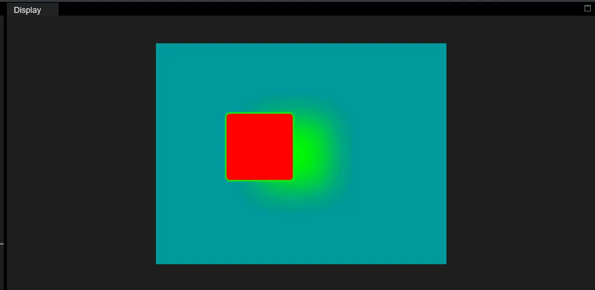
5. Labels
The following code implements a red scrolling text effect on a black background:
- First initialize the LVGL engine and set the screen background to solid black;
- Next, create a label control, configure it with the "circular scrolling" long text display mode (to adapt to scenarios where the text length exceeds the label size), set the label size to 100×20 pixels, set the display text to "HELLO MicroPython LVGL", and make the label display in the center of the screen;
- Then create a custom style, set the text color to red, the font to 16-point Montserrat, and apply this style to the default state of the label; finally, the loading screen finishes rendering, and the final effect is that the red text in the center of the black screen scrolls continuously in a marquee loop.
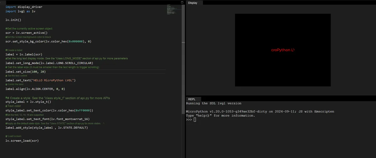
import display_driver
import lvgl as lv

lv.init()

#Get the currently active screen object
scr = lv.screen_active()
#Set the screen background color to black
scr.set_style_bg_color(lv.color_hex(0x000000), 0)

#Create a label
label = lv.label(scr)
#Set the long-text display mode. For more parameters see the "class LONG_MODE" section of api.py
label.set_long_mode(lv.label.LONG.SCROLL_CIRCULAR)
# Set the label size (must be smaller than the text length to trigger scrolling)
label.set_size(100, 20)
# Set the text content
label.set_text("HELLO MicroPython LVGL")
# Center the label
label.align(lv.ALIGN.CENTER, 0, 0)

##Create a style. For more APIs see the "class style_t" section of api.py
style_label = lv.style_t()
#Text color
style_label.set_text_color(lv.color_hex(0xFF0000))
#Set the font; supports 12, 14, 16
style_label.set_text_font(lv.font_montserrat_16)
#Apply as the default state style. For more states see the "class STATE" section of api.py
label.add_style(style_label , lv.STATE.DEFAULT)

# Load the screen
lv.screen_load(scr)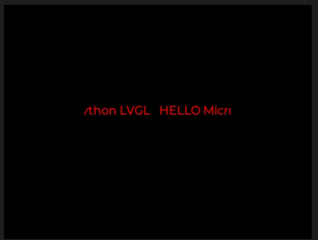
5.1 Modify Different Long Text Display Modes
5.1.1 WRAP (Word Wrap Mode)
When the text length exceeds the label width, it will automatically wrap to the next line to fully display all text content (no clipping or scrolling).
label.set_long_mode(lv.label.LONG.WRAP) 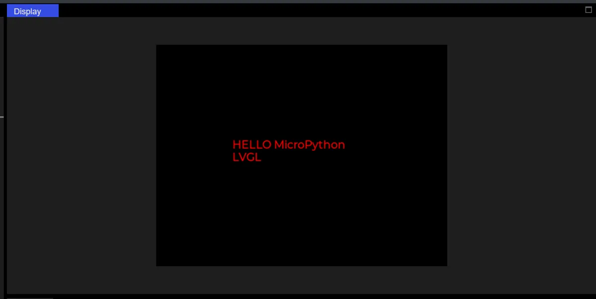
5.1.2 SCROLL Springback Scroll Mode
When the text length exceeds the label width, it will scroll cyclically according to the following rules:
- Step 1 (Left Shift): The text starts from its initial position and scrolls left until the end of the text is fully displayed within the tag (reaching the leftmost end);
- Step 2 (Shift Right): Then it will automatically scroll rightward to return to the initial position of the text (shift right back to the starting point);
- Looping back and forth: After that, the process of "shifting left to the end → shifting right back to the starting point" will be repeated continuously, creating a "scrolling back and forth" effect.
label.set_long_mode(lv.label.LONG.SCROLL) 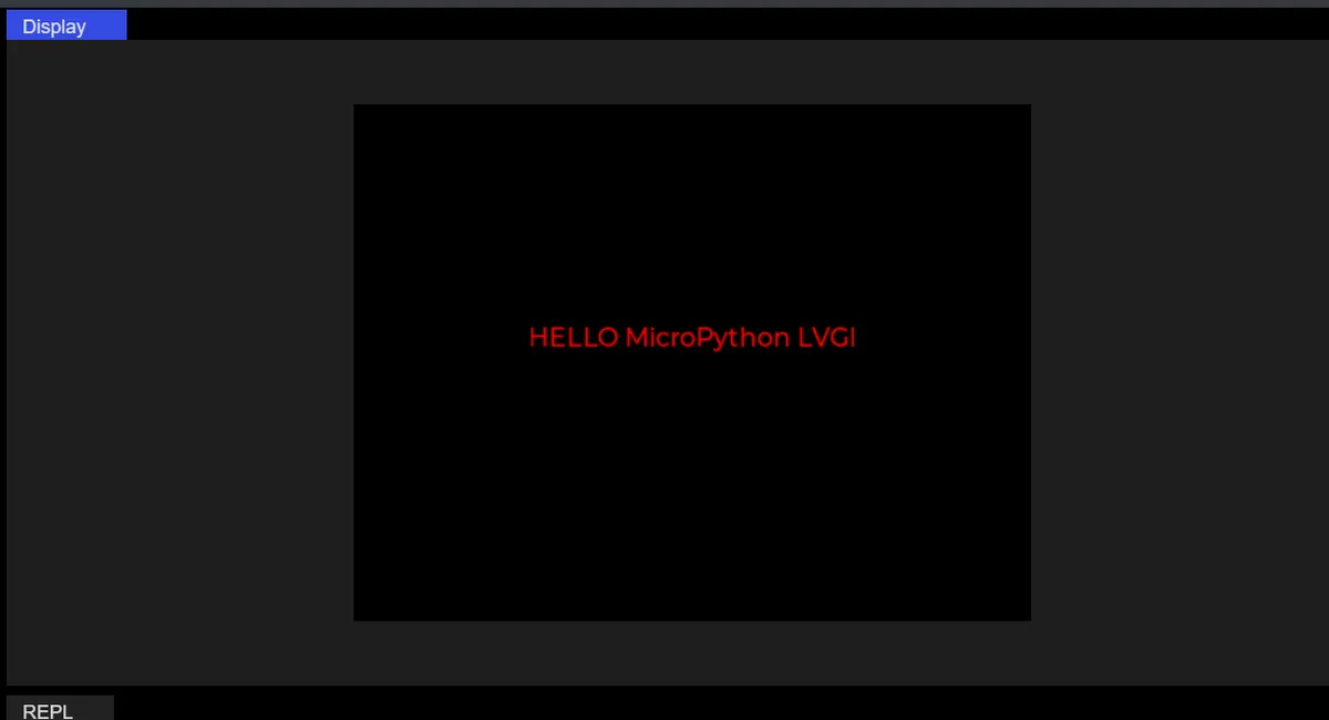
5.1.3 DOT (Ellipsis Mode)
When the text length exceeds the label width, an ellipsis (. ..) will be displayed at the end, indicating that there is still undisplayed content, with no line wrapping or scrolling.
label.set_long_mode(lv.label.LONG.DOT)
label.set_size(100, 50)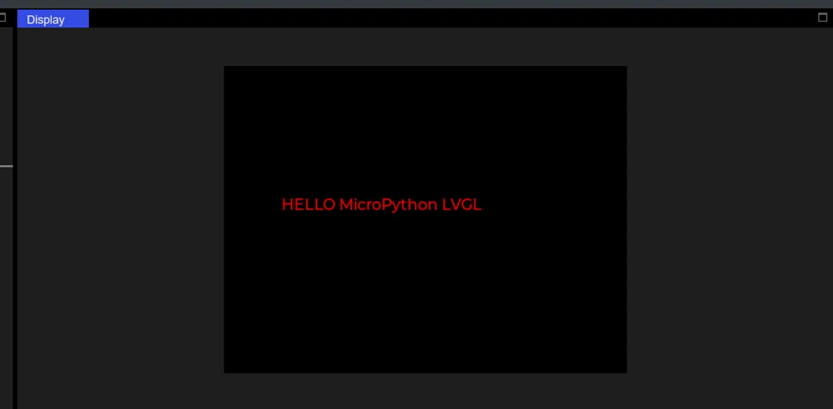
5.1.4 CLIP (Cropping Mode)
When the text length exceeds the label width, the excess part will be directly cropped without displaying any additional marks (such as an ellipsis), and the excess part will be completely invisible.
label.set_long_mode(lv.label.LONG.CLIP)
label.set_size(100, 50)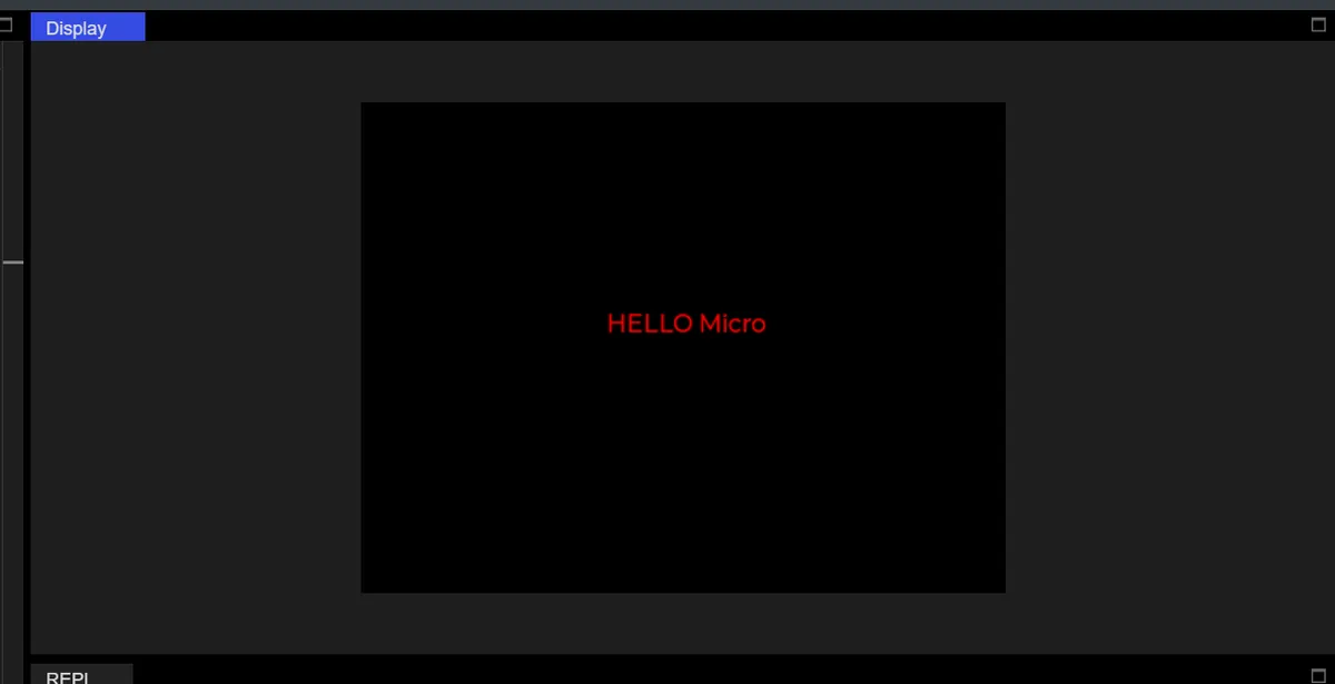
5.2 Set Font
First, run the following code, which will print out all the font names built into LVGL, and these names are directly available for use:
import display_driver
import lvgl as lv

lv.init()

# Print all attributes starting with "font_" (i.e. all built-in fonts)
font_list = [attr for attr in dir(lv) if attr.startswith("font_")]
print("可用字体列表:", font_list)
style_label.set_text_font(lv.font_montserrat_14)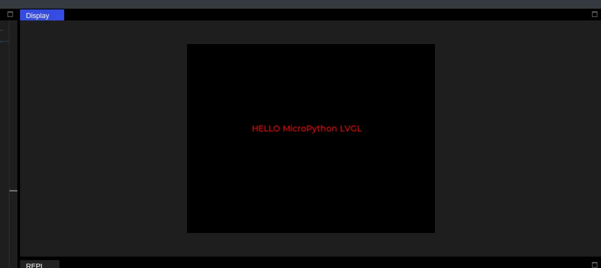
style_label.set_text_font(lv.font_montserrat_24)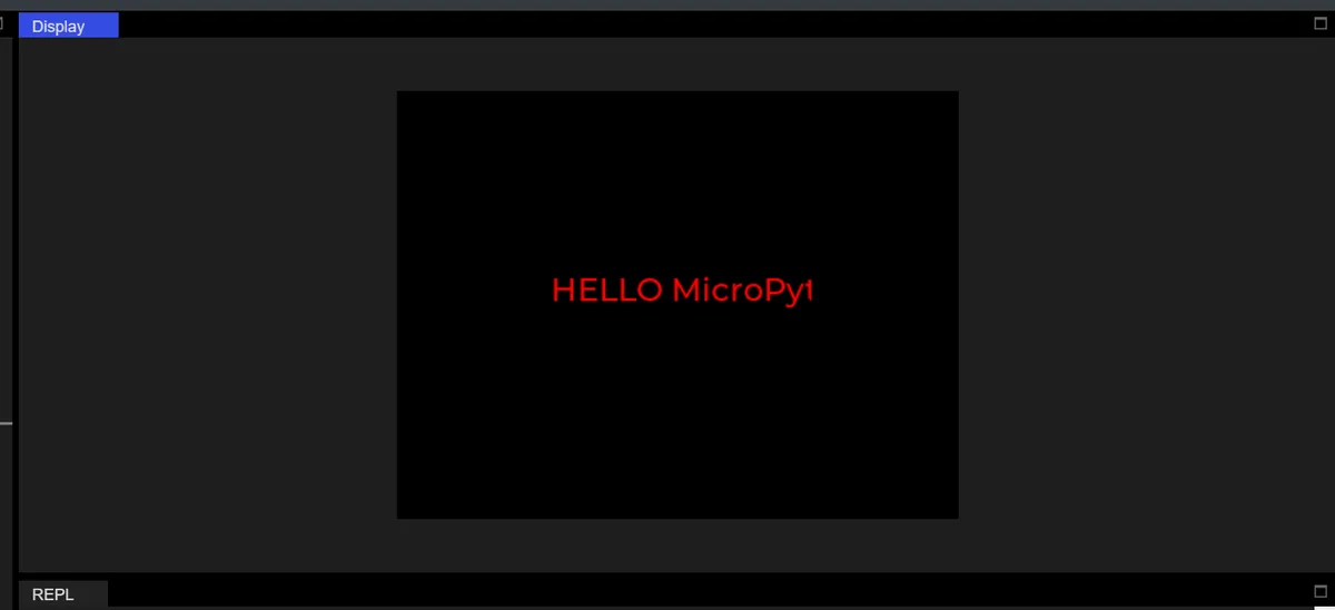
5.3 Set Font Color
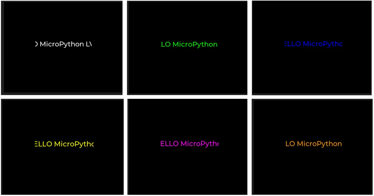
| Color name | Hexadecimal value | Code syntax | Effect |
|---|---|---|---|
| Pure black | 0x000000 | lv.color_hex(0x000000) | Screen background color |
| Pure white | 0xFFFFFF | lv.color_hex(0xFFFFFF) | Most eye-catching on a black background |
| Pure red | 0xFF0000 | lv.color_hex(0xFF0000) | The text color you used before |
| Pure green | 0x00FF00 | lv.color_hex(0x00FF00) | Commonly used for highlight prompts |
| Pure blue | 0x0000FF | lv.color_hex(0x0000FF) | Commonly used for links / emphasized text |
| Yellow | 0xFFFF00 | lv.color_hex(0xFFFF00) | Commonly used for warning messages |
| Purple | 0xFF00FF | lv.color_hex(0xFF00FF) | Decorative text |
| Cyan | 0x00FFFF | lv.color_hex(0x00FFFF) | Fresh highlight color |
| Dark gray | 0x333333 | lv.color_hex(0x333333) | Secondary text background |
| Light gray | 0xEEEEEE | lv.color_hex(0xEEEEEE) | Light-colored text |
| Orange | 0xFF9900 | lv.color_hex(0xFF9900) | Commonly used for tips |
6. Switches
The following code implements an interactive switch control on a black background, whose core function is to respond to switch state changes in real time and output corresponding prompts:
import display_driver
import lvgl as lv

lv.init()

#Get the currently active screen object
scr = lv.screen_active()
#Set the screen background color to black
scr.set_style_bg_color(lv.color_hex(0x000000), 0)

#Create a switch
switch = lv.switch(scr)
#Set the size
switch.set_size(100, 50)
#Center it
switch.center()

#Interaction callback function
def switch_event_cb(e):
    if switch.has_state(lv.STATE.CHECKED):
        print("OPEN")
    else:
        print("CLOSE")
#Register the interaction callback function. For more states see the "class EVENT" section of api.py
switch.add_event_cb(switch_event_cb, lv.EVENT.VALUE_CHANGED, None)

# Load the screen
lv.screen_load(scr)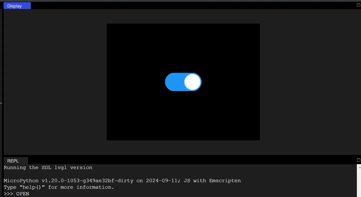
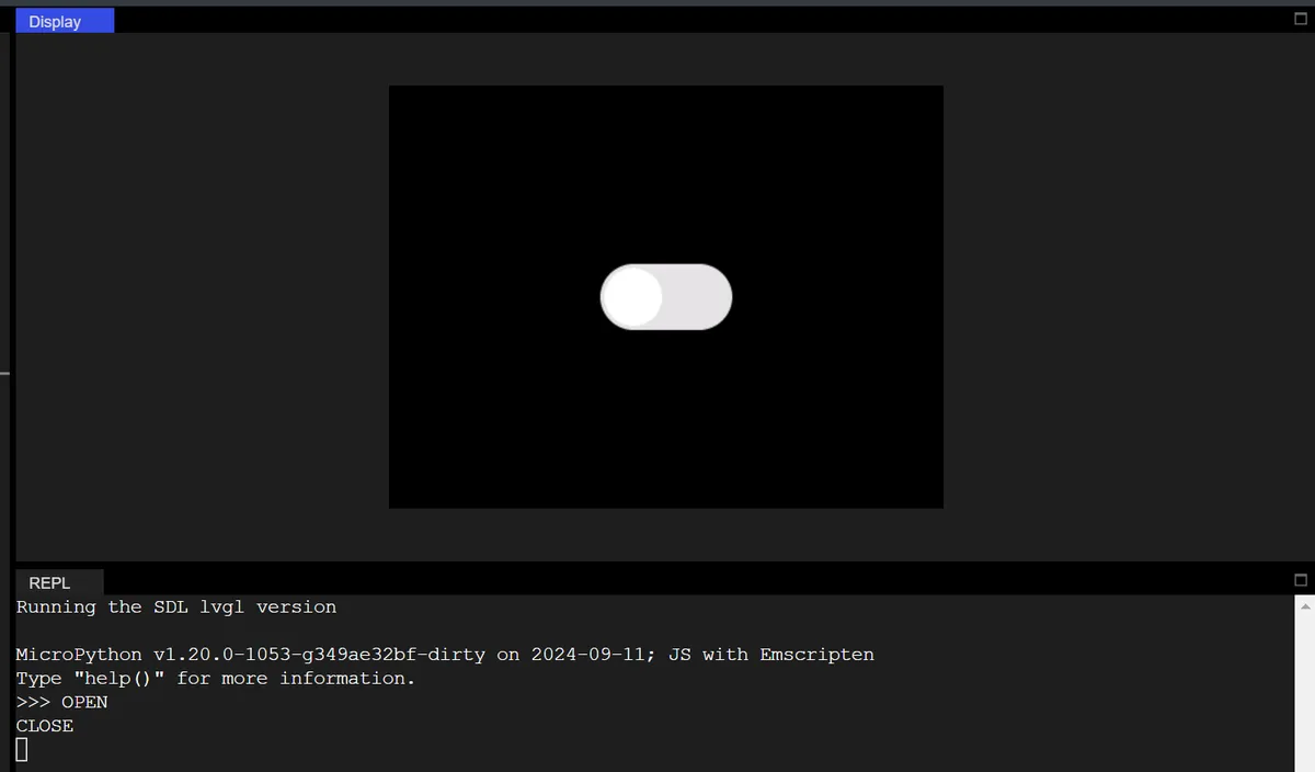
In the code above:
- Define the callback function
switch_event_cb: detect the switch status viahas_state (lv.STATE.CHECKED):- If the switch is in the "ON (CHECKED)" state, the Console will print the English text "OPEN";
- If it is in the "closed" state, print "CLOSE";
- Bind the
lv.EVENT.VALUE_CHANGEDevent (value change event) to the switch: when the switch is toggled manually, the aforementioned callback function will be triggered, and the status prompt will be output in real time.
6.1 Switch Linkage Label (Control Text Display / Color)
Added a label control that synchronously modifies the label text and color when the switch toggles, achieving "control linkage".
import display_driver
import lvgl as lv

lv.init()

scr = lv.screen_active()
scr.set_style_bg_color(lv.color_hex(0x000000), 0)

# Create a switch
switch = lv.switch(scr)
switch.set_size(100, 50)
switch.align(lv.ALIGN.CENTER, 0, -40)  # Move up to leave room for the label

# ========== New: create the linked label ==========
label = lv.label(scr)
label.set_text("Switch is CLOSE")
label.align(lv.ALIGN.CENTER, 0, 20)
# Label style (initially red)
style_label = lv.style_t()
style_label.init()
style_label.set_text_color(lv.color_hex(0xFF0000))
label.add_style(style_label, lv.STATE.DEFAULT)

# Modified callback: linked label
def switch_event_cb(e):
    if switch.has_state(lv.STATE.CHECKED):
        print("OPEN")
        label.set_text("Switch is OPEN")
        label.set_style_text_color(lv.color_hex(0x00FF00), lv.STATE.DEFAULT)  # Green
    else:
        print("CLOSE")
        label.set_text("Switch is CLOSE")
        label.set_style_text_color(lv.color_hex(0xFF0000), lv.STATE.DEFAULT)  # Red

switch.add_event_cb(switch_event_cb, lv.EVENT.VALUE_CHANGED, None)

lv.screen_load(scr)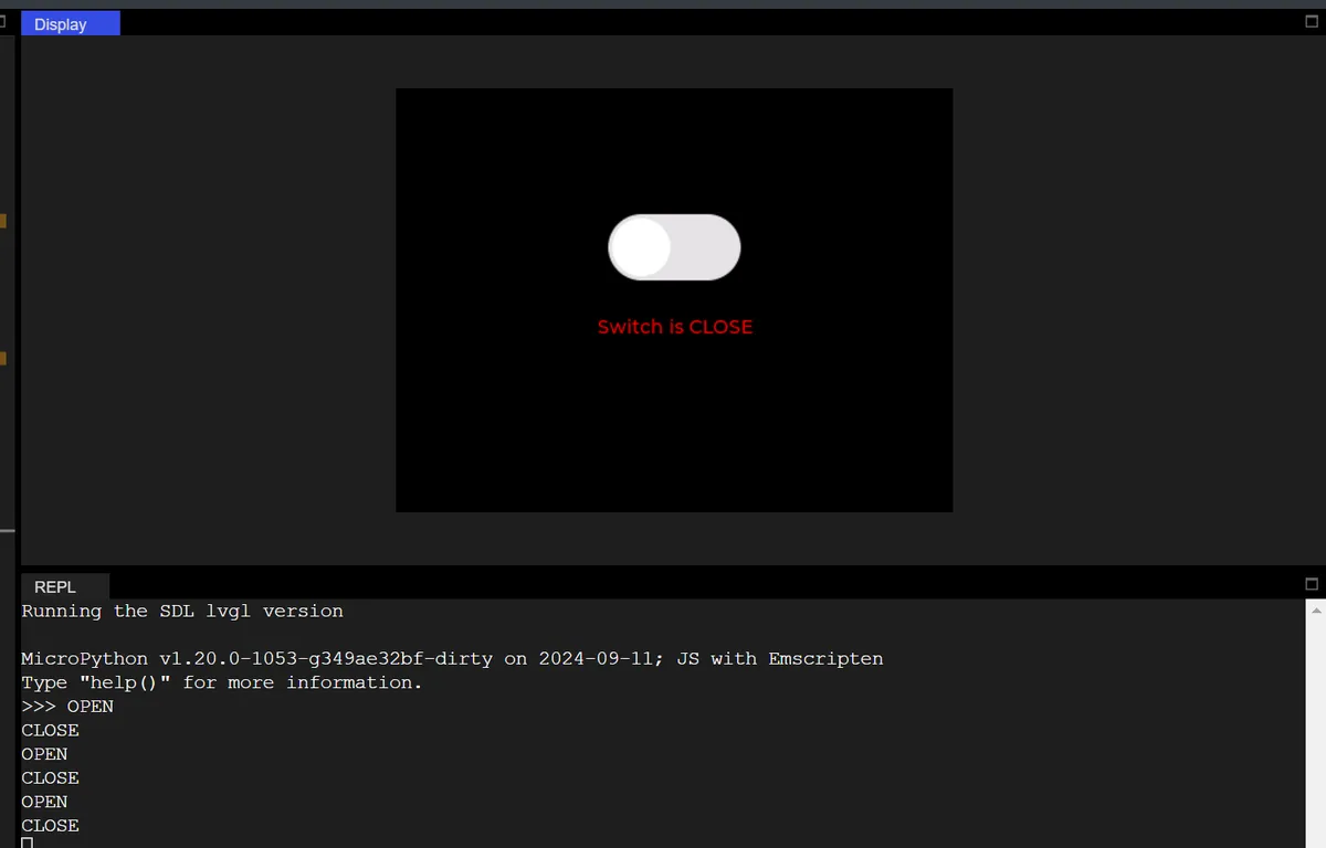
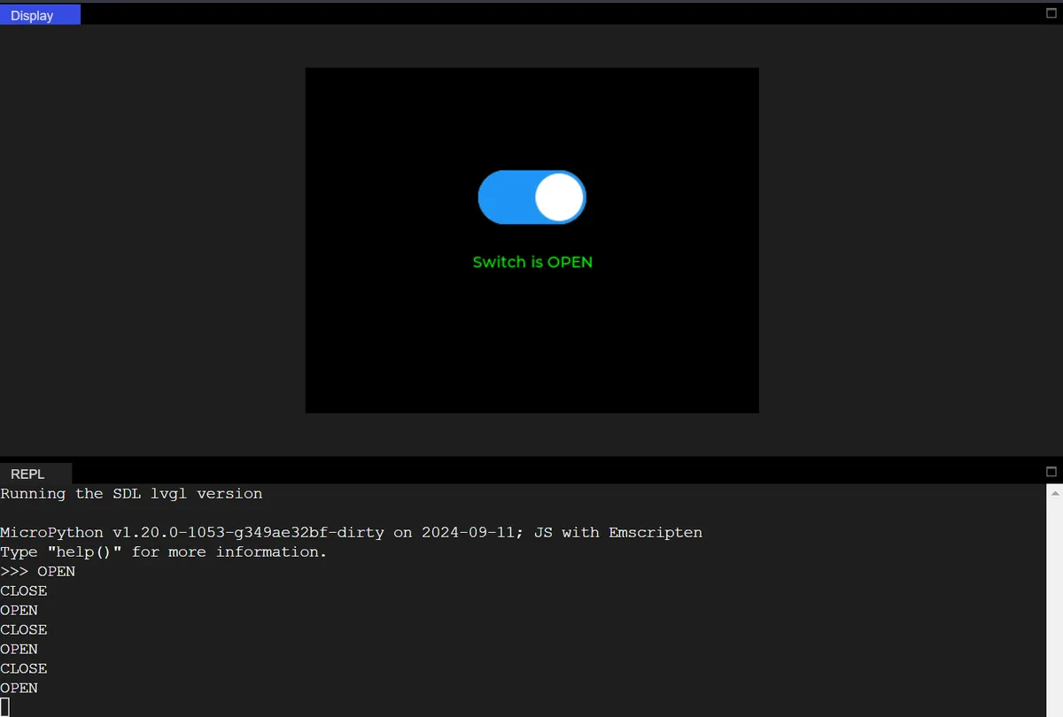
6.2 Complete Switch Configuration (Styles of Track and Slider)
The following code implements a switch control with customizable style, precise centering and interactive feedback on a black background:
import display_driver
import lvgl as lv

lv.init()

#Get the currently active screen object
scr = lv.screen_active()
#Set the screen background color to black
scr.set_style_bg_color(lv.color_hex(0x000000), 0)

# Create and initialize the style object
style_switch = lv.style_t()
style_switch.init()

#Create a switch
switch = lv.switch(scr)
#Set the size
switch.set_size(100, 50)

# First remove all default styles
switch.remove_style_all()

# Off state + track (main part): dark gray
switch.set_style_bg_color(lv.color_hex(0x444444), lv.STATE.DEFAULT | lv.PART.MAIN)
switch.set_style_bg_opa(255, lv.STATE.DEFAULT | lv.PART.MAIN)  # Opaque
switch.set_style_radius(25, lv.STATE.DEFAULT | lv.PART.MAIN)   # Rounded corners
switch.set_style_border_width(0, lv.STATE.DEFAULT | lv.PART.MAIN)  # Remove the default border

# On state + track (main part): green
switch.set_style_bg_color(lv.color_hex(0x00FF00), lv.STATE.CHECKED | lv.PART.MAIN)
switch.set_style_bg_opa(255, lv.STATE.CHECKED | lv.PART.MAIN)
switch.set_style_radius(25, lv.STATE.CHECKED | lv.PART.MAIN)
switch.set_style_border_width(0, lv.STATE.CHECKED | lv.PART.MAIN)

# Off state knob: white
switch.set_style_bg_color(lv.color_hex(0xFFFFFF), lv.STATE.DEFAULT | lv.PART.KNOB)
switch.set_style_bg_opa(255, lv.STATE.DEFAULT | lv.PART.KNOB)
switch.set_style_radius(25, lv.STATE.DEFAULT | lv.PART.KNOB)  # Round knob

# On state knob: yellow
switch.set_style_bg_color(lv.color_hex(0xFFFF00), lv.STATE.CHECKED | lv.PART.KNOB)
switch.set_style_bg_opa(255, lv.STATE.CHECKED | lv.PART.KNOB)
switch.set_style_radius(25, lv.STATE.CHECKED | lv.PART.KNOB)

# Center it
switch.center()

#Interaction callback function
def switch_event_cb(e):
    if switch.has_state(lv.STATE.CHECKED):
        print("OPEN")
    else:
        print("CLOSE")

#Register the interaction callback function. For more states see the "class EVENT" section of api.py
switch.add_event_cb(switch_event_cb, lv.EVENT.VALUE_CHANGED, None)

# Load the screen
lv.screen_load(scr)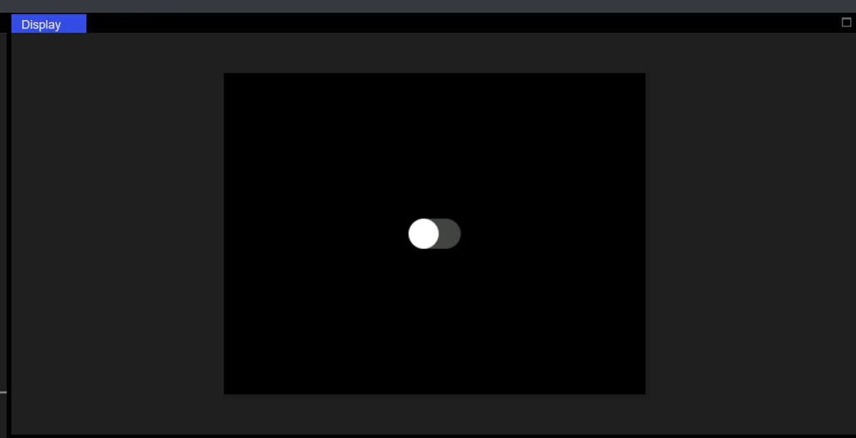
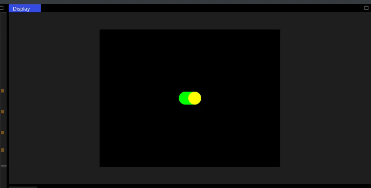
The core logic for customizing the styled state of the switch (track + slider) is as follows:
- Clear default styles: Call
switch.remove_style_all ()to remove all default styles of the switch, so as to prevent the default styles from overriding custom settings; - Set styles by "state + widget"(adaptation for older versions of LVGL):
- "Closed state (lv.STATE.DEFAULT)":
- Track (lv.PART.MAIN, switch background): dark gray (
0x444444), opaque (255), 25px rounded corners (arc-shaped corners), no border; - Slider (lv.PART. switch ): white (
0xFFFFFF), opaque, with 25px rounded corners (circular slider);
- Track (lv.PART.MAIN, switch background): dark gray (
- "Enabled State (lv.STATE.CHECKED)":
- Track: Green (
0x00FF00), same size / rounded corners / transparency; - Slider: Yellow (
0xFFFF00), same size / rounded corners / transparency.
- Track: Green (
- "Closed state (lv.STATE.DEFAULT)":
After all style and size settings are completed, call switch.center (): to recalculate the centering coordinates based on the switch's final style and size state, so as to avoid position offset caused by premature centering and ensure that the switch is accurately displayed in the exact center of the screen.
7. Indicator Light LED
In the following code, we create an LED indicator:
import display_driver
import lvgl as lv

lv.init()

#Get the currently active screen object
scr = lv.screen_active()
#Set the screen background color to black
scr.set_style_bg_color(lv.color_hex(0x000000), 0)

#Create an LED
led = lv.led(scr)
#Set the size
led.set_size(50, 50)
#Set the color when lit
led.set_color(lv.color_hex(0xFF0000))
# Set the brightness; range: 0-255
led.set_brightness(150)
#Center it
led.center()

#Turn on
#led.on()
#Turn off
#led.off()
# Toggle the state
#led.toggle()

# Load the screen
lv.screen_load(scr)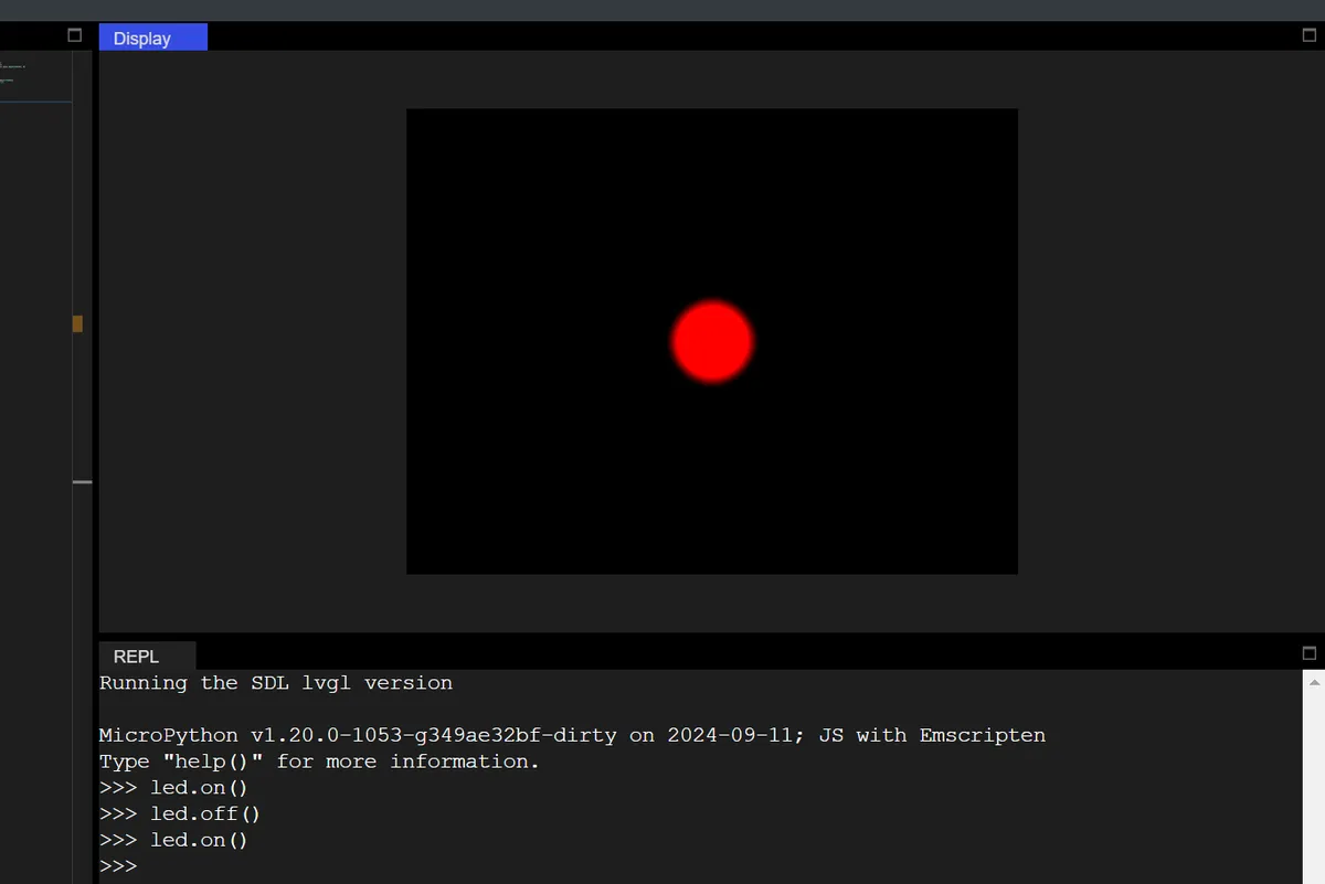
7.1 Multi-Color Water Flowing Lights with Automatic Brightness Adjustment
Create 4 LED lights of different colors to realize the functions of "sequential flowing lighting + automatic brightness gradient":
- Four LED lights are lit in sequence in a cycle (water flowing effect);
- The brightness of each illuminated LED automatically cycles from 0 to 255 then back to 0 (with gradual brightness transition);
- All LEDs that are not currently illuminated are turned off.
import display_driver
import lvgl as lv

lv.init()

# 1. Screen configuration: black background
scr = lv.screen_active()
scr.set_style_bg_color(lv.color_hex(0x000000), 0)

# 2. Create 4 LEDs, arranged horizontally
led_list = []
led_colors = [
    lv.color_hex(0xFF0000),   # Red
    lv.color_hex(0x00FF00),   # Green
    lv.color_hex(0x0000FF),   # Blue
    lv.color_hex(0xFFFF00)    # Yellow
]
# Create 4 LEDs in a loop, arranged horizontally
for i in range(4):
    led = lv.led(scr)
    led.set_size(50, 50)  # LED size
    # Horizontal layout: centered on the screen, x-axis offsets of ±80/±20
    x_offset = -100 + i * 60
    led.align(lv.ALIGN.CENTER, x_offset, 0)
    led.set_color(led_colors[i])  # Set different colors
    led_list.append(led)

# 3. Running-light control variables
current_led_idx = 0    # Index of the currently lit LED
brightness = 0         # Current brightness (0-255)
brightness_dir = 1     # Brightness change direction: 1 = increasing, -1 = decreasing

# 4. Timer callback: automatically adjust brightness + switch running light
def flow_led_timer_cb(e):
    global current_led_idx, brightness, brightness_dir

    # Step 1: turn off all LEDs first
    for led in led_list:
        led.off()

    # Step 2: adjust brightness (0→255→0 back and forth)
    brightness += brightness_dir * 5  # Changes by 5 each time; speed is adjustable
    if brightness >= 255:
        brightness = 255
        brightness_dir = -1  # Maximum value reached, start decreasing
    elif brightness <= 0:
        brightness = 0
        brightness_dir = 1   # Minimum value reached, start increasing

    # Step 3: light the current LED and set its brightness
    current_led = led_list[current_led_idx]
    current_led.on()
    current_led.set_brightness(brightness)
    print(f"LED ID:{current_led_idx+1}, brightness:{brightness}")

    # Step 4: switch to the next LED (looping)
    current_led_idx = (current_led_idx + 1) % len(led_list)

# Create a timer: run the callback every 100ms (running-light speed)
lv.timer_create(flow_led_timer_cb, 100, None)

# Load the screen
lv.screen_load(scr)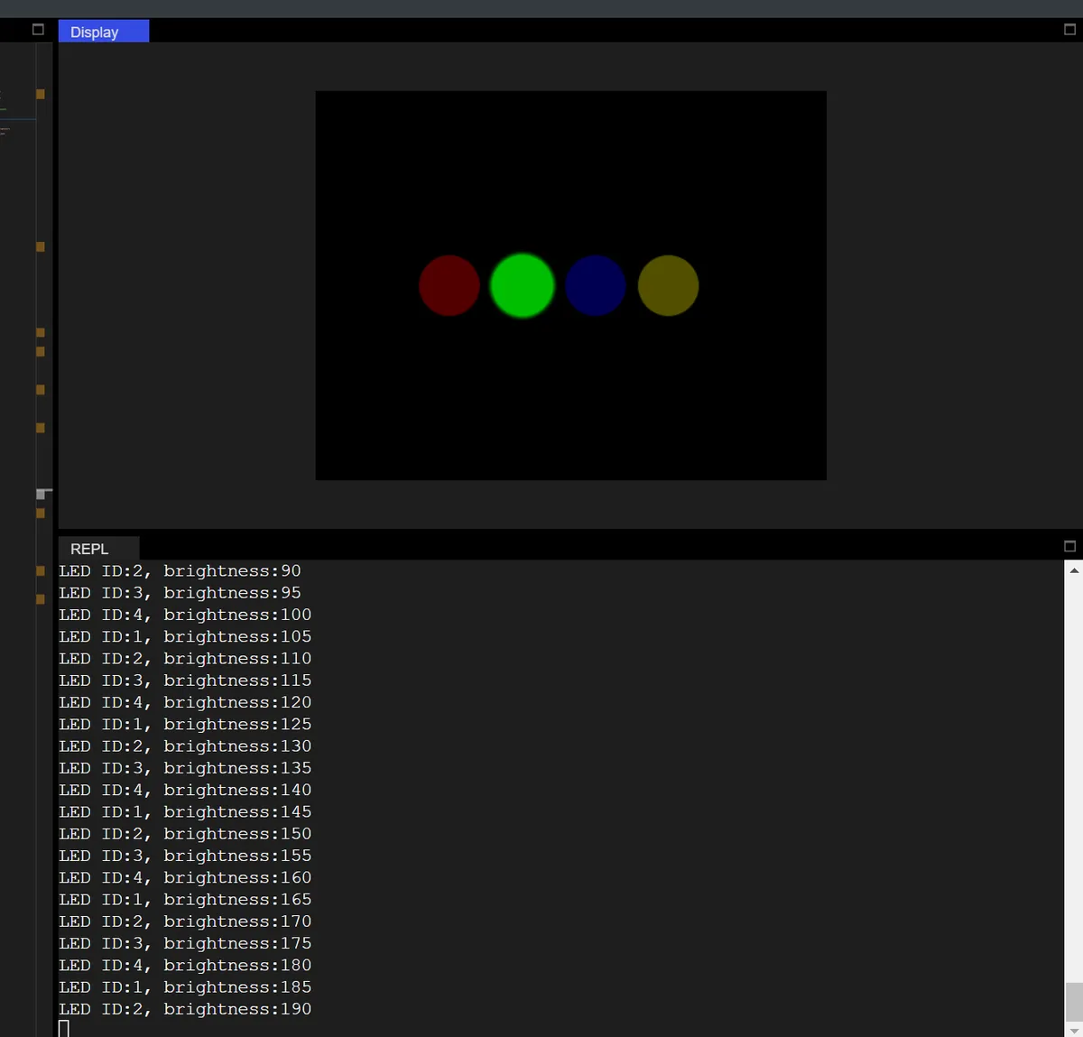
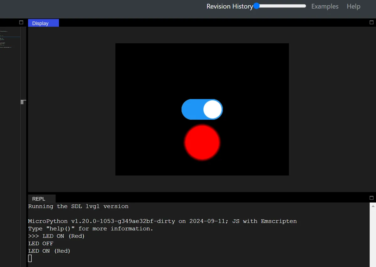
7.2 Switch Control for LED On/Off
import display_driver
import lvgl as lv
import time

lv.init()

scr = lv.screen_active()
# Black background
scr.set_style_bg_color(lv.color_hex(0x000000), 0)

switch = lv.switch(scr)
# Switch size
switch.set_size(100, 50)
# Call center to ensure accurate positioning
switch.center()

# Initialize with the given LED class, parent object is the screen
led1 = lv.led(scr)
# LED size
led1.set_size(80, 80)
# Place the LED 80 pixels below the switch
led1.align(lv.ALIGN.CENTER, 0, 80)
# Set the LED color to red
led1.set_color(lv.color_hex(0xFF0000))
# Full brightness (0-255)
led1.set_brightness(255)

# Bind the switch to the LED control logic
def switch_led_cb(e):
    if switch.has_state(lv.STATE.CHECKED):
        led1.on()  # Switch on → LED on
        print("LED ON (Red)")
    else:
        led1.off()  # Switch off → LED off
        print("LED OFF")

# Bind the switch value-changed event
switch.add_event_cb(switch_led_cb, lv.EVENT.VALUE_CHANGED, None)

lv.screen_load(scr)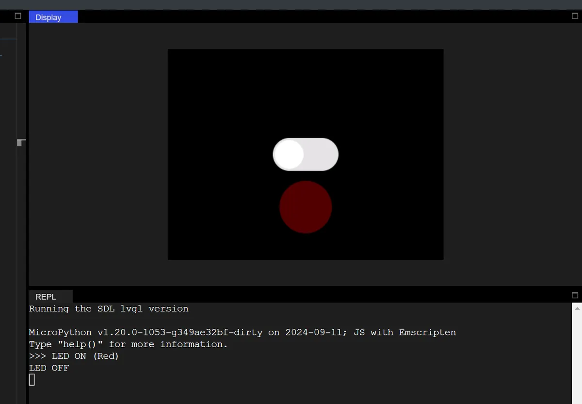
8. Checkbox
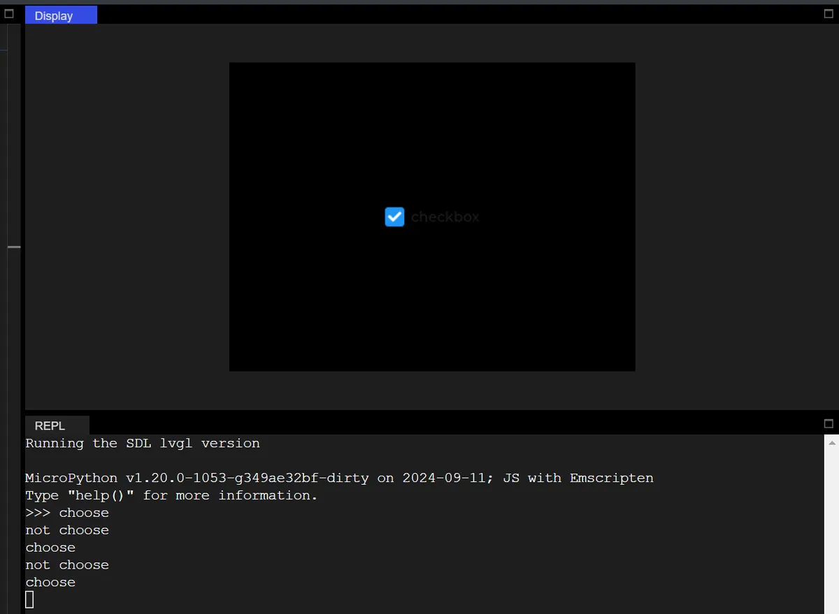
The following code implements an interactive checkbox control that is centered on a black background. Its core function is to respond to the checked / unchecked state of the checkbox in real time and output corresponding prompts to the Console.
import display_driver
import lvgl as lv
import time

lv.init()

#Get the currently active screen object
scr = lv.screen_active()
#Set the screen background color to black
scr.set_style_bg_color(lv.color_hex(0x000000), 0)

#Create a checkbox
cb = lv.checkbox(scr)
#Set the checkbox text
cb.set_text("checkbox")
#Center it
cb.center()

#Interaction callback function
def cb_event_cb(e):
    if cb.has_state(lv.STATE.CHECKED):
        print("choose")
    else:
        print("not choose")
#Register the interaction callback function. For more states see the "class EVENT" section of api.py
cb.add_event_cb(cb_event_cb, lv.EVENT.VALUE_CHANGED, None)

lv.screen_load(scr)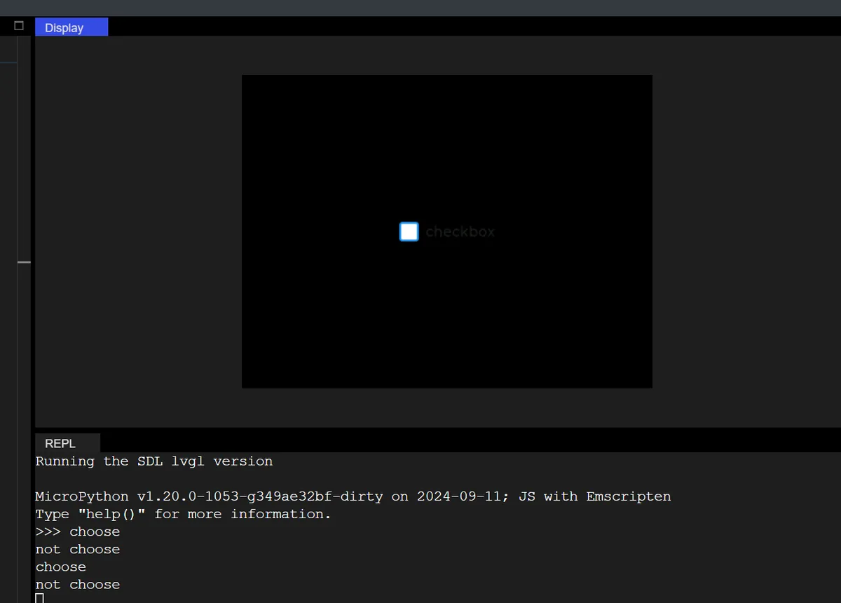
8.1 Checkbox Font Customization Display
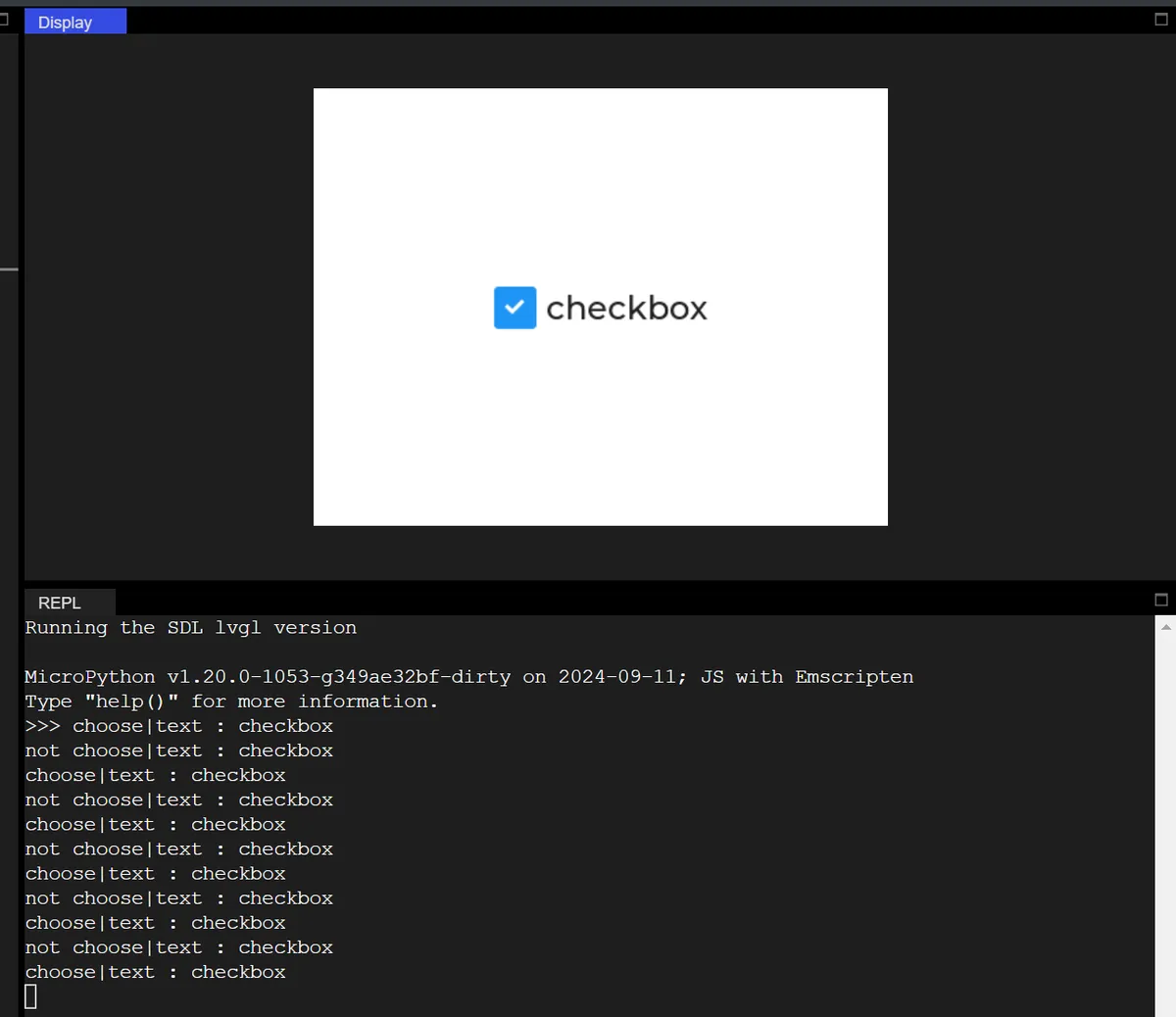
The following code creates a check box and customizes its text style (font, color, size):
import display_driver
import lvgl as lv
import time

lv.init()

#Get the currently active screen object
scr = lv.screen_active()
#Set the screen background color to black
scr.set_style_bg_color(lv.color_hex(0xFFFFFF), 0)

#Create a checkbox
cb = lv.checkbox(scr)
#Set the checkbox text
cb.set_text("checkbox")
#Center it
cb.center()

# Create a font style object
style_cb_text = lv.style_t()
style_cb_text.init()
# Set the font
style_cb_text.set_text_font(lv.font_montserrat_24)
# Apply the style to the checkbox
cb.add_style(style_cb_text, lv.STATE.DEFAULT)

#Interaction callback function
def cb_event_cb(e):
    global cb_text
    cb_text = cb.get_text()
    if cb.has_state(lv.STATE.CHECKED):
        print(f"choose|text : {cb_text}")
    else:
        print(f"not choose|text : {cb_text}")
#Register the interaction callback function. For more states see the "class EVENT" section of api.py
cb.add_event_cb(cb_event_cb, lv.EVENT.VALUE_CHANGED, None)

lv.screen_load(scr)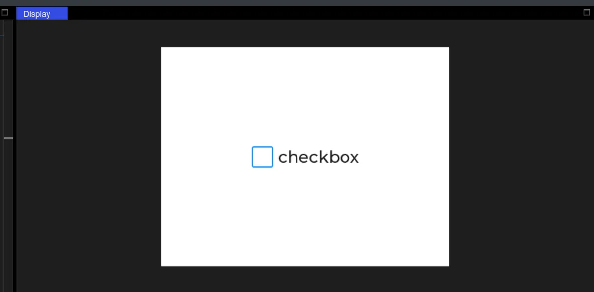
8.2 Control the LED by checking the checkbox
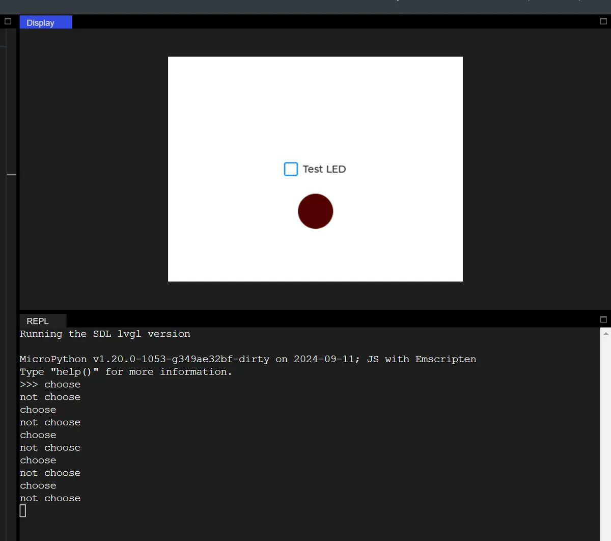
In the following code, tick the checkbox to turn on the LED:
import display_driver
import lvgl as lv

lv.init()

# Screen initialization (keep the white background from your original code)
scr = lv.screen_active()
scr.set_style_bg_color(lv.color_hex(0xFFFFFF), 0)

# 1. Minimal checkbox (no extra styling, get it running first)
cb = lv.checkbox(scr)
cb.set_text("Test LED")
cb.center()

# 2. Minimal LED (only set size + color + position, no dependence on checkbox alignment)
led = lv.led(scr)
led.set_size(50, 50)
led.align(lv.ALIGN.CENTER, 0, 60)  # Directly below the checkbox
led.set_color(lv.color_hex(0xFF0000))

# 3. Minimal callback (only controls the LED on/off, no global variables)
def cb_test_cb(e):
    if cb.has_state(lv.STATE.CHECKED):
        led.on()
        print("choose")
    else:
        led.off()
        print("not choose")

# 4. Register the event (format identical to your original code)
cb.add_event_cb(cb_test_cb, lv.EVENT.VALUE_CHANGED, None)

lv.screen_load(scr)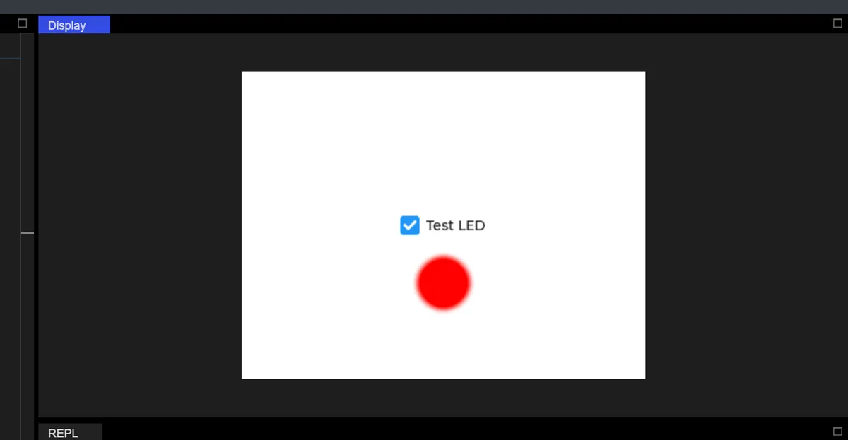
IX. Arc
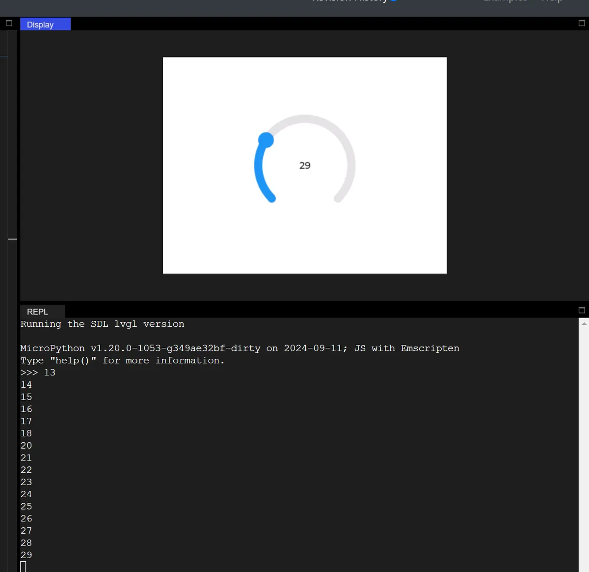
The following code implements an interactive Arc control centered on a white background, whose core function is to update and display/print its current value in real time when the arc is dragged:
import display_driver
import lvgl as lv

lv.init()

# Screen initialization (keep the white background from your original code)
scr = lv.screen_active()
scr.set_style_bg_color(lv.color_hex(0xFFFFFF), 0)

#Create an arc
arc = lv.arc(scr)
#Set the arc size
arc.set_size(150, 150)
#Set the arc value range
arc.set_range(0, 100)
#Set the current value
arc.set_value(10)
#Center it
arc.center()

# Create a value display label
lbl_val = lv.label(scr)
lbl_val.set_text(str(arc.get_value()))
lbl_val.align(lv.ALIGN.CENTER, 0, 0)

#Interaction callback function
def arc_event_cb(e):
    current_val = arc.get_value()
    lbl_val.set_text(str(current_val))
    print(current_val)

#Register the interaction callback function
arc.add_event_cb(arc_event_cb, lv.EVENT.VALUE_CHANGED, None)

lv.screen_load(scr)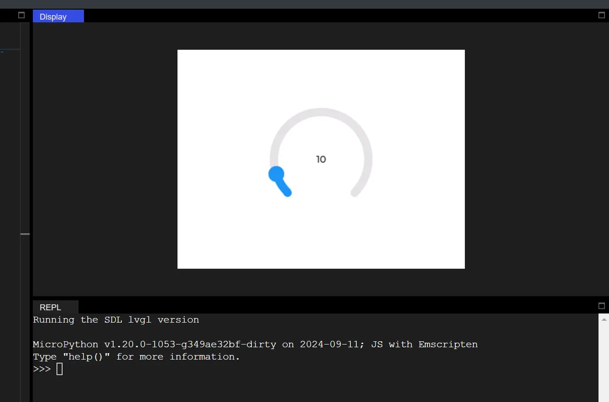
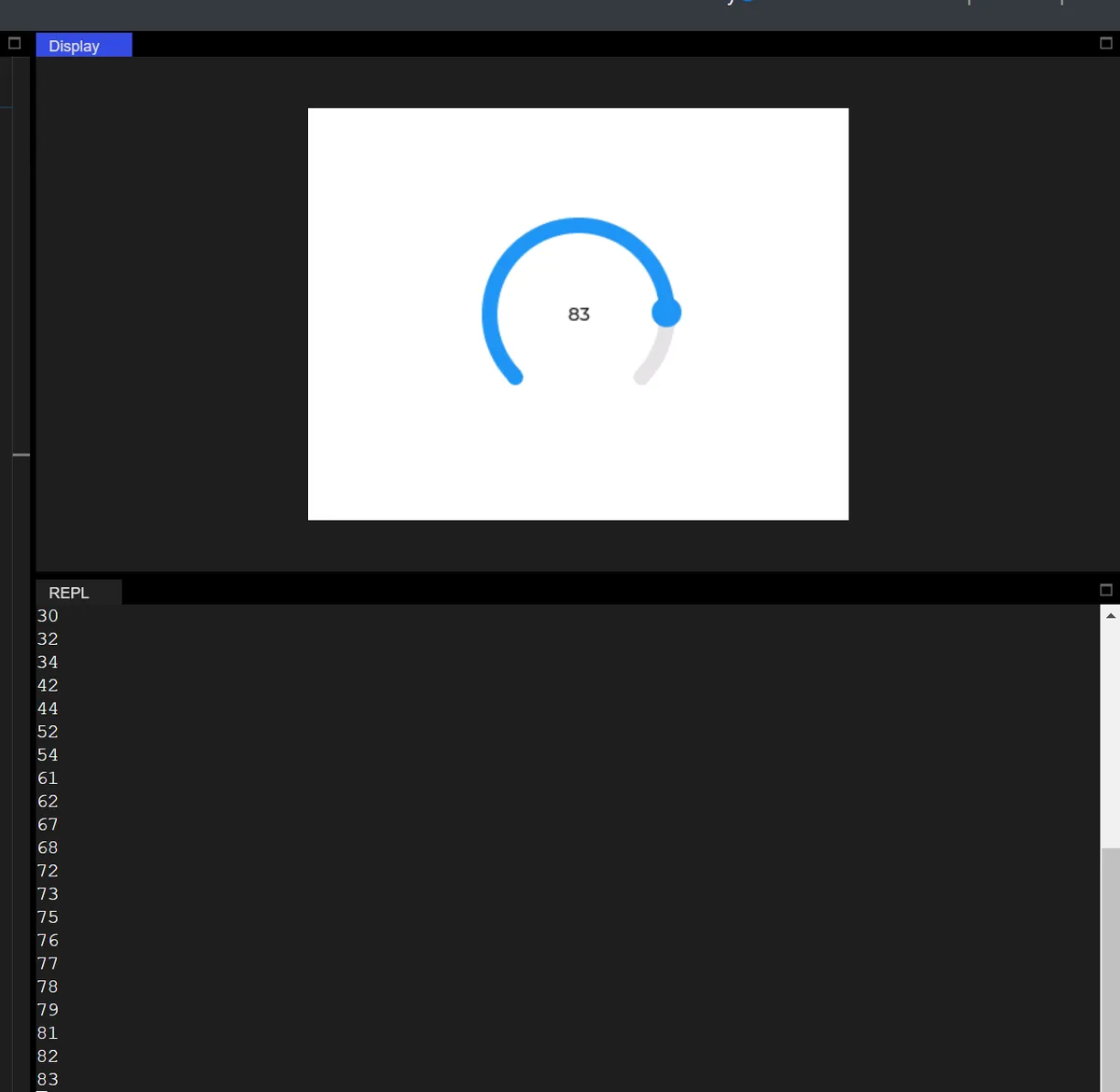
9.1 Setting Dimensions and Value Ranges
import display_driver
import lvgl as lv

lv.init()

# Screen initialization (keep the white background from your original code)
scr = lv.screen_active()
scr.set_style_bg_color(lv.color_hex(0xFFFFFF), 0)

#Create an arc
arc = lv.arc(scr)
#Set the arc size
arc.set_size(200, 200)
#Set the arc value range
arc.set_range(0, 360)
#Set the current value
arc.set_value(10)
#Center it
arc.center()

# Create a value display label
lbl_val = lv.label(scr)
lbl_val.set_text(str(arc.get_value()))
lbl_val.align(lv.ALIGN.CENTER, 0, 0)

#Interaction callback function
def arc_event_cb(e):
    current_val = arc.get_value()
    lbl_val.set_text(str(current_val))
    print(current_val)

#Register the interaction callback function
arc.add_event_cb(arc_event_cb, lv.EVENT.VALUE_CHANGED, None)

lv.screen_load(scr)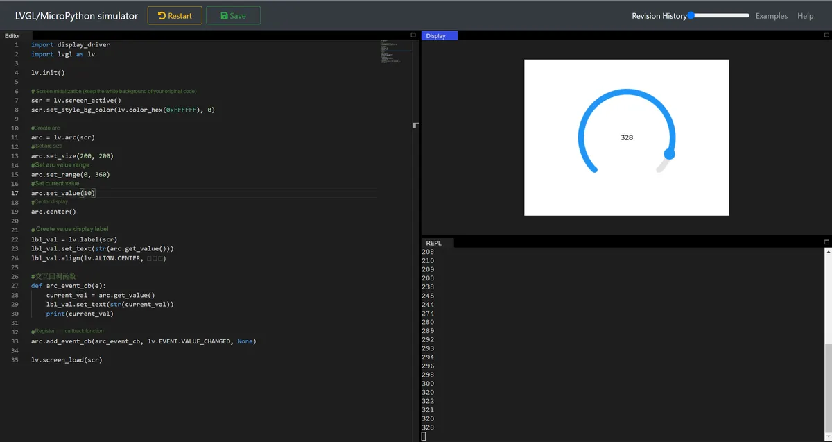
9.2 Adjustment Mode
arc.set_mode(lv.arc.MODE.REVERSE) # MODE.REVERSE: reverse expansion, suitable for "countdown, reverse adjustment" scenarios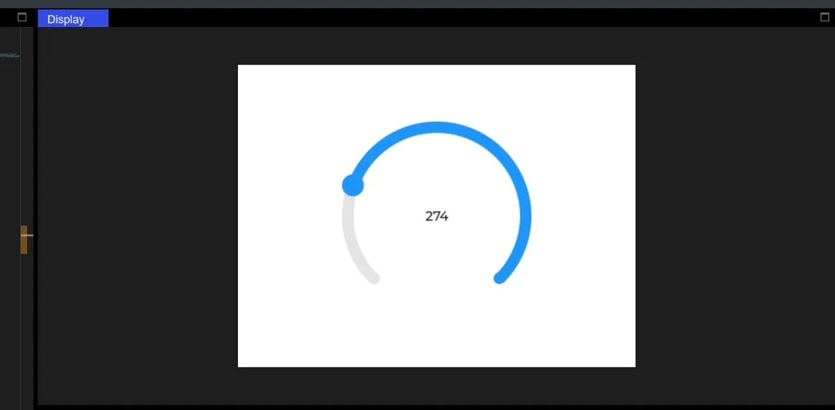
arc.set_mode(lv.arc.MODE.SYMMETRICAL) # MODE.SYMMETRICAL: values are symmetric about the middle value (set a positive/negative range)
# Suitable for "temperature ±, volume balance" scenarios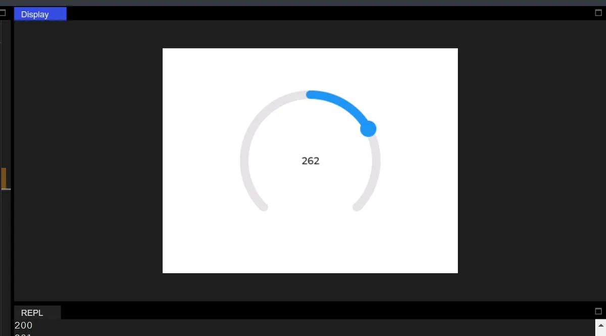
9.3 Set Background Arc
import display_driver
import lvgl as lv

lv.init()

# Screen initialization (keep the white background from your original code)
scr = lv.screen_active()
scr.set_style_bg_color(lv.color_hex(0xFFFFFF), 0)

#Create an arc
arc = lv.arc(scr)
#Set the arc size
arc.set_size(200, 200)
#Set the arc value range
arc.set_range(0, 360)
#Set the current value
arc.set_value(10)
#Center it
arc.center()

# Set the mode
arc.set_mode(lv.arc.MODE.NORMAL) # MODE.NORMAL: most common, value goes from minimum → maximum, arc expands clockwise

#  Set the background arc
arc.set_bg_angles(0, 270)

# Create a value display label
lbl_val = lv.label(scr)
lbl_val.set_text(str(arc.get_value()))
lbl_val.align(lv.ALIGN.CENTER, 0, 0)

#Interaction callback function
def arc_event_cb(e):
    current_val = arc.get_value()
    lbl_val.set_text(str(current_val))
    print(current_val)

#Register the interaction callback function
arc.add_event_cb(arc_event_cb, lv.EVENT.VALUE_CHANGED, None)

lv.screen_load(scr)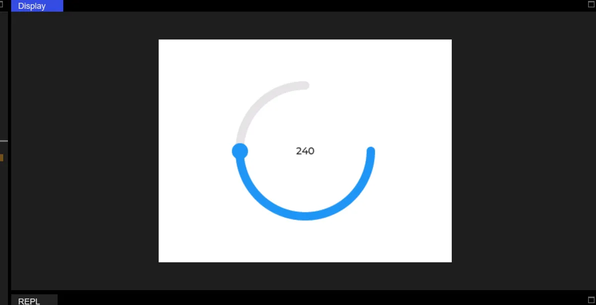
9.4 Arc Integral Rotation
# The whole arc widget spans 90 degrees
arc.set_rotation(90)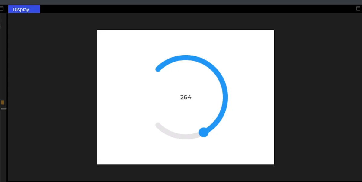
9.5 Curve Control of LED Brightness
The code is as follows:
import display_driver
import lvgl as lv

lv.init()

# 1. Screen initialization
scr = lv.screen_active()
scr.set_style_bg_color(lv.color_hex(0xFFFFFF), 0)

# 2. Create the arc (integrating the core methods)
arc = lv.arc(scr)
arc.set_size(150, 150)
# Display a full circle
arc.set_angles(0, 360)
arc.set_bg_angles(0, 360)

# Value range = LED brightness range (0~255)
arc.set_range(0, 255)
# Initial brightness 0 (LED off)
arc.set_value(0)
# Normal mode (clockwise to brighten)
arc.set_mode(lv.arc.MODE.NORMAL)
# Centered in the upper half of the screen
arc.align(lv.ALIGN.CENTER, 0, -50)

# 3. Create the LED
led = lv.led(scr)
led.set_size(80, 80)
led.align(lv.ALIGN.CENTER, 0, 80)  # Centered below the arc
led.set_color(lv.color_hex(0xFF0000))  # Red LED
led.set_brightness(0)  # Initial brightness 0

# 4. Interaction callback: arc value → LED brightness
def arc_led_cb(e):
    # get_value: get the current value of the arc (0~255)
    brightness = arc.get_value()
    # Set the LED brightness
    led.set_brightness(brightness)
    # Print for debugging (value = brightness)
    print(f"LED Brightness : {brightness}")

# Bind the value-changed event
arc.add_event_cb(arc_led_cb, lv.EVENT.VALUE_CHANGED, None)

lv.screen_load(scr)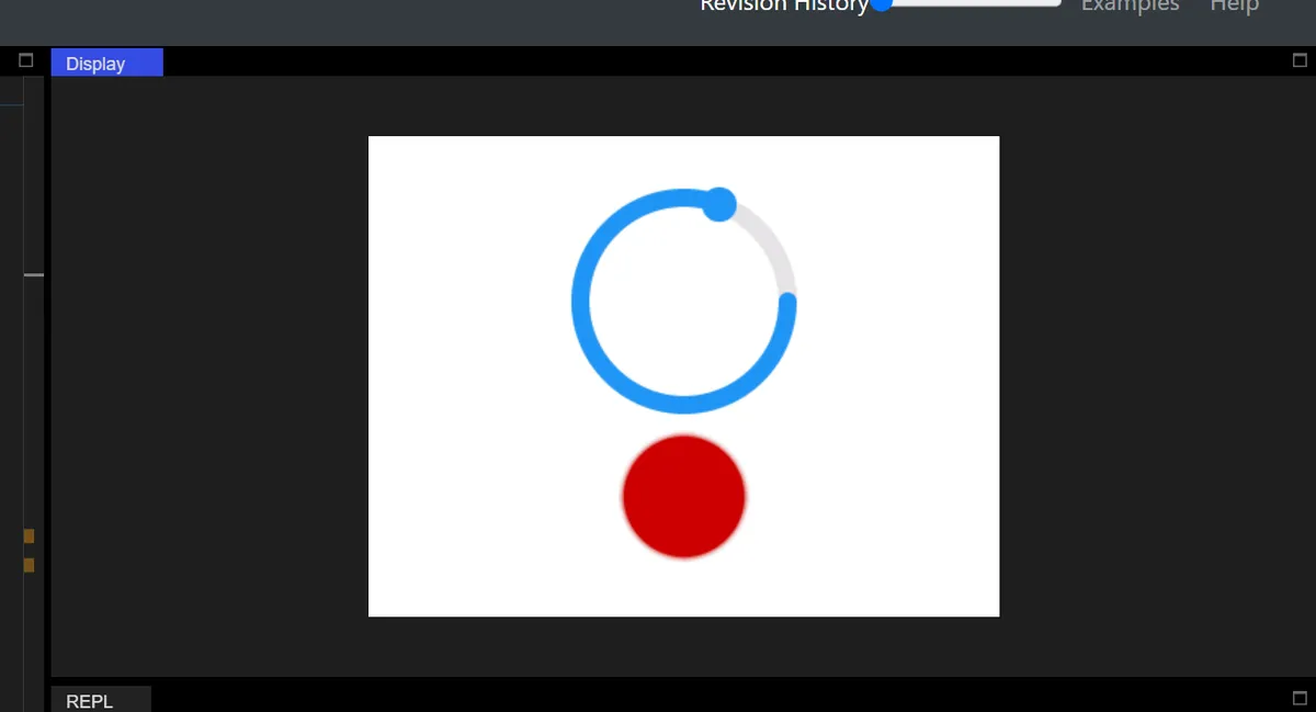
X. Slider
The code is as follows:
import display_driver
import lvgl as lv

lv.init()

# Screen initialization
scr = lv.screen_active()
scr.set_style_bg_color(lv.color_hex(0xFFFFFF), 0)

#Create a slider
slider = lv.slider(scr)
#Set the slider size
slider.set_size(300, 50)
#Set the slider value range
slider.set_range(0, 100)
#Center it
slider.center()

#Create a value display label
lbl_val = lv.label(scr)
lbl_val.set_text(str(slider.get_value()))
lbl_val.align(lv.ALIGN.CENTER, 0, -50)

#Interaction callback function
def slider_event_cb(e):
    current_val = slider.get_value()
    lbl_val.set_text(str(current_val))
    print(current_val)

#Register the interaction callback function. For more states see the "class EVENT" section of api.py
slider.add_event_cb(slider_event_cb, lv.EVENT.VALUE_CHANGED, None)

lv.screen_load(scr)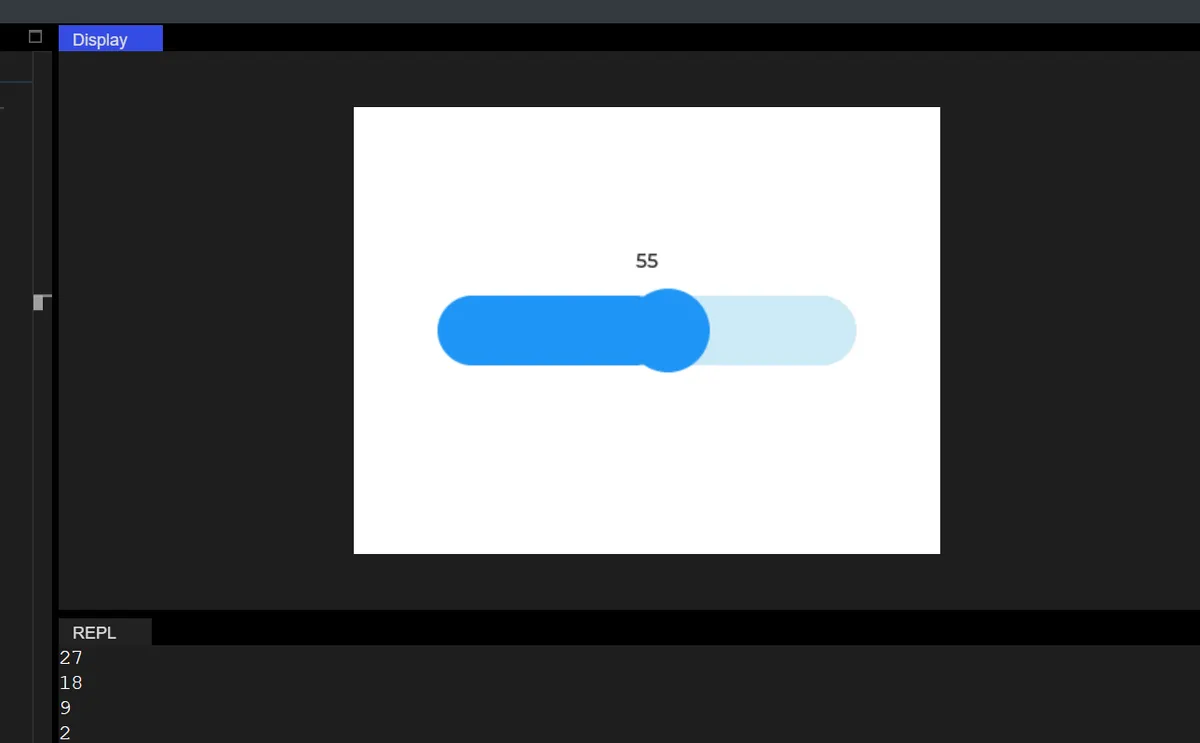
10.1 Modify Slider Mode
The differences between the different modes are as follows:
| Constant | Purpose |
|---|---|
| NORMAL | Normal mode (default): single slider, dragged from the minimum value to the maximum value (this is what your earlier code used) |
| SYMMETRICAL | Symmetric mode: centered on 0, with values symmetric about zero (for example, with a range of -50 to 50, the slider at center is 0) |
| RANGE | Range mode: dual sliders, lets you select a value interval (for example, setting a range of 10 to 80) |
10.1.1 Scope Mode
The code is as follows:
import display_driver
import lvgl as lv

lv.init()

# Screen initialization
scr = lv.screen_active()
scr.set_style_bg_color(lv.color_hex(0xFFFFFF), 0)

# ===================== Core change: slider mode =====================
# Create the slider and set it to [RANGE mode] (dual knobs)
slider = lv.slider(scr)
slider.set_mode(lv.slider.MODE.RANGE)  # Switch to range mode
# You can also try symmetrical mode: slider.set_mode(lv.slider.MODE.SYMMETRICAL)

# Set the slider size (keep width > height for horizontal mode)
slider.set_size(300, 50)
# Symmetrical mode: set a symmetric range (e.g. -50~50); range mode can use 0~100
slider.set_range(0, 100)
slider.center()

# ===================== Label display adapted to the mode =====================
# Main knob value label (right knob)
lbl_main = lv.label(scr)
lbl_main.set_text(f"main value:{slider.get_value()}")
lbl_main.align(lv.ALIGN.CENTER, 0, -50)

# Added for range mode: left knob value label
lbl_left = lv.label(scr)
lbl_left.set_text(f"left value:{slider.get_left_value()}")
lbl_left.align(lv.ALIGN.CENTER, 0, -80)

# ===================== Callback function adapted to multiple modes =====================
def slider_event_cb(e):
    # Get the values of the main knob (right) and the left knob
    main_val = slider.get_value()
    left_val = slider.get_left_value()

    # Update the label text
    lbl_main.set_text(f"main value:{main_val}")
    lbl_left.set_text(f"left value:{left_val}")

    # Print the mode and values (for debugging)
    print(f"current mode:{slider.get_mode()}, left value:{left_val}, main value:{main_val}")

# Register the value-changed event
slider.add_event_cb(slider_event_cb, lv.EVENT.VALUE_CHANGED, None)

lv.screen_load(scr)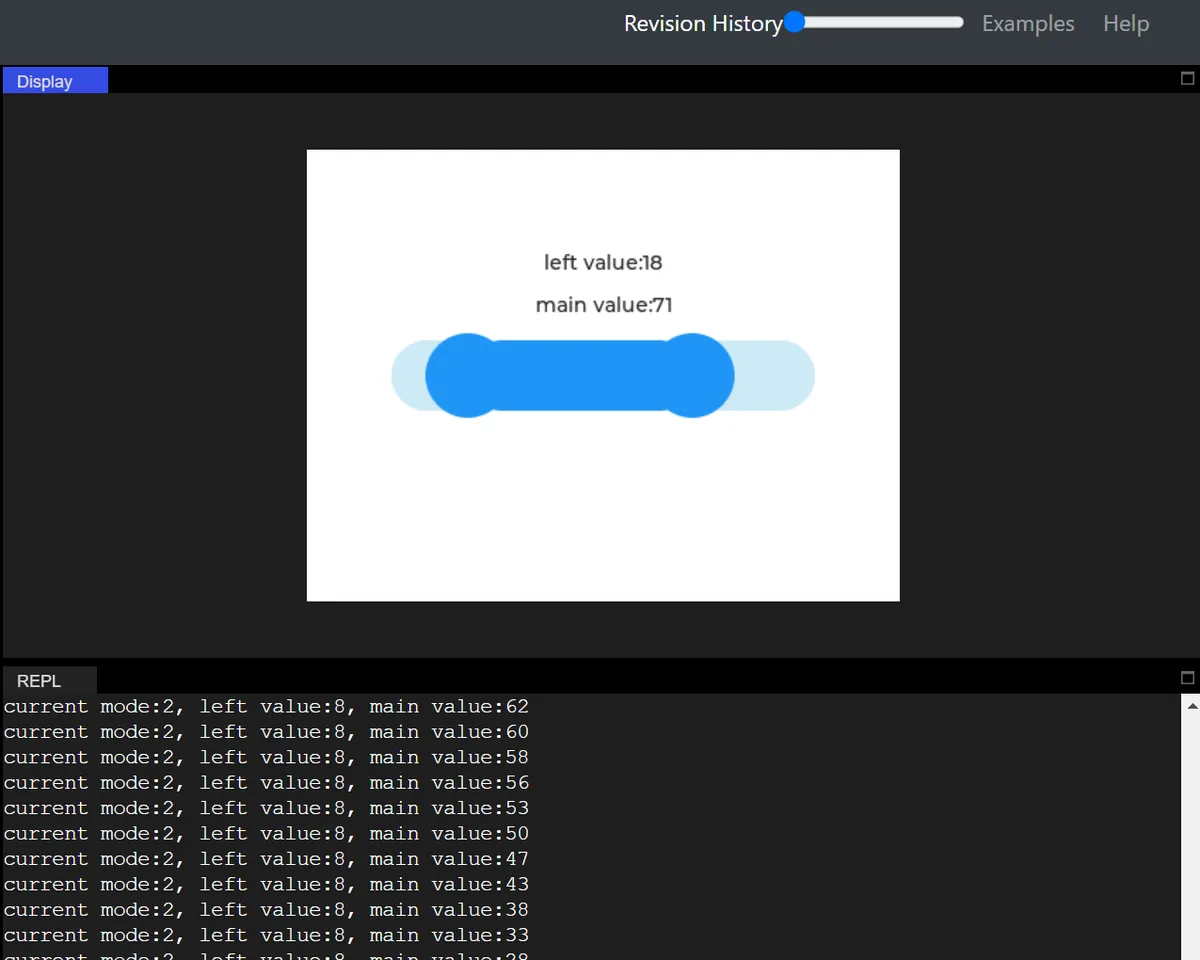
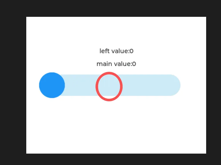
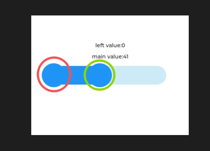
First click once, then drag:
10.1.2 Symmetric Mode
import display_driver
import lvgl as lv

lv.init()

# Screen initialization
scr = lv.screen_active()
scr.set_style_bg_color(lv.color_hex(0xFFFFFF), 0)

# ===================== Core change: slider mode =====================
# Create the slider and set it to [RANGE mode] (dual knobs)
slider = lv.slider(scr)
# slider.set_mode(lv.slider.MODE.RANGE)  # Switch to range mode
slider.set_mode(lv.slider.MODE.SYMMETRICAL) # Symmetrical mode

# Set the slider size (keep width > height for horizontal mode)
slider.set_size(300, 50)
# Symmetrical mode: set a symmetric range (e.g. -50~50); range mode can use 0~100
slider.set_range(-50, 50)
slider.center()

# ===================== Label display adapted to the mode =====================
# Main knob value label (right knob)
lbl_main = lv.label(scr)
lbl_main.set_text(f"main value:{slider.get_value()}")
lbl_main.align(lv.ALIGN.CENTER, 0, -50)

# Added for range mode: left knob value label
lbl_left = lv.label(scr)
lbl_left.set_text(f"left value:{slider.get_left_value()}")
lbl_left.align(lv.ALIGN.CENTER, 0, -80)

# ===================== Callback function adapted to multiple modes =====================
def slider_event_cb(e):
    # Get the values of the main knob (right) and the left knob
    main_val = slider.get_value()
    left_val = slider.get_left_value()

    # Update the label text
    lbl_main.set_text(f"main value:{main_val}")
    lbl_left.set_text(f"left value:{left_val}")

    # Print the mode and values (for debugging)
    print(f"current mode:{slider.get_mode()}, left value:{left_val}, main value:{main_val}")

# Register the value-changed event
slider.add_event_cb(slider_event_cb, lv.EVENT.VALUE_CHANGED, None)

lv.screen_load(scr)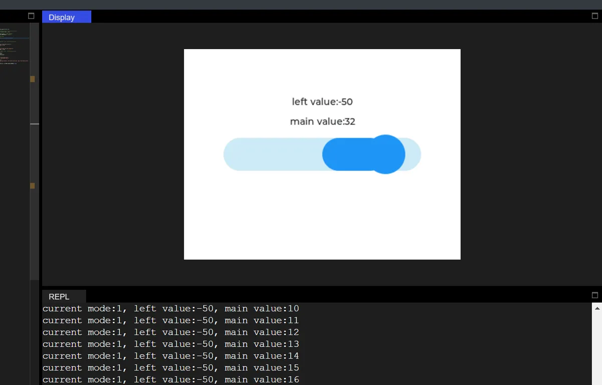
10.2 Modify Slider Direction
The following code is not runnable in version 9.0:
Change the slider from the default horizontal (HORIZONTAL) to vertical (VERTICAL), and adjust its size and layout to adapt to the vertical orientation.
import display_driver
import lvgl as lv

lv.init()

# Screen initialization
scr = lv.screen_active()
scr.set_style_bg_color(lv.color_hex(0xFFFFFF), 0)

# ===================== Core change: slider orientation =====================
slider = lv.slider(scr)
# Force vertical orientation (default is horizontal)
slider.set_orientation(lv.slider.ORIENTATION.VERTICAL)

# Vertical slider: swap width and height (narrow and tall)
slider.set_size(50, 300)  # Width 50, height 300 (vertical orientation needs height > width)
slider.set_range(0, 100)
slider.center()

# ===================== Label layout adapted to vertical orientation =====================
lbl_val = lv.label(scr)
lbl_val.set_text(str(slider.get_value()))
# Place the label to the right of the vertical slider (X offset +80, Y centered)
lbl_val.align(lv.ALIGN.CENTER, 80, 0)

# ===================== Callback function (logic unchanged, layout adapted) =====================
def slider_event_cb(e):
    current_val = slider.get_value()
    lbl_val.set_text(f"当前值:{current_val}")
    print(f"垂直滑动条值:{current_val}")

slider.add_event_cb(slider_event_cb, lv.EVENT.VALUE_CHANGED, None)

lv.screen_load(scr)
10.3 Using set_range in RANGE mode
Focus on the RANGE mode to demonstrate set_range ()(custom value range) usage and implement "initial interval selection".
#Set the slider value range
slider.set_range(0, 300)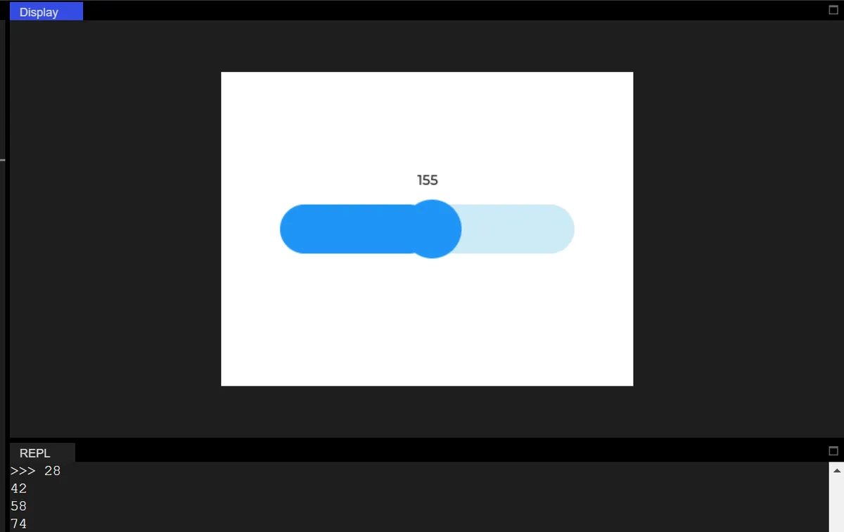
10.4 Determine whether the slider is being dragged
The code is as follows:
import display_driver
import lvgl as lv

# Initialize the LVGL core engine
lv.init()

# Screen initialization: set white background
scr = lv.screen_active()
scr.set_style_bg_color(lv.color_hex(0xFFFFFF), 0)

# Create a normal horizontal slider
slider = lv.slider(scr)
# Set slider size: width 300 pixels, height 50 pixels
slider.set_size(300, 50)
# Set value range: 0~100
slider.set_range(0, 100)
# Display the slider centered
slider.center()

# ===================== Split into two independent Labels =====================
# 1. Value display Label (updated only by the slider callback)
num_label = lv.label(scr)
num_label.set_text("Value: 0")
# Value label position: 70 pixels above the slider, centered
num_label.align(lv.ALIGN.CENTER, 0, -70)

# 2. Drag status Label (updated only by the timer)
status_label = lv.label(scr)
status_label.set_text("Status: Not dragging")
# Status label position: 40 pixels above the slider, centered
status_label.align(lv.ALIGN.CENTER, 0, -40)

# Global variable: stores the current slider value (replaces dynamic attributes, avoids AttributeError)
current_value = slider.get_value()

# ===================== Slider callback: handles only the value Label =====================
# Function: only responds to value changes, updates the value Label + global variable, does not handle any status logic
def slider_event_cb(e):
    global current_value
    # Get the latest value and update the global variable
    current_value = slider.get_value()
    # Update only the value Label
    num_label.set_text(f"Value: {current_value}")
    # Print value update (English)
    print(f"Value updated to: {current_value}")

# Register the value-changed event
slider.add_event_cb(slider_event_cb, lv.EVENT.VALUE_CHANGED, None)

# ===================== Timer: only handles the drag-state Label =====================
# Function: only polls the drag state, updates the text and color of the state Label
def timer_cb(timer):
    # Only check the drag state
    is_dragging = slider.is_dragged()
    # Only update the state Label
    if is_dragging:
        status_label.set_text("Status: Dragging")
        status_label.set_style_text_color(lv.color_hex(0xFF0000), 0)  # Dragging: red
    else:
        status_label.set_text("Status: Not dragging")
        status_label.set_style_text_color(lv.color_hex(0x000000), 0)  # Not dragging: black
    # Print the drag state (in English)
    print(f"Dragging status: {is_dragging}")

# Create a timer: poll every 50ms (adjustable)
timer = lv.timer_create(timer_cb, 50, None)

# Load the screen
lv.screen_load(scr)
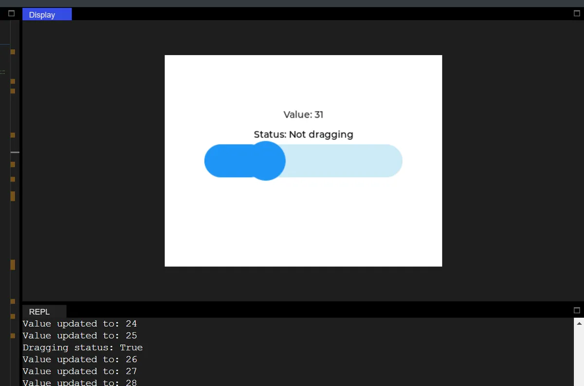
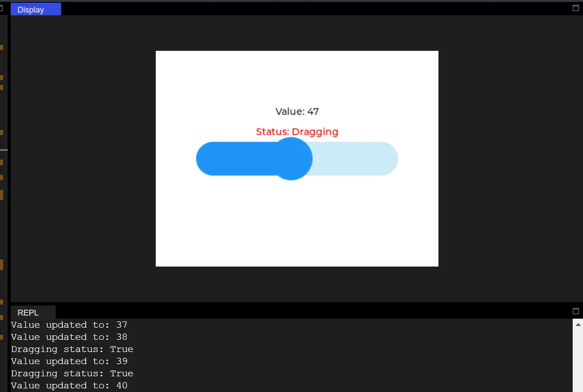
In the code above, the interactive slider function is implemented:
- First, initialize the LVGL engine and the screen with a white background, create a horizontal slider, set its size and value range, and then display it centered.
- Then split two independent labels (the value label and the drag status label), and store the value of the slider via a global variable to avoid the error caused by MicroPython LVGL not supporting dynamic object properties;
- The callback function for slider value change is only responsible for updating the text of the value label, synchronizing the global variables, and printing the value update information;
- Meanwhile, create an LVGL timer to polling the drag status of the slider every 50ms, only update the text of the status label (display "Dragging" when dragging, "Not dragging" when not dragging) and the font color (red when dragging, black when not dragging), and print the drag status;
- The comments throughout the code are in Chinese to facilitate logic understanding, while the printed content is in English, which not only ensures the clear separation of functional responsibilities but also adapts to the compatibility of the operating environment.
- Drag the slider:
num_labelReal-time displayValue: XX(The value changes are only updated via the slider callback);status_labelDisplayStatus: Dragging(in red, updated by timer);- Terminal output:
Value updated to: XX+Dragging status: True.
- Release the slider:
num_labelKeep the latest value;status_labelimmediately switch toStatus: Not dragging(black);- Terminal output:
Dragging status: False.
11. Line Segments
import display_driver
import lvgl as lv

# Initialize the LVGL core engine
lv.init()

# Screen initialization: set white background
scr = lv.screen_active()
scr.set_style_bg_color(lv.color_hex(0xFFFFFF), 0)

#Create a line
line = lv.line(scr)
#Define the vertex coordinates (x, y) of the line
points = [
    lv.point_precise_t({'x': 50, 'y': 50}),
    lv.point_precise_t({'x': 150, 'y': 100}),
    lv.point_precise_t({'x': 250, 'y': 50}),
    lv.point_precise_t({'x': 300, 'y': 150})
]
# Set the vertices of the line
line.set_points(points, len(points))

# Load the screen
lv.screen_load(scr)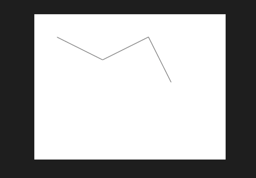
We can use the set_y_invert method to set whether the Y-axis is inverted (to control the drawing direction of the line chart):
line.set_y_invert(True)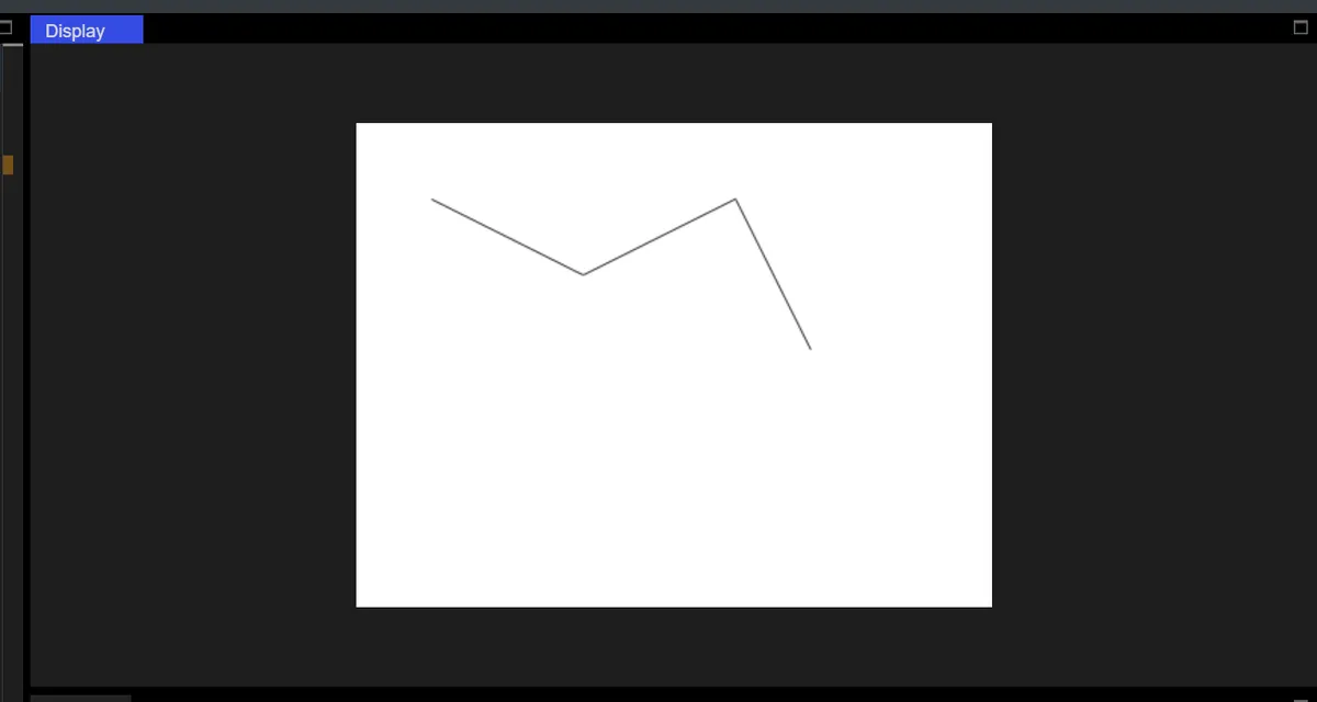
12. Charts and Graphs
Inner Enum Class:
| Class name | Description |
|---|---|
| chart.TYPE | Chart type enumeration, used to specify how the chart is displayed: - NONE: no chart - LINE: line chart - BAR: bar chart - SCATTER: scatter chart |
| chart.UPDATE_MODE | Data update mode enumeration, controls how data is displayed when new data is added: - SHIFT: data shifts left (new data is added on the right, old data shifts left) - CIRCULAR: circular overwrite (new data overwrites the oldest data) |
| chart.AXIS | Axis enumeration, specifies the axis the data is bound to: - PRIMARY_Y: primary Y axis (default) - SECONDARY_Y: secondary Y axis - PRIMARY_X: primary X axis - SECONDARY_X: secondary X axis - LAST: last axis |
Core Methodology:
| Method name | Meaning | Input parameters (actually usable format) | Return value | Notes |
|---|---|---|---|---|
| __init__(parent) | Chart constructor, creates a chart instance | parent: lv.obj type (e.g. the screen object scr) | lv.chart object | None |
| set_type(type) | Sets the chart display type | type: int enum value (1=LINE line chart, 2=BAR bar chart, 3=SCATTER scatter chart, 0=NONE) | None | lv.chart.TYPE.LINE actually corresponds to the int value 1; just pass an int directly |
| set_point_count(count) | Sets the maximum number of data points the chart displays | count: int type (e.g. 10/20) | None | None |
| set_update_mode(mode) | Sets the update logic when new data is added | mode: int enum value (0=SHIFT shift left, 1=CIRCULAR circular overwrite) | None | lv.chart.UPDATE_MODE.SHIFT actually corresponds to the int value 0 |
| set_div_line_count(hdiv, vdiv) | Sets the number of chart grid lines | hdiv: int type (number of horizontal grid lines, e.g. 3); vdiv: int type (number of vertical grid lines, e.g. 3) | None | Both parameters must be passed together; neither can be omitted |
| set_range(axis, min, max) | Sets the value range of the specified axis | axis: int enum value ( 0=PRIMARY_Y primary Y axis, 1=SECONDARY_Y secondary Y axis, 2=PRIMARY_X primary X axis, 3=SECONDARY_X secondary X axis); min: int type (axis minimum value, e.g. 0); max: int type (axis maximum value, e.g. 100) | None | All three parameters must be passed together; lv.chart.AXIS.PRIMARY_Y corresponds to the int value 0 |
| get_type() | Gets the current chart type | None | int enum value ( 1=LINE line chart, 2=BAR bar chart, etc.) | Corresponds one-to-one with the int value passed to set_type |
| get_point_count() | Gets the currently set number of data points | None | int type (e.g. 10) | Same as the value set by set_point_count |
| get_x_start_point(ser) | Gets the X-axis start point index of the specified data series | ser: lv_chart_series_t struct object (created by add_series) | int type (e.g. 0) | Depends on the series object created by add_series |
| get_point_pos_by_id(ser, id, p_out) | Gets the coordinates of the point in the specified data series by ID | ser: lv_chart_series_t struct object; id: int type (data point ID, e.g. 0); p_out: lv_point_t struct object (stores the coordinate result) | None | The coordinate result is stored in the p_out object; no return value |
| refresh() | Forces a chart refresh to update the data / style display | None | None | Call after updating data to refresh the interface immediately |
| add_series(color, axis) | Adds a data series (line / bar) to the chart | color: lv_color_t struct object (e.g. lv.color_hex(0xFF0000)); axis: int enum value (0=PRIMARY_Y primary Y axis) | lv_chart_series_t struct object | The color does not need to be converted to int; pass the object generated by lv.color_hex directly |
| remove_series(series) | Removes the specified data series from the chart | series: lv_chart_series_t struct object | None | Depends on the series object created by add_series |
| hide_series(series, hide) | Hides / shows the specified data series | series: lv_chart_series_t struct object; hide: bool type (True = hide, False = show) | None | Depends on the series object created by add_series |
| set_series_color(series, color) | Sets the display color of the specified data series | series: lv_chart_series_t struct object; color: lv_color_t struct object | None | Depends on the series object created by add_series |
| set_x_start_point(ser, id) | Sets the X-axis start point index of the specified data series | ser: lv_chart_series_t struct object; id: int type (start point index, e.g. 0) | None | Depends on the series object created by add_series |
| get_series_next(ser) | Gets the next series after the specified data series (used for traversal) | ser: lv_chart_series_t struct object | lv_chart_series_t struct object (returns None if there is no next one) | Depends on the series object created by add_series |
| add_cursor(color, dir) | Adds a cursor to the chart (marks a data point) | color: lv_color_t struct object; dir: int enum value (8=DIR.BOTTOM downward) | lv_chart_cursor_t struct object | None |
| set_cursor_pos(cursor, pos) | Sets the cursor position in the chart | cursor: lv_chart_cursor_t struct object (created by add_cursor); pos: lv_point_t struct object (contains x/y coordinates) | None | Depends on the cursor object created by add_cursor |
| set_cursor_point(cursor, ser, point_id) | Positions the cursor at the specified data point of the specified series | cursor: lv_chart_cursor_t struct object; ser: lv_chart_series_t struct object; point_id: int type (data point ID, e.g. 0) | None | Depends on objects created by add_cursor and add_series |
| get_cursor_point(cursor) | Gets the coordinate point where the cursor is currently positioned | cursor: lv_chart_cursor_t struct object | lv_point_t struct object (contains x/y coordinates) | Depends on the cursor object created by add_cursor |
| set_all_value(series, value) | Sets all data points of the specified series to the same value | series: lv_chart_series_t struct object; value: int type (e.g. 0) | None | Depends on the series object created by add_series |
| set_next_value(ser, value) | Adds the next Y-axis data point to the specified series | ser: lv_chart_series_t struct object; value: int type (e.g. 50) | None | Automatically processes data according to the mode set by set_update_mode |
| set_next_value2(ser, x_value, y_value) | Adds the next X/Y-axis data point to the specified series | ser: lv_chart_series_t struct object; x_value: int type (e.g. 1); y_value: int (e.g., 60) | None | Supports a custom X-axis value, unlike set_next_value |
| set_value_by_id(ser, id, value) | Set the Y-axis value of the data point with the specified ID in the specified series | ser: lv_chart_series_t struct object; id: int (data point ID, e.g., 0); value: int (e.g., 70) | None | Depends on the series object created by add_series |
| set_value_by_id2(ser, id, x_value, y_value) | Set the X/Y-axis values of the data point with the specified ID in the specified series | ser: lv_chart_series_t struct object; id: int (data point ID, e.g., 0); x_value: int (e.g., 2); y_value: int (e.g., 80) | None | Depends on the series object created by add_series |
| set_ext_y_array(ser, array) | Bind an external Y-axis data array to the specified series | ser: lv_chart_series_t struct object; array: list[int] (e.g., [0,10,20,30,40]) | None | Depends on the series object created by add_series |
| set_ext_x_array(ser, array) | Bind an external X-axis data array to the specified series | ser: lv_chart_series_t struct object; array: list[int] (e.g., [0,10,20,30,40]) | None | Depends on the series object created by add_series |
| get_y_array(ser) | Get the Y-axis data array of the specified series | ser: lv_chart_series_t struct object | C Array (int32 []) (equivalent to Python list[int]) | Depends on the series object created by add_series |
| get_x_array(ser) | Get the X-axis data array of the specified series | ser: lv_chart_series_t struct object | C Array (int32 []) (equivalent to Python list[int]) | Depends on the series object created by add_series |
| get_pressed_point() | Get the ID of the data point hit when the user clicks the chart | None | int (2147483647 = no hit; other values are the data point ID) | 2147483647 is equivalent to -1 (no hit) |
| get_first_point_center_offset() | Get the center offset of the first data point of the chart | None | int type (e.g. 10) | The offset is in pixels, used for precise data point positioning |
12.1 Line Chart
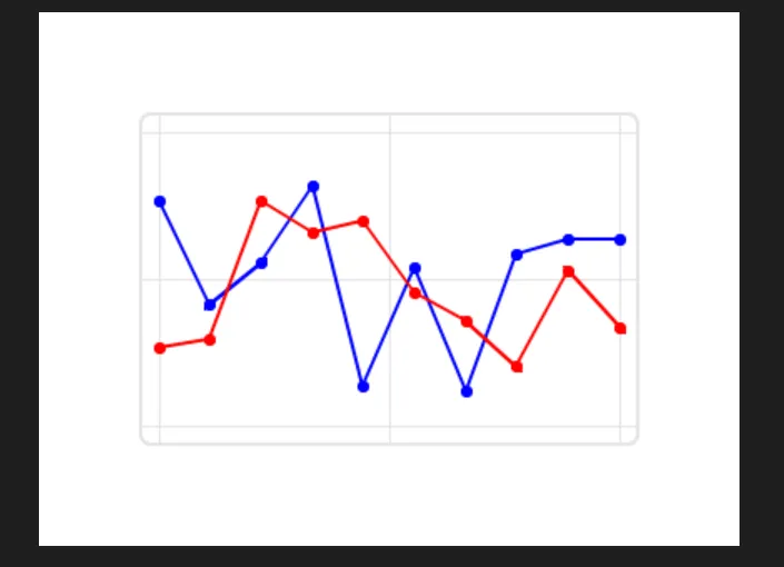
In the following code, the following operations are performed:
- The screen displays a line chart with a white background and a 3×3 grid, featuring two lines in red and blue that start at 0.
- Random data is automatically generated every 500ms: the line extends to the right, and the old data disappears after shifting out of the left boundary.
- The terminal continuously outputs English logs:
Updated: ser1= XX, ser2= XXwithout any parameter errors.
import display_driver
import lvgl as lv
import random
import time

# Initialize the LVGL core engine
lv.init()

# Screen initialization: white background
scr = lv.screen_active()
scr.set_style_bg_color(lv.color_hex(0xFFFFFF), 0)

# ===================== Create and configure the chart =====================
chart = lv.chart(scr)
chart.set_size(300, 200)  # Chart size
chart.center()            # Center on screen

# Core configuration (strictly matches the APIs that passed testing)
chart.set_type(lv.chart.TYPE.LINE)          # Line chart type
chart.set_point_count(10)                   # Number of data points (shows at most 10)
chart.set_update_mode(lv.chart.UPDATE_MODE.SHIFT)  # Data shifts left on update
chart.set_div_line_count(3, 3)              # Grid lines: 3 horizontal + 3 vertical (2 parameters, passed testing)
chart.set_range(lv.chart.AXIS.PRIMARY_Y, 0, 100)  # Y-axis range: 0~100 (3 parameters, passed testing)

# ===================== Add data series =====================
# Pass the color object + AXIS constant directly (passed testing, no int conversion needed)
# Red line
ser1 = chart.add_series(lv.color_hex(0xFF0000), lv.chart.AXIS.PRIMARY_Y)
# Blue line
ser2 = chart.add_series(lv.color_hex(0x0000FF), lv.chart.AXIS.PRIMARY_Y)

# ===================== Initialize data =====================
chart.set_all_value(ser1, 0)  # Initialize the red line to 0 (2 parameters, passed testing)
chart.set_all_value(ser2, 0)  # Initialize the blue line to 0

# ===================== Timer: update data in real time =====================
def update_chart(timer):
    """Timer callback: generate random data and update the chart"""
    val1 = random.randint(20, 80)  # Random value for the red line
    val2 = random.randint(10, 90)  # Random value for the blue line

    chart.set_next_value(ser1, val1)  # Update the red line data
    chart.set_next_value(ser2, val2)  # Update the blue line data

    print(f"Updated: ser1={val1}, ser2={val2}")  # English log output

# Create a timer: 500ms period, repeatedly runs the update function (regular function callback, passed testing)
lv.timer_create(update_chart, 500, None)

# ===================== Load the screen =====================
lv.screen_load(scr)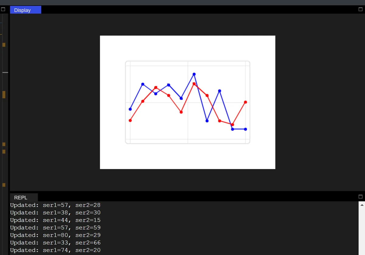
12.2 Bar Chart
The code below displays a bar chart with a white background, which consists of 6 groups of red and blue bars, with the Y-axis ranging from 0 to 100, along with 3 horizontal grid lines and 2 vertical grid lines.
import display_driver
import lvgl as lv
import random
import time

# Initialize the LVGL core engine
lv.init()

# Screen initialization: white background
scr = lv.screen_active()
scr.set_style_bg_color(lv.color_hex(0xFFFFFF), 0)

# Create a bar chart
chart = lv.chart(scr)
chart.set_size(300, 220)  # Set the chart size: width 300, height 220
chart.center()            # Center the chart on screen

# Configure the chart as a bar chart type (pass lv.chart.TYPE.BAR directly, passed testing)
chart.set_type(lv.chart.TYPE.BAR)
# Set the number of data points (number of bars): 6
chart.set_point_count(6)
# Set the grid lines: 3 horizontal lines, 2 vertical lines (2 parameters, passed testing)
chart.set_div_line_count(3, 2)
# Y-axis range 0~100
chart.set_range(lv.chart.AXIS.PRIMARY_Y, 0, 100)

# First group: red bars, using the primary Y axis (pass the color object + AXIS constant directly, passed testing)
ser1 = chart.add_series(lv.color_hex(0xFF5733), lv.chart.AXIS.PRIMARY_Y)
# Second group: blue bars, using the primary Y axis
ser2 = chart.add_series(lv.color_hex(0x3377FF), lv.chart.AXIS.PRIMARY_Y)

# Set the first group of data
data1 = [30, 45, 28, 67, 50, 75]
for idx, value in enumerate(data1):
    # Set the Y-axis values one by one by ID
    chart.set_value_by_id(ser1, idx, value)

# Set the second group of data
data2 = [20, 55, 38, 47, 60, 55]
for idx, value in enumerate(data2):
    chart.set_value_by_id(ser2, idx, value)

# Load the screen
lv.screen_load(scr)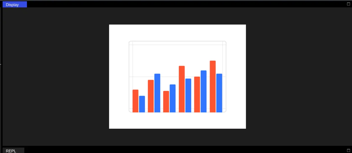
12.3 Scatter Plot
It should be noted that, the SCATTER (scatter chart) type of LVGL is not a scatter chart in the traditional sense that only displays independent discrete points; instead, it automatically connects adjacent Data Points of the same series with polylines, presenting the effect of a "polyline with Data Points", which is significantly different from the scatter chart without connections that we conventionally recognize.This feature makes it more suitable for trajectory update scenarios, such as real-time display of device movement trajectories (e. g., sensor positions, mobile terminal positioning), dynamic change trajectories of multi-dimensional indicators (e. g., XY-axis trend tracking of industrial monitoring data), etc. It can intuitively present the continuous change path of the same type of data on the XY plane, rather than simply displaying the distribution of discrete points.
import display_driver
import lvgl as lv
import time
import random

# ===================== 1. Initialize the LVGL environment =====================
lv.init()
scr = lv.screen_active()
scr.set_style_bg_color(lv.color_hex(0x000000), 0)  # Black background to make the scatter points stand out

# ===================== 2. Core configuration for creating a planar scatter chart =====================
chart = lv.chart(scr)
chart.set_size(400, 300)  # Larger size, suited to XY dual-axis distribution
chart.center()

# Key configuration: dual-axis scatter chart
chart.set_type(lv.chart.TYPE.SCATTER)          # Pure scatter chart type
chart.set_point_count(20)                      # Shows at most 20 scatter points (shift update)
chart.set_update_mode(lv.chart.UPDATE_MODE.CIRCULAR)  # New points added on the right, old points shift left
chart.set_div_line_count(5, 5)                 # 5 horizontal and 5 vertical grid lines, evenly dividing the XY axes

# Set the XY dual-axis ranges (planar coordinate system: X 0-100, Y 0-100)
chart.set_range(lv.chart.AXIS.PRIMARY_X, 0, 100)  # X-axis range
chart.set_range(lv.chart.AXIS.PRIMARY_Y, 0, 100)  # Y-axis range

# ===================== 3. Add three-color scatter series (different XY ranges) =====================
# Red scatter points: upper-left region (X 10-30, Y 70-90)
ser_red = chart.add_series(lv.color_hex(0xFF0000), lv.chart.AXIS.PRIMARY_Y)
# Blue scatter points: middle region (X 40-60, Y 40-60)
ser_blue = chart.add_series(lv.color_hex(0x0000FF), lv.chart.AXIS.PRIMARY_Y)
# Yellow scatter points: lower-right region (X 70-90, Y 10-30)
ser_yellow = chart.add_series(lv.color_hex(0xFFFF00), lv.chart.AXIS.PRIMARY_Y)

# ===================== 4. Initialize scatter data (initially 0) =====================
chart.set_all_value(ser_red, 0)
chart.set_all_value(ser_blue, 0)
chart.set_all_value(ser_yellow, 0)

# ===================== 5. Timer: update the planar scatter in real time (random XY) =====================
def update_scatter(timer):
    """Generate random XY values in different ranges and update the planar scatter points"""
    # Red: upper-left region (X 10-30, Y 70-90)
    x_red = random.randint(10, 30)
    y_red = random.randint(70, 90)
    chart.set_next_value2(ser_red, x_red, y_red)  # Dual-axis update: X+Y

    # Blue: middle region (X 40-60, Y 40-60)
    x_blue = random.randint(40, 60)
    y_blue = random.randint(40, 60)
    chart.set_next_value2(ser_blue, x_blue, y_blue)

    # Yellow: lower-right region (X 70-90, Y 10-30)
    x_yellow = random.randint(70, 90)
    y_yellow = random.randint(10, 30)
    chart.set_next_value2(ser_yellow, x_yellow, y_yellow)

    # Print real-time coordinates (optional, to view the data)
    print(f"Red({x_red},{y_red}) | Blue({x_blue},{y_blue}) | Yellow({x_yellow},{y_yellow})")

# Create a timer: update the scatter points every 600ms
lv.timer_create(update_scatter, 600, None)

# ===================== 6. Load the screen and keep running =====================
lv.screen_load(scr)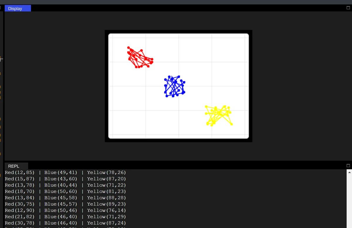
In the code above, the dynamic scatter plot effect with XY dual axes is implemented based on the LVGL graphics library: First, initialize the chart with a black background, configure the value range of 0-100 for the XY axes and the 5×5 uniform grid lines, create three data series in red, blue and yellow corresponding to different XY coordinate intervals of upper left, middle and lower right respectively, and generate random XY coordinates in the corresponding intervals every 600ms via a timer. With the help of set_next_value2 method, the dual-axis Data Points of each series are updated to realize the dynamic refresh of data.
13. Calendar
| API name | Purpose |
|---|---|
| init | Construct a calendar widget, bound to the parent container |
| set_today_date | Set today's date of the calendar |
| set_highlighted_dates | Set the dates to be highlighted in the calendar |
| set_day_names | Set the weekday names at the top of the calendar |
| get_btnmatrix | Get the internal button matrix object of the calendar |
| get_today_date | Get today's date set in the calendar |
| get_showed_date | Get the year and month currently displayed by the calendar |
| get_highlighted_dates | Get the list of highlighted dates of the calendar |
| get_highlighted_dates_num | Get the total number of highlighted dates |
| get_pressed_date | Get the date currently selected by clicking |
| header_dropdown_set_year_list | Set the year list of the drop-down in the calendar header |
The list of actually tested and available APIs is as follows:
| API name | Meaning | Input parameters | Return value |
|---|---|---|---|
| lv.calendar.__init__ | Construct a calendar widget, bound to the specified parent container | parent: lv.obj (e.g., the screen object scr) | lv.calendar (calendar widget object) |
| set_today_date | Set today's date of the calendar | Three int parameters: year, month, day | No return value |
| set_showed_date | Set the year and month currently displayed by the calendar | Two int parameters: year, month | No return value |
| set_highlighted_dates | Set the dates to be highlighted in the calendar | 1. Highlighted date list: list of lv_calendar_date_t objects (each object must have its year/month/day attributes configured); 2. date_num: int, the number of highlighted dates | No return value |
| get_btnmatrix | Get the internal button matrix object of the calendar | No input parameters | lv.buttonmatrix (button matrix object) |
| get_today_date | Get the today's date already set in the calendar | No input parameters | lv_calendar_date_t object (with year/month/day attributes) |
| get_showed_date | Get the year and month currently displayed by the calendar | No input parameters | lv_calendar_date_t object (with year/month attributes) |
| get_highlighted_dates | Get the highlighted dates of the calendar (environment limitation: only the first highlighted date is returned) | No input parameters | lv_calendar_date_t object (with year/month/day attributes) |
| get_highlighted_dates_num | Get the total number of highlighted dates in the calendar | No input parameters | int (number of highlighted dates) |
| header_dropdown_set_year_list | Set the year list of the drop-down in the calendar header | A single str parameter: year string (separate different years with the newline character \n, e.g., "2020\n2021\n2022") | No return value |
13.1 Basic Calendar Initialization
import display_driver
import lvgl as lv

# Initialize the environment
lv.init()
scr = lv.screen_active()
scr.set_style_bg_color(lv.color_hex(0x000000), 0)

#Create a calendar object
calendar = lv.calendar(scr)
#Set the size
calendar.set_size(250, 250)
#Center it
calendar.center()
# Set today's date (March 16, 2026)
calendar.set_today_date(2026, 03, 16)
 # Set the displayed year and month directly
calendar.set_showed_date(2026, 03)

# Load the screen
lv.screen_load(scr)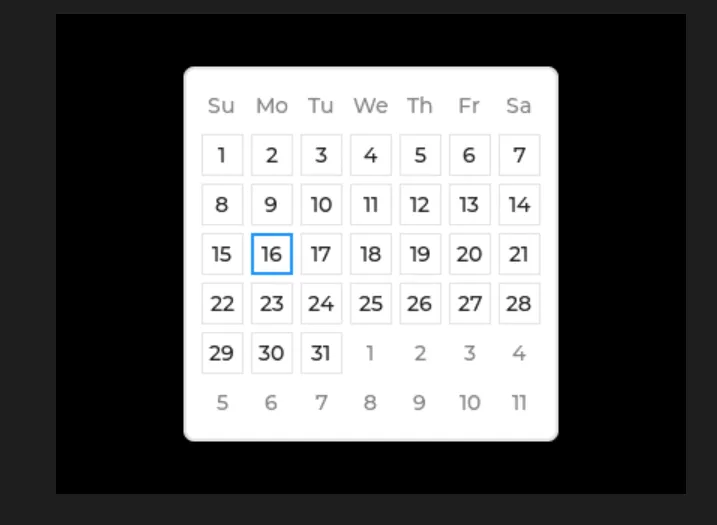
13.2 Highlighted Date Setting and Query
The following code simulates the actual scenario of "marking holidays / important schedules", which is the most commonly used business function of the calendar:
import display_driver
import lvgl as lv

# Initialize the environment
lv.init()
scr = lv.screen_active()
scr.set_style_bg_color(lv.color_hex(0x000000), 0)

calendar = lv.calendar(scr)
calendar.set_size(300, 300)
calendar.center()
calendar.set_today_date(2026, 3, 16)
# Set the displayed year and month directly
calendar.set_showed_date(2026, 03)

# ========== Core API calls ==========
# 1. Construct the highlighted date objects (must use lv_calendar_date_t, required by the environment)
# Highlight March 8 (Women's Day) and March 20 (important meeting)
highlight_date1 = lv.calendar_date_t()
highlight_date1.year, highlight_date1.month, highlight_date1.day = 2026, 3, 8

highlight_date2 = lv.calendar_date_t()
highlight_date2.year, highlight_date2.month, highlight_date2.day = 2026, 3, 20

# 2. set_highlighted_dates: set the highlighted dates (arguments: list of date objects + count int)
calendar.set_highlighted_dates([highlight_date1, highlight_date2], 2)

# 3. get_highlighted_dates_num: get the total number of highlighted dates (returns int)
highlight_count = calendar.get_highlighted_dates_num()
print(f"Total Highlighted Dates: {highlight_count}")

# 4. get_highlighted_dates: get the first highlighted date (environment limitation: only returns the first one)
first_highlight = calendar.get_highlighted_dates()
print(f"First Highlighted Date: {first_highlight.year}-{first_highlight.month}-{first_highlight.day}")

# Load the screen
lv.screen_load(scr)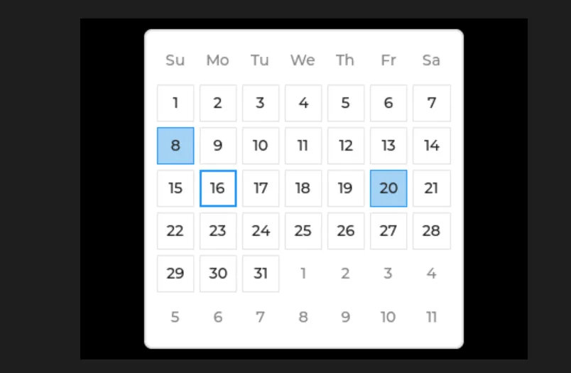
14. Text Box
| API name | Purpose | Input parameters | Return value |
|---|---|---|---|
| __init__ | Construct a Textarea widget, bound to the specified parent container | parent: lv.obj type (parent container object) | lv.textarea |
| add_char | Add a single character (the argument is a character code / delay value, actually used for character input) | delay_ms: int (character code / delay in milliseconds) | None |
| add_text | Append text content to the text box | text: str (text to add) | None |
| delete_char | Delete the character to the left of the cursor | None | None |
| set_text | Set the complete content of the text box (overwrites the existing content) | text: str (target text) | None |
| get_text | Get all the current content of the text box | None | str |
| set_placeholder_text | Set the placeholder hint text displayed when the text box is empty | text: str (placeholder text) | None |
| get_placeholder_text | Get the placeholder hint text of the text box | None | str |
| set_cursor_pos | Set the cursor position (by character index, starting from 0) | index: int (cursor index position) | None |
| get_cursor_pos | Get the index position where the cursor is currently located | None | int |
| set_cursor_click_pos | Set whether the cursor is automatically positioned when the text box is clicked | antialias: bool (True = on, False = off) | None |
| get_cursor_click_pos | Get the on/off state of "click to position cursor" | None | bool |
| cursor_right | Move the cursor one character position to the right | None | None |
| cursor_left | Move the cursor one character position to the left | None | None |
| cursor_down | Move the cursor down one line (in multi-line mode) | None | None |
| cursor_up | Move the cursor up one line (in multi-line mode) | None | None |
| set_password_mode | Turn password input mode on / off (input content is masked) | antialias: bool (True = on, False = off) | None |
| set_password_bullet | Set the mask character in password mode (e.g., *, ●) | text: str (mask character, a single character recommended) | None |
| get_password_bullet | Get the mask character of the current password mode | None | str |
| set_password_show_time | Set how long a password character stays visible after input (in milliseconds; becomes masked after the timeout) | delay_ms: int (display duration, in ms) | None |
| get_password_show_time | Get the visible duration of password characters | None | int |
| set_one_line | Set whether the text box displays only a single line (False = multi-line allowed) | antialias: bool (True = single line, False = multi-line) | None |
| get_one_line | Get the single-line / multi-line display state of the text box | None | bool |
| set_accepted_chars | Set the set of characters the text box allows to be entered (characters outside it cannot be entered) | text: str (allowed characters, e.g., "0-9a-z") | None |
| get_accepted_chars | Get the set of characters currently allowed for input | None | str |
| set_max_length | Set the maximum character length the text box allows to be entered | delay_ms: int (maximum length value) | None |
| set_insert_replace | Set the replacement text in insert mode (replaces the selected content when typing) | text: str (replacement text) | None |
| set_text_selection | Turn the text selection function on / off (allows part of the text to be selected) | antialias: bool (True = on, False = off) | None |
| get_text_selection | Get the on/off state of the text selection function | None | bool |
| text_is_selected | Check whether any text is currently selected | None | bool |
| clear_selection | Clear the currently selected text (cancel the selection state) | None | None |
| get_current_char | Get the ASCII/Unicode code value of the character at the cursor position | None | int |
| get_label | Get the Label object (underlying widget) used internally by the text box to render text | None | lv.label |
14.1 Plain Text Box
import display_driver
import lvgl as lv

# Initialize the environment
lv.init()
scr = lv.screen_active()
scr.set_style_bg_color(lv.color_hex(0x000000), 0)

# Create a regular text box (multi-line input)
textarea1 = lv.textarea(scr)
textarea1.set_size(lv.pct(90), 100)
textarea1.set_pos(lv.pct(5), lv.pct(5))
textarea1.set_placeholder_text("Multi-line input...")
textarea1.set_max_length(100)  # Maximum 100 characters

# Load the screen
lv.screen_load(scr)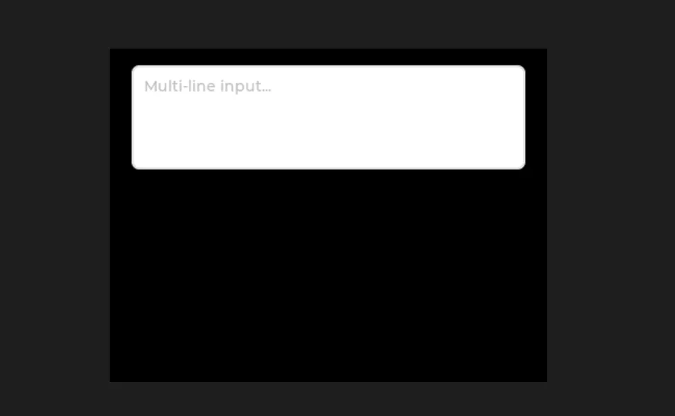
14.2 Password Box
import display_driver
import lvgl as lv

# Initialize the environment
lv.init()
scr = lv.screen_active()
scr.set_style_bg_color(lv.color_hex(0x000000), 0)

# Create a password box
password_area = lv.textarea(scr)
password_area.set_size(lv.pct(90), 50)
password_area.set_pos(lv.pct(5), lv.pct(35))
password_area.set_placeholder_text("Please enter the password.")
password_area.set_password_mode(True)
password_area.set_password_bullet("•")  # Password shown as dots
password_area.set_password_show_time(1000)  # Typed characters are shown for 1 second and then change to dots
password_area.set_max_length(20)  # Password maximum 20 characters

# Load the screen
lv.screen_load(scr)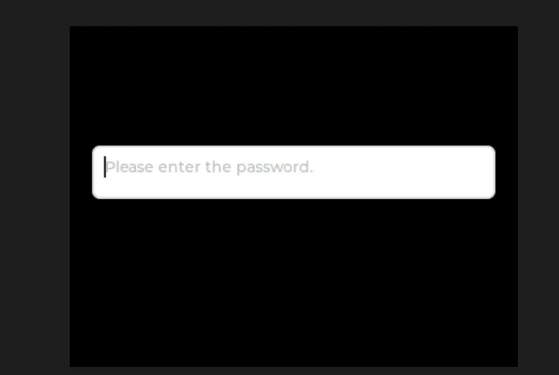
14.3 Text Box Allowing Numeric Input Only
import display_driver
import lvgl as lv

# Initialize the environment
lv.init()
scr = lv.screen_active()
scr.set_style_bg_color(lv.color_hex(0x000000), 0)

# Create a text box with a character limit (digits only)
number_area = lv.textarea(scr)
number_area.set_size(lv.pct(90), 50)
number_area.set_pos(lv.pct(5), lv.pct(55))
number_area.set_placeholder_text("Please enter a number")
number_area.set_one_line(True)  # Single-line mode
number_area.set_accepted_chars("0123456789")  # Only digit input allowed
number_area.set_max_length(10)  # Maximum 10 digits

# Load the screen
lv.screen_load(scr)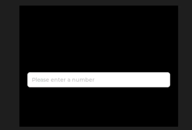
15. Keyboard
| API name | Purpose | Input parameters | Return value | Notes |
|---|---|---|---|---|
| __init__ | Construct a keyboard widget, bound to the specified parent container | parent: lv.obj (e.g., the screen object scr) | lv.keyboard | Basic creation |
| set_textarea | Bind the keyboard to a Textarea to link input (core) | obj: lv.textarea (text box to bind) | None | Input content is automatically synchronized to the text box |
| get_textarea | Get the currently bound Textarea object | None | lv.textarea | Verify whether the binding is in effect |
| set_mode | Set the keyboard input mode | mode: int (enum value) 0=TEXT_LOWER (lowercase) 1=TEXT_UPPER (uppercase) 3=NUMBER (numbers) | None | Switch the input mode as needed |
| get_mode | Get the current keyboard mode | None | int | Return the mode enum value |
| set_popovers | Turn the special character pop-up layer on / off (e.g., punctuation, symbols) | antialias: bool (True = on) | None | Enhance special character input |
| set_map | Customize the keyboard key layout of the specified mode | 1. mode: int (mode) 2. map: list [str] (button text) 3. ctrl_map: None | None | Simplified: pass None for ctrl_map |
| get_selected_button | Get the ID of the currently selected button (returns 65535 if none selected) | None | int | Aids interaction logic |
| get_button_text | Get the button display text by button ID | btn_id: int (button ID, starting from 0) | str | Verify that the custom layout takes effect |
15.1 General Single Text Box Input Keyboard
import display_driver
import lvgl as lv

# Initialize the environment
lv.init()
scr = lv.screen_active()
scr.set_style_bg_color(lv.color_hex(0x000000), 0)

#Create a keyboard
keyboard = lv.keyboard(scr)
#Set the size
keyboard.set_size(400, 200)
#Align to bottom center
keyboard.align(lv.ALIGN.BOTTOM_MID, 0, 0)
# Create the input target (using textarea as an example)
textarea = lv.textarea(scr)
textarea.set_size(380, 100)
textarea.align(lv.ALIGN.TOP_MID, 0, 20)
textarea.set_placeholder_text("textarea...")  # Placeholder text
# Bind the keyboard to the input target; once bound, keyboard input goes directly into the textarea
keyboard.set_textarea(textarea)

# Load the screen
lv.screen_load(scr)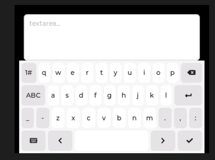
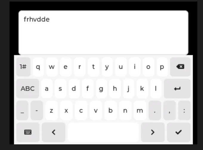
15.2 Plain Text Numeric Input Box with Keyboard Show/Hide Control
In the following code, we implement a minimalist example of numeric input interaction, retaining only the core functions of "plaintext numeric input + virtual numeric keypad":
- Numeric Input Restriction: The input box only allows the input of digits from 0 to 9, with a maximum of 6 digits, and non-numeric characters are strictly prohibited from being entered;
- Virtual Keyboard Linkage: A pure numeric virtual keyboard will automatically pop up when the input field is clicked, and the input content will be synchronized to the input field in real time;
- Keyboard Show/Hide Control: After completing input, tap the "Checkmark / Enter" key on the keyboard, and the keyboard will automatically hide (implemented by adjusting its position);
import display_driver
import lvgl as lv

lv.init()
scr = lv.screen_active()
scr.set_style_bg_color(lv.color_hex(0x000000), 0)
scr_h = scr.get_height()  # Get the screen height

# Create a plain-text numeric input box (core)
textarea = lv.textarea(scr)
textarea.set_size(380, 50)  # Fixed size
textarea.set_pos(10, 20)     # Fixed position
textarea.set_placeholder_text("Please enter the number.")
textarea.set_accepted_chars("0123456789")  # Digits only
textarea.set_one_line(True)                # Single line
textarea.set_max_length(6)                 # 6-digit limit

# Create a numeric keyboard (initially moved off screen)
kb = lv.keyboard(scr)
kb.set_size(400, 200)       # Fixed size
kb.set_pos(0, scr_h + 100)  # Initially hidden (off screen)
kb.set_mode(lv.keyboard.MODE.NUMBER)  # Digits-only mode

# Keyboard show/hide logic (minimal)
def show_kb(e):
    """Tap the input box: show the keyboard"""
    kb.set_textarea(textarea)
    # Move to the bottom of the screen
    kb.set_pos(0, scr_h - 350)

def hide_kb(e):
    """Confirm/Enter: hide the keyboard"""
    if e.get_code() == lv.EVENT.READY:
        # Move back off screen
        kb.set_pos(0, scr_h + 100)

# 5. Bind events
textarea.add_event_cb(show_kb, lv.EVENT.CLICKED, None)
kb.add_event_cb(hide_kb, lv.EVENT.READY, None)

# 6. Run
lv.screen_load(scr)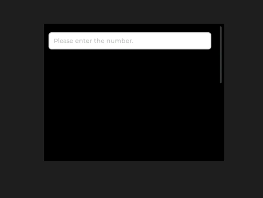
Tap the text box to bring up the keyboard, then tap the [checkmark] to dismiss the keyboard:
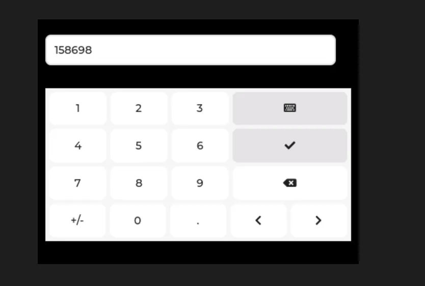
Scroll down to view the keyboard:
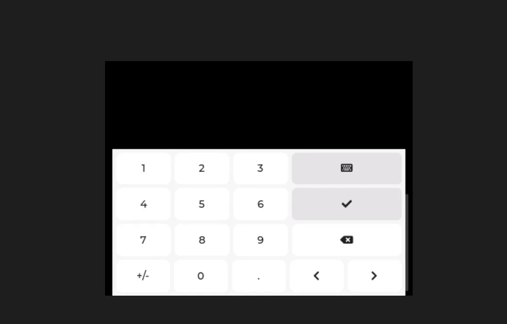
15.3 Dual Text Boxes (Standard + Numeric) Sharing a Virtual Keyboard
The following code implements the function of sharing one virtual keyboard for both a regular text box and a numeric text box, with automatic switching of keyboard input modes:
- Dual text box differentiation:
- Plain text box: No character limit, supports full input of letters, numbers, symbols and other characters;
- Numeric text box: Only digits 0-9 are allowed for input, with a maximum of 6 digits, and non-numeric characters are strictly prohibited;
- Shared Keyboard Switch :
- Click a normal text box → the keyboard switches to "lowercase text mode", binds to the text box and displays it;
- Click the numeric text box → the keyboard switches to "pure numeric mode", binds to this text box and displays it;
- Unified display and hiding logic: No matter which text box triggers the keyboard, clicking the "check mark / Enter" key will hide the keyboard, and the interaction logic is unified;
The code is as follows:
import display_driver
import lvgl as lv

# 1. Initialize the environment
lv.init()
scr = lv.screen_active()
scr.set_style_bg_color(lv.color_hex(0x000000), 0)
scr_h = scr.get_height()  # Get the screen height

# 2. Create two text boxes
# 2.1 Plain text box (no character limit)
text_normal = lv.textarea(scr)
text_normal.set_size(380, 50)
text_normal.set_pos(10, 20)
text_normal.set_placeholder_text("Normal text...")
text_normal.set_one_line(True)

# 2.2 Numeric text box (digits only, 6-character limit)
text_number = lv.textarea(scr)
text_number.set_size(380, 50)
text_number.set_pos(10, 90)
text_number.set_placeholder_text("Number only...")
text_number.set_accepted_chars("0123456789")
text_number.set_one_line(True)
text_number.set_max_length(6)

# 3. Create a shared virtual keyboard (initially hidden off-screen)
kb = lv.keyboard(scr)
kb.set_size(400, 200)
kb.set_pos(0, scr_h + 100)  # Initially off-screen

# 4. Keyboard show/hide + binding logic (core: switch the bound text box)
def show_kb_normal(e):
    """Tap the plain text box: bind + show the keyboard (default text mode)"""
    kb.set_textarea(text_normal)
    kb.set_mode(lv.keyboard.MODE.TEXT_LOWER)  # Plain text mode
    kb.set_pos(0, scr_h - 350)  # Move to the bottom of the screen

def show_kb_number(e):
    """Tap the numeric text box: bind + show the keyboard (numeric mode)"""
    kb.set_textarea(text_number)
    kb.set_mode(lv.keyboard.MODE.NUMBER)  # Digits-only mode
    kb.set_pos(0, scr_h - 300)  # Move to the bottom of the screen

def hide_kb(e):
    """Confirm/Enter: hide the keyboard"""
    if e.get_code() == lv.EVENT.READY:
        kb.set_pos(0, scr_h + 100)  # Move back off-screen

# 5. Bind events
text_normal.add_event_cb(show_kb_normal, lv.EVENT.CLICKED, None)
text_number.add_event_cb(show_kb_number, lv.EVENT.CLICKED, None)
kb.add_event_cb(hide_kb, lv.EVENT.READY, None)

# 6. Run
lv.screen_load(scr)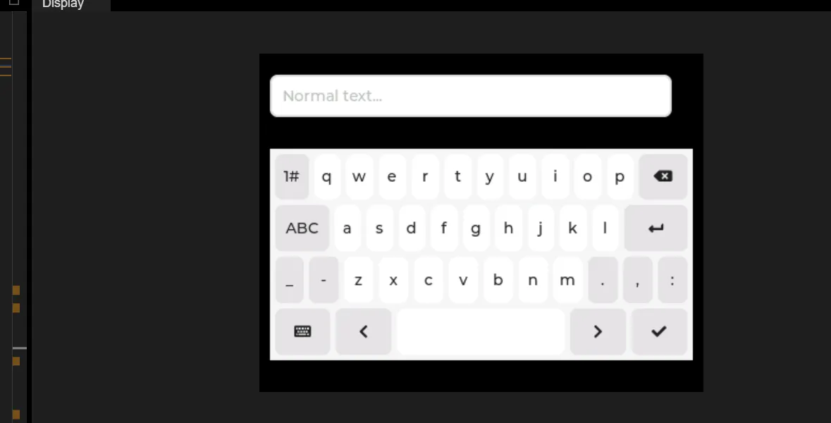
Tap the general text box, and the full keyboard will appear; tap the check mark, and the keyboard will disappear.
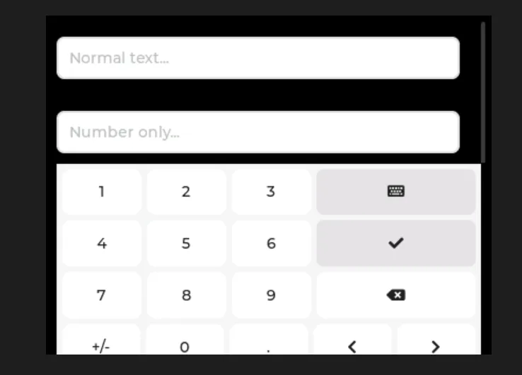
Tap the number input box, and the number input box appears; tap the checkmark, and the keyboard disappears.
16. Drop-down List
| API name | Meaning | Input parameters | Return value |
|---|---|---|---|
| set_text | Set the text displayed by the dropdown list | str (text to display) | None |
| set_options | Set the dropdown list options (dynamic string) | str (options separated by newline character \n) | None |
| set_options_static | Set the dropdown list options (static string) | str (options separated by newline character \n) | None |
| add_option | Add a single option at the specified position | str (option text), int (insertion position index) | None |
| clear_options | Clear all options of the dropdown list | No parameters | None |
| set_selected | Set the default selected option of the dropdown list | int (index of the selected item, starting from 0) | None |
| set_dir | Set the expansion direction of the dropdown list | int (direction enum value, e.g., 0 = down, 1 = up) | None |
| set_symbol | Set the arrow symbol on the right side of the dropdown list | str (symbol identifier, e.g., "LV_SYMBOL_DOWN") | None |
| set_selected_highlight | Set whether the selected item is highlighted | bool (True = highlighted, False = not highlighted) | None |
| get_list | Get the underlying list container object of the dropdown list | No parameters | obj (list container object) |
| get_text | Get the text currently displayed by the dropdown list | No parameters | str (display text) |
| get_options | Get all options of the dropdown list (newline-separated) | No parameters | str (text of all options) |
| get_selected | Get the index of the currently selected item (core method) | No parameters | int (index of the selected item) |
| get_option_count | Get the total number of options in the dropdown list | No parameters | int (number of options) |
| get_selected_str | Write the selected item's text to the specified buffer | str (buffer), int (buffer size) | None |
| get_option_index | Get the corresponding index from the option text | str (option text to look up) | int (corresponding index, returns -1 if no match) |
| get_symbol | Get the text of the dropdown list's current arrow symbol | No parameters | str (symbol text) |
| get_selected_highlight | Get whether the selected item is highlighted | No parameters | bool (highlight state) |
| get_dir | Get the current expansion direction of the dropdown list | No parameters | int (direction enum value) |
| open | Manually expand the dropdown list | No parameters | None |
| close | Manually collapse the dropdown list | No parameters | None |
| is_open | Check whether the dropdown list is expanded | No parameters | bool (expanded state) |
| bind_value | Bind an observer for value changes (advanced feature) | NoneType (pass None for simplified testing) | None |
16.1 Simple Dropdown List
The following code implements a minimalist drop-down list interaction function:
- First, initialize the LVGL environment and set the screen background to solid black, then create a drop-down list control and center it on the screen, and configure 4 selectable options for this drop-down list, namely "case 1" to "case 4"(separated by line breaks);
- Then, an interaction callback function is defined. When the selected item of the drop-down list changes, this function will obtain the index value of the currently selected item and print it out in the format of "choose ID: index value";
- Finally, bind this callback function to the "value change" event of the drop-down list, and refresh the screen to activate the entire drop-down list interface, so as to finally implement the core interaction logic of "select a drop-down list option → print the index of the selected item".
import display_driver
import lvgl as lv

# Initialize the environment
lv.init()
scr = lv.screen_active()
scr.set_style_bg_color(lv.color_hex(0x000000), 0)

# Create the dropdown widget
dropdown = lv.dropdown(scr)
#Center it
dropdown.center()
#A string separated by newline characters represents multiple options
dropdown.set_options("case 1\ncase 2\ncase 3\ncase 4")

#Interaction callback function
def dropdown_event_cd(e):
    #Get the index of the currently selected option
    selected_option = dropdown.get_selected()
    #Get the index of the currently selected option
    print(f"choose ID: {selected_option}")

#Register the interaction callback function. For more states see the "class EVENT" section of api.py
dropdown.add_event_cb(dropdown_event_cd, lv.EVENT.VALUE_CHANGED, None)

lv.screen_load(scr)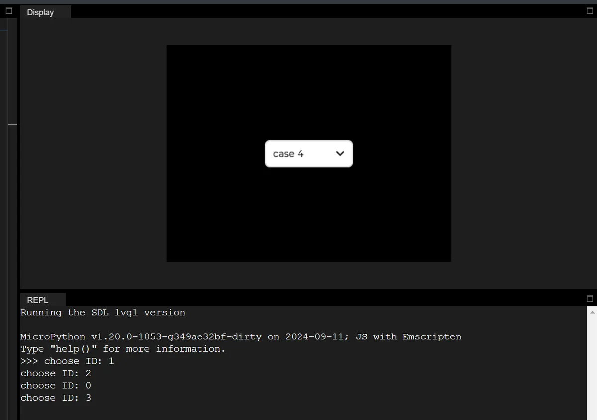
16.2 Get the text of the selected item
In the following example, the basic interaction of the drop-down list is implemented, which not only obtains the index of the selected item, but also parses the corresponding text content:
import display_driver
import lvgl as lv

# Initialize the LVGL environment
lv.init()
scr = lv.screen_active()
scr.set_style_bg_color(lv.color_hex(0x000000), 0)

# Create the dropdown widget and center it
dropdown = lv.dropdown(scr)
dropdown.center()
# Set the dropdown options (business scenario: select a device model)
options = "Model A\nModel B\nModel C\nModel D"
dropdown.set_options(options)

# Interaction callback: get the index and text of the selected item
def dropdown_event_cb(e):
    # Get the index of the currently selected item
    selected_idx = dropdown.get_selected()
    # Get all options and split them by newline
    all_options = dropdown.get_options().split("\n")
    # Safely get the selected text (avoid index out of range)
    selected_text = all_options[selected_idx] if 0 <= selected_idx < len(all_options) else "Unknown"
    # Print the selected result (English output)
    print(f"Selected index: {selected_idx} | Selected text: {selected_text}")

# Bind the value-changed event: trigger the callback when the selected item changes
dropdown.add_event_cb(dropdown_event_cb, lv.EVENT.VALUE_CHANGED, None)

# Load the screen to make the interface take effect
lv.screen_load(scr)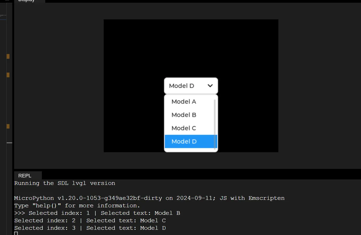
16.3 Dynamically Add and Remove Options
The following code demonstrates dynamically adding/clearing dropdown list options at runtime to adapt to the scenario of "updating selectable configurations based on device status"(e. g., updating communication methods based on device connection status):
import display_driver
import lvgl as lv

# Initialize the LVGL environment
lv.init()
scr = lv.screen_active()
scr.set_style_bg_color(lv.color_hex(0x000000), 0)

# Create the dropdown widget, set a fixed size and position
dropdown = lv.dropdown(scr)
dropdown.set_pos(20, 20)
dropdown.set_size(200, 50)
# Initialize with empty options
dropdown.set_options("")

# Function: dynamically add options (simulate loading communication method configuration)
def add_options():
    # Add options at the specified index positions (WiFi/Bluetooth/Ethernet)
    dropdown.add_option("WiFi", 0)
    dropdown.add_option("Bluetooth", 1)
    dropdown.add_option("Ethernet", 2)
    # Print the current total number of options
    print(f"Current option count: {dropdown.get_option_count()}")

# Function: clear all options (simulate resetting the configuration)
def clear_all_options():
    dropdown.clear_options()
    # Print the total number of options after clearing
    print(f"Option count after clear: {dropdown.get_option_count()}")

# Call the function at initialization to add options
add_options()

# Interaction callback: clear all options when the last item (Ethernet) is selected
def dropdown_event_cb(e):
    if dropdown.get_selected() == 2:
        clear_all_options()

# Bind the value-changed event
dropdown.add_event_cb(dropdown_event_cb, lv.EVENT.VALUE_CHANGED, None)

# Load the screen
lv.screen_load(scr)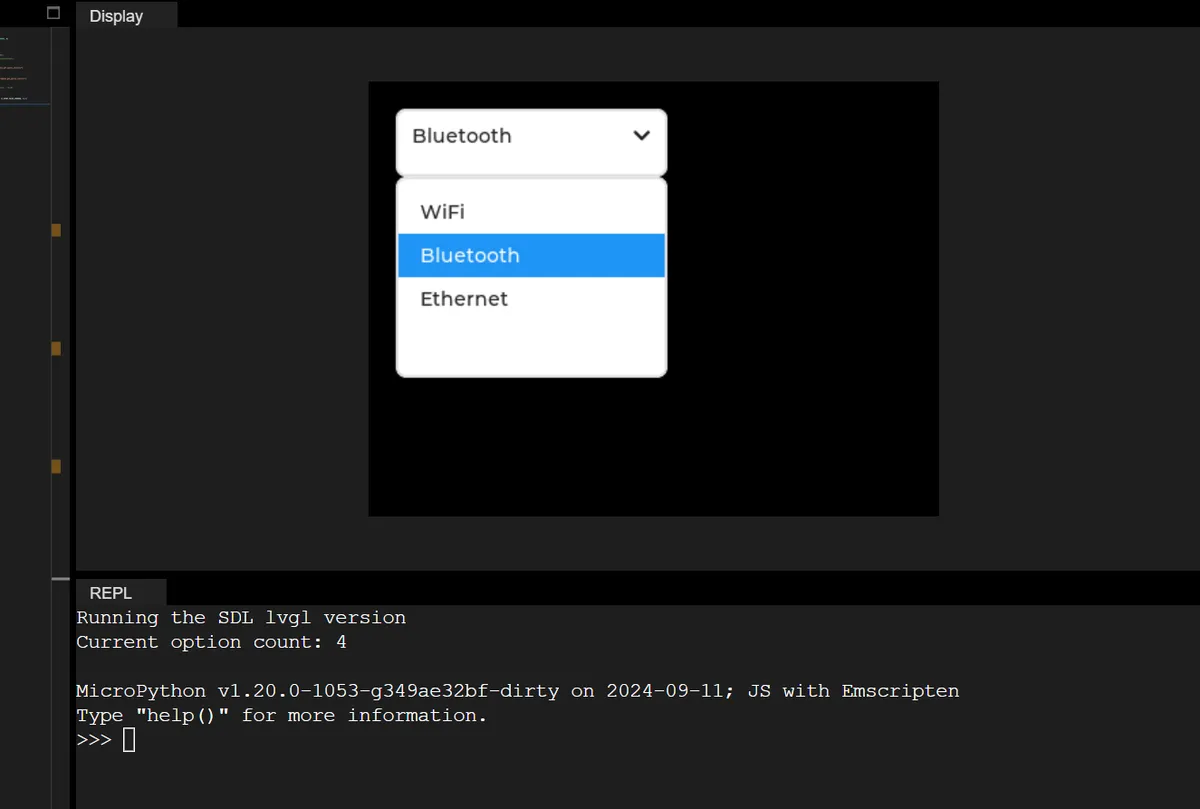
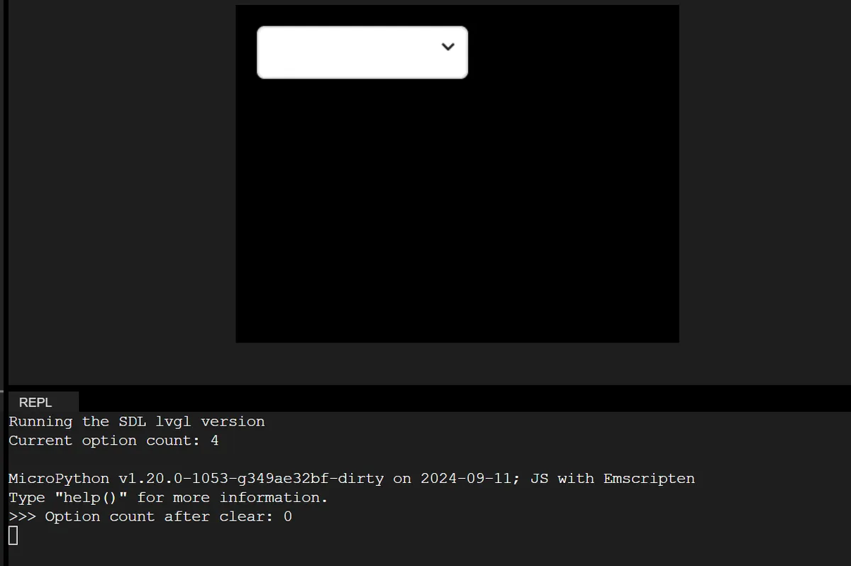
16.4 Button Control for Dropdown List Expansion/Collapse
In the following example, the expand/collapse state of the drop-down list is manually controlled via a button control:
import display_driver
import lvgl as lv

# Initialize the LVGL environment
lv.init()
scr = lv.screen_active()
scr.set_style_bg_color(lv.color_hex(0x000000), 0)

# 1. Create the dropdown widget, set its position and size
dropdown = lv.dropdown(scr)
dropdown.set_pos(lv.pct(10), lv.pct(20))
dropdown.set_size(200, 50)
# Set the dropdown options
dropdown.set_options("Option 1\nOption 2\nOption 3")

# 2. Create a control button: used to expand/collapse the dropdown
btn_open = lv.button(scr)
btn_open.set_pos(lv.pct(10), lv.pct(5))
btn_open.set_size(100, 40)
# Add a text label to the button
btn_label = lv.label(btn_open)
btn_label.set_text("Open List")
btn_label.center()

# Button callback: toggle the dropdown's expanded/collapsed state
def btn_event_cb(e):
    if dropdown.is_open():
        # Collapse the dropdown
        dropdown.close()
        btn_label.set_text("Open List")
    else:
        # Expand the dropdown
        dropdown.open()
        btn_label.set_text("Close List")

# Bind the button click event
btn_open.add_event_cb(btn_event_cb, lv.EVENT.CLICKED, None)

# Dropdown callback: print the index of the selected item
def dropdown_event_cb(e):
    print(f"Selected option index: {dropdown.get_selected()}")

# Bind the dropdown value-changed event
dropdown.add_event_cb(dropdown_event_cb, lv.EVENT.VALUE_CHANGED, None)

# Load the screen
lv.screen_load(scr)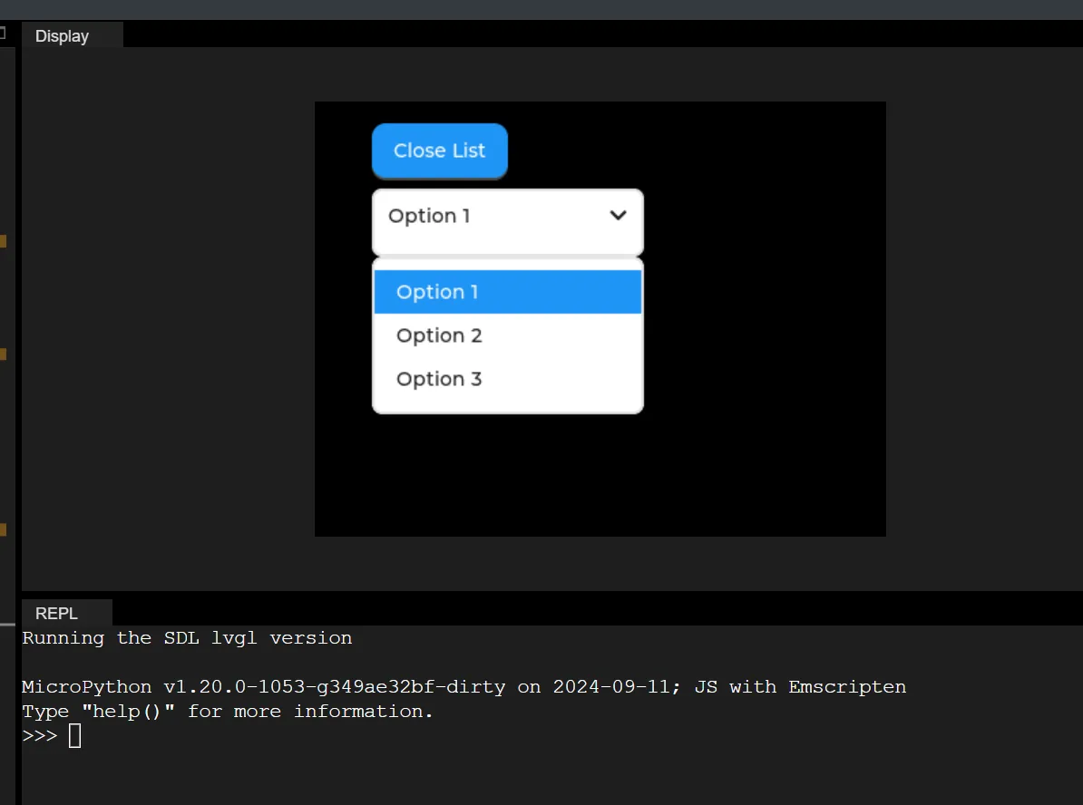
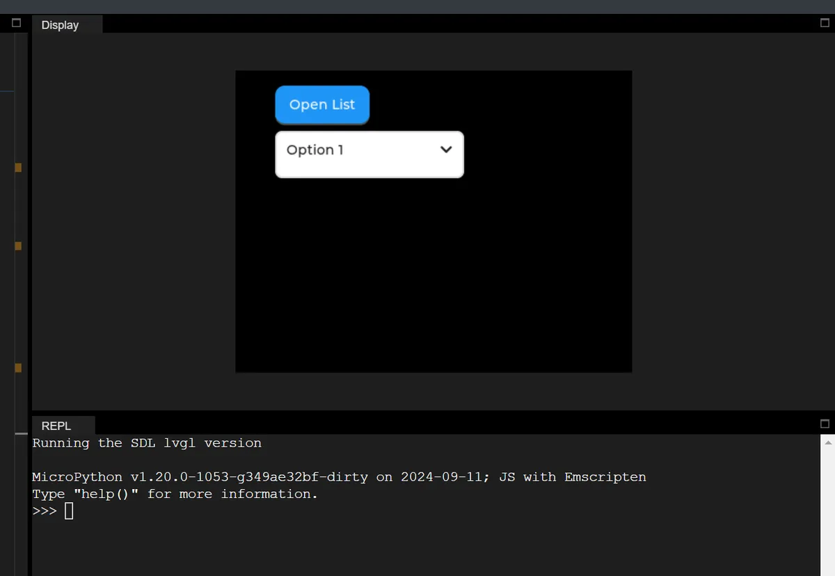
17. Scroll Wheel
| API name | Purpose | Input parameters | Return value |
|---|---|---|---|
| set_options | Set the roller options (separated by newline characters) and scroll mode (normal / infinite loop) | 1st parameter: str (roller options, separated by \n); 2nd parameter: int (scroll mode, lv.roller.MODE.NORMAL=0/INFINITE=1) | None |
| set_selected | Set the roller's selected item by index, and control whether animation is enabled | 1st parameter: int (selected item index, starting from 0); 2nd parameter: int (animation switch, lv.ANIM.OFF=0/ON=1) | None |
| set_visible_row_count | Set the number of visible rows of the roller to control the visual display | int (number of visible rows, 3-5 rows recommended) | None |
| get_selected | Get the index of the roller's currently selected item (core read method) | No parameters | int (index of the selected item) |
| get_selected_str | Write the text of the roller's currently selected item into the specified buffer | 1st parameter: str (buffer to receive the selected text); 2nd parameter: int (buffer size) | None |
| get_options | Get the string of all roller options (separated by \n) | No parameters | str (all options, separated by \n) |
| get_option_count | Get the total number of roller options | No parameters | int (total number of options) |
| bind_value | Bind an observer for value changes (advanced feature, beginners can ignore) | NoneType (actually subject_t type, just pass None when testing) | None |
set_selected (sel_opt: int, anim: int) the second parameter of anim (animation toggle), which controls whether the scroll wheel performs the "smooth scroll to target item" animation when the selected item is set via code, essentially distinguishing between "instant switch" and "smooth scroll switch":
| Parameter value | Actual Meaning | Visual Effect Example |
|---|---|---|
| lv.ANIM.OFF | Animation off (value 0) | The selected item jumps instantly to the target index (e.g., from index 0 straight to index 5, with no transition); switching is extremely fast |
| lv.ANIM.ON | Animation on (value 1) | The selected item scrolls smoothly from its current position to the target index (e.g., from 0 to 5, with the intermediate options visibly passing by one after another); the transition is more user-friendly |
The core differences between the two scrolling modes of the Roller control are shown in the following table:
| Comparison | Normal mode (MODE.NORMAL) | Infinite loop mode (MODE.INFINITE) |
|---|---|---|
| Constant value (SDL environment) | lv.roller.MODE.NORMAL = 0 | lv.roller.MODE.INFINITE = 1 |
| Core Behavior | The roller has clear "first/last boundaries"; once it reaches a boundary, it cannot scroll further in that direction | The roller has no boundaries; scrolling past the last item wraps back to the first item, and scrolling past the first item wraps back to the last item |
| Scroll Boundary Example | After the weekday roller reaches Sunday (index 6), scrolling down has no effect; after it reaches Monday (index 0), scrolling up has no effect | After the month roller reaches December (index 11), scrolling down jumps to January (index 0); after reaching January, scrolling up jumps to December |
| Visual Experience | Gives clear "reached the bottom/top" feedback, so the user knows the boundary has been reached | No sense of a boundary; scrolling loops smoothly, suitable for options with no clear first/last (such as months, numbers, years) |
| Applicable scenarios | Options with a fixed first and last (weekdays, day of the week, days of the week) | Options with no fixed first/last, or that need cyclic selection (months, years, hours, minutes) |
17.1 Examples of Week Selection (Normal Mode) and Month Selection (Infinite Loop Mode)
In the following code, two side-by-side scroll wheels will be displayed on the screen: the left one is a "weekday scroll wheel" that can only scroll to the start and end, while the right one is a "month scroll wheel" that supports infinite looping scrolling:
import display_driver
import lvgl as lv

# Initialize the LVGL environment
lv.init()
scr = lv.screen_active()
scr.set_style_bg_color(lv.color_hex(0x000000), 0)

#Create a normal-mode roller widget (weekday selection)
roller_normal = lv.roller(scr)
roller_normal.set_pos(20, 20)
roller_normal.set_size(200, 150)
#Set the options and normal mode
# Define a string containing Monday to Sunday (options separated by newline \n)
# Set it as the roller options, and set the roller to normal mode (MODE.NORMAL)
days = "Monday\nTuesday\nWednesday\nThursday\nFriday\nSaturday\nSunday"
roller_normal.set_options(days, roller_normal.MODE.NORMAL)
#Set the number of visible rows: the roller area shows at most 5 options at the same time
roller_normal.set_visible_row_count(5)

#Create an infinite-mode roller (month selection)
roller_infinite = lv.roller(scr)
roller_infinite.set_pos(240, 20)
roller_infinite.set_size(200, 150)
#Set the options and infinite mode
months = "January\nFebruary\nMarch\nApril\nMay\nJune\nJuly\nAugust\nSeptember\nOctober\nNovember\nDecember"
# Set the roller to infinite loop mode (MODE.INFINITE)
# In this mode the roller has no first/last limit; after scrolling to the last option (December), scrolling further jumps back to the first option (January)
roller_infinite.set_options(months, roller_normal.MODE.INFINITE)
#Set the number of visible rows
roller_infinite.set_visible_row_count(5)

# Load the screen
lv.screen_load(scr)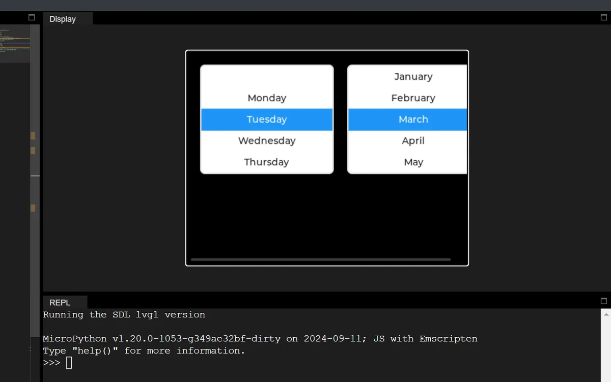
17.2 Change the Number of Visible Rows
#Set the number of visible rows: the roller area shows at most 6 options at the same time
roller_normal.set_visible_row_count(6)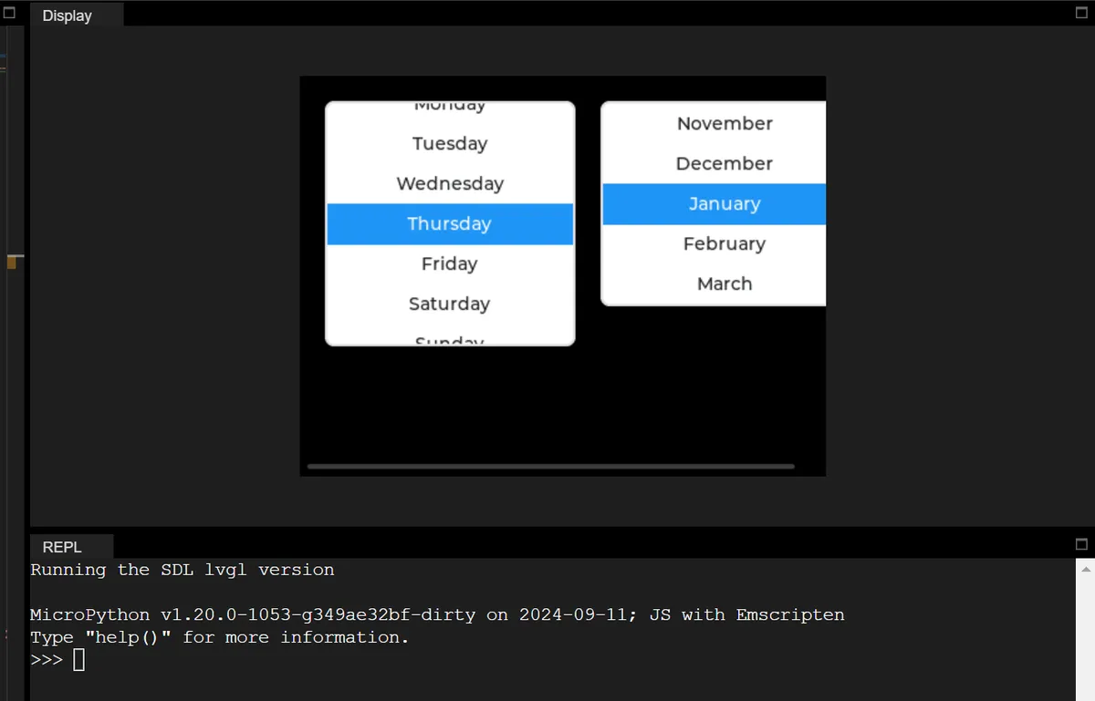
17.3 Read All Selections and Current Selection
import display_driver
import lvgl as lv

# Initialize the LVGL environment
lv.init()
scr = lv.screen_active()
scr.set_style_bg_color(lv.color_hex(0x000000), 0)

# ===================== 1. Normal-mode roller (weekday selection) =====================
roller_normal = lv.roller(scr)
roller_normal.set_pos(20, 20)
roller_normal.set_size(200, 150)
# Configure the weekday options + normal mode
days = "Monday\nTuesday\nWednesday\nThursday\nFriday\nSaturday\nSunday"
roller_normal.set_options(days, lv.roller.MODE.NORMAL)
roller_normal.set_visible_row_count(5)
# Demonstrate set_selected: initially select index 2 (Wednesday) by default, with animation off
roller_normal.set_selected(2, lv.ANIM.OFF)
print(f"[Week Roller] Default selected index: {roller_normal.get_selected()}")

# ===================== 2. Infinite-loop-mode roller (month selection) =====================
roller_infinite = lv.roller(scr)
roller_infinite.set_pos(240, 20)
roller_infinite.set_size(200, 150)
# Configure the month options + infinite loop mode
months = "January\nFebruary\nMarch\nApril\nMay\nJune\nJuly\nAugust\nSeptember\nOctober\nNovember\nDecember"
roller_infinite.set_options(months, lv.roller.MODE.INFINITE)
roller_infinite.set_visible_row_count(5)

# ===================== 3. Dedicated callback functions (separated, core approach) =====================
# ---------- Callback 1: dedicated to the weekday roller (demonstrates get_options / get_selected_str) ----------
def roller_week_cb(e):
    # Operate directly on the global roller_normal, no need to get the target object
    print("\n=== [Week Roller] Value Changed ===")

    # 🔍 Demonstrate get_options: get all options (a newline-separated string)
    all_options = roller_normal.get_options()
    option_count = roller_normal.get_option_count()
    print(f"Total options: {option_count}")
    print(f"All options string: {all_options}")

    # 🔍 Demonstrate get_selected_str: get the selected text through a buffer (core API)
    buf = ""  # Define an empty buffer to receive the selected text
    buf_size = 30  # Buffer size (must be larger than the longest selected text)
    roller_normal.get_selected_str(buf, buf_size)  # Core call: write into the buffer
    print(f"Selected text (by get_selected_str): {buf}")

    # 🔍 Auxiliary verification: get the text through get_selected + splitting get_options
    selected_idx = roller_normal.get_selected()
    selected_text_split = all_options.split("\n")[selected_idx]
    print(f"Selected index: {selected_idx} | Text (split): {selected_text_split}")

# ---------- Callback 2: dedicated to the month roller (demonstrates infinite mode + the same API) ----------
def roller_month_cb(e):
    # Operate directly on the global roller_infinite
    print("\n=== [Month Roller] Value Changed ===")

    # 🔍 Demonstrate get_options: get all options (also works in infinite mode)
    all_options = roller_infinite.get_options()
    option_count = roller_infinite.get_option_count()
    print(f"Total options: {option_count}")

    # 🔍 Demonstrate get_selected_str: read the selected text in infinite mode
    buf = ""
    buf_size = 30
    roller_infinite.get_selected_str(buf, buf_size)
    print(f"Selected text: {buf}")

    # 🔍 Auxiliary verification: index splitting method
    selected_idx = roller_infinite.get_selected()
    selected_text_split = all_options.split("\n")[selected_idx]
    print(f"Selected index: {selected_idx} | Text: {selected_text_split}")

# ===================== 4. Bind the dedicated callbacks (no user_data, no errors) =====================
roller_normal.add_event_cb(roller_week_cb, lv.EVENT.VALUE_CHANGED, None)
roller_infinite.add_event_cb(roller_month_cb, lv.EVENT.VALUE_CHANGED, None)

# Load the screen
lv.screen_load(scr)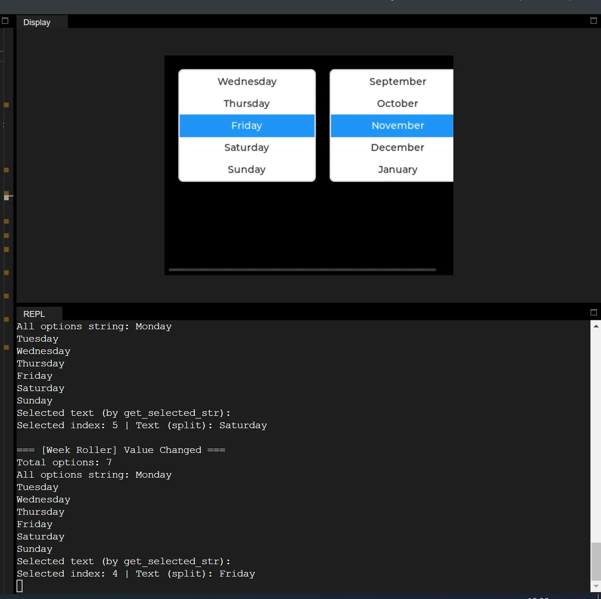
18. Lists
| API name | Meaning | Input parameters | Return value |
|---|---|---|---|
| add_text | Add a plain text item to the list (commonly used for group titles, description text, etc.) | txt: str (text content; a string must be passed) | obj (the created text item object) |
| add_button | Add a button item to the list (pass None as the first argument for no icon; pass an icon object to display that icon) | icon: Any (NoneType passed in tests, no-icon case); txt: str (button display text, string type) | obj (the created button item object) |
| get_button_text | Get the current display text of the specified button item in the list | btn: obj (the button item object returned by add_button must be passed) | str (the button's display text string) |
| set_button_text | Dynamically change the display text of the specified button item in the list | btn: obj (the target button item object); txt: str (new button display text, string type) | None (no return value) |
18.1 Creating Simple Grouped Headings and Button Lists
The following code performs the following operations:
- First, initialize the LVGL environment and set the screen background to solid black, then create a list control that is 300×200 pixels in size and displayed centered on the screen;
- Then add content to the list according to the grouping logic: first add the text item "button A" as the group title, then add the three button items "A1", "A2" and "A3" in sequence, then add the text item "button B" as the second group title, and continue to add the three button items "B1", "B2" and "B3";
- The final loading screen applies all configurations, and finally presents a list control containing two groups of buttons, Group A and Group B, in the center of the pure black background screen, with corresponding text titles in front of each group of buttons for grouping and distinction.
import display_driver
import lvgl as lv

# Initialize the LVGL environment
lv.init()
scr = lv.screen_active()
scr.set_style_bg_color(lv.color_hex(0x000000), 0)

#Create the list object
list_obj = lv.list(scr)
list_obj.set_size(300, 200)
list_obj.center()
#Add a text item
list_obj.add_text("button A")
#Add a button item
btnA1 = list_obj.add_button(None, "A1")
btnA2 = list_obj.add_button(None, "A2")
btnA3 = list_obj.add_button(None, "A3")
#Add a text item
list_obj.add_text("button B")
#Add a button item
btnB1 = list_obj.add_button(None, "B1")
btnB2 = list_obj.add_button(None, "B2")
btnB3 = list_obj.add_button(None, "B3")

# Load the screen
lv.screen_load(scr)
18.2 Reading and Dynamically Modifying Button List Text
In the code below, we have completed the following tasks:
- First, initialize the LVGL environment, set the screen background to solid black, and create a list object that is 300×200 pixels in size and displayed centered on the screen;
- Then, write dedicated click callback functions for the six buttons A1/A2/A3 and B1/B2/B3 respectively. In each callback, first
get_button_textis used to read and print the original display text of the button, thenset_button_textis used to dynamically modify the button text to a new text with the suffix "(Clicked)", and finally the modified text is read again and printed to verify the effect; - Then add the group titles "button A" and "button B" to the list, create six buttons corresponding to the respective groups, and bind a dedicated callback function to each button.
- The final loading screen applies the configuration.
After running the program, click any button, and the Console will output the English text information of the button before and after modification, while the button text on the interface will also be updated synchronously.
import display_driver
import lvgl as lv

# Initialize the LVGL environment
lv.init()
scr = lv.screen_active()
scr.set_style_bg_color(lv.color_hex(0x000000), 0)

# Create the list object (global, for use by callbacks)
list_obj = lv.list(scr)
list_obj.set_size(300, 200)
list_obj.center()

# ===================== Dedicated callback for each button (demonstrates get/set_button_text) =====================
# Dedicated callback for button A1: full demonstration of get/set_button_text usage
def on_btnA1_click(e):
    # 1. Demonstrate get_button_text: read the text currently displayed on the button
    original_text = list_obj.get_button_text(btnA1)
    print(f"[A1] Original text: {original_text}")

    # 2. Demonstrate set_button_text: dynamically change the button text
    list_obj.set_button_text(btnA1, "A1 (Clicked)")

    # 3. Verify the change: read the button text again
    updated_text = list_obj.get_button_text(btnA1)
    print(f"[A1] Updated text: {updated_text}\n")

# Dedicated callback for button A2
def on_btnA2_click(e):
    original_text = list_obj.get_button_text(btnA2)
    print(f"[A2] Original text: {original_text}")
    list_obj.set_button_text(btnA2, "A2 (Clicked)")
    updated_text = list_obj.get_button_text(btnA2)
    print(f"[A2] Updated text: {updated_text}\n")

# Dedicated callback for button A3
def on_btnA3_click(e):
    original_text = list_obj.get_button_text(btnA3)
    print(f"[A3] Original text: {original_text}")
    list_obj.set_button_text(btnA3, "A3 (Clicked)")
    updated_text = list_obj.get_button_text(btnA3)
    print(f"[A3] Updated text: {updated_text}\n")

# Dedicated callback for button B1
def on_btnB1_click(e):
    original_text = list_obj.get_button_text(btnB1)
    print(f"[B1] Original text: {original_text}")
    list_obj.set_button_text(btnB1, "B1 (Clicked)")
    updated_text = list_obj.get_button_text(btnB1)
    print(f"[B1] Updated text: {updated_text}\n")

# Dedicated callback for button B2
def on_btnB2_click(e):
    original_text = list_obj.get_button_text(btnB2)
    print(f"[B2] Original text: {original_text}")
    list_obj.set_button_text(btnB2, "B2 (Clicked)")
    updated_text = list_obj.get_button_text(btnB2)
    print(f"[B2] Updated text: {updated_text}\n")

# Dedicated callback for button B3
def on_btnB3_click(e):
    original_text = list_obj.get_button_text(btnB3)
    print(f"[B3] Original text: {original_text}")
    list_obj.set_button_text(btnB3, "B3 (Clicked)")
    updated_text = list_obj.get_button_text(btnB3)
    print(f"[B3] Updated text: {updated_text}\n")

# ===================== Create the list content and bind the dedicated callbacks =====================
# Add a text item (group title)
list_obj.add_text("button A")
# Create the group A buttons and bind the callbacks
btnA1 = list_obj.add_button(None, "A1")
btnA1.add_event_cb(on_btnA1_click, lv.EVENT.CLICKED, None)

btnA2 = list_obj.add_button(None, "A2")
btnA2.add_event_cb(on_btnA2_click, lv.EVENT.CLICKED, None)

btnA3 = list_obj.add_button(None, "A3")
btnA3.add_event_cb(on_btnA3_click, lv.EVENT.CLICKED, None)

# Add a text item (group title)
list_obj.add_text("button B")
# Create the group B buttons and bind the callbacks
btnB1 = list_obj.add_button(None, "B1")
btnB1.add_event_cb(on_btnB1_click, lv.EVENT.CLICKED, None)

btnB2 = list_obj.add_button(None, "B2")
btnB2.add_event_cb(on_btnB2_click, lv.EVENT.CLICKED, None)

btnB3 = list_obj.add_button(None, "B3")
btnB3.add_event_cb(on_btnB3_click, lv.EVENT.CLICKED, None)

# Load the screen
lv.screen_load(scr)
19. Tabs
| API name | Purpose | Input parameters | Return value |
|---|---|---|---|
| add_tab | Add a new tab to the tab view | str (display name of the tab; must be a string) | obj (the created tab object) |
| rename_tab | Rename the specified tab by its position index | int (tab position index, starting from 0); str (new display name of the tab) | None (no return value) |
| set_active | Set the tab at the specified index as active, and control whether the switch is animated | int (target tab index, starting from 0); int (animation switch, lv.ANIM.OFF=0/ON=1) | None (no return value) |
| set_tab_bar_position | Set the position of the tab bar (top / bottom / left / right) | int (position enum value, lv.DIR.TOP=0/BOTTOM=1/LEFT=2/RIGHT=3) | None (no return value) |
| set_tab_bar_size | Set the size of the tab bar (in pixels) | int (tab bar size in pixels; must be a positive integer) | None (no return value) |
| get_tab_count | Get the total number of tabs in the tab view | No parameters | int (total number of tabs) |
| get_tab_active | Get the index of the currently active tab | No parameters | int (active tab index, starting from 0) |
| get_content | Get the content area object of the tab view (used to add widgets to a tab) | No parameters | obj (content area object) |
| get_tab_bar | Get the tab bar object of the tab view (used to customize the tab bar style) | No parameters | obj (tab bar object) |
19.1 Basic Tab
In the following code, we implement a basic tab view control:
- First, initialize the LVGL environment, obtain the currently active screen object, and set its background color to black;
- Then create a tab view control on the screen, and add three tabs "A", "B" and "C" to it;
- Then create label controls for each tab respectively, set the label text to "tabview A", "tabview B", and "tabview C" in sequence, and center the labels;
The final loading screen applies all configurations, ultimately presenting a view with three tabs on a black-background screen; clicking different tabs will display the corresponding label text centered on the screen.
import display_driver
import lvgl as lv

# Initialize the LVGL environment
lv.init()
scr = lv.screen_active()
scr.set_style_bg_color(lv.color_hex(0x000000), 0)

#Get the currently active screen object
scr = lv.screen_active()
#Set the screen background color to black
scr.set_style_bg_color(lv.color_hex(0x000000), 0)

#Create the tab view
tabview = lv.tabview(scr)
#Add tabs
tab1 = tabview.add_tab("A")
tab2 = tabview.add_tab("B")
tab3 = tabview.add_tab("C")
#Add tab content
label1 = lv.label(tab1)
label1.set_text("tabview A")
label1.center()
label2 = lv.label(tab2)
label2.set_text("tabview B")
label2.center()
label3 = lv.label(tab3)
label3.set_text("tabview C")
label3.center()

# Load the screen
lv.screen_load(scr)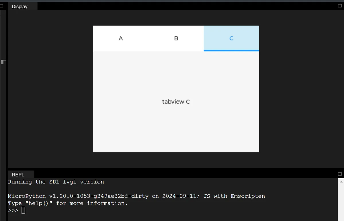
19.2 Get the active tab and set the default active option
In the following code, we add a tab switching event, and in the callback function, we obtain and print the index of the currently active tab in real time; by default, the tab with index 2 is activated during initialization.
import display_driver
import lvgl as lv

# Initialize the LVGL environment
lv.init()
scr = lv.screen_active()
scr.set_style_bg_color(lv.color_hex(0x000000), 0)

# Create the tab view and add tabs
tabview = lv.tabview(scr)
tab1 = tabview.add_tab("A")
tab2 = tabview.add_tab("B")
tab3 = tabview.add_tab("C")

# Add content to the tabs
label1 = lv.label(tab1)
label1.set_text("tabview A")
label1.center()
label2 = lv.label(tab2)
label2.set_text("tabview B")
label2.center()
label3 = lv.label(tab3)
label3.set_text("tabview C")
label3.center()

# ===================== Define the event callback function =====================
def on_tab_switch(e):
    """Tab switch event callback: get and print the index of the currently active tab"""
    # Get the index of the currently active tab
    active_idx = tabview.get_tab_active()
    print(f"Current active tab index: {active_idx}")

# Bind the tab switch event (LV_EVENT.VALUE_CHANGED means the tab was switched)
tabview.add_event_cb(on_tab_switch, lv.EVENT.VALUE_CHANGED, None)

# Initially set the tab at index 2 as active (animation off), which triggers the switch event and prints the index
tabview.set_active(2, lv.ANIM.OFF)

# Load the screen
lv.screen_load(scr)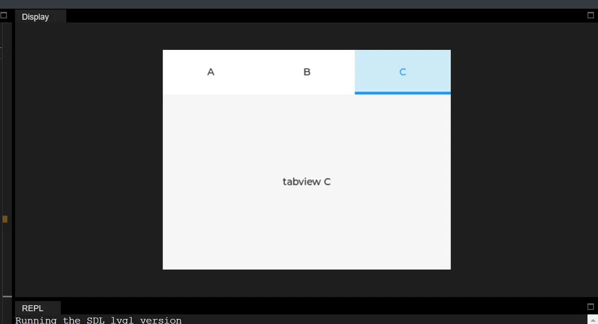
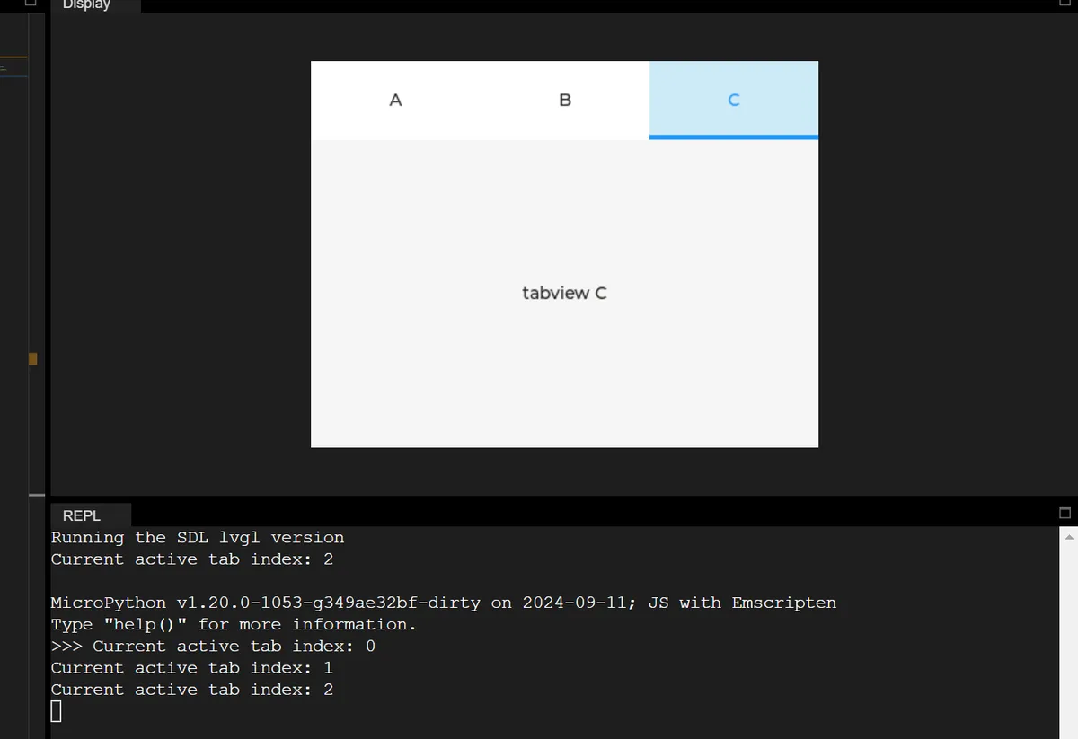
19.3 Dynamically rename tabs and print the total number of tabs
In the following code, we add a tab click event: only when the tab at index 1 (Tab B) is clicked will the rename operation be executed, and the total number of tabs will be printed.
import display_driver
import lvgl as lv

# Initialize the LVGL environment
lv.init()
scr = lv.screen_active()
scr.set_style_bg_color(lv.color_hex(0x000000), 0)

# Create the tab view and add tabs
tabview = lv.tabview(scr)
tab1 = tabview.add_tab("A")
tab2 = tabview.add_tab("B")
tab3 = tabview.add_tab("C")

# Add content to the tabs
label1 = lv.label(tab1)
label1.set_text("tabview A")
label1.center()
label2 = lv.label(tab2)
label2.set_text("tabview B")
label2.center()
label3 = lv.label(tab3)
label3.set_text("tabview C")
label3.center()

# Flag whether it has been renamed (avoid repeated triggering)
renamed_flag = False

# ===================== Define the event callback function =====================
def on_tab_click(e):
    """Tab click event callback: rename the tab at index 1 when it is clicked"""
    global renamed_flag
    # Get the index of the currently active tab
    active_idx = tabview.get_tab_active()

    # Rename only when the tab at index 1 is clicked and it has not been renamed yet
    if active_idx == 1 and not renamed_flag:
        # Rename the tab at index 1 to "B (Renamed)"
        tabview.rename_tab(1, "B (Renamed)")
        # Get the total number of tabs and print it
        total_tabs = tabview.get_tab_count()
        print(f"Tab index 1 renamed to 'B (Renamed)', total tabs: {total_tabs}")
        renamed_flag = True  # Mark as renamed

# Bind the tab switch/click event
tabview.add_event_cb(on_tab_click, lv.EVENT.VALUE_CHANGED, None)

# Load the screen
lv.screen_load(scr)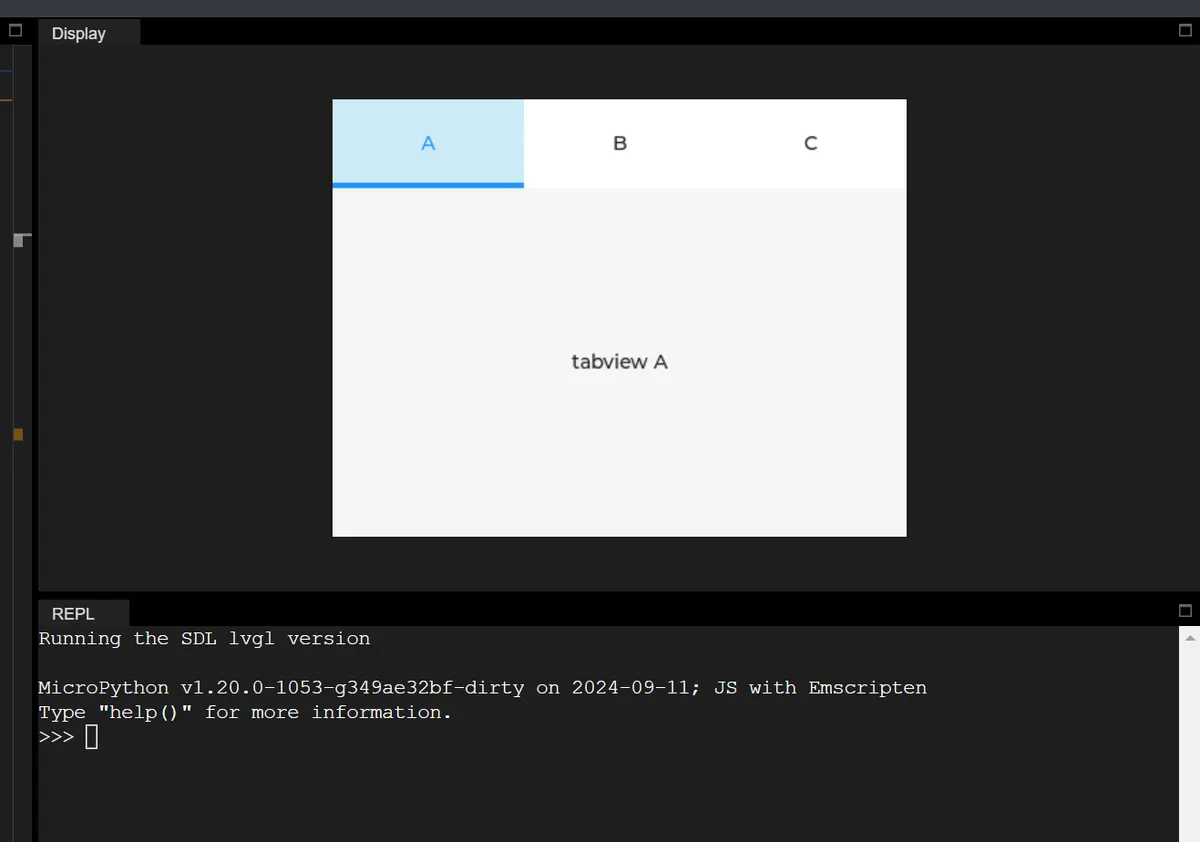
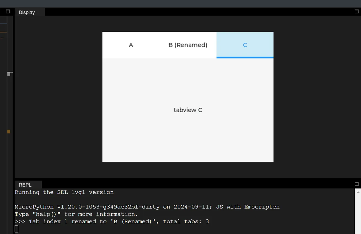
19.4 Dynamically modify the position and size of the tab bar by clicking tabs
In the following code, we add an event callback: only when the tab at index 2 (Tab C) is clicked, set the tab bar position to the bottom, set its size to 50 pixels, and print a prompt message.
import display_driver
import lvgl as lv

# Initialize the LVGL environment
lv.init()
scr = lv.screen_active()
scr.set_style_bg_color(lv.color_hex(0x000000), 0)

# Create the tab view and add tabs
tabview = lv.tabview(scr)
tab1 = tabview.add_tab("A")
tab2 = tabview.add_tab("B")
tab3 = tabview.add_tab("C")

# Add content to the tabs
label1 = lv.label(tab1)
label1.set_text("tabview A")
label1.center()
label2 = lv.label(tab2)
label2.set_text("tabview B")
label2.center()
label3 = lv.label(tab3)
label3.set_text("tabview C")
label3.center()

# Flag whether it has been set (avoid repeated triggering)
set_flag = False

# ===================== Define the event callback function =====================
def on_tab_click(e):
    """Tab click event callback: set the tab bar properties when the tab at index 2 is clicked"""
    global set_flag
    # Get the index of the currently active tab
    active_idx = tabview.get_tab_active()

    # Modify the properties only when the tab at index 2 is clicked and it has not been set yet
    if active_idx == 2 and not set_flag:
        # Set the tab bar position to the bottom
        tabview.set_tab_bar_position(lv.DIR.BOTTOM)
        # Set the tab bar size to 50 pixels
        tabview.set_tab_bar_size(50)
        # Print a prompt message
        print("Tab bar position set to BOTTOM, size set to 50px")
        set_flag = True  # Mark as set

# Bind the tab switch/click event
tabview.add_event_cb(on_tab_click, lv.EVENT.VALUE_CHANGED, None)

# Load the screen
lv.screen_load(scr)
19.5 Obtain the content area and tab bar object and customize the style
In the following code, we take the tab bar object and change its background color to gray; all operations will print the object type and style modification prompts via the Console, and after the screen is finally loaded, you can intuitively see that the tab bar has turned gray:
import display_driver
import lvgl as lv

# Initialize the LVGL environment
lv.init()
scr = lv.screen_active()
scr.set_style_bg_color(lv.color_hex(0x000000), 0)

# Create the tab view and add tabs
tabview = lv.tabview(scr)
tab1 = tabview.add_tab("A")
tab2 = tabview.add_tab("B")
tab3 = tabview.add_tab("C")

# Add content to the tabs
label1 = lv.label(tab1)
label1.set_text("tabview A")
label1.center()
label2 = lv.label(tab2)
label2.set_text("tabview B")
label2.center()
label3 = lv.label(tab3)
label3.set_text("tabview C")
label3.center()

# ===================== Demonstrate the get_content and get_tab_bar APIs =====================
# 1. Get the content area object of the tab view and print its type
content_area = tabview.get_content()
print(f"Tabview content area object type: {type(content_area).__name__}")  # Output: obj
# 2. Get the tab bar object and set its background color to gray (0x808080)
tab_bar = tabview.get_tab_bar()
tab_bar.set_style_bg_color(lv.color_hex(0x808080), 0)
print("Tab bar background color set to gray")  # Note that the tab bar background color has been changed

# Load the screen
lv.screen_load(scr)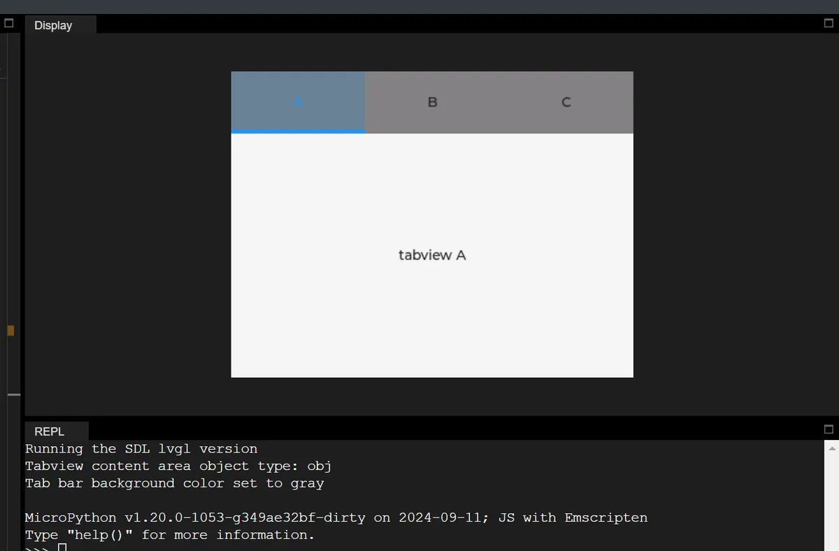
20. Menu
There are currently some issues with this control.
21. Tables
| API name | Core function | Input parameters | Return value | Notes (SDL environment behavior) |
|---|---|---|---|---|
| set_cell_value | Set the text content of the specified cell | row: row number (int), col: column number (int), txt: cell text (str) | No return value (NoneType) | Numeric arguments accept only int; str triggers a type error |
| set_row_count | Set the total number of rows of the table | count: total number of rows (int) | No return value (NoneType) | Passing too few / too many arguments triggers an argument count error |
| set_column_count | Set the total number of columns of the table | count: total number of columns (int) | No return value (NoneType) | A float argument triggers a type error |
| set_column_width | Set the width of the specified column | col_id: column index (int), w: column width (int) | No return value (NoneType) | Width must be a positive integer |
| add_cell_ctrl | Set control attributes for the specified cell (replaces set_cell_ctrl) | row: row number (int), col: column number (int), ctrl: control attribute (int, e.g. CELL_CTRL.TEXT_CROP) | No return value (NoneType) | ctrl must be a CELL_CTRL enum value (int type) |
| clear_cell_ctrl | Clear the control attributes of the specified cell | row: row number (int), col: column number (int), ctrl: control attribute (int) | No return value (NoneType) | Passing extra arguments triggers an argument count error |
| set_cell_user_data | Bind a custom user data object to the specified cell | row: row number (int), col: column number (int), obj: user data object (lv.obj) | No return value (NoneType) | SDL allows passing str, but it has no effect |
| get_cell_value | Get the text content of the specified cell | row: row number (int), col: column number (int) | cell_text: cell text (str) | Returns an empty string if not set |
| get_row_count | Get the total number of rows of the table | None | row_count: total number of rows (int) | Returns the default value (e.g. 0) if not set |
| get_column_count | Get the total number of columns of the table | None | col_count: total number of columns (int) | Returns the default value (e.g. 0) if not set |
| get_column_width | Get the width of the specified column | col: column index (int) | col_width: column width (int) | Returns the default width if not set |
| has_cell_ctrl | Check whether the specified cell has the target control attribute | row: row number (int), col: column number (int), ctrl: control attribute (int) | is_has: whether the cell has the attribute (bool) | Returning False means the attribute is not set |
| get_selected_cell | Get the currently selected cell position (the result is stored in the passed-in lists) | row_list: list that receives the selected row number (list), col_list: list that receives the selected column number (list) | No return value (NoneType); the result is stored in the passed-in lists | SDL allows passing str, but it cannot receive the result |
| get_cell_user_data | Get the user data object bound to the specified cell | row: row number (int), col: column number (int) | user_data: user data object (Blob/lv.obj) | Displayed as Blob type in the SDL environment |
21.1 Basic Table
import display_driver
import lvgl as lv

# Initialize the LVGL environment
lv.init()
scr = lv.screen_active()
scr.set_style_bg_color(lv.color_hex(0x000000), 0)

# 1. Create table instance
table = lv.table(scr)
table.set_size(300, 200)  # Set table size
table.align(lv.ALIGN.CENTER, 0, 0)  # Center on screen
# Set number of table rows and columns
table.set_row_count(4)
table.set_column_count(3)
# Set column width
table.set_column_width(0, 80)
table.set_column_width(1, 100)

# Fill table data
table.set_cell_value(0, 0, "ID")
table.set_cell_value(0, 1, "NAME")
table.set_cell_value(0, 2, "STATE")

table.set_cell_value(1, 0, "001")
table.set_cell_value(1, 1, "Device A")
table.set_cell_value(1, 2, "ON")

table.set_cell_value(2, 0, "002")
table.set_cell_value(2, 1, "Device B")
table.set_cell_value(2, 2, "OFF")

table.set_cell_value(3, 0, "003")
table.set_cell_value(3, 1, "Device C")
table.set_cell_value(3, 2, "ON")

# Load the screen
lv.screen_load(scr)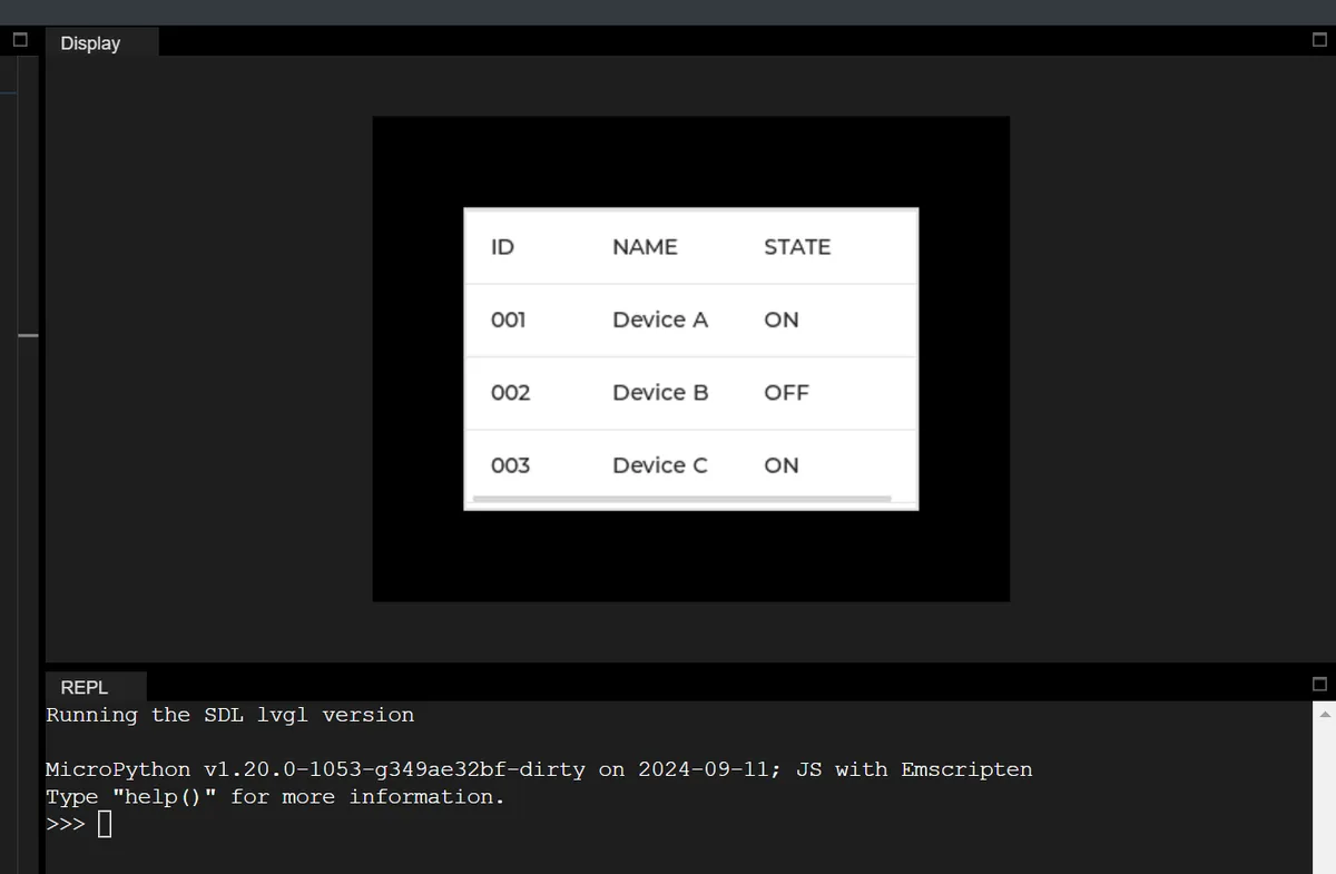
21.2 Get the total number of rows in a table and the width of a specified column
# get_row_count: query total number of table rows
current_row_count = table.get_row_count()
print(f"get_row_count() → Current total rows: {current_row_count}, return value type: {type(current_row_count).__name__}")

# get_column_width: query width of specified column
query_col_width = 1
current_col_width = table.get_column_width(query_col_width)
print(f"get_column_width({query_col_width}) → Width of column {query_col_width}: {current_col_width}, return value type: {type(current_col_width).__name__}")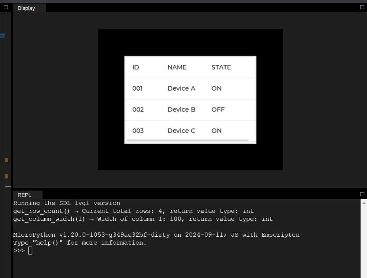
21.3 Add Cell Control Properties
Cell control attribute (CELL_CTRL) is the display/behavior rule provided by LVGL for table cells, defined via enumeration values (such as text clipping, cell merging, custom markers, etc.), which is used to control the rendering logic and interaction behavior of cells.
In the following code, the following operations are performed:
- Add the "text truncation" attribute to the long text cell at row 1, column 1, so that text exceeding the column width (100px) will be hidden to prevent the cell from being stretched due to text wrapping;
- Add the "merge right" attribute to the cell at row 3, column 0 to merge it with the cell at row 3, column 1 on its right, so as to achieve the effect of spanning columns for display;
import display_driver
import lvgl as lv

# Initialize the LVGL environment
lv.init()
scr = lv.screen_active()
scr.set_style_bg_color(lv.color_hex(0x000000), 0)

# Create table instance and initialize basic configuration
table = lv.table(scr)
table.set_size(400, 250)  # Enlarge table size to make merge/crop effects easier to show
table.align(lv.ALIGN.CENTER, 0, 0)
table.set_row_count(4)
table.set_column_count(3)
table.set_column_width(0, 80)
table.set_column_width(1, 100)
table.set_column_width(2, 80)

# Purpose: disable vertical scrolling of the table and let height adapt automatically, avoiding an initial scrollbar
table.set_scroll_dir(lv.DIR.NONE)

# Fill test data (includes long text to demonstrate the TEXT_CROP effect)
table.set_cell_value(0, 0, "ID")
table.set_cell_value(0, 1, "NAME")
table.set_cell_value(0, 2, "STATE")
table.set_cell_value(1, 0, "001")
table.set_cell_value(1, 1, "Device A - Long Text For Crop Test")  # Very long text
table.set_cell_value(1, 2, "ON")
table.set_cell_value(2, 0, "002")
table.set_cell_value(2, 1, "Device B")
table.set_cell_value(2, 2, "OFF")

# Control attribute 1: TEXT_CROP - crop text when too long (the part beyond the column width is hidden)
# Purpose: prevent very long text from stretching the cell, showing only content within the column width
crop_row, crop_col = 1, 1
crop_ctrl = lv.table.CELL_CTRL.TEXT_CROP
# Add TEXT_CROP attribute
table.add_cell_ctrl(crop_row, crop_col, crop_ctrl)
print(f"add_cell_ctrl({crop_row},{crop_col},TEXT_CROP) → Add text crop attribute, return value: None")
# Check whether it was added successfully
is_has_crop = table.has_cell_ctrl(crop_row, crop_col, crop_ctrl)
print(f"has_cell_ctrl({crop_row},{crop_col},TEXT_CROP) → Attribute exists: {is_has_crop}, return type: {type(is_has_crop).__name__}")

# Control attribute 2: MERGE_RIGHT - merge cell to the right (the current cell merges with the column to its right)
# Purpose: merge adjacent cells to achieve a column-spanning display
merge_row, merge_col = 3, 0
merge_ctrl = lv.table.CELL_CTRL.MERGE_RIGHT
# First fill in the text of the merged cell
table.set_cell_value(merge_row, merge_col, "Merged Cell (003+Device C)")
# Add MERGE_RIGHT attribute (merge columns 0 and 1 of row 3)
table.add_cell_ctrl(merge_row, merge_col, merge_ctrl)
print(f"add_cell_ctrl({merge_row},{merge_col},MERGE_RIGHT) → Add cell merge right attribute, return value: None")
# Check whether it was added successfully
is_has_merge = table.has_cell_ctrl(merge_row, merge_col, merge_ctrl)
print(f"has_cell_ctrl({merge_row},{merge_col},MERGE_RIGHT) → Attribute exists: {is_has_merge}, return type: {type(is_has_merge).__name__}")

# Purpose: force LVGL to recalculate the table layout, avoiding an initial scrollbar/line-wrap anomalies
table.update_layout()

# Load screen (shows the effect of TEXT_CROP cropping long text and MERGE_RIGHT merging cells)
lv.screen_load(scr)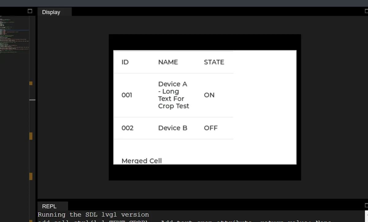
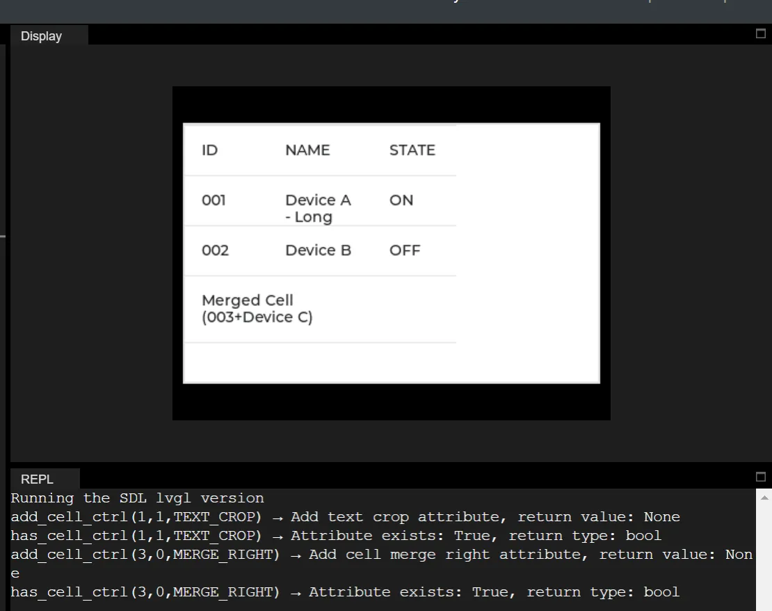
22. Displaying Images and Animated GIFs
The summary table of core APIs for lv.image is as follows:
| API name | Meaning | Input arguments (count + type + description) | Return value (type + description) |
|---|---|---|---|
| set_rotation | Set the image rotation angle | 1, int type (rotation angle, e.g. 90/180/270) | None, no return value |
| get_rotation | Get the current image rotation angle | 0, no input arguments | int type (current rotation angle value) |
| set_src | Set the image source (file / symbol / binary data) | 1, str type (image path such as "test.png" or an LVGL built-in symbol) | None, no return value |
| set_offset_x | Set the image X-axis offset (horizontal position adjustment) | 1, int type (offset in pixels; positive shifts right, negative shifts left) | None, no return value |
| get_offset_x | Get the current image X-axis offset | 0, no input arguments | int type (current X-axis offset in pixels) |
| set_offset_y | Set the image Y-axis offset (vertical position adjustment) | 1, int type (offset in pixels; positive shifts down, negative shifts up) | None, no return value |
| get_offset_y | Get the current image Y-axis offset | 0, no input arguments | int type (current Y-axis offset in pixels) |
| set_scale | Set the overall image zoom ratio (proportional scaling) | 1, int type (zoom ratio, 100=100%, 200=200%) | None, no return value |
| get_scale | Get the current overall image zoom ratio | 0, no input arguments | int type (current overall zoom ratio value) |
| set_scale_x | Set the image X-axis zoom ratio separately (width scaling only) | 1, int type (X-axis zoom ratio) | None, no return value |
| get_scale_x | Get the current image X-axis zoom ratio | 0, no input arguments | int type (current X-axis zoom ratio value) |
| set_scale_y | Set the image Y-axis zoom ratio separately (height scaling only) | 1, int type (Y-axis zoom ratio) | None, no return value |
| get_scale_y | Get the current image Y-axis zoom ratio | 0, no input arguments | int type (current Y-axis zoom ratio value) |
| set_antialias | Enable / disable image anti-aliasing (smooths scaled / rotated edges) | 1, bool type (True to enable, False to disable) | None, no return value |
| get_antialias | Check whether image anti-aliasing is enabled | 0, no input arguments | bool type (True = enabled, False = disabled) |
| set_blend_mode | Set the image blend mode (transparency / overlay effects, etc.) | 1, lv.blend_mode_t enum (e.g. lv.BLEND_MODE.NORMAL) | None, no return value |
| get_blend_mode | Get the current image blend mode | 0, no input arguments | lv.blend_mode_t enum (current blend mode) |
| set_pivot | Set the image rotation pivot point | 2, int type (x: pivot X coordinate, y: pivot Y coordinate) | None, no return value |
| get_pivot | Get the image rotation pivot point | 1, lv.point_t object (used to receive the pivot coordinates) | None, the result is stored in the passed-in lv.point_t object |
The summary table of core APIs for lv.image is as follows:
| API name | Meaning | Input parameters | Return value | Typical exception messages in the SDL environment |
|---|---|---|---|---|
| set_src | Set the GIF source (file / binary data) | Count: 1 Type: str/bytes Description: str = GIF file path (e.g. "anim.gif"); bytes = GIF binary data | Count: 0 Type: None Description: No return value | 1. Wrong argument count: argument num/types mismatch 2. Wrong type (int passed): Cannot convert 'int' to pointer! |
| restart | Restart GIF playback (play from the beginning) | Count: 0 Type: None Description: No arguments needed | Count: 0 Type: None Description: No return value | Passing any argument: argument num/types mismatch |
| pause | Pause GIF playback | Count: 0 Type: None Description: No arguments needed | Count: 0 Type: None Description: No return value | Passing any argument: argument num/types mismatch |
| resume | Resume GIF playback (continue after pause) | Count: 0 Type: None Description: No arguments needed | Count: 0 Type: None Description: No return value | Passing any argument: argument num/types mismatch |
The summary table of LVGL built-in symbols (SYMBOL) is shown below, which organizes the name, meaning, type and typical usage scenarios of LVGL built-in symbols (lv.SYMBOL) by function, to adapt to the development requirements of SDL LVGL/MicroPython environment, and all symbol types are int (can be directly passed to interfaces such as lv.image.set_src / button text):
| Category | Symbol name | Meaning | Type | Typical Use Case |
|---|---|---|---|---|
| Basic identifiers | SYMBOL.BULLET | Dot / bullet | int | List item prefix, marker dot |
| Basic identifiers | SYMBOL.LIST | List | int | List menu entry, list view icon |
| Basic identifiers | SYMBOL.OK | Confirm / checkmark | int | Submit button, operation success indicator |
| Basic identifiers | SYMBOL.CLOSE | Close / cross | int | Close button, cancel operation, popup close |
| Basic identifiers | SYMBOL.WARNING | Warning / exclamation mark | int | Error indication, risky operation reminder |
| Multimedia | SYMBOL.AUDIO | Audio / sound | int | Audio playback entry, sound settings |
| Multimedia | SYMBOL.VIDEO | Video | int | Video playback entry, video settings |
| Multimedia | SYMBOL.MUTE | Mute | int | Mute button, volume off |
| Multimedia | SYMBOL.VOLUME_MID | Medium volume | int | Volume adjustment (medium) |
| Multimedia | SYMBOL.VOLUME_MAX | Maximum volume | int | Volume adjustment (maximum) |
| Multimedia | SYMBOL.PREV | Previous track / previous frame | int | Media playback control (previous) |
| Multimedia | SYMBOL.PLAY | Play | int | Play button, start animation |
| Multimedia | SYMBOL.PAUSE | Pause | int | Pause button, pause animation |
| Multimedia | SYMBOL.STOP | Stop | int | Stop button, stop playback |
| Multimedia | SYMBOL.NEXT | Next track / next frame | int | Media playback control (next) |
| Multimedia | SYMBOL.EJECT | Eject / exit | int | Disc eject, device exit |
| Multimedia | SYMBOL.SHUFFLE | Shuffle | int | Media shuffle mode |
| Multimedia | SYMBOL.LOOP | Repeat | int | Media repeat mode |
| Navigation / direction | SYMBOL.LEFT | Left arrow | int | Back, move left, previous step |
| Navigation / direction | SYMBOL.RIGHT | Right arrow | int | Forward, move right, next step |
| Navigation / direction | SYMBOL.UP | Up arrow | int | Move up, scroll up, increase |
| Navigation / direction | SYMBOL.DOWN | Down arrow | int | Move down, scroll down, decrease |
| Operation / control | SYMBOL.POWER | Power supply | int | Power on / off button, power status |
| Operation / control | SYMBOL.SETTINGS | Settings | int | Settings entry, configuration menu |
| Operation / control | SYMBOL.HOME | Home | int | Return to home button |
| Operation / control | SYMBOL.REFRESH | Refresh / reload | int | Refresh data, reload page |
| Operation / control | SYMBOL.PLUS | Plus sign | int | Increase, add, create new |
| Operation / control | SYMBOL.MINUS | Minus sign | int | Decrease, delete, remove |
| Operation / control | SYMBOL.EYE_OPEN | Eye (open) | int | Show password, show hidden content |
| Operation / control | SYMBOL.EYE_CLOSE | Eye (closed) | int | Hide password, hide sensitive content |
| Operation / control | SYMBOL.CUT | Cut | int | Text / file cut operation |
| Operation / control | SYMBOL.COPY | Copy | int | Text / file copy operation |
| Operation / control | SYMBOL.PASTE | Paste | int | Text / file paste operation |
| Operation / control | SYMBOL.SAVE | Save | int | Save file, save configuration |
| Operation / control | SYMBOL.EDIT | Edit | int | Edit text, modify content |
| Operation / control | SYMBOL.BACKSPACE | Backspace / delete | int | Keyboard backspace, delete character |
| Operation / control | SYMBOL.NEW_LINE | Newline | int | Keyboard newline, text line break |
| File / storage | SYMBOL.DOWNLOAD | Download | int | File download, data import |
| File / storage | SYMBOL.UPLOAD | Upload | int | File upload, data export |
| File / storage | SYMBOL.DRIVE | Drive / disk | int | Disk / drive entry |
| File / storage | SYMBOL.DIRECTORY | Folder / directory | int | Folder entry, directory browsing |
| File / storage | SYMBOL.FILE | File | int | File icon, file list item |
| File / storage | SYMBOL.TRASH | Recycle bin / delete | int | Delete file, empty recycle bin |
| File / storage | SYMBOL.SD_CARD | SD card | int | SD card storage, external storage entry |
| Device / connection | SYMBOL.CALL | Phone / call | int | Make a call, call log |
| Device / connection | SYMBOL.WIFI | WIFI | int | WIFI status, network settings |
| Device / connection | SYMBOL.BLUETOOTH | Bluetooth | int | Bluetooth status, Bluetooth settings |
| Device / connection | SYMBOL.USB | USB | int | USB connection, USB storage |
| Device / connection | SYMBOL.GPS | Positioning / GPS | int | Location service, map navigation |
| Status / prompt | SYMBOL.BARS | Progress bar / bar chart | int | Progress display, data statistics |
| Status / prompt | SYMBOL.ENVELOPE | Envelope / mail | int | Mail notification, message center |
| Status / prompt | SYMBOL.CHARGE | Charging | int | Device charging status, charging prompt |
| Status / prompt | SYMBOL.BELL | Bell / notification | int | Message notification, reminder settings |
| Status / prompt | SYMBOL.BATTERY_FULL | Battery (full) | int | Battery full status |
| Status / prompt | SYMBOL.BATTERY_3 | Battery (3/4) | int | Battery 75% charge status |
| Status / prompt | SYMBOL.BATTERY_2 | Battery (2/4) | int | Battery 50% charge status |
| Status / prompt | SYMBOL.BATTERY_1 | Battery (1/4) | int | Battery 25% charge status |
| Status / prompt | SYMBOL.BATTERY_EMPTY | Battery (empty) | int | Battery low / dead status |
| Image / edit | SYMBOL.IMAGE | Picture / image | int | Image viewing, gallery entry |
| Image / edit | SYMBOL.TINT | Color adjustment / coloring | int | Image color adjustment, color settings |
| Input / interaction | SYMBOL.KEYBOARD | Keyboard | int | Virtual keyboard, input entry |
| Placeholder / test | SYMBOL.DUMMY | Placeholder / test | int | UI placeholder, function test |
LVGL Blend Mode lv.BLEND_MODE Names, descriptions, blending effects and typical use cases of all enumeration values:
| Symbol name | Meaning | Type | Blend effect description | Typical Use Case |
|---|---|---|---|---|
| BLEND_MODE.NORMAL | Normal blend | int | Default mode, foreground pixels cover background pixels (background shows only in transparent areas), no color overlay / modification | Normal display (icons, text, regular images, buttons) |
| BLEND_MODE.ADDITIVE | Additive blend | int | Foreground color + background color (brightness adds up, colors get brighter as they mix, white + any color = white) | Glow effect (button highlight, notification prompt, light animation, gradient glow) |
| BLEND_MODE.SUBTRACTIVE | Subtractive blend | int | Background color - foreground color (brightness decreases, colors get darker as they mix, black - any color = black) | Shadow effects, mask overlays, vignette processing, reducing local brightness |
| BLEND_MODE.MULTIPLY | Multiply | int | Foreground color × background color (colors darken, contrast increases, white × any color = original background color) | Image overlay, texture blending, dark watermarks, retro filters |
| BLEND_MODE.DIFFERENCE | Difference blend | int | Difference between the pixel values of the foreground and background colors (colors invert, strong contrast, same color = black) | Color inversion effects, difference marking, warning alerts, contrast highlighting |
22.1 Basic Display of Images and GIFs
import display_driver
import lvgl as lv
import fs_driver

# Initialize the LVGL environment
lv.init()
scr = lv.screen_active()
scr.set_style_bg_color(lv.color_hex(0xFFFFFF), 0)

fs_drv = lv.fs_drv_t()
fs_driver.fs_register(fs_drv, 'S')

'''Display LVGL built-in symbols'''
# Create image
img_symbol = lv.image(scr)
# Display an LVGL built-in symbol ("AUDIO" icon); for more icons see the "class SYMBOL" section of api.py
img_symbol.set_src(lv.SYMBOL.AUDIO)
#Center it
img_symbol.align(lv.ALIGN.CENTER, 0, 0)

# The code below cannot be displayed in the simulator!!!

# '''Display images from storage'''
# img_symbol2 = lv.image(scr)
# # Display png
# img_symbol2.set_src('S:001.png')
# # Display jpg
# #img_symbol2.set_src('S:001.jpg')
# img_symbol2.align(lv.ALIGN.RIGHT_MID, 0, 0)  # Display on the right

# '''Display gif'''
# img_symbol3 = lv.gif(scr)
# img_symbol3.set_src('S:001.gif')
# img_symbol3.align(lv.ALIGN.LEFT_MID, 0, 0)  # Display on the left

# Load the screen
lv.screen_load(scr)
22.2 Internal Icon Display
The code is as follows:
import display_driver
import lvgl as lv

# Initialize the LVGL environment
lv.init()
scr = lv.screen_active()
scr.set_style_bg_color(lv.color_hex(0xFFFFFF), 0)  # White background

# ========== 1. Core parameter configuration (adjustable, controls density/size) ==========
ICON_SIZE = 24          # Size of a single icon (width = height; smaller shows more)
ICON_GAP = 8            # Spacing between icons (horizontal/vertical)
SCREEN_PADDING = 8      # Padding at screen edges (keeps icons from touching the edge)

# ========== 2. Get all built-in SYMBOL icons ==========
symbol_list = [
    getattr(lv.SYMBOL, name)
    for name in dir(lv.SYMBOL)
    if not name.startswith("__") and name.isupper()
]
total_icons = len(symbol_list)
print(f"Total icons: {total_icons}")

# ========== 3. Dynamically calculate layout (adapts to any screen size) ==========
# Get actual screen size (automatically adapted in the SDL environment)
screen_w = scr.get_width()
screen_h = scr.get_height()

# Calculate the number of icons that fit per row/column
icons_per_row = (screen_w - 2 * SCREEN_PADDING) // (ICON_SIZE + ICON_GAP)
icons_per_col = (screen_h - 2 * SCREEN_PADDING) // (ICON_SIZE + ICON_GAP)
max_icons_per_screen = icons_per_row * icons_per_col
print(f"Screen size: {screen_w}x{screen_h}")
print(f"Icons per row: {icons_per_row}, per column: {icons_per_col}")
print(f"Max icons per screen: {max_icons_per_screen}")

# ========== 4. Manual layout: create icons one by one and set coordinates ==========
for idx, sym in enumerate(symbol_list):
    # Skip the part beyond one screen (to show all, add scrolling; see the extension below)
    if idx >= max_icons_per_screen:
        break

    # Calculate the row/column of the current icon
    row = idx // icons_per_row
    col = idx % icons_per_row

    # Calculate icon coordinates (core formula for even distribution)
    x = SCREEN_PADDING + col * (ICON_SIZE + ICON_GAP)
    y = SCREEN_PADDING + row * (ICON_SIZE + ICON_GAP)

    # Create icon (directly as a child of the screen, no container)
    img = lv.image(scr)
    img.set_size(ICON_SIZE, ICON_SIZE)  # Fixed size
    img.set_src(sym)                    # Set SYMBOL icon
    img.set_pos(x, y)                   # Set coordinates manually

# ========== 5. Load screen ==========
lv.screen_load(scr)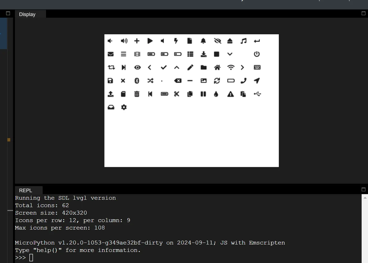
Version Record
Version Number | Modifier | Time | Content |
v1.0 | Li Zisheng | 2026/03/13 | Initialize the document. |