
Contents
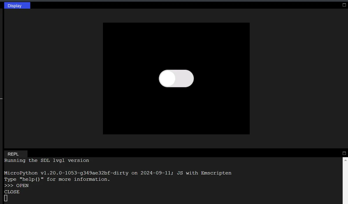
The following code implements an interactive switch control on a black background, whose core function is to respond to switch state changes in real time and output corresponding prompts:
import display_driver
import lvgl as lv

lv.init()

#Get the currently active screen object
scr = lv.screen_active()
#Set the screen background color to black
scr.set_style_bg_color(lv.color_hex(0x000000), 0)

#Create a switch
switch = lv.switch(scr)
#Set the size
switch.set_size(100, 50)
#Center it
switch.center()

#Interaction callback function
def switch_event_cb(e):
    if switch.has_state(lv.STATE.CHECKED):
        print("OPEN")
    else:
        print("CLOSE")
#Register the interaction callback function. For more states see the "class EVENT" section of api.py
switch.add_event_cb(switch_event_cb, lv.EVENT.VALUE_CHANGED, None)

# Load the screen
lv.screen_load(scr)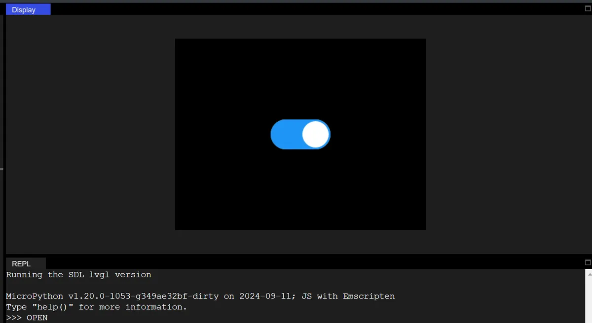
In the code above:
- Define the callback function
switch_event_cb: detect the switch state viahas_state (lv.STATE.CHECKED):- If the switch is in the "ON (CHECKED)" state, the Console prints the English text "OPEN";
- If it is in the "closed" state, print "CLOSE";
- Bind the
lv.EVENT.VALUE_CHANGEDevent (value change event) to the switch: when the switch is toggled manually, the aforementioned callback function will be triggered, and status prompts will be output in real time.
6.1 Switch Linkage Tag (Control Text Display / Color)
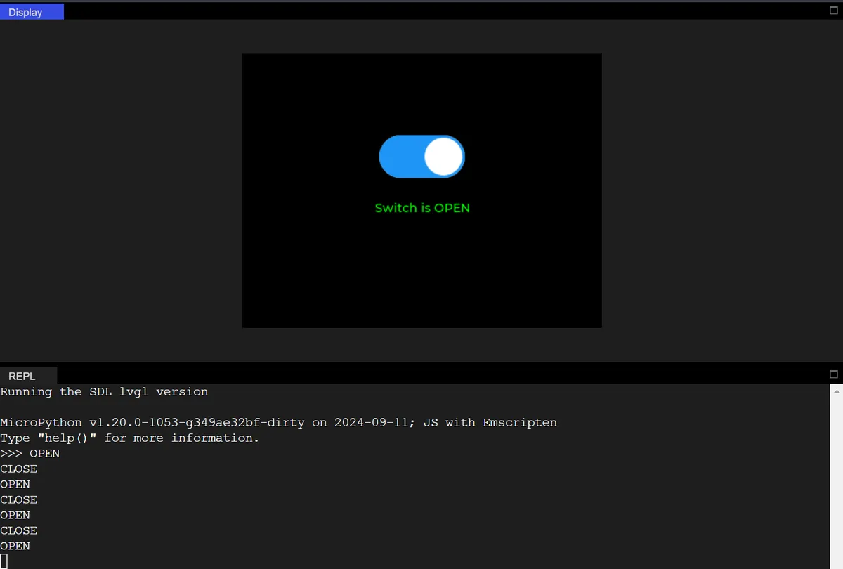
Added a label control, which synchronously modifies the label text and color when the switch is toggled, realizing "control linkage".
import display_driver
import lvgl as lv

lv.init()

scr = lv.screen_active()
scr.set_style_bg_color(lv.color_hex(0x000000), 0)

# Create a switch
switch = lv.switch(scr)
switch.set_size(100, 50)
switch.align(lv.ALIGN.CENTER, 0, -40)  # Move up to leave room for the label

# ========== New: create the linked label ==========
label = lv.label(scr)
label.set_text("Switch is CLOSE")
label.align(lv.ALIGN.CENTER, 0, 20)
# Label style (initially red)
style_label = lv.style_t()
style_label.init()
style_label.set_text_color(lv.color_hex(0xFF0000))
label.add_style(style_label, lv.STATE.DEFAULT)

# Modified callback: linked label
def switch_event_cb(e):
    if switch.has_state(lv.STATE.CHECKED):
        print("OPEN")
        label.set_text("Switch is OPEN")
        label.set_style_text_color(lv.color_hex(0x00FF00), lv.STATE.DEFAULT)  # Green
    else:
        print("CLOSE")
        label.set_text("Switch is CLOSE")
        label.set_style_text_color(lv.color_hex(0xFF0000), lv.STATE.DEFAULT)  # Red

switch.add_event_cb(switch_event_cb, lv.EVENT.VALUE_CHANGED, None)

lv.screen_load(scr)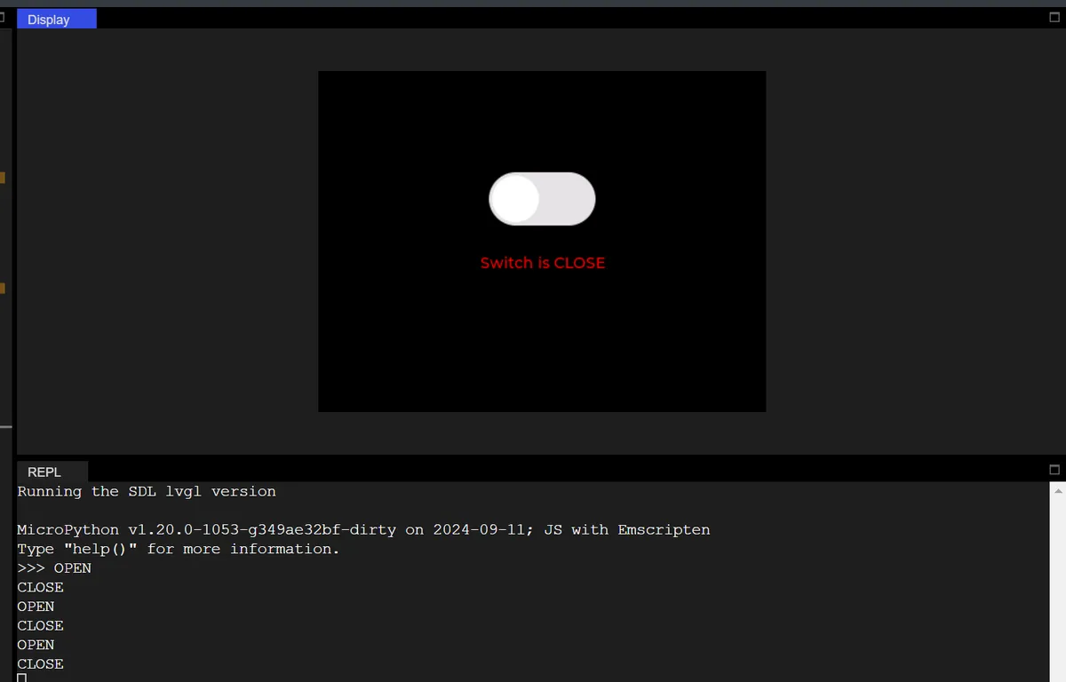
6.2 Complete Switch Configuration (Track and Slider Styles)
The following code implements a switch control with customizable style, precise centering and interactive feedback on a black background:
import display_driver
import lvgl as lv

lv.init()

#Get the currently active screen object
scr = lv.screen_active()
#Set the screen background color to black
scr.set_style_bg_color(lv.color_hex(0x000000), 0)

# Create and initialize the style object
style_switch = lv.style_t()
style_switch.init()

#Create a switch
switch = lv.switch(scr)
#Set the size
switch.set_size(100, 50)

# First remove all default styles
switch.remove_style_all()

# Off state + track (main part): dark gray
switch.set_style_bg_color(lv.color_hex(0x444444), lv.STATE.DEFAULT | lv.PART.MAIN)
switch.set_style_bg_opa(255, lv.STATE.DEFAULT | lv.PART.MAIN)  # Opaque
switch.set_style_radius(25, lv.STATE.DEFAULT | lv.PART.MAIN)   # Rounded corners
switch.set_style_border_width(0, lv.STATE.DEFAULT | lv.PART.MAIN)  # Remove the default border

# On state + track (main part): green
switch.set_style_bg_color(lv.color_hex(0x00FF00), lv.STATE.CHECKED | lv.PART.MAIN)
switch.set_style_bg_opa(255, lv.STATE.CHECKED | lv.PART.MAIN)
switch.set_style_radius(25, lv.STATE.CHECKED | lv.PART.MAIN)
switch.set_style_border_width(0, lv.STATE.CHECKED | lv.PART.MAIN)

# Off state knob: white
switch.set_style_bg_color(lv.color_hex(0xFFFFFF), lv.STATE.DEFAULT | lv.PART.KNOB)
switch.set_style_bg_opa(255, lv.STATE.DEFAULT | lv.PART.KNOB)
switch.set_style_radius(25, lv.STATE.DEFAULT | lv.PART.KNOB)  # Round knob

# On state knob: yellow
switch.set_style_bg_color(lv.color_hex(0xFFFF00), lv.STATE.CHECKED | lv.PART.KNOB)
switch.set_style_bg_opa(255, lv.STATE.CHECKED | lv.PART.KNOB)
switch.set_style_radius(25, lv.STATE.CHECKED | lv.PART.KNOB)

# Center it
switch.center()

#Interaction callback function
def switch_event_cb(e):
    if switch.has_state(lv.STATE.CHECKED):
        print("OPEN")
    else:
        print("CLOSE")

#Register the interaction callback function. For more states see the "class EVENT" section of api.py
switch.add_event_cb(switch_event_cb, lv.EVENT.VALUE_CHANGED, None)

# Load the screen
lv.screen_load(scr)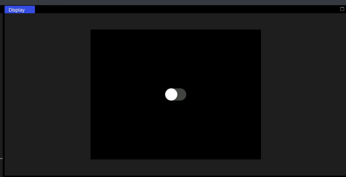
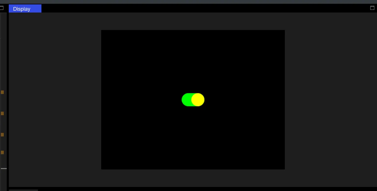
The core logic for customizing the styled state of the switch (track + slider) is as follows:
- Clear default styles: call
switch.remove_style_all ()to remove all default styles of the switch, so as to prevent the default styles from overriding custom settings; - Set styles by "state + widget"(adaptation for older LVGL versions):
- "Closed state (lv.STATE.DEFAULT)":
- Track (lv.PART.MAIN, switch background): dark gray (
0x444444), opaque (255), 25px rounded corners (arc-shaped edges), no border; - Slider (lv.PART. switch ): white (
0xFFFFFF), opaque, with 25px rounded corners (circular slider);
- Track (lv.PART.MAIN, switch background): dark gray (
- "Activated (lv.STATE.CHECKED)":
- Track: Green (
0x00FF00), with consistent size, rounded corners and transparency; - Slider: Yellow (
0xFFFF00), same size / rounded corners / transparency.
- Track: Green (
- "Closed state (lv.STATE.DEFAULT)":
After all style and size settings are completed, call switch.center (): based on the final style and size state of the switch to recalculate the centering coordinates, so as to avoid position offset caused by premature centering and ensure that the switch is accurately displayed in the exact center of the screen.
Version Record
Version Number | Modifier | Time | Content |
v1.0 | Li Zisheng | 2026/03/23 | Initialize the document. |