
Contents
- I. Core Objects and Interface Layout: The Skeleton System of GUI
- 1.1 Object Foundation (Objects)
- 1.2 Layout and Space Management
- 1.3 Layer Management (Layers)
- II. Visual Style and Resource System: GUI Skins and Creatives
- 2.1 Style System (Styles)
- 2.2 State
- 2.3 Cascading Styles
- 2.4 Style Inheritance
- 2.5 Parts
- 2.6 Style Initialization and Attribute Manipulation
- 2.7 Add / Replace / Remove Styles for Controls
- 2.8 Style Change Notification
- 2.9 Obtain the Final Style Property Value of the Control
- 2.10 Local Styles
- 2.11 Transitions
- 2.12 Opacity, Blend Mode and Transform
- 2.13 Themes
- 2.14 Summary Table of Style Attributes
- 2.15 Colors
- 2.16 Fonts and Icons
- 2.17 Image
- III. Interaction and Event Handling: The Interaction Nerve of GUI
- 3.1 Input Device Adaptation (Input devices)
- 3.2 Event Mechanism (Events)
- IV. Display and Multi-Screen Management: GUI Output Window
- 4.1 Multi-display Device Support
- 4.2 Use of a single display device
- 4.3 Mirror Display and Split-Screen Splicing
- 4.4 Transparent Screen
- 5. Timing and Dynamic Effects: The Dynamic Engine of GUI
- 5.1 Timers
- 5.2 Animation System (Animations)
- VI. Underlying Rendering and Performance Optimization: The Performance Foundation of GUI
- 6.1 Drawing Mechanism (Drawing)
- 6.2 Profiler
- 6.3 Rendering and GPU Acceleration
- VII. Extensibility and Customization Capabilities: GUI Extension Interfaces
- 7.1 File System
- 7.2 Custom Extensions
- Version Record
I. Core Objects and Interface Layout: The Skeleton System of GUI
An Object is a unified abstraction of all UI elements in LVGL and serves as the fundamental building block for constructing GUIs; together with the mechanisms of layout, scrolling and layers, it collectively defines the structure and spatial relationships of the interface.
1.1 Object Foundation (Objects)
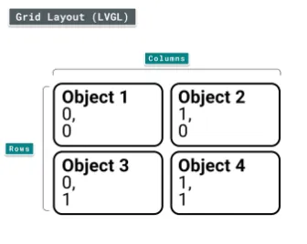
- Core Properties: All objects share common properties (position, size, visibility, etc.), and use Parts to break down internal structures (e. g., the background/text area of a button), and States to describe interaction states (normal / pressed / disabled / focused, etc.).
- Working Mechanism: Objects are organized in a tree structure, supporting screen management and snapshot caching to provide fundamental capabilities for interface switching and state preservation.
- API Support: It provides a unified interface for object creation, destruction, and property read/write operations, serving as the lowest-level operation entry for GUI development.
1.1.1 Core Definition of an Object
All UI elements in LVGL (such as Button, Label, Image, Slider, Chart) are referred to as Objects, and are also commonly translated as "Widgets".
1.1.2 Attributes of the Object: Basic + Exclusive
The attributes of an object are divided into "basic attributes shared by all objects" and "exclusive attributes of specific controls", which correspond to two distinct sets of API designs.
1.1.2.1 Basic Attributes
| Core Basic Properties | Description |
|---|---|
| Position | Object coordinates within the parent container (relative position) |
| Size | Object width and height |
| Parent | Parent object (container) |
| Styles | Style (visual appearance) |
| Event handlers | Event handler (interaction response) |
1.1.2.2 Exclusive Attributes
Different types of controls have their own specific attributes, for example:
- Slider: minimum value, maximum value, current value;
- Switch: On/Off status;
- Chart: data series, axis ranges.
1.1.3 Working Mechanism of Objects
1.1.3.1 Parent-Child Structure
The core rules are as follows:
- Every object (except the screen) has exactly one parent object;
- A parent object can contain any number of child objects;
- A parent object can be understood as a "container", and all the position and display logic of a child object depend on its parent object;
- There are no mandatory parent/child type restrictions, but there are common design conventions (e. g., Button is commonly used as a parent container, and Label is commonly used as a child element).
The core features are as follows:
- Linked Movement - Child Objects Move with Parent Object: The coordinates of a child object are local coordinates relative to its parent object, not absolute screen coordinates. If the position of the parent object changes, all child objects will move synchronously;
- Parent Inner Visibility - Child Objects Beyond Parent Area Are Hidden by Default: If a child object partially or completely exceeds the bounds of its parent container, the exceeding portion will be "clipped"(invisible); clipping can be disabled by adding a flag:
1.1.3.2 Creation and Destruction of Objects
LVGL supports dynamically creating and deleting objects at runtime, and only "currently existing objects" occupy RAM, which is a core design for memory saving on embedded devices.
1.1.4 Screens: Special Top-Level Objects
A screen is a top-level object with no parent object. Each display always has an "active screen", which serves as the ultimate container for all UI elements.
We can create, activate and load, and bring up animated loading screens.
1.1.5 Parts: The "stylable components" of an object
Parts are "sub-modules" split by LVGL for widgets, similar to "pseudo-elements" in CSS, designed to enable fine-grained customization of the visual style of widgets.
LVGL has the following built-in general widgets (all controls are built by combining these components):
| Part Enumeration | Purpose | Example scenario |
|---|---|---|
| LV_PART_MAIN | Main body of the widget (background rectangle) | Button background, slider base |
| LV_PART_SCROLLBAR | Scrollbar | Scrollbar of a list or text box |
| LV_PART_INDICATOR | Indicator | Slider progress bar, switch toggle block, checkbox tick box |
| LV_PART_KNOB | Draggable handle | Slider knob, volume control handle |
| LV_PART_SELECTED | Selected state marker | Selected list item, selected option in a dropdown |
| LV_PART_ITEMS | Repeated child elements | Table cells, list items |
| LV_PART_CURSOR | Cursor / marker | Text box input cursor, chart value cursor |
Different styles can be set for different parts of a control via components, for example:
- Set a gray background for the slider's
LV_PART_MAINpart; - Set a blue
LV_PART_INDICATORof the slider to display a blue Progress Bar; - Set a red circular handle for the slider's
LV_PART_.
1.1.6 States: The "interaction state identifier" of an object
An object can be in multiple "states" at the same time. LVGL automatically switches states based on user interactions, and also supports manual state modification. States serve as the core basis for style switching in different interaction scenarios.
The predefined states are as follows:
| State Enumeration | Meaning | Trigger Scenarios |
|---|---|---|
| LV_STATE_DEFAULT | Default state | Initial state when the widget has not been operated |
| LV_STATE_CHECKED | Checked / toggled state | Switch turned on, checkbox checked |
| LV_STATE_FOCUSED | Focused state | Selected by keyboard / encoder, touched / clicked by mouse |
| LV_STATE_PRESSED | Pressed state | Touch / mouse is held on the widget without release |
| LV_STATE_DISABLED | Disabled state | Widget is not interactive (grayed out) |
| LV_STATE_SCROLLED | Scrolled state | List / text box is being scrolled |
| LV_STATE_USER_1~4 | Custom state | Business extension (such as "Favorited", "Expired") |
LVGL automatically updates its status based on user operations, for example:
- Touch and press the button → Auto add
LV_STATE_PRESSED; - Release the button → Automatically removed
LV_STATE_PRESSED; - Keyboard-selected button → Auto-add
LV_STATE_FOCUSED.
We can also manually set / clear states via code (supports bitwise OR of multiple states |).
1.1.7 Snapshot: The "Screenshot Function" of Objects
It can generate a snapshot image (e. g. PNG/BMP) containing the object and all its sub-objects, which is commonly used for:
- Save the screenshot of the current interface;
- Convert complex controls into image caches to improve rendering performance.
1.2 Layout and Space Management
The positioning, sizing and layout design of LVGL draw heavily on the core logic of CSS (with lightweight adaptations for embedded scenarios), and serve as the core capability for controlling the arrangement of UI elements.
- Position and Size: Supports absolute positioning and relative positioning, and can dynamically adjust the size and coordinates of objects via styles or code to adapt to different resolution.
- Layout System: Built-in layout algorithms including flow, grid, and flexbox, which automatically arrange child elements to eliminate manual position calculation and improve interface adaptation efficiency.
- Transformation and Translation: Support object transformations such as translation, scaling, and rotation to achieve dynamic visual effects.
- Scrolling Mechanism: Provides scrolling capability for objects whose content exceeds the display area (such as lists and long texts), supporting manual scrolling, automatic scrolling, and scrollbar style customization.
1.2.1 Core Overview
The position/size/layout system of LVGL has the following core features (a CSS subset adapted to embedded resource constraints):
- Styled Storage: Attributes such as position, size, and layout are ultimately stored in the object's style (which can be configured via the style API or the simplified API in mpy);
- Size constraints: support
min-width/max-width,min-height/max-heightto limit the extreme values of the object's dimensions; - Multi-unit support: pixel, percentage, content Self-Adaptation (LV_SIZE_CONTENT);
- Coordinate reference:
x= 0; y= 0represents the top-left corner of the parent object's content area (the parent object's padding + border width shall be superimposed); - Box Model: follows the CSS
border-boxmodel (width and height include borders and padding); - Layout Support: Built-in Flexbox (flexible layout) and Grid (grid layout) to cover the vast majority of UI arrangement scenarios.
1.2.2 Core Units
LVGL supports three units, which are the basis for setting positions and dimensions, and can be passed directly in mpy via the corresponding method:
| Unit Type | Description | Example (mpy) |
|---|---|---|
| Pixel | Absolute pixel value; an integer represents pixels by default | obj.set_x(10) → set the object's x coordinate to 10 pixels |
| Percentage | Relative value (based on the parent object's content area size); requires conversion with lv.pct() | obj.set_width(lv.pct(50)) → width is 50% of the parent object's content area |
| Content-adaptive (LV_SIZE_CONTENT) | Special constant; the object size automatically fits all child elements (similar to CSS auto) | obj.set_width(lv.SIZE_CONTENT) → width adapts to child elements |
1.2.3 Boxing Model
LVGL follows the CSS border-box model, where an object's "size box" consists of 4 components (which determine the calculation logic for position and size):
| Component | Purpose | Effect on Size |
|---|---|---|
| Margin | Blank area outside the object (recognized only by some layouts) | Does not affect the object's own size; only affects spacing to other objects |
| Border (border width) | Border width of the object | Included in the object's width and height (core of border-box) |
| Padding | Blank space between the object's border and its child elements | Included in the object's width and height; child element coordinates start after the padding |
| Content area | Actual content area of the object | Content area width/height = object width/height - left and right borders - left and right padding (same for height) |
The key rules are as follows:
- The border is drawn inside the "bounding box" of the object;
- The coordinate reference of a child element is "the top-left corner of the parent object's content area"(i. e., the top-left corner of the parent object + padding + border);
- The outline is drawn outside the bounding box and does not affect the size or layout of the object.
1.2.4 Important Notes
- Delayed coordinate calculation: For performance reasons, LVGL does not immediately calculate coordinate or dimension modifications, and only marks the object as "Dirty Data" for unified refresh before screen redraw; if you need to obtain the latest value immediately after modifying the position or dimension, you need to manually trigger the refresh.
- Impact of style removal: The simplified APIs for position/size (such as
set_x/set_width) essentially write attributes to the "local style" of the object; if you remove all styles of the object (such asobj.remove_style_all ()) or remove the style of the main part (LV_PART_MAIN), the already set position/size will be cleared at the same time.
1.2.5 Location Settings
1.2.5.1 Location Settings
In mpy, settings can be configured directly via a simplified API, with the coordinate origin set at the top-left corner of the parent object's content area.
1.2.5.2 Alignment
Flexible alignment is achieved by modifying the "alignment origin", the core of which lies in the lv.ALIGN_XXX enumeration, which can be used directly in mpy.
We can align it to the parent object:
| Core Enumeration (mpy) | Meaning |
|---|---|
| lv.ALIGN.TOP_LEFT | Top-left corner of the parent object |
| lv.ALIGN.TOP_MID | Top center of the parent object |
| lv.ALIGN.TOP_RIGHT | Top-right corner of the parent object |
| lv.ALIGN.BOTTOM_LEFT | Bottom-left corner of the parent object |
| lv.ALIGN.BOTTOM_MID | Bottom center of the parent object |
| lv.ALIGN.BOTTOM_RIGHT | Bottom-right corner of the parent object |
| lv.ALIGN.LEFT_MID | Left center of the parent object |
| lv.ALIGN.RIGHT_MID | Right center of the parent object |
| lv.ALIGN.CENTER | Exact center of the parent object |
You can also align it to any reference object:
Implemented via align_to, which supports the "external alignment" enumeration (LV_ALIGN_OUT_XXX). mpy example:
# Align the label to the top center of btn, offset upward by 10 pixels
label.align_to(btn, lv.ALIGN_OUT_TOP_MID, 0, -10)
External Alignment Core Enumeration (mpy):
lv.ALIGN_OUT_TOP_LEFT/OUT_TOP_MID/OUT_TOP_RIGHTlv.ALIGN_OUT_BOTTOM_LEFT/OUT_BOTTOM_MID/OUT_BOTTOM_RIGHTlv.ALIGN_OUT_LEFT_TOP/OUT_LEFT_MID/OUT_LEFT_BOTTOMlv.ALIGN_OUT_RIGHT_TOP/OUT_RIGHT_MID/OUT_RIGHT_BOTTOM
1.2.6 Dimension Setting
1.2.6.1 Location Settings
In mpy, by simplifying API settings, it supports pixels, percentages, and LV_SIZE_CONTENT:
# Set width/height separately
obj.set_width(200)  # Width 200 pixels
obj.set_height(100) # Height 100 pixels

# Set width and height at once
obj.set_size(200, 100)

# Percentage example: height is 100% of the parent's content area (fills the parent's height)
obj.set_height(lv.pct(100))

# Content-adaptive example: width fits all child elements
obj.set_width(lv.SIZE_CONTENT)
1.2.6.2 Content Area Dimensions
Directly set the width and height of the "content area"(the actual width and height of the element = width and height of the content area + border + padding):
# Set content area width to 50 pixels (actual width = left padding + 50 + right padding)
obj.set_content_width(50)
# Set content area height to 30 pixels
obj.set_content_height(30)

# Get size (mpy)
w = obj.get_width()          # Get bounding box width
content_w = obj.get_content_width()  # Get content area width
1.2.6.3 Minimum / Maximum Dimensions
Set size extremities via style configuration to solve the issue of "percentage / Self-Adaptation size exceeding expectations", an mpy example is as follows:
# 1. Create a style and set max-height
style = lv.style_t()
style.init()
style.set_max_height(200)  # Maximum height 200 pixels (lv.pct(50) is also supported)

# 2. Add the style to the object to limit its height
obj.set_height(lv.pct(100))  # Originally fills the parent's height
obj.add_style(style, lv.PART_MAIN)  # Limit height to no more than 200 pixels
1.2.7 Style Control Position / Size
The simplified API for position and dimensions is essentially "syntactic sugar for styling", and directly using style settings offers the following advantages:
- Batch Setting: A single style can be applied to multiple objects to uniformly control their size and position;
- Stateful Configuration: Set different positions/sizes for different states (e. g., pressed, focused);
- Transition Animation: Smooth animations for size/position changes can be achieved via style transitions;
- Layered Overriding: The base style is set with default values, and child styles only override the properties that need to be modified.
mpy example (the width increases when the button is pressed):
# Initialize

import display_driver
import lvgl as lv

# Create a button with a label

lv.init()
scr = lv.screen_active()

btn = lv.button(scr)
btn.align(lv.ALIGN.CENTER, 0, 0)

# 1. Create the default state style
style_normal = lv.style_t()
style_normal.init()
style_normal.set_width(100)  # Default width 100 pixels

# 2. Create the pressed state style
style_pressed = lv.style_t()
style_pressed.init()
style_pressed.set_width(120)  # Width 120 pixels when pressed

# 3. Add styles to the button
btn.add_style(style_normal, lv.STATE.DEFAULT)
btn.add_style(style_pressed, lv.STATE.PRESSED)

lv.screen_load(scr)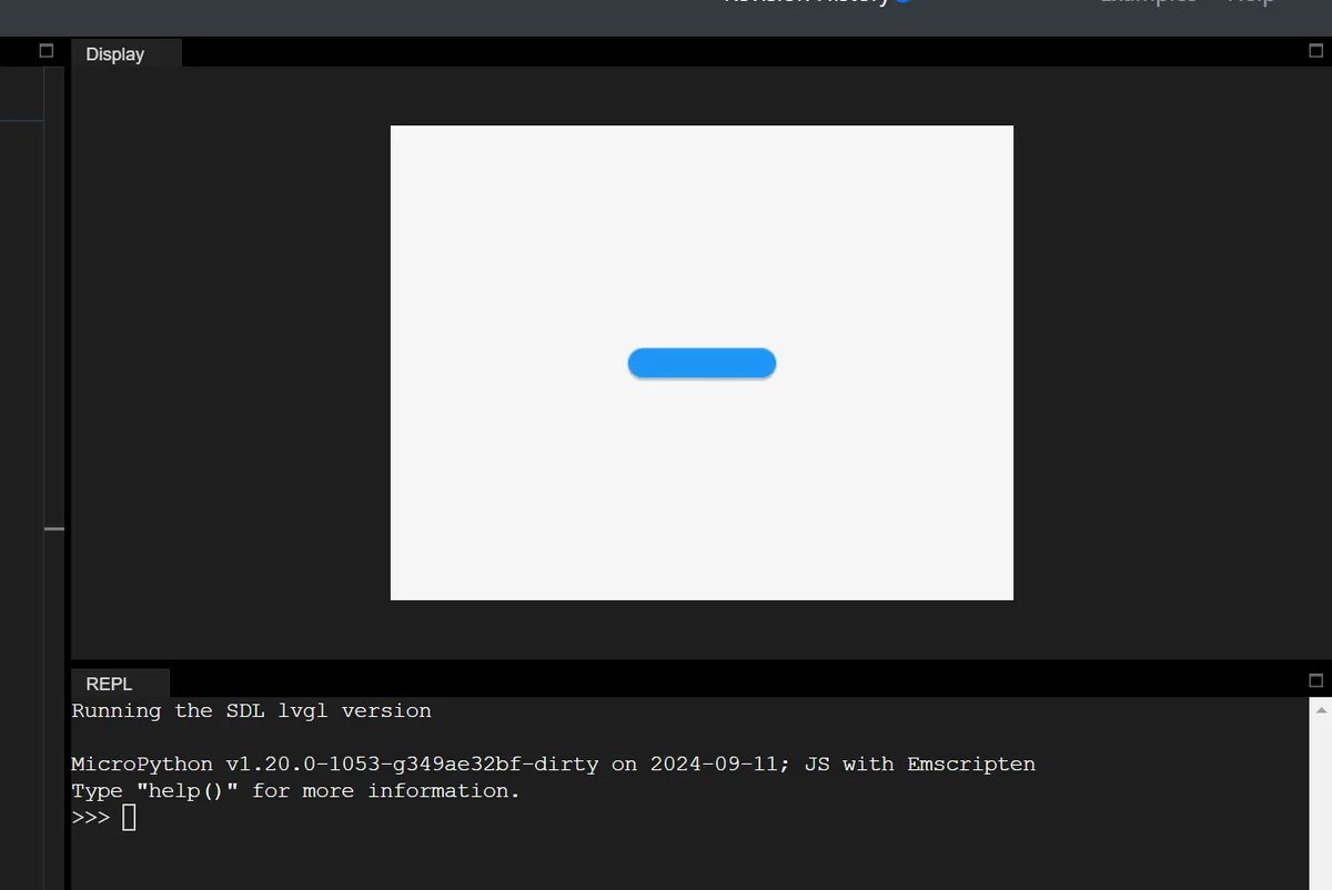
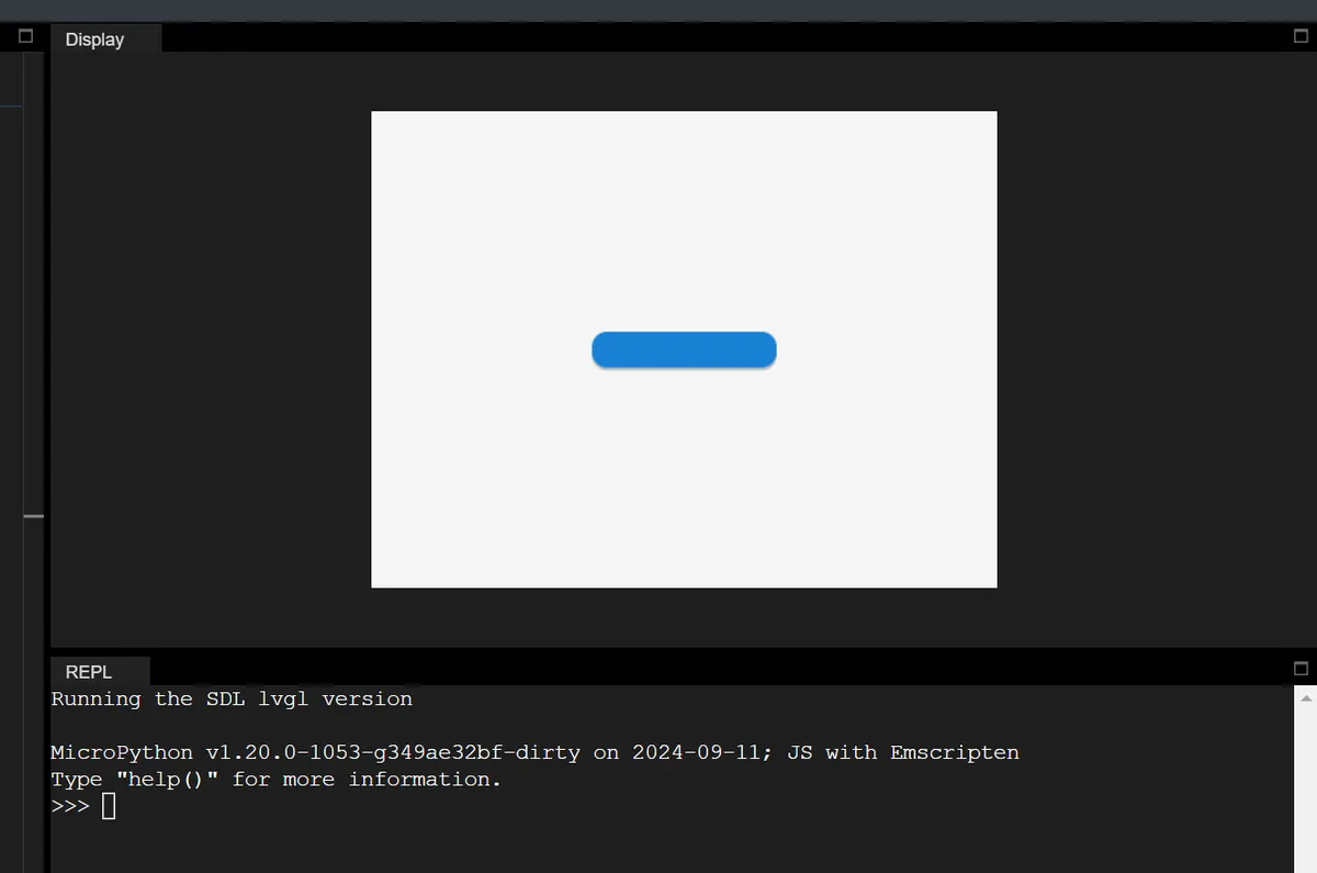
1.2.8 Translation
Relative offset based on the object's current position, which solves the problem that "objects with different initial positions offset by the same distance during interaction"(e. g., moving up when a button is pressed), mpy example:
# Initialize

import display_driver
import lvgl as lv

# Create a button with a label

lv.init()
scr = lv.screen_active()

btn = lv.button(scr)
btn.align(lv.ALIGN.CENTER, 0, 0)

# 1. Create the default state style
style_normal = lv.style_t()
style_normal.init()
style_normal.set_width(100)  # Default width 100 pixels

# 2. Create the pressed state style
style_pressed = lv.style_t()
style_pressed.init()
style_pressed.set_width(120)  # Width 120 pixels when pressed
# Create the pressed state style, set y-axis translation to -20 pixels (move up 20)
style_pressed.set_translate_y(-20)

# 3. Add styles to the button
btn.add_style(style_normal, lv.STATE.DEFAULT)
btn.add_style(style_pressed, lv.STATE.PRESSED)

lv.screen_load(scr)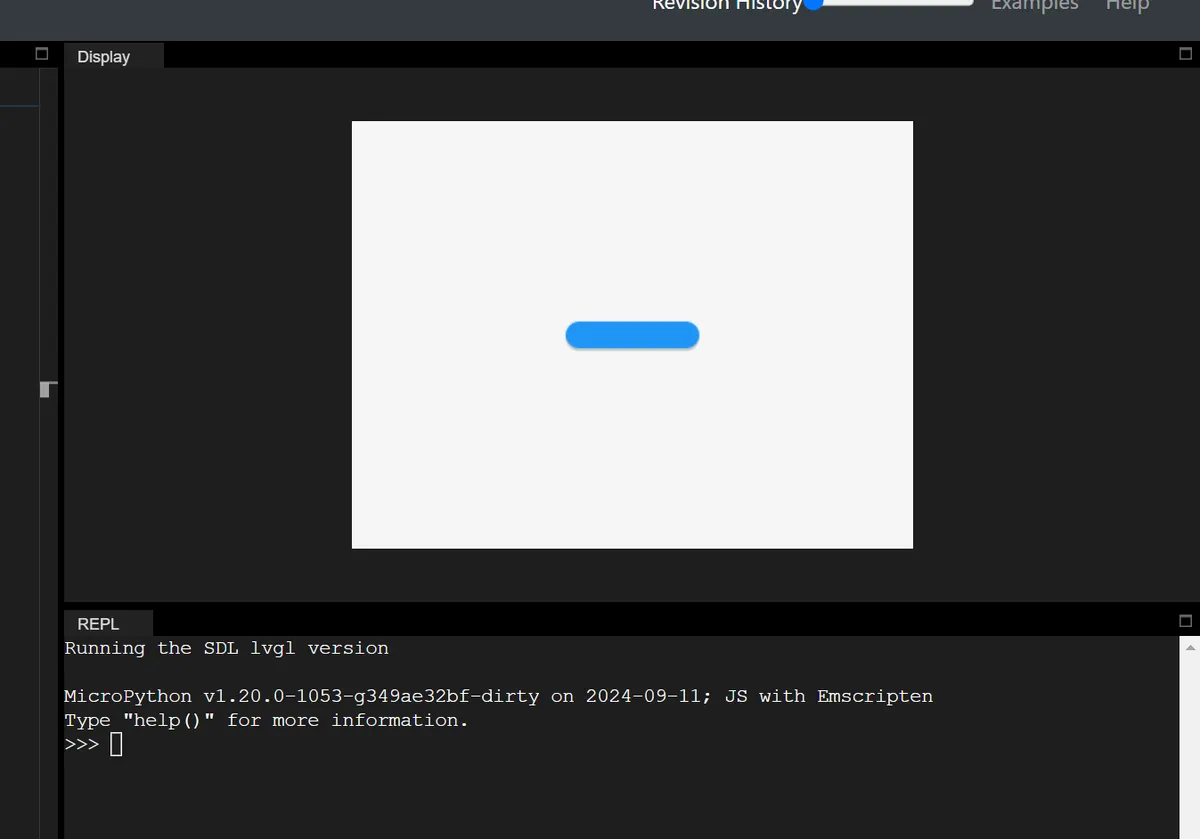
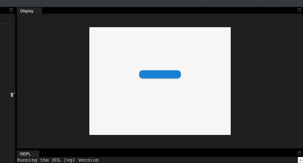
In addition, there are two key features:
- Percentage support: The percentage for translation is based on the object's own dimensions (not the parent object). For example,
set_translate_x (lv.pct (50))→ offset to the right by 50% of the object's own width; - Layout Compatibility: The translation takes effect after layout calculation, which does not affect the layout, but will trigger the recalculation of scroll bars / content Self-Adaptation (actually changing the position).
1.2.9 Transformation
"Visual scaling" based on the object's current size only changes the display effect, without affecting the actual size (the layout, scroll bars, and content Self-Adaptation will not perceive it). mpy example (enlarge when the button is pressed):
# Initialize

import display_driver
import lvgl as lv

# Create a button with a label

lv.init()
scr = lv.screen_active()

btn = lv.button(scr)
btn.align(lv.ALIGN.CENTER, 0, 0)

# 1. Create the default state style
style_normal = lv.style_t()
style_normal.init()
style_normal.set_width(100)  # Default width 100 pixels

# 2. Create the pressed state style
style_pressed = lv.style_t()
style_pressed.init()
style_pressed.set_width(120)  # Width 120 pixels when pressed
# Expand width/height outward by 10 pixels each (visually +20 in width, +20 in height)
style_pressed.set_transform_width(10)
style_pressed.set_transform_height(10)

# 3. Add styles to the button
btn.add_style(style_normal, lv.STATE.DEFAULT)
btn.add_style(style_pressed, lv.STATE.PRESSED)

lv.screen_load(scr)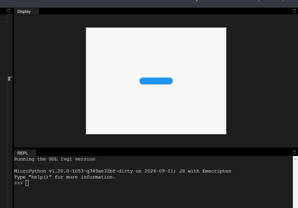
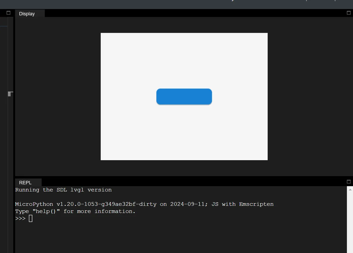
| Feature | Translation | Transformation |
|---|---|---|
| Position / size | Changes the real position | Visual scaling only; the real size is unchanged |
| Layout Impact | Affects layout / scrollbar | Does not affect layout / scrollbar |
| Purpose | Position offset during interaction | Visual scaling during interaction (no layout interference) |
1.2.10 Layout System (Layout)
The layout automatically calculates the position and size of child objects (overriding manually set x/y/width/height), which is enabled via set_layout in mpy:
# Enable Flex layout on the parent container
container = lv.obj(lv.screen_active())
container.set_layout(lv.LAYOUT_FLEX)
1.2.10.1 Built-in Layouts
LVGL has two built-in core layouts (inspired by CSS), which are the most commonly used layout methods in mpy:
| Layout Type | Main Purpose | Key Features |
|---|---|---|
| Flexbox (lv.LAYOUT_FLEX) | Arranges child objects in rows / columns | Supports wrapping, adaptive expansion, alignment, and spacing adjustment |
| Grid (lv.LAYOUT_GRID) | Arranges child objects in a two-dimensional grid | Fixed rows and columns, cell merging, adaptive proportions |
1.2.10.2 Layout-related Flag Bits
Control the behavior of child objects in the layout via flags, which in mpy are set using add_flag / remove_flag as follows:
| Flags (mpy) | Purpose |
|---|---|
| lv.OBJ_FLAG_HIDDEN | Hidden objects are ignored by the layout |
| lv.OBJ_FLAG_IGNORE_LAYOUT | The object is completely free of layout control (position / size set manually) |
| lv.OBJ_FLAG_FLOATING | Equivalent to IGNORE_LAYOUT, and is ignored by LV_SIZE_CONTENT |
mpy Example:
# Child object ignores the layout; position is set manually
obj.add_flag(lv.OBJ_FLAG_IGNORE_LAYOUT)
obj.set_pos(10, 10)  # Layout will not modify this position
1.2.10.3 Custom Layout
In MPY, custom layouts (for advanced use cases) can be implemented by registering layout callbacks, with the core logic as follows:
- Register the layout update function;
- Calculate the position / size of the sub-object in the callback;
- Set a custom layout identifier for the container.
1.2.11 Scroll
The scrolling system of LVGL is the core mechanism for implementing interactive browsing when content exceeds the container in embedded GUIs, featuring an intuitive design that aligns with user expectations and supporting a rich set of customization features.
1.2.11.1 Core Principle of Scrolling
The trigger logic of scrolling in LVGL is extremely intuitive:
- When a child element extends beyond the "content area" of its parent element — the area obtained by subtracting the parent element's padding from its dimensions —
pad, the parent element automatically switches to a scrollable state, and the scrollbar will be displayed according to the configured settings; - Any type of LVGL object (buttons, images, meters, ordinary containers, etc.) can serve as a scroll container;
- Scrolling only supports horizontal/vertical unidirectional (e. g. only horizontal, only vertical), and diagonal scrolling is not supported.
1.2.11.2 Scrollbar: A Visual Indicator for Scrolling
A scrollbar provides intuitive feedback of the scrolling status, and supports flexible display and style control:
- Display Mode: The display logic of the scrollbar can be controlled via configuration, and the core modes include:
- Off (OFF): Never display the scrollbar;
- Always Show (ON): The scrollbar is displayed regardless of whether scrolling is required;
- Show while scrolling (ACTIVE): Only displayed when the user swipes the container;
- Auto (AUTO): Display only when the content exceeds the container.
- Style Customization:
- The scrollbar is an independent component
LV_PART_SCROLLBARwhose styles (e. g. background color, width) can be configured separately; - When the container is in the "scrolled" state (
LV_STATE_SCROLLED), you can set a dedicated style for the scrollbar (e. g., change its color while scrolling); - You can adjust the spacing between the scrollbar and the container via padding (
pad), and control the thickness of the scrollbar through thewidthproperty; if the container is configured with RTL (right-to-left) text direction, the vertical scrollbar will automatically move to the left side (it is on the right side by default).
- The scrollbar is an independent component
1.2.11.3 Scroll Events: Monitor Scrolling Behavior
LVGL provides three types of core events for capturing the entire lifecycle of scrolling:
Core Event | Meaning of Core Events |
LV_EVENT_SCROLL_BEGIN | Triggered when scrolling starts, the parameters of the scrolling animation (such as animation duration and easing curve) can be modified; |
LV_EVENT_SCROLL_END | Triggered when scrolling ends, which is suitable for executing the final logic after scrolling (such as loading more content and updating status); |
LV_EVENT_SCROLL | Triggered during scrolling (on every position change), suitable for real-time monitoring of scroll position (e. g., dynamically updating UI elements, recording scroll offset). |
1.2.11.4 Rolling Core Expansion Features
LVGL provides a rich set of scroll enhancement features covering both interactive experience and functional control:
| Feature Name | Core description | Key controls (flag / event / API) | Additional notes |
|---|---|---|---|
| Scrollability control | 1. Removing the specified flag disables container scrolling (scroll actions can still be passed to the parent container); 2. Can restrict the container to scroll only in specific directions (/ direction combinations) | 1. Disable scrolling: remove LV_OBJ_FLAG_SCROLLABLE; 2. Direction restriction: lv_obj_set_scroll_dir(obj, LV_DIR_...) | Supported directions: LV_DIR_TOP/LEFT/BOTTOM/RIGHT/HOR/VER/ALL, can be combined (e.g. `LV_DIR_TOP、LV_DIR_LEFT`) |
| Scroll chain | When a child container reaches its scroll limit, the scroll action is passed up level by level to the parent container (child → parent → grandparent), and the parent scrolls instead | Enable / disable: LV_OBJ_FLAG_SCROLL_CHAIN_HOR (horizontal) / VER (vertical) | With the flag off, the scroll action ends at the current container and is no longer passed up |
| Scroll momentum | Simulates physical inertia: after the user releases a swipe, scrolling decelerates slowly, restoring a realistic interaction feel | Enable / disable: LV_OBJ_FLAG_SCROLL_MOMENTUM | - |
| Elastic scroll | When scrolling past the boundary, the content slightly exceeds the edge, then automatically bounces back to a valid position after release, improving the interaction experience | Enable: LV_OBJ_FLAG_SCROLL_ELASTIC | Under normal conditions the container cannot scroll beyond its content |
| Snapping | When scrolling ends, child objects automatically align to a specified position in the container, making scrolling more orderly (e.g. carousel / list item alignment) | 1. Child object can snap: LV_OBJ_FLAG_SNAPPABLE; 2. Alignment rule: lv_obj_set_scroll_snap_x/y(obj, LV_SCROLL_SNAP_...) (NONE/START/END/CENTER) | After the scroll is released, the momentum end point is calculated first, then the nearest snap point is found and scrolled to with animation |
| Scroll one | When enabled, each scroll switches only one snappable child object (e.g. a carousel moves one page per swipe) | Enable: LV_OBJ_FLAG_SCROLL_ONE | Prerequisite: the child objects are snappable, and the container's snap alignment is set to something other than NONE |
| Scroll on focus | When focus moves to a child object outside the container's visible area, the container automatically scrolls to bring that object into view | No specific control flag; a built-in LVGL feature | Supports recursive scroll adaptation for nested containers and across tabs (tabview) |
| Manual scrolling | 1. Active trigger: scroll by an offset / to specified coordinates; 2. Real-time retrieval: scroll offset coordinates | 1. Trigger API: lv_obj_scroll_by/to/to_x/to_y(); 2. Coordinate retrieval API: lv_obj_get_scroll_x/y/top/bottom/left/right() | Can be used for saving the scroll position, updating the UI dynamically, etc. |
| Self size | 1. Self size is the actual size of the object's content area (as opposed to its displayed size); 2. Scrolling is triggered when self size > displayed size (scrolling is possible even without children) | Custom self size: handle the LV_EVENT_GET_SELF_SIZE event | Typical scenario: table widget (many rows make the self height much larger than the displayed height) |
1.3 Layer Management (Layers)
The layers in LVGL essentially control the rendering hierarchy of UI elements (i. e., "which element appears on top of another"), and there are two core hierarchical systems:
- First, the default hierarchy of ordinary objects based on the "creation order";
- Second, there are special system layers (top/sys/bottom) that are globally visible.
To be precise:
- Hierarchy Rules: Objects are stacked by default in the order they are created, and the hierarchy can be adjusted manually to achieve overlay effects such as pop-up windows and floating windows.
- Special layers: The top/sys layers are used to display global pop-ups and status bars; the bottom layers are for background elements to ensure a clear hierarchy of priorities.
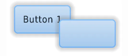
1.3.1 Creation Order: Default Hierarchy Rules
LVGL follows the default "later-created objects on top" principle: newly created objects (and their child objects) are drawn on top of older objects (and their child objects), which may cover the display area of the older objects.
# Initialize

import display_driver
import lvgl as lv

# Create a button with a label

lv.init()
scr = lv.screen_active()

# Create the first button (created first, lower in z-order)
btn1 = lv.button(scr)
# Position (x=60, y=40)
btn1.set_pos(60, 40)
label1 = lv.label(btn1)
label1.set_text("Button 1")

# Create the second button (created later, higher in z-order, covers the overlapping area of btn1)
btn2 = lv.button(scr)
# Position (x=60, y=60)
btn2.set_pos(60, 60)
label2 = lv.label(btn2)
label2.set_text("Button 2")

lv.screen_load(scr)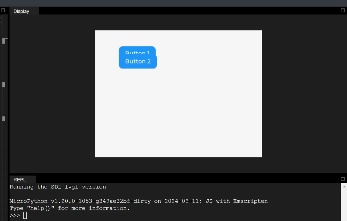
1.3.2 Modify Hierarchy: Proactively Adjust the Display Order of Objects
When the default creation order fails to meet requirements (e. g., moving a low-level button to the top layer), LVGL provides 4 explicit methods to modify the layer order, which can be directly invoked via the corresponding object methods in MicroPython:
1.3.2.1 Pin to Top / Pin to Bottom (Most Commonly Used)
| Method (mpy) | Purpose |
|---|---|
| obj.move_foreground() | Move the object (and its children) to the top layer of the parent container |
| obj.move_background() | Move the object (and its children) to the bottom layer of the parent container |
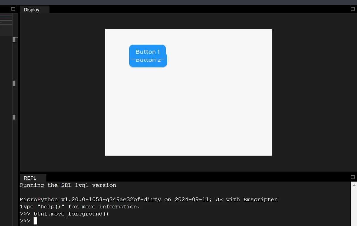
mpy example: Bring the previously created btn1 to the top layer (to cover btn2)
# Move btn1 to the topmost layer of the parent container (scr)
btn1.move_foreground()
1.3.2.2 Move to the specified index position
Each child object of a parent container has an "index value", which determines the hierarchy:
- Index
0: the bottom layer of the parent container; - Index
Number of child objects + 1: the upper layer of the parent container; - Negative indices: count backwards from the top level (e. g.,
-1= top level,-2= the level immediately below the top level).
mpy core method:
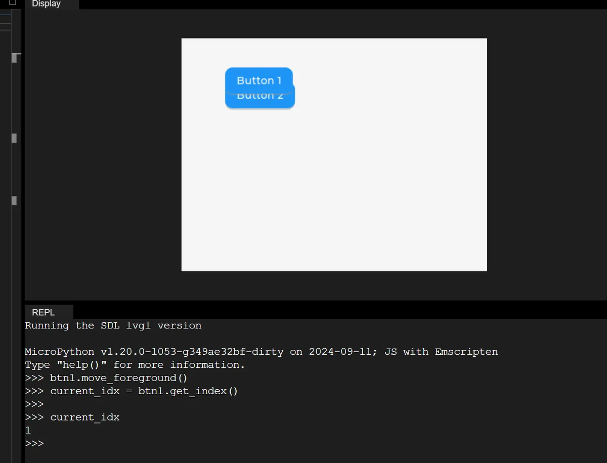
# 1. Get the object's current index
current_idx = obj.get_index()

# 2. Move to the specified index (e.g., move up 1 level)
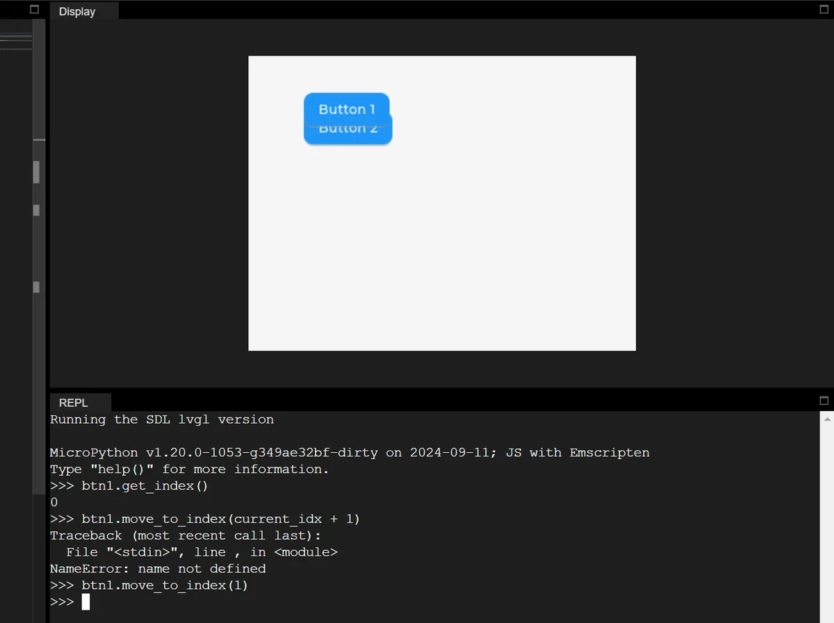
obj.move_to_index(current_idx + 1)

# 3. Move directly to the bottom layer (index 0)
obj.move_to_index(0)
mpy example:
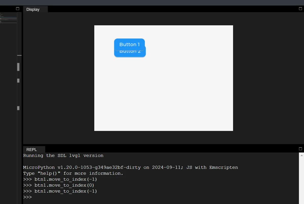
1.3.2.3 Hierarchy Impact of Changing the Parent Object
When you modify the parent container of an object via obj.set_parent (new_parent), the object will automatically become the topmost child object of the new parent container.
# Change btn1's parent to btn2; btn1 becomes the topmost child of btn2
btn1.set_parent(btn2)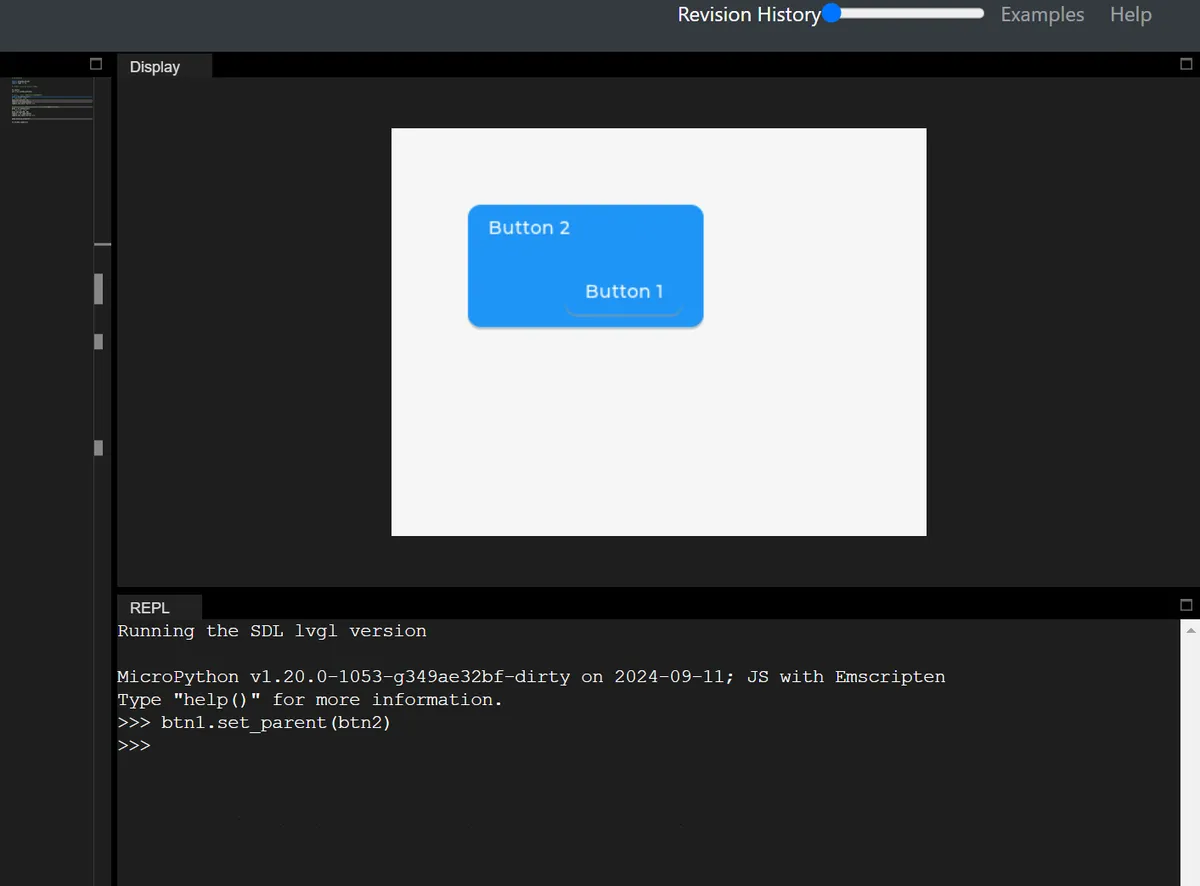
1.3.3 Top Layer and System Layer (Top & Sys Layers)
LVGL provides two globally visible special layers (shared by all screens, not shared across different displays) for each physical display, which are hierarchically higher than all objects on ordinary screens:
layer_top(top-level layer): at the topmost layer of the currently active screen (lv.screen_active ());layer_sys(system layer): Located at the very top oflayer_top, it is the highest hierarchy of the entire display.
Many beginners are confused about LVGL's layer_top / layer_sys / layer_bottom, and the core reason is that they fail to understand the essential difference between "ordinary screen objects" and "global special layers":
- Ordinary objects (such as buttons and pop-ups) belong to a specific screen and will disappear when you switch screens;
- A special layer is a "display-level global layer": no matter which screen you switch to, the content on this layer remains visible at all times, and its hierarchy is fixed to be above or below all regular screens.
显示器最终显示效果 = 最顶层往下叠加
├─ layer_sys(系统层,最顶层)→ 比如鼠标光标,永远在所有内容上面
├─ layer_top(顶级图层)→ 比如全局弹窗、悬浮窗,覆盖所有屏幕
├─ 当前活跃的普通屏幕(屏幕A/屏幕B)→ 普通按钮/标签都在这一层
└─ layer_bottom(底层图层)→ 比如全局背景图,在所有屏幕下面
1.3.3.1 layer_top (Top-level Layer): Globally Visible "Floating Window / Modal Pop-up"
Similar to the "floating window" or "system pop-up window" on a mobile phone: no matter which APP (corresponding to a regular screen in LVGL) you switch to, the floating window remains displayed; when "modal mode" is enabled, the underlying content cannot be clicked (for example, a mobile phone pop-up window blocks operations on the APP).
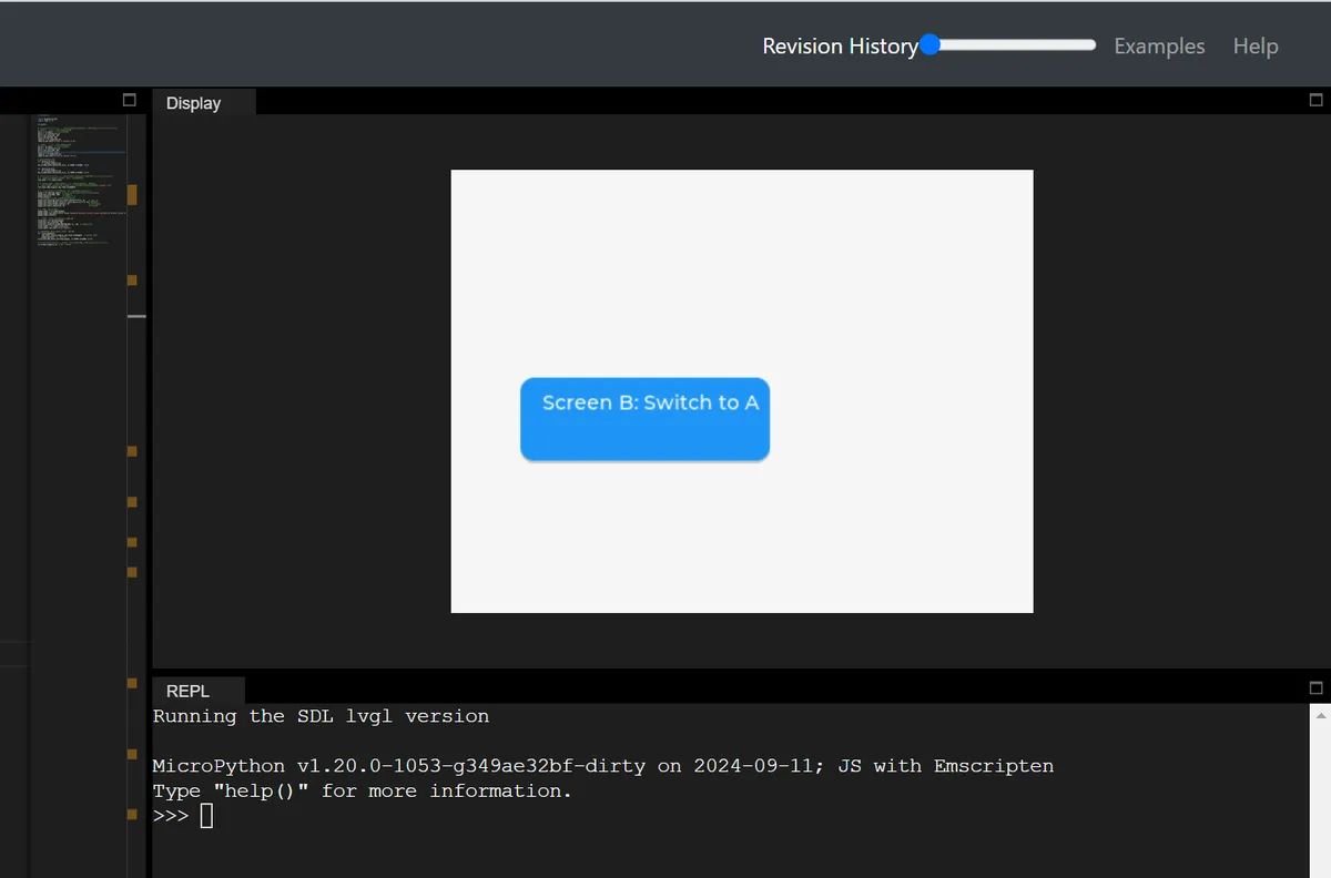
In the following code, two regular screens that can be switched between each other are created, and a globally visible modal popup is generated on layer_top. This popup is similar to the "system-level popup" on mobile phones: it does not disappear when switching between screens, and will block the interaction of the underlying screen. The underlying buttons can only be used normally after the popup is closed.
# Initialize

import display_driver
import lvgl as lv

lv.init()

# ===================== Step 1: Create two normal screens (for switching test) =====================
# Screen A: add a button; clicking it switches to screen B
scr_a = lv.obj()  # Create normal screen A
btn_a = lv.button(scr_a)
btn_a.set_size(180, 60)
btn_a.set_pos(50, 50)
label_a = lv.label(btn_a)
label_a.set_text("Screen A: Switch to B")

# Screen B: add a button; clicking it switches to screen A
scr_b = lv.obj()  # Create normal screen B
btn_b = lv.button(scr_b)
btn_b.set_size(180, 60)
btn_b.set_pos(50, 150)
label_b = lv.label(btn_b)
label_b.set_text("Screen B: Switch to A")

# Bind the screen switching event
def switch_to_b(e):
    lv.screen_load(scr_b)
btn_a.add_event_cb(switch_to_b, lv.EVENT.CLICKED, None)

def switch_to_a(e):
    lv.screen_load(scr_a)
btn_b.add_event_cb(switch_to_a, lv.EVENT.CLICKED, None)

# ===================== Step 2: Create a global modal popup with layer_top =====================
# 1. Get the display's top layer (global layer, shared by all screens)
top_layer = lv.layer_top()

# 2. Add a "click absorb" flag to top_layer → implements modal behavior (buttons below cannot be clicked)
# Principle: when the user clicks the screen, the click event is received by top_layer, and widgets on the underlying screen do not get the click event
top_layer.add_flag(lv.obj.FLAG.CLICKABLE)

# 3. Create the popup on top_layer (globally visible, stays regardless of which screen is shown)
popup = lv.obj(top_layer)  # The parent object is top_layer, not a normal screen!
popup.set_size(300, 200)   # Popup size
popup.center()             # Popup centered
# Set popup style: white background, gray border, rounded corners
popup.set_style_bg_color(lv.color_hex(0xFFFFFF), 0)    # White background
popup.set_style_border_color(lv.color_hex(0xCCCCCC), 0)# Gray border
popup.set_style_border_width(2, 0)                     # Border width 2px
popup.set_style_radius(10, 0)                          # Corner radius 10px

# 4. Add text + close button to the popup
popup_label = lv.label(popup)
popup_label.set_text("Global Modal Popup\n→ Persists across screen switches\n→ Blocks clicks on underlying elements")
popup_label.center()

# Add close button: clicking it removes the modal and closes the popup
close_btn = lv.button(popup)
close_btn.set_size(120, 30)
close_btn.align(lv.ALIGN.BOTTOM_MID, 0, -10)  # Popup bottom center
close_label = lv.label(close_btn)
close_label.set_text("Close Popup")

# Event to close the popup: remove click absorption + delete the popup
def close_popup(e):
    top_layer.remove_flag(lv.obj.FLAG.CLICKABLE)  # Cancel click absorption
    popup.delete()  # Delete the popup
close_btn.add_event_cb(close_popup, lv.EVENT.CLICKED, None)

# ===================== Step 3: Load the initial screen and run the test =====================
lv.screen_load(scr_a)  # Load screen A first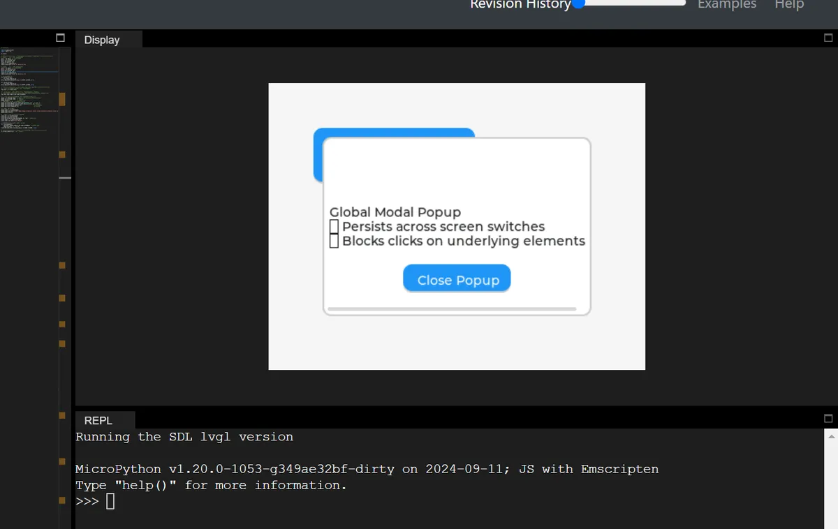
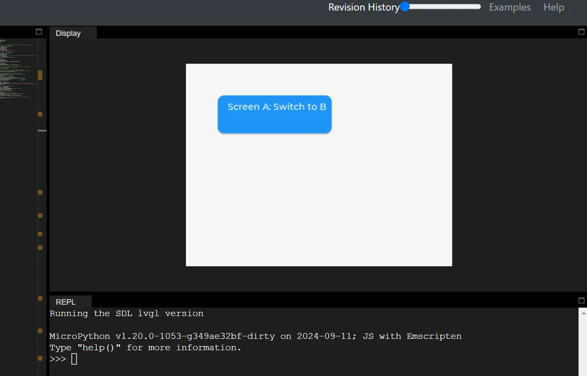
It can be seen that:
- Startup procedure: Screen A is displayed, but is covered by the pop-up window of
layer_top, and clicking the "Switch to B" button on Screen A has no response (modal blocking); - Test operation: Even if you switch to Screen B via other methods (such as modifying the code), the pop-up window will still be displayed on top of Screen B, and the "Switch to A" button on Screen B will also be unclickable;
- Close the pop-up: Click the "Close Popup" button on the pop-up, the pop-up will disappear,
layer_topwill no longer absorb click events. At this point, the toggle buttons for Screen A/B can be clicked normally, and the screens can be switched between each other; - Core Verification:
layer_toppop-up is "global", ordinary screen switching will not affect it, and it can block all underlying interactions — this is exactly the core logic of the "system-level modal pop-up / floating window" on mobile phones.
1.3.3.2 layer_sys (system layer): the topmost "system-level element"
LVGL internally uses this layer to place elements that "must always be on top"(such as the mouse cursor). Even if layer_top has a pop-up window, layer_sys content will still cover the pop-up.
The demo code is as follows:
# Initialize

import display_driver
import lvgl as lv
import time

lv.init()

# ===================== Step 1: Create two normal screens (for switching test) =====================
# Screen A: add a button; clicking it switches to screen B
scr_a = lv.obj()  # Create normal screen A
btn_a = lv.button(scr_a)
btn_a.set_size(180, 60)
btn_a.set_pos(50, 50)
label_a = lv.label(btn_a)
label_a.set_text("Screen A: Switch to B")

# Screen B: add a button; clicking it switches to screen A
scr_b = lv.obj()  # Create normal screen B
btn_b = lv.button(scr_b)
btn_b.set_size(180, 60)
btn_b.set_pos(50, 150)
label_b = lv.label(btn_b)
label_b.set_text("Screen B: Switch to A")

# Bind the screen switching event
def switch_to_b(e):
    lv.screen_load(scr_b)
btn_a.add_event_cb(switch_to_b, lv.EVENT.CLICKED, None)

def switch_to_a(e):
    lv.screen_load(scr_a)
btn_b.add_event_cb(switch_to_a, lv.EVENT.CLICKED, None)

# ===================== Step 2: Create a global modal popup with layer_top =====================
# 1. Get the display's top layer (global layer, shared by all screens)
top_layer = lv.layer_top()

# 2. Add a "click absorb" flag to top_layer → implements modal behavior (buttons below cannot be clicked)
# Principle: when the user clicks the screen, the click event is received by top_layer, and widgets on the underlying screen do not get the click event
top_layer.add_flag(lv.obj.FLAG.CLICKABLE)

# 3. Create the popup on top_layer (globally visible, stays regardless of which screen is shown)
popup = lv.obj(top_layer)  # The parent object is top_layer, not a normal screen!
popup.set_size(300, 200)   # Popup size
popup.center()             # Popup centered
# Set popup style: white background, gray border, rounded corners
popup.set_style_bg_color(lv.color_hex(0xFFFFFF), 0)    # White background
popup.set_style_border_color(lv.color_hex(0xCCCCCC), 0)# Gray border
popup.set_style_border_width(2, 0)                     # Border width 2px
popup.set_style_radius(10, 0)                          # Corner radius 10px

# 4. Add text + close button to the popup
popup_label = lv.label(popup)
popup_label.set_text("Global Modal Popup\n→ Persists across screen switches\n→ Blocks clicks on underlying elements")
popup_label.center()

# Add close button: clicking it removes the modal and closes the popup
close_btn = lv.button(popup)
close_btn.set_size(120, 30)
close_btn.align(lv.ALIGN.BOTTOM_MID, 0, -10)  # Popup bottom center
close_label = lv.label(close_btn)
close_label.set_text("Close Popup")

# Event to close the popup: remove click absorption + delete the popup
def close_popup(e):
    top_layer.remove_flag(lv.obj.FLAG.CLICKABLE)  # Cancel click absorption
    popup.delete()  # Delete the popup
close_btn.add_event_cb(close_popup, lv.EVENT.CLICKED, None)

# ===================== Step 3: Load the initial screen and run the test =====================
lv.screen_load(scr_a)  # Load screen A first

# Get the system layer (topmost layer)
sys_layer = lv.layer_sys()

# 2. Create a small circle (simulates a mouse cursor)
cursor = lv.obj(sys_layer)
cursor.set_size(20, 20)       # Cursor size 20x20
cursor.set_style_bg_color(lv.color_hex(0xFF0000), 0)  # Red background
cursor.set_style_radius(10, 0)                        # Circle (radius = size/2)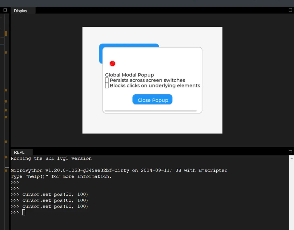
After running, you can see the following:
As we run the command to adjust the ball position in the REPL, the red circular cursor will pass through the pop-up window of layer_top and always stay on the top (it remains visible even when blocked by the pop-up window).
The summary is as follows:
layer_sysis the "ultimate top layer", and no content can override it;- Developers generally do not use
layer_systo avoid interfering with the internal cursor/system elements of LVGL; - Each display has its own independent
layer_sys, which is not shared between different displays.
1.3.3 layer_bottom (bottom layer): global background image
Set the "background for all screen sharing", such as the global background image of an APP, so that the background remains unchanged no matter which page (screen) you switch to (provided that the screen background is semi-transparent).
In the following code, we set:
- layer_bottom refers to the dark blue global background;
- Screen A features a light gray semi-transparent background;
- Screen B has a background of a different color.
# Initialize

import display_driver
import lvgl as lv
import time

lv.init()

# ===================== Step 1: Create the global background for layer_bottom =====================
# Get the bottom layer
bottom_layer = lv.layer_bottom()

# Global background: dark blue (#1A237E), fully opaque (to highlight the global background)
bg_rect = lv.obj(bottom_layer)
bg_rect.set_size(lv.pct(80), lv.pct(80))  # Fill the entire screen
bg_rect.set_style_bg_color(lv.color_hex(0x1A237E), 0)  # Dark blue (high contrast)
bg_rect.set_style_bg_opa(255, 0)  # Background opaque

# ===================== Step 2: Create two normal screens (semi-transparent background) =====================
# Screen A: semi-transparent background (so the light cyan of the bottom layer shows through)
scr_a = lv.obj()
scr_a.set_style_bg_opa(64, 0)  # Opacity 64 (25%), more transparent
scr_a.set_style_bg_color(lv.color_hex(0xF5F5F5), 0)  # Light gray
btn_a = lv.button(scr_a)
btn_a.set_pos(50, 50)
btn_a.set_size(180, 60)
label_a = lv.label(btn_a)
label_a.set_text("Screen A: Switch to B")

# Screen B: semi-transparent background as well
scr_b = lv.obj()
scr_b.set_style_bg_opa(64, 0)
scr_b.set_style_bg_color(lv.color_hex(0xF5F5F5), 0)
btn_b = lv.button(scr_b)
btn_b.set_pos(50, 150)
btn_b.set_size(180, 60)
label_b = lv.label(btn_b)
label_b.set_text("Screen B: Switch to A")

# Bind the switch event
def switch_to_b(e):
    lv.screen_load(scr_b)
btn_a.add_event_cb(switch_to_b, lv.EVENT.CLICKED, None)

def switch_to_a(e):
    lv.screen_load(scr_a)
btn_b.add_event_cb(switch_to_a, lv.EVENT.CLICKED, None)

# ===================== Step 3: Test the result =====================
lv.screen_load(scr_a)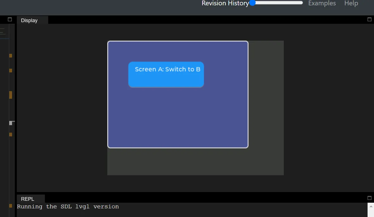
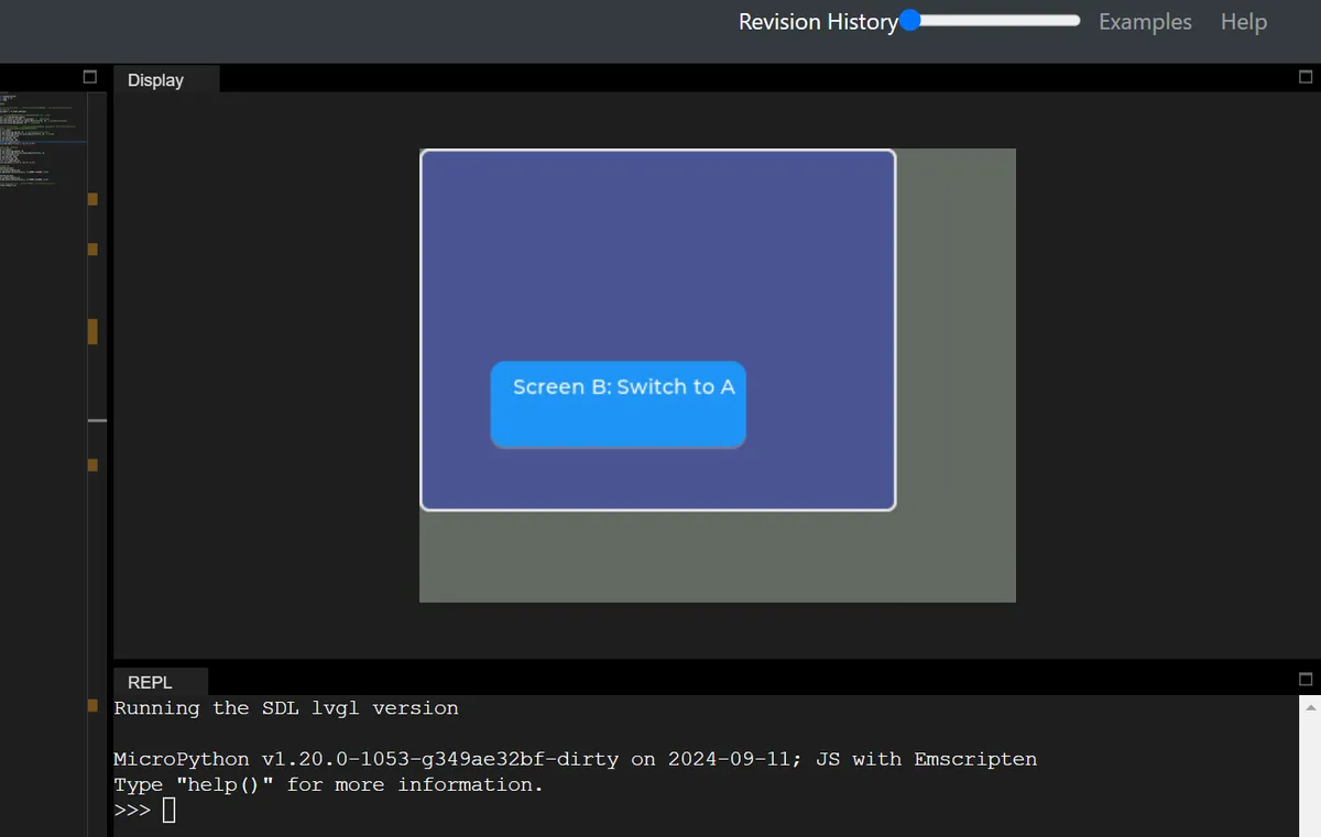
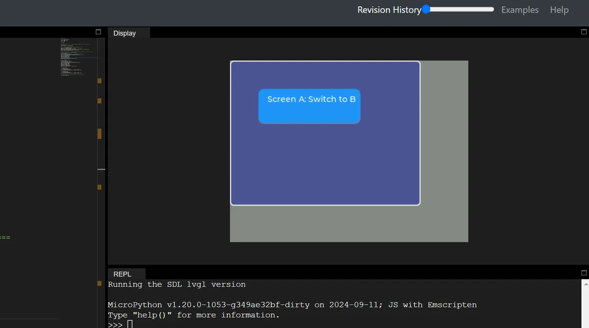
It can be seen that when switching between screens A and B, the dark blue global background remains unchanged at all times, while the light gray screen background changes accordingly with the switch.
II. Visual Style and Resource System: GUI Skins and Creatives
Styles serve as the core for controlling the visual presentation of objects. Together with basic resources such as colors, fonts and images, they collectively define the visual style of a GUI, and support highly customized and thematized configurations.
First, memorize the 3 most fundamental concepts:
| Official concept | Plain-language understanding | Example |
|---|---|---|
| Style | The widget's "appearance set" | Can define an appearance such as "red background, 2px black border, white text", like dressing up a widget |
| State | The widget's "behavior state" | A button displayed normally (default), pressed by a finger, selected, or disabled, like a person standing / sitting / running |
| Part | A complex widget's "components" | A slider is split into: background (base), progress bar (indicator), and knob (adjustment handle); each part can be styled separately |
At the same time, there are two key rules as follows:
- State priority: Each state is assigned a value (for example, pressed
LV_STATE_PRESSED= 0x0020, focusedLV_STATE_FOCUSED= 0x0002); the higher the value, the higher the priority. For instance, when a button is both "pressed and focused", the style corresponding to the "pressed" state will be applied preferentially. - Style Cascading: When multiple styles are applied to the same control, the later-applied styles will override the earlier ones (only for identical properties).
Basic visual resources include:
- Colors: Supports formats such as RGB and ARGB, allows users to create custom colors and configure transparency, and adapts to the color depth of different display devices.
- Fonts: Compatible with Unicode encoding, with built-in common fonts, support for custom fonts and icon symbols, and the capability to load fonts from files/memory at runtime, meeting the needs of multilingual support and personalized typography.
- Images: Supports multiple storage methods and color formats, provides image decoding and caching mechanisms, optimizes image loading performance, and can load image resources from the file system or memory.
2.1 Style System (Styles)
Styles in LVGL serve as the core mechanism for controlling the appearance of UI components (objects), which are designed with reference to CSS while adapted to the lightweight characteristics of embedded GUIs.
First, quickly align the core terms of LVGL styling through CSS analogy:
| LVGL concept | CSS equivalent concept | Plain explanation |
|---|---|---|
| lv_style_t | CSS class (.btn) | Container that stores style properties (such as border, color, font) |
| Target Part | CSS pseudo-element (::after) | A component's parts (such as a slider's knob, a button's text area) |
| Target State | CSS pseudo-class (:hover) | A component's state (such as pressed, focused, disabled, default) |
| Style cascading | CSS class stacking (.btn.red) | Multiple styles are stacked, with properties overridden as needed |
| Style priority | CSS priority rules | Later-added styles > earlier-added ones; local styles > normal styles |
| Inheritance | CSS inheritance (such as text color) | Child components can inherit some style properties from the parent component |
- Core Features:
- Stateful styling: Different interaction states can be bound to different styles (e. g., changing color when a button is pressed).
- Cascading and Inheritance: Styles can be inherited from parent objects or overridden via Local Styles, so as to achieve the effect of "unified global settings with fine-grained local adjustments".
- Componentization: Styles can be configured separately for different components of an object (e. g., setting colors for the button background and text respectively).
- Style Properties: Cover all-dimensional visual attributes including size, padding/margin, background, border, shadow, image, text, line, etc. , and support advanced effects such as transitions, transparency, Blend Mode, and color filters.
- Theme System: It encapsulates styles into themes to enable one-click global style switching for quick adaptation to the visual requirements of different products.
2.2 State
The State in LVGL refers to binary flag bits that describe the current behavior/status of an object (such as a button or slider), whose core function is to bind different styles to objects in different states or state combinations, so as to realize interactive effects such as "changing color on click, adding a border when focused". In mpy, state constants are called in the form of lv.STATE.XXX, and the corresponding relationship is as follows:
| MicroPython state constant | Value | Meaning | Priority (higher value = higher priority) |
|---|---|---|---|
| lv.STATE.DEFAULT | 0x0000 | Normal / released state (default fallback) | Lowest |
| lv.STATE.CHECKED | 0x0001 | Checked / toggled state (e.g. a checkbox is checked) | ↑ |
| lv.STATE.FOCUSED | 0x0002 | Focused state (triggered by keyboard / touch / mouse) | ↑ |
| lv.STATE.FOCUS_KEY | 0x0004 | Focus triggered only by keyboard / encoder (not touch) | ↑ |
| lv.STATE.EDITED | 0x0008 | Encoder edit state | ↑ |
| lv.STATE.HOVERED | 0x0010 | Mouse hover (not supported yet) | ↑ |
| lv.STATE.PRESSED | 0x0020 | Pressed state | ↑ |
| lv.STATE.SCROLLED | 0x0040 | Scrolled state | ↑ |
| lv.STATE.DISABLED | 0x0080 | Disabled state | ↑ |
| lv.STATE.USER_1 ~ 4 | 0x1000+ | Custom state (extend as needed) | Highest (user-defined) |
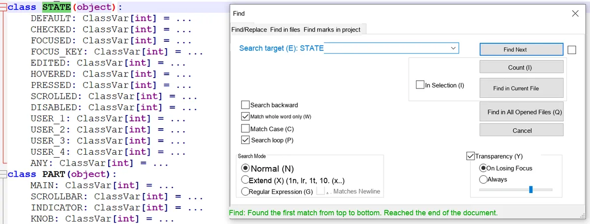
When LVGL matches styles to objects, it follows the logic of " states with higher priority override those with lower priority, and fall back to the default if no match is found ", with the core rules as follows:
- Single state: the higher the value, the higher the priority (e. g.
PRESSED (0x20)>FOCUSED (0x02)>DEFAULT (0x00)); - Combined state: Priority = sum of the values of each state (e. g.,
PRESSED | FOCUSED= 0x22, which has a higher priority than the singlePRESSED); - Fallback rule: If there is no corresponding style for the current state, the "most matching high-priority state" will be searched, and it will eventually fall back to
DEFAULTstate; if there is still no available style, the built-in default value of LVGL will be used.
Suppose the following styles are set for the button:
DEFAULT: White background (#FFFFFF);PRESSED: Gray background (#999999);FOCUSED: Red background (#FF0000);PRESSED | FOCUSED: Rose-colored background (#FF69B4).
Style matching results in different states:
- Default only: No other states, use white directly;
- Only press:
PRESSEDpriority (0x20) >DEFAULT, displayed in gray; - Only focus on:
FOCUSEDpriority (0x02) >DEFAULT, in red; - Press + Focus: First match the combined state (0x22) → rose gold; if the combined state is not set, use
PRESSED(0x20) → gray; - Check only: For the background color of the unchecked state, revert to
DEFAULT→ white.
2.3 Cascading Styles
You don't need to define all appearance attributes in a single style; you can apply multiple styles to the same object. Styles added later have higher priority (and will override the same attributes of previously added styles), however, state priority always takes precedence over cascade priority.
- CSS analogy: Similar to
<div class="btn btn-red">,btnis the base style (defines the general appearance of the button: rounded corners, padding),btn-redis the extended style (only redefines the background color as red). - Key Example:
- Basic style: dark gray by default, light gray when pressed;
- Red style: only the default state is defined as red (no pressed state);
- Effect: The button displays red by default (the added red style matches), and shows light gray when pressed (the state has higher priority, and the pressed state of the base style is a better match).
2.4 Style Inheritance
Some attributes (mainly text-related attributes such as font, text color, and text alignment) can be inherited from the parent object, and the parent object's style will be looked up upward only when none of the child object's own styles (including the default state) have set this attribute.
The parent object uses its current state to provide inherited values. For example, when a button is in the "pressed" state, if the text label inside the button has no text color configured, it will inherit the text color of the button's "pressed" state instead of the default state.
2.5 Parts
LVGL widgets consist of multiple "functional components", each of which can be styled independently (similar to CSS pseudo-elements such as:: after), enabling differentiated appearances for different areas of the widget.
Predefined Core Components (General):
Predefined Core Component Names | Meaning |
LV_PART_MAIN | Control body (e. g., the background of a button, the overall background of a slider) |
LV_PART_INDICATOR | Indicators (such as the Progress Bar of a slider, the on indicator of a switch, and the check box of a checkbox) |
LV_PART_KNOB | Adjustment handle / (e. g. the draggable button of a slider, the adjustment point of a scroll wheel) |
LV_PART_SCROLLBAR | scroll bar |
LV_PART_SELECTED | Selected item (e. g. the selected entry in a drop-down box) |
LV_PART_CURSOR | Cursor (e. g., the input cursor in a text box) |
Example: The slider consists of three components: MAIN (background), INDICATOR (Progress Bar), and (adjustment ), and you may set the to red, the Progress Bar to blue, and the background to gray respectively.
2.6 Style Initialization and Attribute Manipulation
Essentially, a style is a variable of type lv_style_t, and all operations on it must follow fixed rules:
- Storage Rule:
lv_style_tmust be static / global / dynamically allocated (cannot be a local variable of a function), otherwise the variable will be destroyed and the style will become invalid after the function finishes executing; - Initialization: Must be initialized with
lv_style_init ()before use to set properties; - Attribute Manipulation:
- Settings: Define properties (e. g., background color, border width) via the
set_<property_name>()function; - Removal:
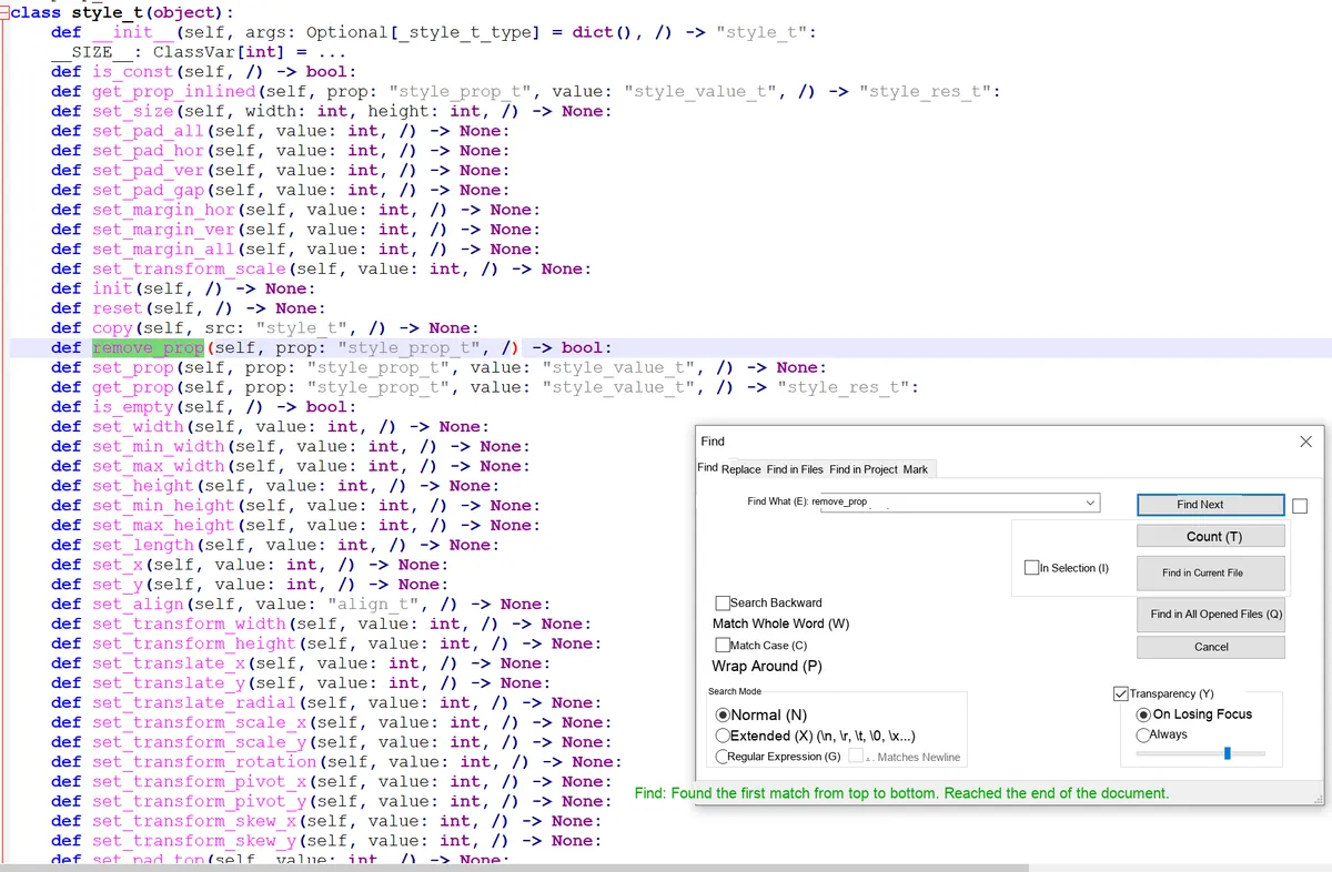
remove_prop ()can delete a certain set attribute; - Acquisition:
get_prop ()reads the attribute value, and the result is stored inlv_style_value_t(divided into three categories:numstores numerical values / booleans / opacity,colorstores colors,ptrstores pointers); - Reset:
reset ()Releases all data occupied by the style;
- Settings: Define properties (e. g., background color, border width) via the
- Constant style: A read-only
conststyle (which saves RAM) can be defined, and its properties cannot be modified after initialization.
2.7 Add / Replace / Remove Styles for Controls
A style takes effect only when bound to a control, and the core operation revolves around the "selector"(a combination of a component and its state):
- Add Style:
add_style (widget, style, selector). The selector is a combination of "part | state"(LV_PART_MAIN/LV_STATE_DEFAULTcan be omitted). For example, writing onlyLV_STATE_PRESSEDmeans "the pressed state of the main part". - Replacement Style:
replace_style ()can replace the old style corresponding to the specified selector in the control (it needs to match the selector used when adding the style); - Remove Style:
remove_style_all (): Clears all styles of the control;remove_style (): Removes the style of the specified style / selector, and you can useLV_STATE_ANY/LV_PART_ANYto match any state / part.
2.8 Style Change Notification
After modifying the style that has been bound to a control, you need to actively notify the control to refresh it, otherwise the style will not take effect:
- Simple refresh (color/transparency, etc.):
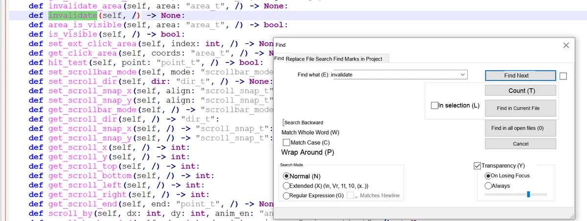
invalidate ()simply trigger the control to repaint; - Complex refresh (size / transformation, etc.):
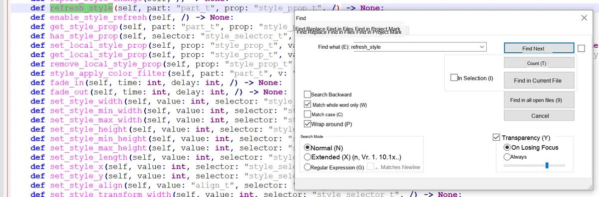
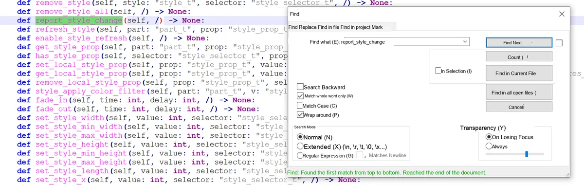
refresh_style ()allows specifying the components / properties to be refreshed, or refreshing all of them; - Global refresh:
report_style_change ()makes LVGL automatically check all widgets that use this style and refresh them.
2.9 Obtain the Final Style Property Value of the Control
You can obtain the final property value of a certain component of a control via get_style_<property_name>(control, component), and this function will automatically synthesize the following:
- Priority of cascading styles and state matching rules;
- Inherited properties of the parent object;
- Override of local styles;
- Current value of the transition animation; finally returns the actual display value in the current state (returns the LVGL built-in default value if there is no match).
2.10 Local Styles
Analogous to inline styles in CSS (<div style="color:red">), but with more powerful features:
- Features: Exclusive to the current control, cannot be shared with other controls; automatically released when the control is deleted;
- Extensibility: States and components can be specified (inline CSS styles do not have this capability), for example, setting a local red background only for the focused state of the slider ;
- Priority: Local styles take precedence over all "normal styles"(cascading styles).
2.11 Transitions
When switching the default state, style properties change immediately; transitions enable animated gradients (e. g., a 300ms gradient of the background color when a button is pressed):
- Core parameters: transition duration, delay, animation curve (easing function, e. g., fast first then slow), properties to be animated (e. g., background color, opacity);
- State Association: Different transition parameters can be configured for different states (e. g., 100ms transition when pressed, 500ms transition when released);
- Storage: Transition parameters are stored in styles. You need to define a transition descriptor first and then bind it to the style.
2.12 Opacity, Blend Mode and Transform
When setting opa (opacity), transform_angle (rotation), transform_zoom (scaling) and other properties:
- LVGL creates an "intermediate layer (snapshot)" for the
MAINpart of the widget, and implements transparency/blending/transformation effects based on the snapshot; - Memory Rule: When only setting opacity / Blend Mode, block-based rendering can be used to save memory; when rotation / scaling is set, full-layer rendering is required (resulting in higher memory usage);
- Interaction Adaptation: The clickable area of a control will be adjusted synchronously along with its transformation (e. g., rotation).
2.13 Themes
A theme is a collection of styles used to unify the default appearance of the entire interface:
- Multi-screen adaptation: different themes can be configured for different displays (e. g., color theme for color screens, black-and-white theme for monochrome screens);
- Default Theme: The default theme built into LVGL, which automatically applies default styles to all newly created widgets once enabled;
- Theme extension: You can create custom themes based on existing ones, and set a "parent theme" to form a theme chain (e. g. default theme → custom theme → dark theme), where the style priority of the parent theme is lower than that of the child theme.
2.14 Summary Table of Style Attributes
2.14.1 Dimensions and Location (Size and position)
| Property name | Function description | Default value | Inherited | Affects layout | Extra draw |
|---|---|---|---|---|---|
| width | Sets the object width; supports pixels / percentage / LV_SIZE_CONTENT | Widget-specific | No | Yes | No |
| min_width | Minimum width limit | 0 | No | Yes | No |
| max_width | Maximum width limit | LV_COORD_MAX | No | Yes | No |
| height | Sets the object height; supports pixels / percentage / LV_SIZE_CONTENT | Widget-specific | No | Yes | No |
| min_height | Minimum height limit | 0 | No | Yes | No |
| max_height | Maximum height limit | LV_COORD_MAX | No | Yes | No |
| x | X coordinate relative to the alignment reference | 0 | No | Yes | No |
| y | Y coordinate relative to the alignment reference | 0 | No | Yes | No |
| align | Alignment relative to the parent | LV_ALIGN_DEFAULT | No | Yes | No |
| transform_width | Widen the object in both directions | 0 | No | No | Yes |
| transform_height | Heighten the object in both directions | 0 | No | No | Yes |
| translate_x | X offset after layout | 0 | No | Yes | No |
| translate_y | Y offset after layout | 0 | No | Yes | No |
| transform_zoom | Zoom; 256 = original size | 0 | No | Yes | Yes |
| transform_angle | Rotation angle (in units of 0.1°) | 0 | No | Yes | Yes |
| transform_pivot_x | Transform pivot X coordinate | 0 | No | No | No |
| transform_pivot_y | Transform pivot Y coordinate | 0 | No | No | No |
2.14.2 Padding
| Property name | Function description | Default value | Inherited | Affects layout | Extra draw |
|---|---|---|---|---|---|
| pad_top | Top padding | 0 | No | Yes | No |
| pad_bottom | Bottom padding | 0 | No | Yes | No |
| pad_left | Left padding | 0 | No | Yes | No |
| pad_right | Right padding | 0 | No | Yes | No |
| pad_row | Layout row spacing | 0 | No | Yes | No |
| pad_column | Layout column spacing | 0 | No | Yes | No |
2.14.3 Margin
| Property name | Function description | Default value | Inherited | Affects layout | Extra draw |
|---|---|---|---|---|---|
| margin_top | Top margin | 0 | No | Yes | No |
| margin_bottom | Bottom margin | 0 | No | Yes | No |
| margin_left | Left margin | 0 | No | Yes | No |
| margin_right | Right margin | 0 | No | Yes | No |
2.14.4 Background
| Property name | Function description | Default value | Inherited | Affects layout | Extra draw |
|---|---|---|---|---|---|
| bg_color | Background color | 0xffffff | No | No | No |
| bg_opa | Background opacity | LV_OPA_TRANSP | No | No | No |
| bg_grad_color | Background gradient color | 0x000000 | No | No | No |
| bg_grad_dir | Gradient direction | LV_GRAD_DIR_NONE | No | No | No |
| bg_main_stop | Main color gradient start point | 0 | No | No | No |
| bg_grad_stop | Gradient color start point | 255 | No | No | No |
| bg_grad | Gradient descriptor | NULL | No | No | No |
| bg_dither_mode | Gradient dither mode | LV_DITHER_NONE | No | No | No |
| bg_img_src | Background image source | NULL | No | No | Yes |
| bg_img_opa | Background image opacity | LV_OPA_COVER | No | No | No |
| bg_img_recolor | Background image recolor color | 0x000000 | No | No | No |
| bg_img_recolor_opa | Image recolor intensity | LV_OPA_TRANSP | No | No | No |
| bg_img_tiled | Background image tiling | 0 | No | No | No |
2.14.5 Border
| Property name | Function description | Default value | Inherited | Affects layout | Extra draw |
|---|---|---|---|---|---|
| border_color | Border color | 0x000000 | No | No | No |
| border_opa | Border opacity | LV_OPA_COVER | No | No | No |
| border_width | Border width (pixels only) | 0 | No | Yes | No |
| border_side | Border sides to display | LV_BORDER_SIDE_NONE | No | No | No |
| border_post | Border drawing timing (after / before children) | 0 | No | No | No |
2.14.6 Outline
| Property name | Function description | Default value | Inherited | Affects layout | Extra draw |
|---|---|---|---|---|---|
| outline_width | Outline width | 0 | No | No | Yes |
| outline_color | Outline color | 0x000000 | No | No | No |
| outline_opa | Outline opacity | LV_OPA_COVER | No | No | Yes |
| outline_pad | Outline-to-object spacing | 0 | No | No | Yes |
2.14.7 Shadow
| Property name | Function description | Default value | Inherited | Affects layout | Extra draw |
|---|---|---|---|---|---|
| shadow_width | Shadow width | 0 | No | No | Yes |
| shadow_offset_x | Shadow X offset | 0 | No | No | Yes |
| shadow_offset_y | Shadow Y offset | 0 | No | No | Yes |
| shadow_spread | Shadow spread | 0 | No | No | Yes |
| shadow_color | Shadow color | 0x000000 | No | No | No |
| shadow_opa | Shadow opacity | LV_OPA_COVER | No | No | Yes |
2.14.8 Image
| Property name | Function description | Default value | Inherited | Affects layout | Extra draw |
|---|---|---|---|---|---|
| img_opa | Image opacity | LV_OPA_COVER | No | No | No |
| img_recolor | Image recolor blend color | 0x000000 | No | No | No |
| img_recolor_opa | Image recolor intensity | 0 | No | No | No |
2.14.9 Line
| Property name | Function description | Default value | Inherited | Affects layout | Extra draw |
|---|---|---|---|---|---|
| line_width | Line width | 0 | No | No | Yes |
| line_dash_width | Dash width | 0 | No | No | Yes |
| line_dash_gap | Dash gap | 0 | No | No | Yes |
| line_rounded | Line end rounding | 0 | No | No | Yes |
| line_color | Line color | 0x000000 | No | No | No |
| line_opa | Line opacity | LV_OPA_COVER | No | No | No |
2.14.10 Arc
| Property name | Function description | Default value | Inherited | Affects layout | Extra draw |
|---|---|---|---|---|---|
| arc_width | Arc thickness | 0 | No | No | Yes |
| arc_rounded | Arc end rounding | 0 | No | No | Yes |
| arc_color | Arc color | 0x000000 | No | No | No |
| arc_opa | Arc opacity | LV_OPA_COVER | No | No | No |
| arc_img_src | Arc mask image | NULL | No | No | No |
2.14.11 Text
| Property name | Function description | Default value | Inherited | Affects layout | Extra draw |
|---|---|---|---|---|---|
| text_color | Text color (hexadecimal RGB value) | 0x000000 (black) | Yes | No | No |
| text_opa | Text opacity, value range: - 0/LV_OPA_TRANSP (fully transparent) - 255/LV_OPA_COVER (fully opaque) - 10~90/LV_OPA_10~LV_OPA_90 (semi-transparent) | LV_OPA_COVER | Yes | No | No |
| text_font | Text font (pointer to type lv_font_t) | LV_FONT_DEFAULT (default font) | Yes | Yes | No |
| text_letter_space | Letter spacing (unit: pixels) | 0 | Yes | Yes | No |
| text_line_space | Line spacing for multi-line text (unit: pixels) | 0 | Yes | Yes | No |
| text_decor | Text decoration, supports bitwise OR combination: - LV_TEXT_DECOR_NONE (no decoration) - LV_TEXT_DECOR_UNDERLINE (underline) - LV_TEXT_DECOR_STRIKETHROUGH (strikethrough) | LV_TEXT_DECOR_NONE | Yes | No | No |
| text_align | Text alignment within a line (affects only text lines, not the object itself): - LV_TEXT_ALIGN_LEFT (left aligned) - LV_TEXT_ALIGN_CENTER (center aligned) - LV_TEXT_ALIGN_RIGHT (right aligned) - LV_TEXT_ALIGN_AUTO (auto, adapts to the text base direction) | LV_TEXT_ALIGN_AUTO | Yes | Yes | No |
2.14.12 Miscellaneous
| Property name | Function description | Default value | Inherited | Affects layout | Extra draw |
|---|---|---|---|---|---|
| radius | Corner radius | 0 | No | No | No |
| clip_corner | Clip overflow content at rounded corners | 0 | No | No | No |
| opa | Overall object opacity scaling | LV_OPA_COVER | Yes | No | No |
| color_filter_dsc | Color filter descriptor | NULL | No | No | No |
| color_filter_opa | Color filter intensity | LV_OPA_TRANSP | No | No | No |
| anim | Animation template | NULL | No | No | No |
| anim_time | Animation duration (ms) | 0 | No | No | No |
| anim_speed | Animation speed (px/sec) | 0 | No | No | No |
| transition | Style transition descriptor | NULL | No | No | No |
| blend_mode | Color blend mode | LV_BLEND_MODE_NORMAL | No | No | No |
| layout | Child widget layout | 0 | No | Yes | No |
| base_dir | Text base direction (LTR/RTL) | LV_BASE_DIR_AUTO | Yes | Yes | No |
2.15 Colors
2.15.1 Core Basic Knowledge
The color module of LVGL is the underlying core of UI rendering, which is responsible for color creation, format conversion, color adjustment and transparency control. The core principles of its design are as follows: Unified color interface —— No matter what the system-configured color depth (LV_COLOR_DEPTH) is, all APIs interact based on the lv_color_t type (fixed RGB888 format), and the framework automatically handles the underlying color depth conversion without requiring developers to pay extra attention.
lv_color_t is the standard type for color storage in LVGL, with the following core features:
- Internally, it is stored in RGB888 format (each of the red, green and blue channels has 8 bits, with a value range of 0-255);
- Decoupled from the actual color depth of the system (e. g., 16-bit RGB565,8-bit phased rollout), no manual conversion is required during API calls, and LVGL automatically adapts to the hardware;
- It serves as the input/output type for all color-related functions (such as creating colors, blending colors, and setting control styles).
RGB is the most commonly used color definition method for embedded UIs, and LVGL provides three convenient interfaces:
| Interface form | Purpose | Example |
|---|---|---|
| lv_color_make(r,g,b) | Create color dynamically (runtime) | lv_color_t c = lv_color_make(255,0,0); (pure red) |
| LV_COLOR_MAKE(r,g,b) | Constant initialization (compile time) | const lv_color_t c = LV_COLOR_MAKE(0,255,0); (pure green) |
| lv_color_hex(0xRRGGBB) | 6-digit hexadecimal (RR = red, GG = green, BB = blue) | lv_color_t c = lv_color_hex(0x0000FF); (pure blue) |
| lv_color_hex3(0xRGB) | 3-digit shorthand hexadecimal (automatically expanded to 6 digits) | lv_color_t c = lv_color_hex3(0x123); (equivalent to 0x112233) |
2.15.2 Methods for Creating Colors
2.15.1.1 RGB Mode Creation (the most basic method, directly specifying red/green/blue)
RGB is the most commonly used color definition method for embedded UIs, and LVGL provides three convenient interfaces:
| Interface form | Purpose | Example |
|---|---|---|
| lv_color_make(r,g,b) | Create color dynamically (runtime) | lv_color_t c = lv_color_make(255,0,0); (pure red) |
| LV_COLOR_MAKE(r,g,b) | Constant initialization (compile time) | const lv_color_t c = LV_COLOR_MAKE(0,255,0); (pure green) |
| lv_color_hex(0xRRGGBB) | 6-digit hexadecimal (RR = red, GG = green, BB = blue) | lv_color_t c = lv_color_hex(0x0000FF); (pure blue) |
| lv_color_hex3(0xRGB) | 3-digit shorthand hexadecimal (automatically expanded to 6 digits) | lv_color_t c = lv_color_hex3(0x123); (equivalent to 0x112233) |
2.15.1.2 HSV Mode Creation (Suitable for Dynamic Color Adjustment/Gradient)
HSV (Hue, Saturation, Value) better aligns with the human eye's perception of color, making it suitable for scenarios that require color gradients and dynamic hue adjustment:
- Hue (H): 0-359 (0 = red, 120 = green, 240 = blue);
- Saturation (S): 0-100 (0 = phased rollout, 100 = pure color);
- Value (V): 0-100 (0 = pure black, 100 = maximum brightness).
Core conversion function:
lv_color_hsv_to_rgb(h, s, v): HSV to RGB (returnslv_color_t);lv_color_rgb_to_hsv(r, g, b): RGB values to HSV;lv_color_to_hsv(color):lv_color_ttype to HSV.
2.15.1.3 Palette Creation (Material Design Preset Colors, Simplified UI Color Matching)
LVGL has a built-in Material Design color palette that provides 19 base colors, each consisting of a main color, 4 dark variants and 5 light variants, eliminating the need for manual RGB value adjustment and ensuring consistent UI colors.
How to use the palette:
- Get the main color:
lv_palette_main (LV_PALETTE_XXX); - Get the light variant:
lv_palette_lighten (LV_PALETTE_XXX, v)(v = 1~5, the larger the number, the lighter the color); - Get the dark variant:
lv_palette_darken (LV_PALETTE_XXX, v)(v = 1~4; the larger the number, the darker the color).
2.15.3 Modification and Blending of Colors
LVGL provides convenient functions to adjust color brightness and blend two colors, meeting the needs of dynamic UIs (such as button pressed/hover states, gradient backgrounds):
| Function name | Function | Parameter description |
|---|---|---|
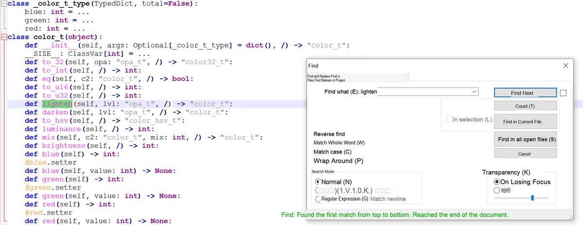
| lv_color_lighten(c, lvl) | Lighten color | lvl=0 (unchanged) ~ 255 (all white) |
| lv_color_darken(c, lvl) | Darken color | lvl=0 (unchanged) ~ 255 (all black) |
| lv_color_change_lightness(c, lvl) | Overall brightness adjustment | lvl=0 (all black), 128 (unchanged), 255 (all white) |
| lv_color_mix(c1, c2, ratio) | Mix two colors | ratio=0 (all c2), 128 (half each), 255 (all c1) |
2.15.4 Transparency
LVGL uses the lv_opa_t type (based on uint8_t, with values ranging from 0 to 255) to describe transparency, which centers on the concept of "coverage": the higher the value, the less transparent the color, and the more of the underlying content it obscures.
2.15.5 Core Constants
Palette base color constants:
| Constant name | Corresponding color | Constant name | Corresponding color |
|---|---|---|---|
| LV_PALETTE_RED | Red | LV_PALETTE_GREEN | Green |
| LV_PALETTE_PINK | Pink | LV_PALETTE_LIGHT_GREEN | Light green |
| LV_PALETTE_PURPLE | Purple | LV_PALETTE_LIME | Lime |
| LV_PALETTE_DEEP_PURPLE | Deep purple | LV_PALETTE_YELLOW | Yellow |
| LV_PALETTE_INDIGO | Indigo | LV_PALETTE_AMBER | Amber |
| LV_PALETTE_BLUE | Blue | LV_PALETTE_ORANGE | Orange |
| LV_PALETTE_LIGHT_BLUE | Light blue | LV_PALETTE_DEEP_ORANGE | Deep orange |
| LV_PALETTE_CYAN | Cyan | LV_PALETTE_BROWN | Brown |
| LV_PALETTE_TEAL | Teal | LV_PALETTE_BLUE_GREY | Blue gray |
| LV_PALETTE_GREY | Gray | - | - |
Transparency Constants:
| Constant name | Value | Meaning | Constant name | Value | Meaning |
|---|---|---|---|---|---|
| LV_OPA_TRANSP | 0 | Fully transparent | LV_OPA_60 | 153 | 60% opaque |
| LV_OPA_10 | 25 | 10% opaque (almost transparent) | LV_OPA_70 | 178 | 70% opaque |
| LV_OPA_20 | 51 | 20% opaque | LV_OPA_80 | 204 | 80% opaque |
| LV_OPA_30 | 76 | 30% opaque | LV_OPA_90 | 229 | 90% opaque (almost opaque) |
| LV_OPA_40 | 102 | 40% opaque | LV_OPA_COVER | 255 | Fully opaque (default) |
| LV_OPA_50 | 128 | 50% opaque (semi-transparent) | - | - | - |
2.16 Fonts and Icons
The font module of LVGL is the core of text rendering, essentially a package of "glyph bitmap set + rendering control information". All fonts are ultimately stored in the lv_font_t structure, and are bound for use via the text_font field of the widget style.
2.16.1 Core Fundamentals: Pixel Precision of Fonts (bpp)
bpp (bits per pixel, short for bits per pixel) is the most fundamental core attribute of a font, which determines the edge smoothness and memory footprint of the font:
- Function: Describes the "transparency precision" of font pixels; the higher the value, the better (smoother) the anti-aliasing effect of font edges.
- Optional values: 1,2, 4,8 (only these four values are supported);
- Memory Trade-off: The font memory footprint at bpp= 4 is approximately 4 times that at bpp= 1, while it is 8 times when bpp= 8;
- Default Rule: The built-in Montserrat font uses bpp= 4 by default to balance image quality and memory usage.
2.16.2 Unicode and Symbol Support (Basic Text Rendering)
LVGL natively supports UTF-8 encoding Unicode characters, which serves as the foundation for multi-language and symbol rendering:
2.16.2.1 Enablement Conditions
Ensure that lv_conf.h has LV_TXT_ENC = LV_TXT_ENC_UTF8 (enabled by default), and the code files are saved in UTF-8 encoding.
2.16.2.2 Usage of Built-in Symbols
LVGL extends built-in fonts with FontAwesome icons (such as check marks, WiFi symbols, play buttons, etc.), which can be used directly via the LV_SYMBOL_XXX constants:
- Used alone:
lv_label_set_text(label, LV_SYMBOL_OK); - Concatenate with text:
lv_label_set_text (label, LV_SYMBOL_OK " Confirm"); - Multiple symbols concatenated:
lv_label_set_text(label, LV_SYMBOL_OK LV_SYMBOL_WIFI).
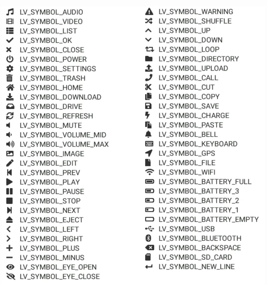
2.16.3 Built-in Fonts
LVGL provides multiple types of built-in fonts, which need to be enabled via lv_conf.h using the LV_FONT_… macros, and are mainly divided into two categories: "ordinary fonts" and "special fonts":
2.16.3.1 Regular Font (Montserrat Family)
Based on the Montserrat font, it covers ASCII characters, the degree sign (U+ 00B0), bullet point (U+ 2022) and built-in symbols, offers 19 sizes ranging from 12px to 48px, and follows the naming convention of LV_FONT_MONTSERRAT_<size>(for example, LV_FONT_MONTSERRAT_16), which corresponds to the global variable lv_font_montserrat_16.
2.16.3.2 Special Font
| Constant name | Feature | Applicable scenarios |
|---|---|---|
| LV_FONT_MONTSERRAT_28_COMPRESSED | 28px, 3bpp + compressed storage | Large screens with low memory |
| LV_FONT_DEJAVU_16_PERSIAN_HEBREW | 16px, supports Hebrew / Arabic / Persian | Middle Eastern language interfaces |
| LV_FONT_SIMSUN_16_CJK | 16px, includes 1000 common CJK characters | Basic CJK (Chinese, Japanese, Korean) interface |
| LV_FONT_UNSCII_8/16 | 8/16px, pixel style, ASCII only | Retro pixel-style UI, low-memory devices |
2.16.4 Special Rendering Features of Fonts
2.16.4.1 Bidirectional Text (BiDi) Support
Supports rendering for left-to-right (LTR) and right-to-left (RTL) languages (such as Arabic and Hebrew), as well as mixed-direction text:
- Enable:
lv_conf.hturn onLV_USE_BIDI; - Basic direction: It can be configured via
lv_obj_set_base_dir (obj, dir)for any widget, and child widgets automatically inherit the direction setting from their parent; - Core constants:
LV_BASE_DIR_LTR(default),LV_BASE_DIR_RTL,LV_BASE_DIR_AUTO(auto-detection); - Effect: In RTL mode, the control creation position, Tab bar, checkboxes, etc. will automatically adapt to the right-to-left layout.
2.16.4.2 Arabic / Persian Character Support
The character forms of such languages vary depending on their position (isolated/initial/medial/final), and LVGL enables LV_USE_ARABIC_PERSIAN_CHARS to support this rule, but there are 3 limitations:
- Only static text display such as Label is supported, while Text Area for text input is not supported;
- Only dynamic text (
lv_label_set_text ()) is processed, while static text (lv_label_set_text_static ()) is not processed; - The returned result when retrieving the text is the processed form.
2.16.4.3 Subpixel Rendering
By leveraging the RGB sub-pixel layout of screen pixels, the horizontal resolution is tripled, resulting in smoother font edges:
- Enabling condition: check "Subpixel"(for online converter) / add
--lcdflag (for command line) when generating fonts; - Memory cost: The memory usage of the font increases by approximately 3 times;
- Adaptation: It is necessary to match the screen sub-pixel order (RGB/BGR), which can be configured via
LV_SUBPX_BGR.
Serial No. | Function | Description | Enabling / Configuration Method | Restrictions / Precautions |
1 | Bidirectional Text (BiDi) Support | It supports left-to-right (LTR) and right-to-left (RTL) languages (such as Arabic and Hebrew), and also supports mixed-direction text rendering. | Enable | In RTL mode, the control creation position, Tab bar, checkboxes and other elements will automatically adapt to the right-to-left layout. |
2 | Arabic / Persian character support | It supports the character forms of such languages that vary according to their position (isolated / initial / medial / final). | Enable | Only supports the display of static text such as |
3 | Subpixel Rendering | By leveraging the RGB sub-pixel layout of screen pixels, it improves the horizontal resolution to make font edges more delicate. | When generating fonts, check the "Subpixel" option (in the online converter), or add the | Font memory increases by approximately 3x; it is necessary to match the sub-pixel order (RGB / BGR) of the screen. |
4 | Subset Font | Compresses font bitmaps to reduce memory usage, making it suitable for large-sized fonts. | Check the "Compressed" option in the online converter; this feature is enabled by default in the command line, and you can use | The rendering speed is approximately 30% slower; it is recommended to only compress large-sized, infrequently used fonts; the compression effect is more significant for large-size / high-bpp fonts. |
5 | Kerning | Adjust the spacing between specific character pairs (e. g., "AV", "Ta") to enhance the visual appeal of typesetting. | Generated by the online converter by default; add | FreeType integration is not supported for the time being; Tiny TTF supports GPOS/Kern tables. |
2.16.5 Font Extension (Custom / Dynamic Loading)
Serial No. | Functions | Description | Implementation / Configuration | Restrictions / Notes |
1 | Add New Fonts (Core Extension Method) | LVGL does not natively support vector fonts such as TTF and WOFF, which need to be converted into bitmap fonts before use. | ① Online converter: Configure dimensions, bpp, and character range, then generate a C file to add to the project; ② Offline converter (Node.js): Suitable for batch and local generation; ③ Built-in Font Script (Python): Generates Montserrat fonts with custom dimensions and character ranges. | It must be converted to a bitmap font before use; the font size increases significantly with the dimensions and character set. |
2 | Add New Symbol | Extend custom symbols (such as USB, battery icons) based on FontAwesome. | ① Obtain the Unicode ID of the symbol; ② Import FontAwesome in the online converter and specify the corresponding Unicode; ③ Generate the font file; ④ Define and use constants after converting Unicode to UTF-8. | Ensure that the corresponding Unicode characters are included in the font, and different encoding formats are converted correctly. |
3 | Load fonts at runtime | Supports dynamic font loading from files or memory (not embedded at compile time). | Enable the LVGL file system; ① File loading: ② Memory loading: | The font needs to be converted to |
4 | Custom Font Engine | Replace the LVGL built-in bitmap font engine (e. g., integrate FreeType to render TTF). | Implement two core callbacks: ① ② | It features high implementation complexity, and requires handling issues such as caching and Performance optimization on your own. |
5 | Font Fallback | When the primary font lacks certain characters, it will automatically render them using a fallback font, which is suitable for multi-language and multi-symbol scenarios. | Settings: | Excessively long fallback chains will impact performance; it is necessary to properly plan the font coverage. |
2.16.6 Core Constant Table
2.16.6.1 Basic Direction Constants (BiDi-related)
| Constant name | Value / Meaning | Applicable scenarios |
|---|---|---|
| LV_BASE_DIR_LTR | 0, left to right (default) | Chinese / English / European languages |
| LV_BASE_DIR_RTL | 1, right to left | Arabic / Hebrew / Persian |
| LV_BASE_DIR_AUTO | 2, auto-detect | Mixed-direction text |
2.16.6.2 Built-in Common Font Constants (Montserrat Family)
| Constant name | Size (px) | Constant name | Size (px) |
|---|---|---|---|
| LV_FONT_MONTSERRAT_12 | 12 | LV_FONT_MONTSERRAT_30 | 30 |
| LV_FONT_MONTSERRAT_14 | 14 | LV_FONT_MONTSERRAT_32 | 32 |
| LV_FONT_MONTSERRAT_16 | 16 | LV_FONT_MONTSERRAT_34 | 34 |
| LV_FONT_MONTSERRAT_18 | 18 | LV_FONT_MONTSERRAT_36 | 36 |
| LV_FONT_MONTSERRAT_20 | 20 | LV_FONT_MONTSERRAT_38 | 38 |
| LV_FONT_MONTSERRAT_22 | 22 | LV_FONT_MONTSERRAT_40 | 40 |
| LV_FONT_MONTSERRAT_24 | 24 | LV_FONT_MONTSERRAT_42 | 42 |
| LV_FONT_MONTSERRAT_26 | 26 | LV_FONT_MONTSERRAT_44 | 44 |
| LV_FONT_MONTSERRAT_28 | 28 | LV_FONT_MONTSERRAT_46/48 | 46/48 |
2.16.6.3 Transparency /bpp Related
| Constant name | Meaning | Font bpp options |
|---|---|---|
| LV_OPA_TRANSP | Fully transparent (0) | 1/2/4/8 |
| LV_OPA_COVER | Fully opaque (255) | - |
2.17 Image
The "image" in LVGL is essentially a combination of bitmap data and metadata. The metadata contains key information such as dimensions and color format, and its core design revolves around "lightweight storage", "format adaptability" and "high-performance rendering" to adapt to the memory and hardware constraints of embedded scenarios.
2.17.1 Core Fundamentals: Image Storage Methods
LVGL supports two image storage formats, which are respectively adapted to the scenarios of "fixed resources" and "flexible update":
| Storage method | Storage location | Core carrier | Advantages | Disadvantages |
|---|---|---|---|---|
| Variable storage | Internal memory (RAM/ROM) | lv_image_dsc_t struct | Linked into the program at compile time, resource usage is controllable; no extra IO needed for rendering | Changing an image requires recompiling the project |
| File storage | External storage (SD card / SPI Flash) | LVGL file system driver | Images can be updated independently without rebuilding the main program | Must be loaded into RAM before rendering, IO takes time; low resource friendliness |
lv_image_dsc_t Core Structure (Variable Storage Foundation)
This struct serves as the core encapsulation of memory images, with the following key fields:
header.cf: Color format (determines the storage rule for image pixels);header.w/h: Image width / height (max. 2048px);data: Pointer to the bitmap data;data_size: Byte length of the bitmap data.
2.17.2 Core Foundation: Color Format (Underlying Rules for Image Rendering)
The color format determines the encoding method of image pixels. LVGL divides them into two categories: "built-in formats" and "raw formats", which are the key to adapting images to hardware:
2.17.2.1 Built-in Color Formats (Directly Supported for Rendering)
| Format category | Specific type | Core features | Applicable scenarios |
|---|---|---|---|
| Native format | LV_COLOR_FORMAT_NATIVE | Stores RGB data at the color depth configured in LVGL | Ordinary color images, matching the hardware's native color depth |
| Native with Alpha | LV_COLOR_FORMAT_NATIVE_WITH_ALPHA | Native format + one Alpha byte per pixel | Color images with transparency |
| Indexed color format | LV_COLOR_FORMAT_I1/I2/I4/I8 | Palette mode (2/4/16/256 colors), each pixel takes 1/2/4/8 bits | Images with low color depth and few colors (such as icons) |
| Alpha-only format | LV_COLOR_FORMAT_A1/A2/A4/A8 | Stores only Alpha values, color is determined by style.img_recolor | Single-tone images whose color can change dynamically (such as font-type bitmaps) |
2.17.2.2 Byte Storage Order in Native Format
Under different color depths, LV_COLOR_FORMAT_NATIVE the byte arrangement rule is as follows:
- 32-bit color depth: Byte 0 = Blue → Byte 1 = Green → Byte 2 = Red → Byte 3 = Alpha (when Alpha is included);
- 16-bit color depth: Byte 0 = lower 3 bits of green + 5 bits of blue → Byte 1 = 5 bits of red + upper 3 bits of green → Byte 2 = Alpha (when Alpha is included);
- 8-bit color depth: Byte 0 = 3 bits for red + 3 bits for green + 2 bits for blue → Byte 2 = Alpha (when Alpha is present).
2.17.2.3 Original Format (External Decoder Required)
For common formats such as PNG and JPG that are not directly supported by LVGL, it needs to be used with the "image decoder":
LV_COLOR_FORMAT_RAW: Basic raw format (e. g. pure PNG/JPG);LV_COLOR_FORMAT_RAW_ALPHA: Raw format with an Alpha channel.
2.17.3 Adding and Using Images
2.17.3.1 Two Methods for Adding Images
- Online Converter (Recommended): Upload BMP/PNG/JPG files, configure the name, color format, and output type (variable / binary), then generate files for direct integration; the generated C file will contain all color depth data, but only the part matching
LV_COLOR_DEPTHwill be linked; - Manual creation: Construct the
lv_image_dsc_tstruct at runtime, or dynamically generate an image using the Canvas widget.
2.17.3.2 Core Logic of Image Usage
Render via the lv_image control, simply set the data source:
- Variable storage: bind the
lv_image_dsc_tpointer; - File storage: Specify the file path (you need to register the file system driver first).
2.17.4 Image Decoder
LVGL natively only supports indexed color, native color, etc. , and external decoding libraries need to be integrated for PNG/JPG formats:
- Core: Implement 4 callbacks, namely info (obtain image information), open (decoding), get_area (optional, regional decoding), and close (release resources);
- Mechanism: Multiple decoders can be registered, which will be automatically matched by LVGL; the built-in decoders only support indexed color, RGB565 and RGB888.
2.17.5 Image Post-processing
Adjust the image data after decoding (such as alpha premultiplication and row alignment) to adapt to hardware requirements; mark the processing status to avoid repeated operations.
2.17.6 Image Cache (Performance optimization)
- Purpose: To avoid repeated decoding/reading of PNG/JPG files and improve efficiency;
- Configuration: Set the cache size via LV_CACHE_DEF_SIZE (default: 0), evict entries based on decoding time consumption + usage count; cache needs to be manually invalidated upon file modification;
- Customizable caching algorithms are supported.
2.17.7 Core Constants
| Category | Constant / Macro | Core meaning |
|---|---|---|
| Color format | LV_COLOR_FORMAT_NATIVE | Native RGB, ordinary color image |
| NATIVE_WITH_ALPHA | Native RGB+Alpha, color image with transparency | |
| I1/I2/I4/I8 | Indexed color, low color depth image | |
| A1/A2/A4/A8 | Alpha only, single-tone image | |
| RAW/RAW_ALPHA | Needs decoding, PNG/JPG (RAW_ALPHA has transparency) | |
| Cache | LV_CACHE_DEF_SIZE | Default cache size (0, disabled) |
| PTR/FILE | Cache source: memory pointer / file path | |
| Decoder return value | LV_RESULT_OK | Operation succeeded |
| LV_RESULT_INVALID | Format not supported |
III. Interaction and Event Handling: The Interaction Nerve of GUI
Realizing a complete interaction chain of "user operation → interface response" through input device adaptation and event mechanism is the core of the operability of GUI.
3.1 Input Device Adaptation (Input devices)
The input devices defined by LVGL are mainly divided into four categories, covering the mainstream interaction methods in embedded scenarios:
- Pointer-type devices: devices such as touchpads and mice that can control the movement of the cursor;
- Keyboard devices: key assembly devices such as standard keyboards and numeric keypads;
- Encoder: A -type device that supports left/right rotation and press operations;
- External hardware keys: physical keys bound to specific positions on the screen.
- Supported Types: Compatible with mainstream embedded input hardware such as pointer-class devices (touch, mouse), keyboards, encoders (, etc.
- Working Logic: Convert hardware input signals into input events recognizable by LVGL, and deliver them to the corresponding objects to implement operations such as tapping, swiping, and key pressing.
3.1.1 Core Interaction Mechanism
Category | Core Interaction Capability | Key Mechanisms / Events | Important Supplement |
Pointer Devices (Pointers) | Cursor, Gesture | Cursor: An image object can be bound as the cursor for an input device; Gesture: | The cursor object needs to remove the "clickable" flag (disabled by default for image objects); By default, gestures are propagated to the parent object; to prevent this propagation, you need to remove Objects that are scrolling will not trigger gestures; After handling the gesture, you can call |
Keyboard / Encoder (Keypad and encoder) | No cursor, relies on Group interaction | First create a group and add UI components to it; There is always only one focused object within the group; The input device shall be associated with a group; Default groups can be configured | One device can only be bound to one group, while one group can receive inputs from multiple devices; Buttons, sliders, text boxes and other controls can all be added to groups to simplify interaction development |
Encoder Navigation / Edit Mode | Turn left, turn right, press | Navigation mode: Rotating left/right switches the focused object ( Edit Mode: Rotating left/right corresponds to modifying values or states ( | The "dual mode" is used to compensate for the limitation that the encoder only has three actions: left rotation, right rotation and pressing. |
Style Feedback | Interactive state-driven style changes |
|
|
3.1.2 Core Constants (Predefined Keys)
The core of the interaction between the keyboard / encoder lies in the key constants predefined by LVGL, which map the general interaction logic. To realize standardized interaction, it is necessary to map the hardware keys to these constants. The following is the function description of the core constants:
| Constant name | Function meaning |
|---|---|
| LV_KEY_NEXT | Focus the next object in the group |
| LV_KEY_PREV | Focus the previous object in the group |
| LV_KEY_ENTER | Triggers press, click, long-press and other events (e.g., button click, confirm action) |
| LV_KEY_UP | Increase value / move up (e.g., slider up, text box cursor up) |
| LV_KEY_DOWN | Decrease value / move down |
| LV_KEY_RIGHT | Increase value / move right (e.g., slider right, text box cursor right) |
| LV_KEY_LEFT | Decrease value / move left |
| LV_KEY_ESC | Close / exit (e.g., close dropdown list, exit current page) |
| LV_KEY_DEL | Delete the character to the right of the cursor (e.g., text box editing) |
| LV_KEY_BACKSPACE | Delete the character to the left of the cursor (e.g., text box editing) |
| LV_KEY_HOME | Jump to the beginning / top (e.g., text box cursor to the beginning, list to the top) |
| LV_KEY_END | Jump to the end (e.g., text box cursor to the end, list to the bottom) |
Instructions: In the
read_cb ()callback function of the input device, you only need to map the core constants (NEXT/PREV/ENTER/LEFT/RIGHT) to cover most interaction scenarios; for the encoder, only the three constants LEFT/RIGHT/ENTER need to be mapped.
3.2 Event Mechanism (Events)
3.2.1 Core Definition of an Event
The event system of LVGL serves as the "nerve center" for GUI interaction, which captures various behaviors including user operations, system state changes, and widget lifecycle events, and triggers custom logic accordingly.
An event is LVGL's notification mechanism for "noteworthy behaviors or state changes", and the triggering scenarios include:
- User interaction: triggered by control clicks, scrolling, keystrokes, and gesture operations;
- System status: control redraw, size/style/layout change, object creation/deletion, screen switch;
- Custom Behavior: Custom logic triggered manually by the user.
Scope of Application: Not only common controls (buttons, sliders, labels) can listen for events, but also displays and input devices can register event listeners.
The core features are as follows:
- Event Binding: Allows adding/removing event callbacks for objects to respond to events such as click, long press, status change, value change, etc.
- Event propagation: supports event bubbling (events of child objects are propagated upward to parent objects), allows manual event dispatching, and enables flexible implementation of complex interaction logic.
- Event context: It passes information such as event sources and parameters via the
lv_event_tstruct, enabling the callback function to accurately handle interaction scenarios.
3.2.2 Event Binding and Removal
3.2.2.1 Event Binding
- Core logic: Associate a "callback function" with an object and specify the event type to be monitored (e. g., only monitor clicks, or monitor all events);
- Key Features:
- Multiple event callbacks can be bound to a single object (e. g., listening for both "press" and "click" events simultaneously), and their execution order follows the sequence in which they are bound;
- The same callback function can be bound to multiple objects, or bound to the same object multiple times (with different custom data passed);
- It supports passing custom data (specified when binding events), which can be obtained in the callback to implement differentiated logic;
- The event binding logic of the display screen and input devices is completely consistent with that of the controls.
3.2.2.2 Event Removal
- Core logic: You need to first traverse the event list of the object, find the event descriptor corresponding to the target callback, and then remove it via the index;
- Applicable scenario: When you no longer need to listen for a certain type of event (e. g., cleaning up callbacks before a control is destroyed).
3.2.3 Event Code Classification
| Event category | Event code | Function description |
|---|---|---|
| Input device events (can be received by all widgets) | LV_EVENT_PRESSED | Object is pressed (triggered once) |
| LV_EVENT_PRESSING | Object is being continuously pressed (triggered repeatedly while pressed) | |
| LV_EVENT_PRESS_LOST | Object is still pressed, but the cursor / finger slides out of the object area | |
| LV_EVENT_SHORT_CLICKED | Object is released after a short press (not triggered if scrolling occurred) | |
| LV_EVENT_LONG_PRESSED | Object press duration reaches the long-press threshold (not triggered if scrolling occurred) | |
| LV_EVENT_LONG_PRESSED_REPEAT | After the long-press threshold, triggered once every specified interval (not triggered if scrolling occurred) | |
| LV_EVENT_CLICKED | Triggered on release (regardless of short or long press; not triggered if scrolling occurred) | |
| LV_EVENT_RELEASED | Triggered in all release scenarios (including release after sliding out of the object) | |
| LV_EVENT_SCROLL_BEGIN | Scrolling begins; the event parameter is a pointer to the scroll animation (modifiable) | |
| LV_EVENT_SCROLL_THROW_BEGIN | Scroll throw begins (no additional notes) | |
| LV_EVENT_SCROLL_END | Scrolling ends | |
| LV_EVENT_SCROLL | Triggered during scrolling | |
| LV_EVENT_GESTURE | Gesture detected; the gesture direction can be obtained with lv_indev_get_gesture_dir() | |
| LV_EVENT_KEY | A key is sent to the object; the key can be obtained with lv_indev_get_key() | |
| LV_EVENT_FOCUSED | Object gains focus | |
| LV_EVENT_DEFOCUSED | Object loses focus | |
| LV_EVENT_LEAVE | Object loses focus but remains selected | |
| LV_EVENT_HIT_TEST | Perform advanced hit testing | |
| LV_EVENT_INDEV_RESET | Input device is reset | |
| Draw events (can be received by all widgets) | LV_EVENT_COVER_CHECK | Check whether the object fully covers an area; the event parameter is lv_cover_check_info_t * |
| LV_EVENT_REFR_EXT_DRAW_SIZE | Get the extra drawing area needed around the object (e.g., shadow); the event parameter is int32_t * (stores the size) | |
| LV_EVENT_DRAW_MAIN_BEGIN | Main drawing phase begins | |
| LV_EVENT_DRAW_MAIN | Perform main drawing logic | |
| LV_EVENT_DRAW_MAIN_END | Main drawing phase ends | |
| LV_EVENT_DRAW_POST_BEGIN | Post-drawing phase begins (after all child objects are drawn) | |
| LV_EVENT_DRAW_POST | Perform post-drawing logic (after all child objects are drawn) | |
| LV_EVENT_DRAW_POST_END | Post-drawing phase ends (after all child objects are drawn) | |
| LV_EVENT_DRAW_TASK_ADDED | Triggered when a draw task is added | |
| Special events (widget-specific, triggered only by certain widgets) | LV_EVENT_VALUE_CHANGED | Object value changes (e.g., slider drag, progress bar update) |
| LV_EVENT_INSERT | Text is inserted into the object; the event data is the inserted string (char *) | |
| LV_EVENT_REFRESH | Notifies the object to refresh its own content (for user-initiated triggering) | |
| LV_EVENT_READY | A process has completed | |
| LV_EVENT_CANCEL | A process was cancelled | |
| Other events (can be received by all widgets) | LV_EVENT_CREATE | Object is being created |
| LV_EVENT_DELETE | Object is being destroyed | |
| LV_EVENT_CHILD_CHANGED | Child object is removed / added, or its size / position changes | |
| LV_EVENT_CHILD_CREATED | Child object is created (bubbles up to all parent objects) | |
| LV_EVENT_CHILD_DELETED | Child object is destroyed (bubbles up to all parent objects) | |
| LV_EVENT_SCREEN_UNLOAD_START | Screen unload starts (triggered immediately when scr_load is called) | |
| LV_EVENT_SCREEN_LOAD_START | Screen load starts (triggered after the screen switch delay expires) | |
| LV_EVENT_SCREEN_LOADED | Screen load finished | |
| LV_EVENT_SCREEN_UNLOADED | Screen unload finished | |
| LV_EVENT_SIZE_CHANGED | Object coordinates / size changed | |
| LV_EVENT_STYLE_CHANGED | Object style changed | |
| LV_EVENT_LAYOUT_CHANGED | Child object position changed due to layout recalculation | |
| LV_EVENT_GET_SELF_SIZE | Get the widget's internal self size | |
| Display event (received only by display objects) | LV_EVENT_INVALIDATE_AREA | Display area invalidated (needs redraw) |
| LV_EVENT_RESOLUTION_CHANGED | Display resolution changed | |
| LV_EVENT_COLOR_FORMAT_CHANGED | Display color format changed | |
| LV_EVENT_REFR_REQUEST | Display requests refresh | |
| LV_EVENT_REFR_START | Display refresh starts | |
| LV_EVENT_REFR_READY | Display refresh ready | |
| LV_EVENT_RENDER_START | Display rendering starts | |
| LV_EVENT_RENDER_READY | Display rendering ready | |
| LV_EVENT_FLUSH_START | Display flush starts | |
| LV_EVENT_FLUSH_FINISH | Display flush finished | |
| Custom event (registered by the user, not triggered by LVGL itself) | Custom event code | 1. Register a custom event code via lv_event_register_id() (e.g. uint32_t MY_EVENT_1 = lv_event_register_id()); 2. Send it manually to any object via lv_event_send(obj, custom event code, &data) |
Of course, there are also manually dispatched events and the special Refresh event:
| Event category | Core API / trigger method | Function description | Example scenario |
|---|---|---|---|
| Send event manually (general) | 1. Widget: lv_obj_send_event(obj, <EVENT_CODE>, &some_data) 2. Display: lv_display_send_event(obj, <EVENT_CODE>, &some_data) 3. Input device: lv_indev_send_event(obj, <EVENT_CODE>, &some_data) | Actively triggers the target event on the specified object and can pass custom data; used to simulate user actions / system state changes instead of triggering the event through real interaction | Simulate a button press: send LV_EVENT_VALUE_CHANGED with the button ID to close the message box manually |
| Refresh special event (LV_EVENT_REFRESH) | Must be sent manually via lv_obj_send_event() (LVGL does not trigger this event automatically) | A refresh notification mechanism designed for the user, used to tell an object to update its own state, appearance or business logic | 1. A label refreshes its text from a variable (e.g. showing the real-time clock) 2. Refresh a label's displayed text when the language changes 3. Enable a button after the correct PIN is entered 4. Add / remove a warning style on an object when a value exceeds its limit |
3.2.4 lv_event_t: Core Parameter for Event Callbacks
3.2.4.1 Core Concepts
In LVGL development with MicroPython (MPY), event_t (corresponding to lv_event_t in C language) is the only parameter received by the event callback function, which encapsulates all context information of the event, including event type, triggering object, custom data, etc.
MPY wraps the C-language lv_event_get_xxx (e) function form into a event_t class member method (such as e.get_code ()) that better conforms to Python syntax; it has no pointer concept, and all return values are class instances encapsulated by LVGL-MPY (such as the widget object obj and the area object area_t), serving as the "core hub" for event processing.
3.2.4.2 Summary Table of Core Methods
| Category | Method name (MPY) | Core meaning | Typical use case / notes |
|---|---|---|---|
| Basic core methods (must know) | get_code() | Get the event code that triggered the current callback (e.g. LV_EVENT_CLICKED/LV_EVENT_VALUE_CHANGED) | Branching in a callback: "run logic A on a click event, run logic B on a value-changed event" |
| get_target() / get_target_obj() | Get the widget object that originally triggered the event (with event bubbling, still returns the original child widget) | When a parent container listens to child widget events, pinpoints "who triggered the event" | |
| get_current_target() / get_current_target_obj() | Get the widget object currently handling the event (with event bubbling, returns the parent container when the parent handles it) | Same return value as get_target_obj() when there is no bubbling; with bubbling, distinguishes the "trigger" from the "handler" | |
| get_user_data() | Get the custom user data passed when the event was bound (e.g. button ID, config dict) | Multiple widgets share one callback and use user_data to distinguish the handling logic | |
| get_param() | Get the event parameter passed when the event was sent manually (e.g. the button ID of a simulated button click) | Pass data when triggering an event manually to implement custom interaction | |
| Event flow control | stop_bubbling() | Stop the event from bubbling up (the parent container no longer receives it) | After a child widget handles the event, prevents the parent container from responding again |
| stop_processing() | Terminate all subsequent event callbacks of the current object | After the event is handled, stop redundant callback execution | |
| Input device related | get_indev() | Get the input device object that triggered the event (touchscreen / key / encoder) | Distinguish the event source: determine whether it was triggered by touch or by a key |
| get_key() | Get the key value of an LV_EVENT_KEY event (integer type) | Key interaction: determine whether the confirm key / back key / arrow key was pressed | |
| get_rotary_diff() | Get the increment of a rotary encoder (positive or negative indicates rotation direction) | Encoder interaction: adjust volume / slider value based on the increment | |
| Scroll / animation related | get_scroll_anim() | Get the animation object of the scroll animation (anim_t) | Custom scroll animation: modify scroll duration / easing curve |
| Drawing / layout specific (custom widgets) | set_ext_draw_size(size) | Set the extra draw area size of the widget (e.g. the area that a shadow / border extends beyond) | When a custom widget adds a shadow, specify the extra drawing space |
| get_self_size_info() | Get the widget's self size information (point_t, x = width / y = height) | Custom scroll container: calculate the actual content size and trigger scroll logic | |
| get_hit_test_info() | Get hit test information (hit_test_info_t) | Custom clickable area: e.g. a circular widget responds only to clicks within the circle | |
| get_cover_area() | Get the widget's cover area (area_t) | Drawing optimization: determine whether the widget covers other widgets and skip unnecessary drawing | |
| set_cover_res(res) | Set the cover check result (fully covered / partially covered / not covered) | Tell LVGL the widget's cover status to reduce drawing overhead | |
| get_draw_task() | Get the current draw task object (draw_task_t) | Custom drawing flow: modify draw priority / content | |
| Extended information retrieval | get_invalidated_area() | Get the screen invalidated area when the event is triggered (area_t) | Drawing optimization: redraw only the areas that need updating |
| get_layer() | Get the layer object the widget belongs to (layer_t) | Multi-layer management: determine whether the widget is on a normal layer / top layer | |
| get_old_size() | Get the widget's old size before the size change (area_t) | Size change event: compare the size before and after modification |
3.2.5 Event Bubbling
Event bubbling is a mechanism designed by LVGL for hierarchical controls to propagate events upwards:
- When a child control triggers an event (such as a click or value change), if the
LV_OBJ_FLAG_EVENT_BUBBLEflag is enabled for that child control, the event will automatically be propagated to its parent container; - If the parent container also has this bubbling flag enabled, the event will continue to propagate upward to the grandparent container until it encounters "a parent object with the bubbling flag disabled" or "no parent object (such as the screen)".
- Core value: There is no need to bind events to each sub-control individually, as the parent container can uniformly handle events for all sub-controls (for example, if there are 10 buttons in a container, you only need to bind one callback to the container to handle all button clicks).
The key method to enable event bubbling is add_flag:
Core event methods for bubbling scenarios (distinguishing between "current target" and "original target"):
| Method (MPY) | Function | Key role in bubbling scenarios |
|---|---|---|
| event.get_current_target_obj() | Get the object currently handling the event | When bubbling to a parent container, returns the parent container; when bubbling to the screen, returns the screen |
| event.get_target_obj() | Get the child object that originally triggered the event | Regardless of the level it bubbles to, always returns the widget that originally triggered the event (e.g. the clicked button) |
IV. Display and Multi-Screen Management: GUI Output Window
In LVGL, the Display (display device) is the hardware-level pixel output carrier (physical screen, virtual screen such as VNC), responsible for flushing UI rendering results to the screen;The Screen is a root container object at the UI level, one display device can be bound to multiple Screens, the Screen has no parent object, and its size completely matches the affiliated display device.
The differences between the two are as follows:
| Dimension | Display (display device) | Screen |
|---|---|---|
| Essence | Physical / virtual hardware, responsible for drawing pixels | Top-level root container of the UI, has no parent object |
| Size property | Fixed hardware resolution | Size = that of its display device; coordinates cannot be modified |
| Ownership | 1 display can have multiple Screens bound to it | 1 Screen belongs to only 1 display |
| Operation limits | Configure driver, buffers, background, etc. | Position / size cannot be changed; can be loaded / deleted |
4.1 Multi-display Device Support
LVGL natively supports multiple independent display devices, each of which can have its own dedicated driver, UI interface and color depth without interfering with each other:
- Creation and Configuration
- Create a new display device via
lv_display_create (), complete the display buffer configuration andflush_cbrefresh callback binding, and that's it; - Use
lv_display_set_default ()to specify the default display device, and all UI objects created subsequently will be automatically mounted to this default device.
- Create a new display device via
- Typical application scenarios
- Main TFT color display + on-demand VNC virtual screen;
- Large-size color screen paired with a small-size monochrome screen;
- Multiple small, simple display screens on large instruments/equipment;
- Dual large-screen scenario: customer display screen + store staff operation screen.
4.2 Use of a single display device
In most embedded scenarios, only a single display device is required, and LVGL will completely hide the complex logic related to multi-display in such cases:
- The last created display device automatically becomes the default display device;
- Common macros (
LV_HOR_RES/LV_VER_RES) and core functions (lv_screen_active ()/lv_screen_load (), etc.) act on the default display by default; - When the relevant function passes
NULLas the device parameter, the default device will be automatically operated and displayed.
4.3 Mirror Display and Split-Screen Splicing
- Mirror Display:
- There is no need to enable multi-display logic; directly in the
flush_cbcallback, forward the render buffer data of the current display device synchronously to another display device to achieve screen mirror.
- There is no need to enable multi-display logic; directly in the
- Split-screen splicing (virtual large display):
- Using multiple small-sized physical screens to splice together into a large-sized virtual display device, the core of the steps is as follows:
- Set the resolution of all small screens uniformly to the total resolution of the virtual large screen;
- Perform clipping correction on the rendering area within
flush_cb; - Flush the buffer data to the corresponding sub-screens respectively according to the cropped area.
- Using multiple small-sized physical screens to splice together into a large-sized virtual display device, the core of the steps is as follows:
4.4 Transparent Screen
- Basic Principle: The screen is opaque by default (LV_OPA_COVER), providing a solid-color background for child controls; if the screen transparency is lower than 100%, the bottom layer (bottom_layer) of the display device will be exposed.
- Core Use Case: To implement translucent overlay interfaces such as OSD menus (video playback at the bottom layer + UI menu overlaid on the upper layer).
- Prerequisite for activation:
- Set the screen background transparency to completely transparent;
- Set the transparency of the underlying layer of the display device to completely transparent;
- The color format of the display device is configured as a format with an Alpha channel (supporting transparency rendering).
5. Timing and Dynamic Effects: The Dynamic Engine of GUI
5.1 Timers
The timer system built into LVGL is a core tool for implementing "periodic tasks" and "delayed execution" in embedded UI development, especially in MPY/MicroPython scenarios. Its design adapts to the lightweight requirements of embedded systems and follows the "non-preemptive" principle, which ensures the security of LVGL API calls and eliminates concerns about UI exceptions caused by timer interrupts.
- Core Features: Create scheduled tasks, support setting execution cycle, repetition times, pause/resume, and can be applied to scenarios such as scheduled refresh, delayed operations, and background tasks.
- Advanced Features: Supports asynchronous calls, idle time measurement, and adapts to task scheduling in RTOS environments.
5.1.1 Core Principle of Timer
The LVGL timer is not a hardware timer, but a task scheduling tool at the software level, which relies on the lv_timer_handler () function at its core:
- The callback functions of all timers only execute when
lv_timer_handler ()is called; - Ensure that
lv_timer_handler ()is called every few milliseconds (usually placed in the main loop / RTOS task), otherwise the timer will not be triggered at all; - The "period (period_ms)" of a timer essentially means that the callback will only be executed when the interval between two
lv_timer_handler ()calls meets this duration.
Meanwhile, the LVGL timer is "non-preemptive":
- When the callback function of a timer is being executed, the callback functions of other timers will not interrupt it;
- Therefore, any LVGL API can be safely called in the timer callback (such as creating controls, modifying styles, and deleting objects) without the need to handle complex synchronization issues related to multi-threading or interrupts, which is particularly important for MPY embedded development.
5.1.2 Timer Creation
LVGL provides two creation methods to adapt to different configuration requirements:
5.1.2.1 Create with Parameters
Key parameters can be directly specified when created via the core function, and will take effect immediately after creation:
- Callback function: The business logic to be executed when the timer is triggered. The callback receives the timer object itself as an input parameter, through which the timer's attributes can be obtained or modified;
- Period (period_ms): The execution interval of the callback (unit: milliseconds; for example, 500ms means the callback is executed once every 500 milliseconds);
- User Data (user_data): Any type of data (e. g., control pointers, status variables) can be passed to the callback; it is necessary to ensure that the data remains "valid" throughout the lifecycle of the timer (e. g., global variables, Static Variables, dynamically allocated memory, to avoid exceptions caused by the destruction of local variables).
5.1.2.2 Base Creation
Create an "empty timer via lv_timer_create_basic (), then dynamically configure parameters such as callback function, period, and user data after creation. This approach is suitable for scenarios where you need to create the object first and adjust parameters later according to business logic.
5.1.3 Basic Operations of Timer (Configuration and Control)
Serial No. | Functions | Description | Scenarios / Examples | Notes |
1 | Ready and Reset (Trigger and Cycle Reset) |
|
|
|
2 | Dynamically modify timer parameters | After a timer is created, its core parameters can be modified at any time without the need to recreate the timer. | You can modify the callback function to replace the logic executed when the timer is triggered; you can also modify the period to adjust the callback execution interval, for example, changing it from 500ms to 1000ms. | The behavior of the timer will immediately take effect according to the new parameters after modification. |
3 | Repetition Count Control | You can use | Set it to a specific value (e. g. |
|
5.1.4 Start, Stop, Pause and Resume of Timers
Serial No. | Functions | API | Description | Features | Applicable Scenarios |
1 | Enable / Disable |
| After the timer is enabled, periodic execution resumes; after the timer is disabled, execution stops and the periodic timer is reset. | When disabled, the timing progress will be reset to zero; when re-enabled, timing will start from 0. | Suitable for long-term switching timers, such as the main function switch (which stops completely after being turned off and restarts timing after being turned on again). |
2 | Pause / Resume |
| Pausing the timer will stop the execution while retaining the current timing progress; after resuming, the timing will continue from the paused position. | The progress remains unchanged after pausing; after resuming, the callback will be triggered once the remaining cycle is completed. | It is applicable to temporarily suspending tasks, such as pausing the animation timer when a pop-up window blocks the view and resuming it after the window is closed. |
5.1.5 Idle Time Measurement
lv_timer_get_idle () is used to obtain the idle time proportion of lv_timer_handler ():
- Core meaning: This value represents
lv_timer_handler ()the percentage of time during execution where "no timers require processing" relative to the total invocation time; - Key Notes:
- It only reflects the idle status of the LVGL timer system, and does not represent the idle time of the entire embedded system;
- If
lv_timer_handler ()is called in the system timer in an RTOS, this value cannot reflect the time consumed by the RTOS idle thread and thus has limited reference significance;
- Scenario: Evaluate the load of the LVGL timer (e. g., if the idle rate is too low, it indicates that the timer tasks are overly dense, and the timer period needs to be optimized).
5.1.6 Timer Handler Recovery Callback
When lv_timer_handler () is stopped (e. g., during system sleep), if you need to monitor its "wake-up timing"(i. e., when lv_timer_handler () resumes being called), you can set a resume callback:
- Bind the callback function and user data via
lv_timer_handler_set_resume_cb (); - The callback will be triggered when
lv_timer_handler ()resumes running from the stopped state; - Scenario: Low-power scenario (system stops
lv_timer_handler ()when sleeping, and triggers a callback to restore UI state after wake-up).
5.1.7 Asynchronous Call
Asynchronous invocation is an extended capability of the timer system, which addresses the issue of "being unable to execute a certain operation immediately", with the core being "to defer the task to the next lv_timer_handler () invocation for execution".
- Core usage scenarios:
- Failed to delete the object immediately: the object is currently being rendered by LVGL or used by other logic; deleting it immediately will cause a crash, so deferred deletion is required.
- Avoid blocking the current execution: time-consuming UI operations (such as batch creation of controls) will block the main loop if placed in the current logic, so they need to be executed asynchronously;
- Ensure LVGL context: Certain operations must be performed within the
lv_timer_handler ()(i. e., in the same context as timers) to avoid thread safety issues.
- Basic Usage and Cancellation:
- Register asynchronous task: via
lv_async_call ()to specify the function to be executed later and the data to be passed; only the data pointer will be saved, so it is necessary to ensure that the data remains "valid" before the function is executed (e. g. global variables / Static Variable); - Cancel asynchronous task:
lv_async_call_cancel ()matches the "target function + data pointer" to clear all eligible asynchronous calls.
- Register asynchronous task: via
- Asynchronous object deletion:
- There is no need to define a custom asynchronous function; simply pass the object to be deleted, and this object will be safely deleted during the next
lv_timer_handler ()call. - Scenario: Quickly implement safe deletion of objects (e. g., delay the deletion of a pop-up window after a button is clicked).
- There is no need to define a custom asynchronous function; simply pass the object to be deleted, and this object will be safely deleted during the next
5.2 Animation System (Animations)
The core of LVGL's animation system lies in automatically and periodically modifying the attribute values of target objects (such as the coordinates, dimensions, and opacity of controls). It achieves visual dynamic effects by binding an "execution callback", eliminating the need for manual loop control throughout the process, and features lightweight performance and ease of use adapted to embedded (MPY) scenarios. Following a design logic of "defining animation rules via configuration for automatic execution by the framework", it supports single-attribute animations and composite timeline animations, while allowing highly customized dynamic effect styles.
- Animation Creation: Defines the change process of object properties such as position, size, and transparency, and supports custom animation paths including linear, accelerated, and decelerated paths.
- Timeline: Combines multiple animations into a sequence to create complex dynamic effects (such as page transitions and loading animations).
- Performance Control: Animation speed/duration is configurable, and animations can be deleted or paused to avoid resource waste.
5.2.1 Core Principles of Animation
- Essential logic: Animation is a value transition process from the start value to the end value. LVGL will, according to the set duration and curve, periodically call the "execution callback function", pass the current value during the transition process into the callback, and finally modify the properties of the target object (such as
lv_obj_set_xfor modifying the x-coordinate,lv_obj_set_widthfor modifying the width). - Callback Compatibility: Most of the attribute-setting functions built into LVGL (such as those for modifying coordinates, dimensions, and opacity) are adapted to the format of animation callbacks, and can be used directly without custom callbacks, which reduces development costs.
- Parallelism and Overlap Rules:
- Different properties of the same object can be animated simultaneously (e. g., modifying both the x and y coordinates at the same time);
- For the same object and the same attribute (e. g., the same
lv_obj_set_xcallback), there can only be one animation; a newly started animation will overwrite the existing one.
5.2.2 Creation and Configuration of Single Animation
The core of creating an animation follows the workflow of "initialization → configure rules → launch". All rules are defined via configuration items, which are divided into mandatory configurations (animation fundamentals) and optional configurations (customized animation effects).
5.2.2.1 Mandatory Configuration
This is the foundation for the animation to function, defining "what to modify, which object to modify, how long the modification lasts, and the start and end points of the modification":
| Configuration item | Core meaning |
|---|---|
| Execution callback | Specifies the "function that modifies the property" (e.g. lv_obj_set_x to change the x coordinate); it is the "action carrier" of the animation; |
| Target object | Specifies the widget the animation acts on (e.g. a button or label); |
| Animation duration | Total time the animation takes from start value to end value (unit: ms); |
| Start and end values | Defines the start and end values of the property (e.g. x coordinate from 0 to 150). |
5.2.2.2 Optional Configuration
These configurations enable richer animation behaviors to adapt to different UI scenarios:
| Configuration item | Core meaning | Applicable scenarios |
|---|---|---|
| Start delay | Wait time before the animation starts (ms); | Multiple animations triggered in sequence (e.g., play B only after A finishes); |
| Animation path (curve) | Defines the pacing of value transitions (e.g., linear, ease-in, overshoot); | Improves animation feel (e.g., overshoot for button clicks, ease-in for swipes); |
| Completion callback | Function triggered when the animation ends; | Run follow-up logic after the animation ends (e.g., load content after a popup animation finishes); |
| Delete callback | Function triggered when the animation is deleted; | Release animation-related resources; |
| Start callback | Function triggered when the animation actually starts (after the delay ends); | Record the animation start state; |
| Playback-reverse duration | Duration of reverse playback (end value → start value) after the animation ends (0 disables); | Back-and-forth animation (e.g., a popup retracts automatically after appearing); |
| Playback-reverse delay | How long to wait after the forward animation ends before reverse playback starts; | Controls the interval of back-and-forth animation; |
| Repeat count | Number of times the animation repeats (LV_ANIM_REPEAT_INFINITE for infinite loop); | Looping animation (e.g., loading animation); |
| Repeat delay | Wait time before each repeat; | Controls the interval of looping animation; |
| Apply start value early | If enabled, the start value is applied immediately; if disabled, it is applied after the delay ends; | Avoids abnormal target property values during the delay; |
5.2.2.3 Animation Startup
After completing all configurations, call the start function to trigger the animation; the framework will automatically handle numerical calculation and callback invocation without manual intervention.
5.2.3 Animation Path (Motion Effect Curve) — Controlling the Gradient Rhythm
Animation path is a function that calculates the current value based on the animation progress, which determines the "feel" of the animation effect. LVGL has multiple built-in common paths that cover most scenarios:
| Built-in path | Transition pacing characteristics | Typical application scenarios |
|---|---|---|
| linear | Linear transition (constant speed) | Constant-speed movement and scaling (e.g., slider sliding); |
| step | Holds the start value throughout, then jumps to the end value on the last step; | Instant-switch animation (e.g., toggle state change); |
| ease_in | Slow at the start, faster afterward; | Page slide-in (slow to fast, more natural); |
| ease_out | Fast at the start, slow at the end; | Page slide-out (fast to slow, not abrupt); |
| ease_in_out | Slow at both the start and end, fast in the middle; | Widget translation (the most general smooth animation); |
| overshoot | Overshoots the end value, then bounces back to the target value; | Emphasis animation (e.g., button click, popup appearing); |
| bounce | Bounces slightly a few times after reaching the end value; | Physical-feel animation (e.g., an object landing, click feedback); |
5.2.4 Conversion between Speed and Time
The default animation defines the total duration via "duration", but in some scenarios, "speed"(e. g. moving 20 pixels per second) is more intuitive. LVGL provides a conversion function for this:
- Core Logic:
Duration =(Value Difference ÷ Speed) × 1000(Speed unit: unit/second, Duration unit: millisecond); - Example: Move the control from 0px to 100px at a speed of 20px/s → Duration = 100÷20×1000 = 5000 milliseconds (5 seconds);
- Applicable Scenario: It is necessary to unify the animation speeds for different distances (e. g., maintain a speed of 20px per second regardless of whether the movement distance is 100px or 200px).
5.2.5 Deletion of Animations
If you need to stop the animation midway, you can delete it by using the combination of "target object + execution callback"(this is the unique identifier of the animation); once deleted, the animation will stop immediately and trigger the "deletion callback"(if configured).
5.2.6 Timeline — Composite Animation Scheduling
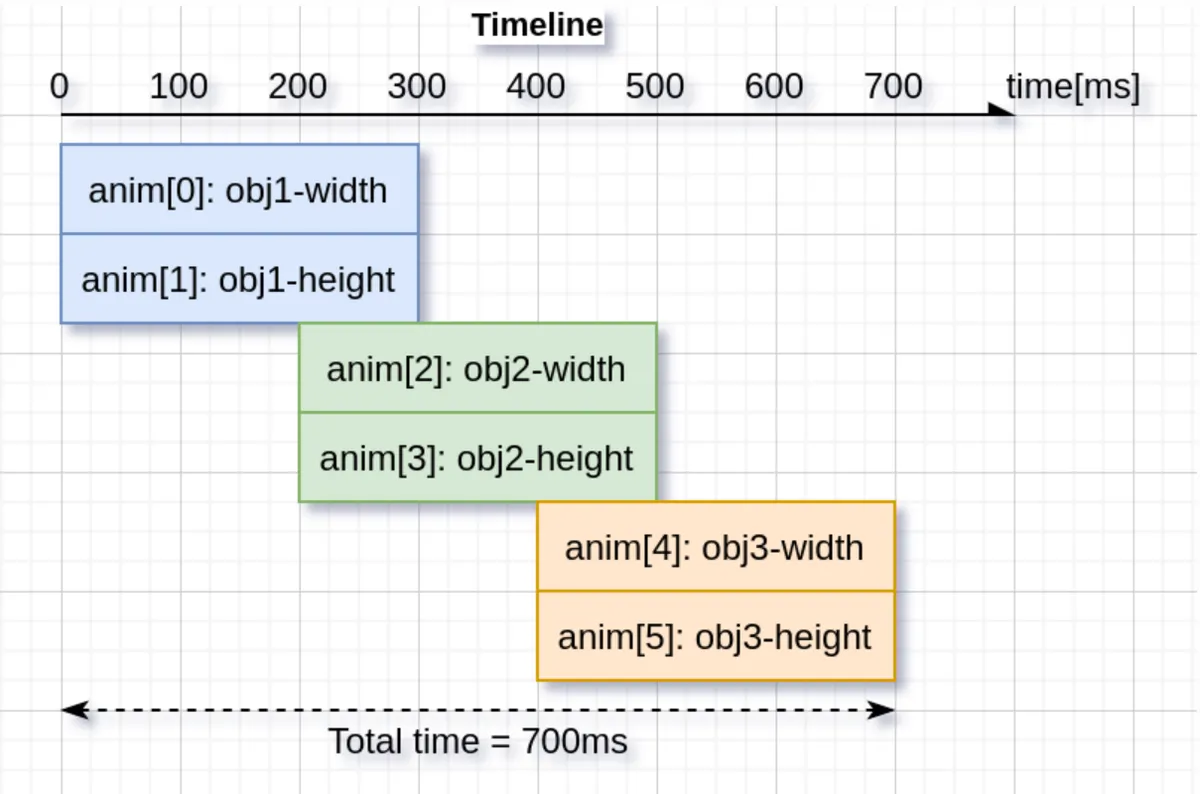
When it is necessary to implement "dynamic effects of multiple controls and multiple attributes according to a specific timeline"(such as boot guide animations and combined pop-up dynamic effects), a single animation is difficult to manage. LVGL provides the "timeline" function, which integrates multiple animations into a whole according to the timeline:
5.2.6.1 Core Value of the Timeline
- Unify the timing management of multiple animations (e. g. Animation A starts at 0ms, Animation B starts at 500ms, Animation C starts at 1000ms);
- Supports overall reverse playback, pause, and jumping to a specified progress position;
- Simplify the logic of complex motion effects (no need to manually manage the delays and callbacks of multiple animations).
5.2.6.2 Process for Creating and Using Timelines
- Create a single animation: Define each sub-animation according to the configuration rules for a single animation, but do not start it;
- Create a timeline object: Initialize an empty timeline container;
- Add sub-animations to the timeline: Specify the "start time on the timeline" for each sub-animation (this time will override the sub-animation's own delay configuration);
- Start Timeline: Triggers the entire composite animation, and the framework will automatically execute each sub-animation according to the timeline;
5.2.6.3 Core Operations of the Timeline
| Operation | Function description |
|---|---|
| Reverse playback | Reverses the whole timeline (e.g., runs from the last animation back to the first); |
| Set progress | Jump directly to a specified progress on the timeline (e.g., start playing from 50% progress); |
| Get total duration | Check the total time of the entire timeline; |
| Stop timeline | Pause all child animations; |
| Delete timeline | Destroy the timeline and all child animations (important: before deleting a widget that is being animated, delete the timeline first to avoid a crash); |
VI. Underlying Rendering and Performance Optimization: The Performance Foundation of GUI
It handles the underlying logic of graphics rendering, provides hardware acceleration and performance analysis tools, and balances feature richness with hardware resource consumption.
6.1 Drawing Mechanism (Drawing)
With VGL, you don’t need to draw anything manually. Simply create controls such as buttons, labels and arcs, adjust their positions and styles, and VGL will automatically refresh and redraw the parts that require updating.
- Refresh Logic: Manages the screen refresh process, only redrawing the changed areas to reduce unnecessary rendering overhead.
- Advanced Features: Supports masking to achieve partial display, and supports hook drawing to customize rendering logic.
6.1.1 Core Rendering Approach: Draw to the Buffer First, Then Update the Screen
LVGL does not draw directly on the screen; instead, it first renders content in an internal "drawing buffer", and once rendering is complete, it copies the buffer contents to the screen. This buffer can be smaller than the screen, and LVGL will divide the frame into small segments (tiles) to match the buffer size.
- Benefit 1: Avoid screen flickering (for example, when rendering elements like a background, buttons, and text, rendering directly to the screen will show the step-by-step drawing process, while using a buffer only displays the final result);
- Benefit 2: Faster speed (it modifies the buffer in memory and finally updates the screen all at once, which saves time compared with directly manipulating screen pixels);
- Difference from the traditional "double buffering" mechanism: it eliminates the need to store two full-screen buffers (which consume excessive memory) and only requires a small buffer, making it better adapted to embedded devices.
6.1.2 How to refresh the screen? Only update the areas that need to be changed
When there are changes in the UI (such as a button being clicked or an animation playing), LVGL will refresh according to the following steps:
- Mark the "invalidated region": record the area that needs to be redrawn; hidden content and content beyond the parent control will not be marked, which saves resources.
- Merging + tiled rendering: periodically merge adjacent invalid regions, render them directly if they fit into the buffer, otherwise render them in multiple passes;
- Screen refresh: Once a section is drawn, the screen driver is called to update that specific section, so only the parts that need modification are redrawn (for example, if the text on a button changes, only the text area is redrawn instead of the entire button);
- Buffer mode affects the refresh rhythm: with single buffering, you have to wait until one block is fully drawn and the screen is updated before drawing the next block; with double buffering, you can draw a new block and update the screen at the same time; with double frame buffering, you only need to switch the buffer address.
6.1.3 Mask: The Core of Creating Fancy Styles
Masking is the underlying logic for LVGL to draw graphics and text. You can use it without understanding the principle, but it is very useful when customizing styles:
- Function: For example, drawing rounded rectangles, arcs, and gradient text is all achieved by using a mask to "block out the unnecessary parts"(for instance, a rounded mask will cover the sharp corners of a rectangle);
- Built-in masks: support effects such as straight-line clipping, rounded corners, arcs, gradients, and bitmap masks, which can basically meet daily styling needs;
- Custom masks: You can also manually add or remove masks, for example, to add gradients to controls or adjust partial transparency.
6.1.4 Custom Drawing: Hook Events Help You Tweak Details
If you want to implement special styles (for example, changing the color of a single button in a matrix button independently), you can use LVGL's "draw hook event":
- Main drawing event: Modifies the drawing of the control itself (e. g., adding custom text/images to a button);
- Post-render event: Drawn on top of the child content of the control (e. g., drawing scrollbars);
- Widget drawing event: Modify a part of the control (e. g. the Progress Bar of the slider, the cell of the table);
- Auxiliary events: for example, checking whether a control blocks a certain area, and setting the drawing space outside the control (such as drawing values outside the slider).
6.2 Profiler
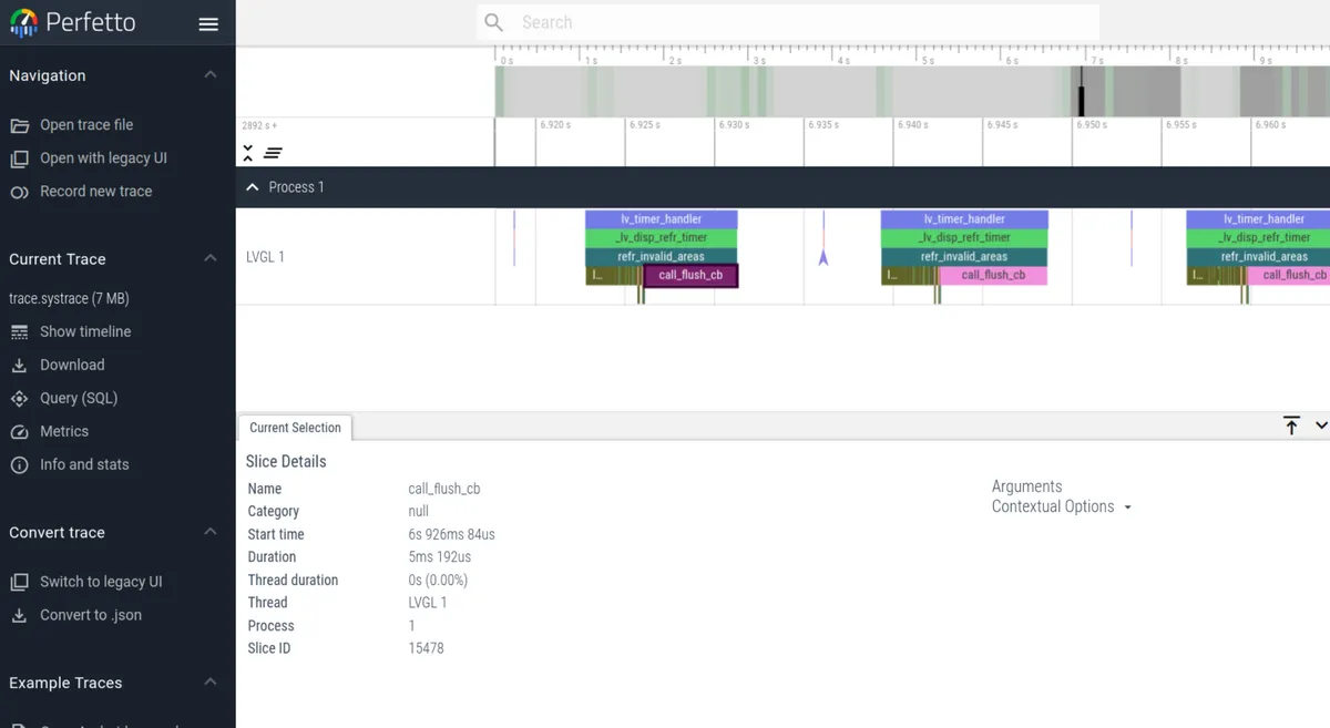
LVGL has a built-in profiler, which is specifically designed to troubleshoot performance issues such as low frame rate, laggy performance and cache invalidation that arise as projects grow more complex. It tracks the timestamps of key runtime events including rendering and user input, stores the data in a buffer of configurable size, outputs logs in the Android systrace format, and allows users to visualize and check time consumption via the Perfetto tool;When in use, you need to enable the feature in the configuration file, where you can set the buffer, high-precision timestamp, and custom log output mode. You can also manually add measurement points to the function, and it supports integration with the analyzer built into the operating system. Meanwhile, there are corresponding solutions for common issues such as log parsing failure, displayed time consumption of 0, laggy analysis, and no log output.
6.3 Rendering and GPU Acceleration
LVGL supports multiple rendering solutions, ranging from pure software rendering to hardware GPU acceleration, and is compatible with various platforms (including embedded MCUs, desktop simulators, etc.), with the core goal of improving UI rendering performance and reducing CPU usage.
- Renderer Type: Supports software rendering (pure CPU computing), SDL rendering (PC simulator), as well as hardware GPU acceleration such as Arm-2D and NXP PXP/DMA2D, and adapts to hardware platforms with different performances.
- Performance Analysis: Measure rendering time consumption via the Profiler to locate performance bottlenecks, with support for custom measurement points and profiler implementation.
The renderers / GPUs of LVGL fall into three categories:
- Pure software rendering: does not rely on any hardware, entirely relies on CPU computing, and features maximum compatibility;
- Desktop platform renderer: Used for PC emulator/debugging, accelerated by desktop GPU;
- Embedded hardware acceleration: A dedicated 2D/GPU module for different MCU/MPU platforms that provides hardware-level drawing acceleration.
The differences are as follows:
| Renderer / GPU | Supported platforms | Core characteristics | Required hardware / instruction set |
|---|---|---|---|
| Software renderer | All platforms (generic) | Pure CPU drawing, best compatibility, average performance | None (pure software) |
| SDL renderer | Desktop / simulator (PC, Mac, etc.) | Hardware-accelerated, smooth for development and debugging, suited to simulators | SDL library + desktop GPU |
| Arm-2D GPU | ARM Cortex-M, all series | 2D acceleration abstraction layer, with synchronous / asynchronous modes, requires hardware / instruction set | Cortex-M + Helium/ACI or DMAC-350, etc. |
| NXP PXP GPU | NXP i.MX RT and similar platforms | Hardware 2D acceleration, reduces CPU usage, optimized for NXP devices | NXP PXP hardware module |
| DMA2D GPU | STM32 (H7/F7, etc.) | Hardware 2D acceleration, memory copy / blending, frees the STM32 CPU | STM32 DMA2D hardware module |
| NXP VGLite GPU | High-end NXP i.MX RT and similar | Hardware 2D/3D acceleration, supports complex graphics, higher performance | NXP VGLite GPU hardware module |
VII. Extensibility and Customization Capabilities: GUI Extension Interfaces
It provides resource loading and custom development capabilities to meet the personalized needs of business scenarios.
7.1 File System
The file system module of LVGL is a hardware-independent abstraction layer, whose core purpose is to mask the underlying differences between various storage media (such as SD cards, SPI Flash, local disks) and file systems (such as FATFS, POSIX-compliant file systems), so as to provide a unified file operation interface for upper-layer applications (such as image loading, file reading and writing).
7.1.1 Core Design Concept
- Drive letter identifier: Each mounted file system (e. g., SD card, internal Flash) is assigned a capital Latin letter (e. g.,
S:for SD card,F:for Flash). The file path follows the unified format[letter]:[path](example:S: images/icon.bin), so upper-layer operations do not need to distinguish the underlying storage type. - Implement callbacks on demand: All operations of the file system (read/write/open/directory traversal, etc.) are implemented via "callback functions", and there is no need to implement all callbacks — setting a certain callback to
NULLmeans that the driver does not support this operation (for example, a read-only storage can ignore the write callback). - Cache Optimization: Supports configuring the read cache size to improve the reading efficiency of slow storage media (e. g. SD cards); setting the cache size to 0 will disable the cache.
7.1.2 Ready-made Drivers (Out Of The Box)
LVGL comes with built-in drivers adapted for mainstream file systems and platforms, eliminating the need to manually implement core callbacks, which can be directly reused:
- POSIX standard-driven: compatible with Unix-like systems such as Linux and macOS;
- Standard C driver: compatible with general C language file operation interfaces;
- Windows Driver: Adapt to the file system of the Windows platform;
- FATFS Driver: Adapts to the FATFS file system commonly used in embedded scenarios (e. g., SD cards, USB flash drives).
7.1.3 Add Custom File System Driver
If the built-in driver cannot meet the requirements (e. g. the SPI Flash file system adapted to the MPY platform), you need to manually register a custom driver, and the core process is as follows:
7.1.3.1 Driver Structure Initialization
You need to first create a driver struct (which shall be allocated globally or statically to avoid invalidation caused by the destruction of local variables) and complete the basic initialization:
- Config Drive Letter: Specify the identifier letter corresponding to this file system (e. g.,
'S'); - Configure cache size: Set the number of bytes for the read cache (0 means the cache is disabled);
- Bind user data: Custom data (such as the hardware handle of a storage device) can be passed in.
7.1.3.2 Bind Core Callback Function
The core capabilities of the driver are implemented by callback functions, which are divided into file operations and directory operations two categories, and can be bound as needed:
| Callback type | Core callbacks | Function description |
|---|---|---|
| Basic ready check | ready_cb | Tells LVGL whether the storage device for this driver is ready (e.g., whether an SD card is inserted) |
| Core file operations | open_cb | Open file: takes the "path with the driver letter removed" + "open mode (read / write)" and returns a file object pointer (used by subsequent operations) |
| close_cb | Close file: releases the resources acquired when the file was opened | |
| read_cb | Read file: reads a specified number of bytes from an opened file | |
| write_cb | Write file: writes a specified number of bytes to an opened file | |
| seek_cb | Move file pointer: adjusts the file read/write position | |
| tell_cb | Get file pointer position: returns the offset of the current read/write pointer in the file | |
| Directory operations | dir_open_cb | Open directory: prepares to iterate over directory contents |
| dir_read_cb | Read directory: reads file / subdirectory names in the directory in a loop (a "/" prefix is recommended to mark directories) | |
| dir_close_cb | Close directory: releases the resources used for directory iteration |
7.1.3.3 Register the driver
After completing the structure configuration and callback binding, register the driver with the LVGL kernel, after which you can access this file system via the drive letter.
7.1.4 Core Logic of Callback Function
All callback designs are centered around the "file object", with the core rules as follows:
open_cbis fundamental: it returns a "file object pointer" when a file is opened successfully, and returnsNULLon failure; this pointer will be passed by LVGL to other file callbacks such asread/write/seekas an operation identifier;- Operation result feedback: Callbacks for operations such as write/read will return an "operation result code"(e. g., success/file not found/insufficient permissions) and inform the actual number of bytes completed (e. g., "planned to write 8 bytes, actually wrote 5 bytes" during a write operation);
- Path handling: The paths received by all callbacks are "the part after removing the drive letter"(e. g.
S: file.txtonly passesfile.txt), so no upper-layer processing for the drive letter is required.
7.1.5 Core Usage Logic of the File System
7.1.5.1 File Operation Process (Read/Write)
Regardless of the underlying storage type, the upper-layer operation process remains unified:
- Open a file: specify the drive letter + path + open mode (read-only / write-only / read-write), and check whether the operation result is successful;
- Read/write data: Read/write the specified number of bytes from/to an opened file object, and check the actual number of bytes completed;
- Close the file: release resources to avoid memory leaks.
7.1.5.2 Directory Operation Procedure
Process for traversing directory contents:
- Open the directory: specify the drive letter + directory path;
- Loop reading: Read the file/directory names in the directory line by line until the reading result is empty (no more content);
- Close the directory: Release directory resources.
7.1.5.3 Core Modes / Result Codes
- Open modes:
LV_FS_MODE_RD(read-only),LV_FS_MODE_WR(write-only),LV_FS_MODE_RD | LV_FS_MODE_WR(read-write); - Operation result code:
LV_FS_RES_OKindicates that the operation succeeded, while other codes indicate errors (such as non-existent file or insufficient permissions).
7.1.6 Key Requirements for Image Controls to Use the File System
To make the LVGL image widget load images from files (instead of variables compiled into the program), the following 4 callbacks must be implemented, and none of them can be missing:
open_cb: Open an image file;close_cb: close the image file;read_cb: Reads the content of the image file;seek/tell_cb: Locate the file pointer (random reading of pixel data from different positions of the file is required when loading an image).
7.2 Custom Extensions
- Custom Component (New Widget): Develop dedicated UI elements (such as custom dashboards and charts) based on the LVGL object system, and reuse the capabilities of the core framework.
- Logging system: Supports configurable log levels and custom log output, which is used for debugging porting and troubleshooting runtime issues.
Version Record
Version Number | Modifier | Time | Content |
v1.0 | Li Zisheng | 2026/03/18 | Initialize the document. |
In this section
- I. Core Objects and Interface Layout: The Skeleton System of GUI
- II. Visual Style and Resource System: GUI Skins and Creatives
- III. Interaction and Event Handling: The Interaction Nerve of GUI
- IV. Display and Multi-Screen Management: GUI Output Window
- 5. Timing and Dynamic Effects: The Dynamic Engine of GUI
- VI. Underlying Rendering and Performance Optimization: The Performance Foundation of GUI
- VII. Extensibility and Customization Capabilities: GUI Extension Interfaces