
Contents
- 2.1 Style System (Styles)
- 2.2 State
- 2.3 Cascading Styles
- 2.4 Style Inheritance
- 2.5 Parts
- 2.6 Style Initialization and Attribute Manipulation
- 2.7 Add / Replace / Remove Styles for Controls
- 2.8 Style Change Notification
- 2.9 Obtain the Final Style Property Value of the Control
- 2.10 Local Styles
- 2.11 Transitions
- 2.12 Opacity, Blend Mode and Transform
- 2.13 Themes
- 2.14 Summary Table of Style Attributes
- 2.15 Colors
- 2.16 Fonts and Icons
- 2.17 Image
- Version Record
Styles serve as the core for controlling the visual presentation of objects. Together with basic resources such as colors, fonts and images, they collectively define the visual style of a GUI, and support highly customized and thematized configurations.
First, memorize the 3 most fundamental concepts:
| Official concept | Plain-language understanding | Example |
|---|---|---|
| Style | The widget's "appearance set" | Can define an appearance such as "red background, 2px black border, white text", like dressing up a widget |
| State | The widget's "behavior state" | A button displayed normally (default), pressed by a finger, selected, or disabled, like a person standing / sitting / running |
| Part | A complex widget's "components" | A slider is split into: background (base), progress bar (indicator), and knob (adjustment handle); each part can be styled separately |
At the same time, there are two key rules as follows:
- State priority: Each state is assigned a value (for example, pressed
LV_STATE_PRESSED= 0x0020, focusedLV_STATE_FOCUSED= 0x0002); the higher the value, the higher the priority. For instance, when a button is both "pressed and focused", the style corresponding to the "pressed" state will be applied preferentially. - Style Cascading: When multiple styles are applied to the same control, the later-applied styles will override the earlier ones (only for identical properties).
Basic visual resources include:
- Colors: Supports formats such as RGB and ARGB, allows users to create custom colors and configure transparency, and adapts to the color depth of different display devices.
- Fonts: Compatible with Unicode encoding, with built-in common fonts, support for custom fonts and icon symbols, and the capability to load fonts from files/memory at runtime, meeting the needs of multilingual support and personalized typography.
- Images: Supports multiple storage methods and color formats, provides image decoding and caching mechanisms, optimizes image loading performance, and can load image resources from the file system or memory.
2.1 Style System (Styles)
Styles in LVGL serve as the core mechanism for controlling the appearance of UI components (objects), which are designed with reference to CSS while adapted to the lightweight characteristics of embedded GUIs.
First, quickly align the core terms of LVGL styling through CSS analogy:
| LVGL concept | CSS equivalent concept | Plain explanation |
|---|---|---|
| lv_style_t | CSS class (.btn) | Container that stores style properties (such as border, color, font) |
| Target Part | CSS pseudo-element (::after) | A component's parts (such as a slider's knob, a button's text area) |
| Target State | CSS pseudo-class (:hover) | A component's state (such as pressed, focused, disabled, default) |
| Style cascading | CSS class stacking (.btn.red) | Multiple styles are stacked, with properties overridden as needed |
| Style priority | CSS priority rules | Later-added styles > earlier-added ones; local styles > normal styles |
| Inheritance | CSS inheritance (such as text color) | Child components can inherit some style properties from the parent component |
- Core Features:
- Stateful styling: Different interaction states can be bound to different styles (e. g., changing color when a button is pressed).
- Cascading and Inheritance: Styles can be inherited from parent objects or overridden via Local Styles, so as to achieve the effect of "unified global settings with fine-grained local adjustments".
- Componentization: Styles can be configured separately for different components of an object (e. g., setting colors for the button background and text respectively).
- Style Properties: Cover all-dimensional visual attributes including size, padding/margin, background, border, shadow, image, text, line, etc. , and support advanced effects such as transitions, transparency, Blend Mode, and color filters.
- Theme System: It encapsulates styles into themes to enable one-click global style switching for quick adaptation to the visual requirements of different products.
2.2 State
The State in LVGL refers to binary flag bits that describe the current behavior/status of an object (such as a button or slider), whose core function is to bind different styles to objects in different states or state combinations, so as to realize interactive effects such as "changing color on click, adding a border when focused". In mpy, state constants are called in the form of lv.STATE.XXX, and the corresponding relationship is as follows:
| MicroPython state constant | Value | Meaning | Priority (higher value = higher priority) |
|---|---|---|---|
| lv.STATE.DEFAULT | 0x0000 | Normal / released state (default fallback) | Lowest |
| lv.STATE.CHECKED | 0x0001 | Checked / toggled state (e.g. a checkbox is checked) | ↑ |
| lv.STATE.FOCUSED | 0x0002 | Focused state (triggered by keyboard / touch / mouse) | ↑ |
| lv.STATE.FOCUS_KEY | 0x0004 | Focus triggered only by keyboard / encoder (not touch) | ↑ |
| lv.STATE.EDITED | 0x0008 | Encoder edit state | ↑ |
| lv.STATE.HOVERED | 0x0010 | Mouse hover (not supported yet) | ↑ |
| lv.STATE.PRESSED | 0x0020 | Pressed state | ↑ |
| lv.STATE.SCROLLED | 0x0040 | Scrolled state | ↑ |
| lv.STATE.DISABLED | 0x0080 | Disabled state | ↑ |
| lv.STATE.USER_1 ~ 4 | 0x1000+ | Custom state (extend as needed) | Highest (user-defined) |
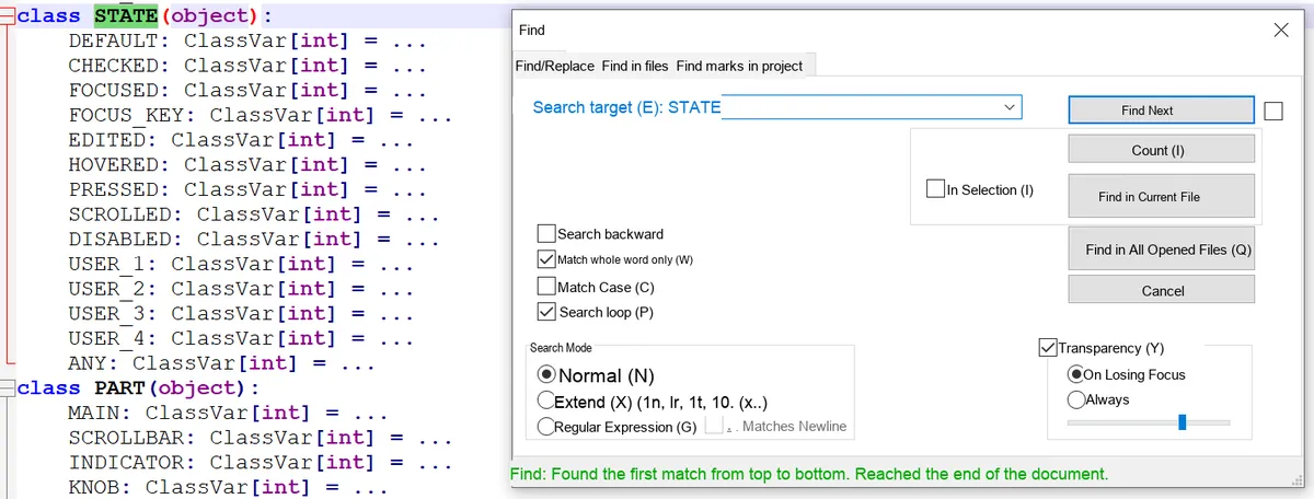
When LVGL matches styles to objects, it follows the logic of " states with higher priority override those with lower priority, and fall back to the default if no match is found ", with the core rules as follows:
- Single state: the higher the value, the higher the priority (e. g.
PRESSED (0x20)>FOCUSED (0x02)>DEFAULT (0x00)); - Combined state: Priority = sum of the values of each state (e. g.,
PRESSED | FOCUSED= 0x22, which has a higher priority than the singlePRESSED); - Fallback rule: If there is no corresponding style for the current state, the "most matching high-priority state" will be searched, and it will eventually fall back to
DEFAULTstate; if there is still no available style, the built-in default value of LVGL will be used.
Suppose the following styles are set for the button:
DEFAULT: White background (#FFFFFF);PRESSED: Gray background (#999999);FOCUSED: Red background (#FF0000);PRESSED | FOCUSED: Rose-colored background (#FF69B4).
Style matching results in different states:
- Default only: No other states, use white directly;
- Only press:
PRESSEDpriority (0x20) >DEFAULT, displayed in gray; - Only focus on:
FOCUSEDpriority (0x02) >DEFAULT, in red; - Press + Focus: First match the combined state (0x22) → rose gold; if the combined state is not set, use
PRESSED(0x20) → gray; - Check only: For the background color of the unchecked state, revert to
DEFAULT→ white.
2.3 Cascading Styles
You don't need to define all appearance attributes in a single style; you can apply multiple styles to the same object. Styles added later have higher priority (and will override the same attributes of previously added styles), however, state priority always takes precedence over cascade priority.
- CSS analogy: Similar to
<div class="btn btn-red">,btnis the base style (defines the general appearance of the button: rounded corners, padding),btn-redis the extended style (only redefines the background color as red). - Key Example:
- Basic style: dark gray by default, light gray when pressed;
- Red style: only the default state is defined as red (no pressed state);
- Effect: The button displays red by default (the added red style matches), and shows light gray when pressed (the state has higher priority, and the pressed state of the base style is a better match).
2.4 Style Inheritance
Some attributes (mainly text-related attributes such as font, text color, and text alignment) can be inherited from the parent object, and the parent object's style will be looked up upward only when none of the child object's own styles (including the default state) have set this attribute.
The parent object uses its current state to provide inherited values. For example, when a button is in the "pressed" state, if the text label inside the button has no text color configured, it will inherit the text color of the button's "pressed" state instead of the default state.
2.5 Parts
LVGL widgets consist of multiple "functional components", each of which can be styled independently (similar to CSS pseudo-elements such as:: after), enabling differentiated appearances for different areas of the widget.
Predefined Core Components (General):
Predefined Core Component Names | Meaning |
LV_PART_MAIN | Control body (e. g., the background of a button, the overall background of a slider) |
LV_PART_INDICATOR | Indicators (such as the Progress Bar of a slider, the on indicator of a switch, and the check box of a checkbox) |
LV_PART_KNOB | Adjustment handle / (e. g. the draggable button of a slider, the adjustment point of a scroll wheel) |
LV_PART_SCROLLBAR | scroll bar |
LV_PART_SELECTED | Selected item (e. g. the selected entry in a drop-down box) |
LV_PART_CURSOR | Cursor (e. g., the input cursor in a text box) |
Example: The slider consists of three components: MAIN (background), INDICATOR (Progress Bar), and (adjustment ), and you may set the to red, the Progress Bar to blue, and the background to gray respectively.
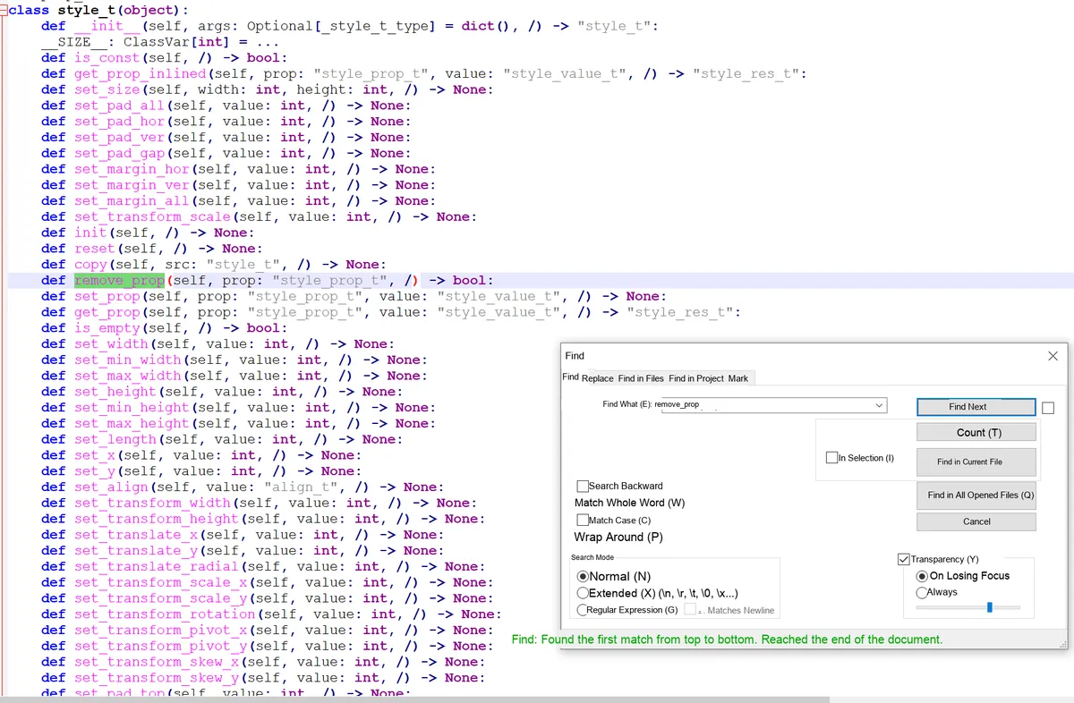
2.6 Style Initialization and Attribute Manipulation
Essentially, a style is a variable of type lv_style_t, and all operations on it must follow fixed rules:
- Storage Rule:
lv_style_tmust be static / global / dynamically allocated (cannot be a local variable of a function), otherwise the variable will be destroyed and the style will become invalid after the function finishes executing; - Initialization: Must be initialized with
lv_style_init ()before use to set properties; - Attribute Manipulation:
- Settings: Define properties (e. g., background color, border width) via the
set_<property_name>()function; - Removal:
remove_prop ()can delete a certain set attribute; - Acquisition:
get_prop ()reads the attribute value, and the result is stored inlv_style_value_t(divided into three categories:numstores numerical values / booleans / opacity,colorstores colors,ptrstores pointers); - Reset:
reset ()Releases all data occupied by the style;
- Settings: Define properties (e. g., background color, border width) via the
- Constant style: A read-only
conststyle (which saves RAM) can be defined, and its properties cannot be modified after initialization.
2.7 Add / Replace / Remove Styles for Controls
A style takes effect only when bound to a control, and the core operation revolves around the "selector"(a combination of a component and its state):
- Add Style:
add_style (widget, style, selector). The selector is a combination of "part | state"(LV_PART_MAIN/LV_STATE_DEFAULTcan be omitted). For example, writing onlyLV_STATE_PRESSEDmeans "the pressed state of the main part". - Replacement Style:
replace_style ()can replace the old style corresponding to the specified selector in the control (it needs to match the selector used when adding the style); - Remove Style:
remove_style_all (): Clears all styles of the control;remove_style (): Removes the style of the specified style / selector, and you can useLV_STATE_ANY/LV_PART_ANYto match any state / part.
2.8 Style Change Notification
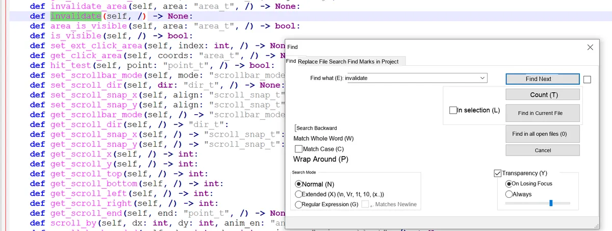
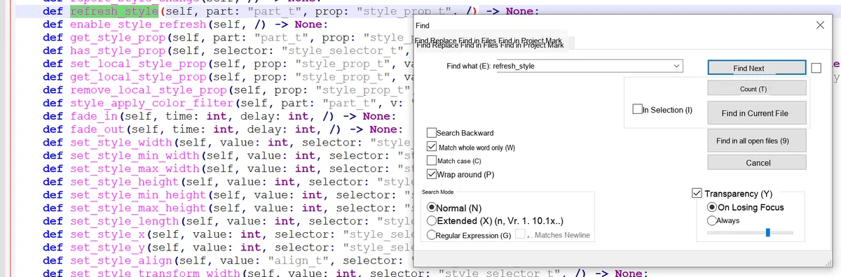
After modifying the style that has been bound to a control, you need to actively notify the control to refresh it, otherwise the style will not take effect:
- Simple refresh (color/transparency, etc.):
invalidate ()simply trigger the control to repaint; - Complex refresh (size / transformation, etc.):
refresh_style ()allows specifying the components / properties to be refreshed, or refreshing all of them; - Global refresh:
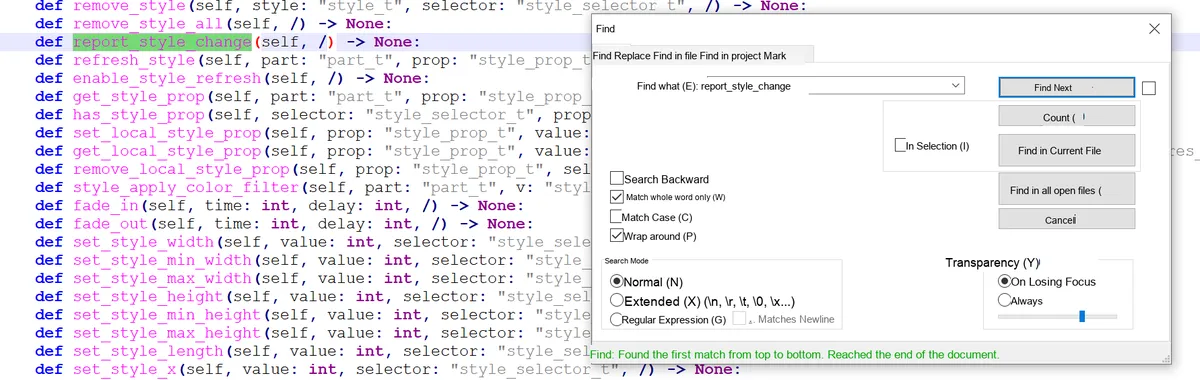
report_style_change ()makes LVGL automatically check all widgets that use this style and refresh them.
2.9 Obtain the Final Style Property Value of the Control
You can obtain the final property value of a certain component of a control via get_style_<property_name>(control, component), and this function will automatically synthesize the following:
- Priority of cascading styles and state matching rules;
- Inherited properties of the parent object;
- Override of local styles;
- Current value of the transition animation; finally returns the actual display value in the current state (returns the LVGL built-in default value if there is no match).
2.10 Local Styles
Analogous to inline styles in CSS (<div style="color:red">), but with more powerful features:
- Features: Exclusive to the current control, cannot be shared with other controls; automatically released when the control is deleted;
- Extensibility: States and components can be specified (inline CSS styles do not have this capability), for example, setting a local red background only for the focused state of the slider ;
- Priority: Local styles take precedence over all "normal styles"(cascading styles).
2.11 Transitions
When switching the default state, style properties change immediately; transitions enable animated gradients (e. g., a 300ms gradient of the background color when a button is pressed):
- Core parameters: transition duration, delay, animation curve (easing function, e. g., fast first then slow), properties to be animated (e. g., background color, opacity);
- State Association: Different transition parameters can be configured for different states (e. g., 100ms transition when pressed, 500ms transition when released);
- Storage: Transition parameters are stored in styles. You need to define a transition descriptor first and then bind it to the style.
2.12 Opacity, Blend Mode and Transform
When setting opa (opacity), transform_angle (rotation), transform_zoom (scaling) and other properties:
- LVGL creates an "intermediate layer (snapshot)" for the
MAINpart of the widget, and implements transparency/blending/transformation effects based on the snapshot; - Memory Rule: When only setting opacity / Blend Mode, block-based rendering can be used to save memory; when rotation / scaling is set, full-layer rendering is required (resulting in higher memory usage);
- Interaction Adaptation: The clickable area of a control will be adjusted synchronously along with its transformation (e. g., rotation).
2.13 Themes
A theme is a collection of styles used to unify the default appearance of the entire interface:
- Multi-screen adaptation: different themes can be configured for different displays (e. g., color theme for color screens, black-and-white theme for monochrome screens);
- Default Theme: The default theme built into LVGL, which automatically applies default styles to all newly created widgets once enabled;
- Theme extension: You can create custom themes based on existing ones, and set a "parent theme" to form a theme chain (e. g. default theme → custom theme → dark theme), where the style priority of the parent theme is lower than that of the child theme.
2.14 Summary Table of Style Attributes
2.14.1 Dimensions and Location (Size and position)
| Property name | Function description | Default value | Inherited | Affects layout | Extra draw |
|---|---|---|---|---|---|
| width | Sets the object width; supports pixels / percentage / LV_SIZE_CONTENT | Widget-specific | No | Yes | No |
| min_width | Minimum width limit | 0 | No | Yes | No |
| max_width | Maximum width limit | LV_COORD_MAX | No | Yes | No |
| height | Sets the object height; supports pixels / percentage / LV_SIZE_CONTENT | Widget-specific | No | Yes | No |
| min_height | Minimum height limit | 0 | No | Yes | No |
| max_height | Maximum height limit | LV_COORD_MAX | No | Yes | No |
| x | X coordinate relative to the alignment reference | 0 | No | Yes | No |
| y | Y coordinate relative to the alignment reference | 0 | No | Yes | No |
| align | Alignment relative to the parent | LV_ALIGN_DEFAULT | No | Yes | No |
| transform_width | Widen the object in both directions | 0 | No | No | Yes |
| transform_height | Heighten the object in both directions | 0 | No | No | Yes |
| translate_x | X offset after layout | 0 | No | Yes | No |
| translate_y | Y offset after layout | 0 | No | Yes | No |
| transform_zoom | Zoom; 256 = original size | 0 | No | Yes | Yes |
| transform_angle | Rotation angle (in units of 0.1°) | 0 | No | Yes | Yes |
| transform_pivot_x | Transform pivot X coordinate | 0 | No | No | No |
| transform_pivot_y | Transform pivot Y coordinate | 0 | No | No | No |
2.14.2 Padding
| Property name | Function description | Default value | Inherited | Affects layout | Extra draw |
|---|---|---|---|---|---|
| pad_top | Top padding | 0 | No | Yes | No |
| pad_bottom | Bottom padding | 0 | No | Yes | No |
| pad_left | Left padding | 0 | No | Yes | No |
| pad_right | Right padding | 0 | No | Yes | No |
| pad_row | Layout row spacing | 0 | No | Yes | No |
| pad_column | Layout column spacing | 0 | No | Yes | No |
2.14.3 Margin
| Property name | Function description | Default value | Inherited | Affects layout | Extra draw |
|---|---|---|---|---|---|
| margin_top | Top margin | 0 | No | Yes | No |
| margin_bottom | Bottom margin | 0 | No | Yes | No |
| margin_left | Left margin | 0 | No | Yes | No |
| margin_right | Right margin | 0 | No | Yes | No |
2.14.4 Background
| Property name | Function description | Default value | Inherited | Affects layout | Extra draw |
|---|---|---|---|---|---|
| bg_color | Background color | 0xffffff | No | No | No |
| bg_opa | Background opacity | LV_OPA_TRANSP | No | No | No |
| bg_grad_color | Background gradient color | 0x000000 | No | No | No |
| bg_grad_dir | Gradient direction | LV_GRAD_DIR_NONE | No | No | No |
| bg_main_stop | Main color gradient start point | 0 | No | No | No |
| bg_grad_stop | Gradient color start point | 255 | No | No | No |
| bg_grad | Gradient descriptor | NULL | No | No | No |
| bg_dither_mode | Gradient dither mode | LV_DITHER_NONE | No | No | No |
| bg_img_src | Background image source | NULL | No | No | Yes |
| bg_img_opa | Background image opacity | LV_OPA_COVER | No | No | No |
| bg_img_recolor | Background image recolor color | 0x000000 | No | No | No |
| bg_img_recolor_opa | Image recolor intensity | LV_OPA_TRANSP | No | No | No |
| bg_img_tiled | Background image tiling | 0 | No | No | No |
2.14.5 Border
| Property name | Function description | Default value | Inherited | Affects layout | Extra draw |
|---|---|---|---|---|---|
| border_color | Border color | 0x000000 | No | No | No |
| border_opa | Border opacity | LV_OPA_COVER | No | No | No |
| border_width | Border width (pixels only) | 0 | No | Yes | No |
| border_side | Border sides to display | LV_BORDER_SIDE_NONE | No | No | No |
| border_post | Border drawing timing (after / before children) | 0 | No | No | No |
2.14.6 Outline
| Property name | Function description | Default value | Inherited | Affects layout | Extra draw |
|---|---|---|---|---|---|
| outline_width | Outline width | 0 | No | No | Yes |
| outline_color | Outline color | 0x000000 | No | No | No |
| outline_opa | Outline opacity | LV_OPA_COVER | No | No | Yes |
| outline_pad | Outline-to-object spacing | 0 | No | No | Yes |
2.14.7 Shadow
| Property name | Function description | Default value | Inherited | Affects layout | Extra draw |
|---|---|---|---|---|---|
| shadow_width | Shadow width | 0 | No | No | Yes |
| shadow_offset_x | Shadow X offset | 0 | No | No | Yes |
| shadow_offset_y | Shadow Y offset | 0 | No | No | Yes |
| shadow_spread | Shadow spread | 0 | No | No | Yes |
| shadow_color | Shadow color | 0x000000 | No | No | No |
| shadow_opa | Shadow opacity | LV_OPA_COVER | No | No | Yes |
2.14.8 Image
| Property name | Function description | Default value | Inherited | Affects layout | Extra draw |
|---|---|---|---|---|---|
| img_opa | Image opacity | LV_OPA_COVER | No | No | No |
| img_recolor | Image recolor blend color | 0x000000 | No | No | No |
| img_recolor_opa | Image recolor intensity | 0 | No | No | No |
2.14.9 Line
| Property name | Function description | Default value | Inherited | Affects layout | Extra draw |
|---|---|---|---|---|---|
| line_width | Line width | 0 | No | No | Yes |
| line_dash_width | Dash width | 0 | No | No | Yes |
| line_dash_gap | Dash gap | 0 | No | No | Yes |
| line_rounded | Line end rounding | 0 | No | No | Yes |
| line_color | Line color | 0x000000 | No | No | No |
| line_opa | Line opacity | LV_OPA_COVER | No | No | No |
2.14.10 Arc
| Property name | Function description | Default value | Inherited | Affects layout | Extra draw |
|---|---|---|---|---|---|
| arc_width | Arc thickness | 0 | No | No | Yes |
| arc_rounded | Arc end rounding | 0 | No | No | Yes |
| arc_color | Arc color | 0x000000 | No | No | No |
| arc_opa | Arc opacity | LV_OPA_COVER | No | No | No |
| arc_img_src | Arc mask image | NULL | No | No | No |
2.14.11 Text
| Property name | Function description | Default value | Inherited | Affects layout | Extra draw |
|---|---|---|---|---|---|
| text_color | Text color (hexadecimal RGB value) | 0x000000 (black) | Yes | No | No |
| text_opa | Text opacity, value range: - 0/LV_OPA_TRANSP (fully transparent) - 255/LV_OPA_COVER (fully opaque) - 10~90/LV_OPA_10~LV_OPA_90 (semi-transparent) | LV_OPA_COVER | Yes | No | No |
| text_font | Text font (pointer to type lv_font_t) | LV_FONT_DEFAULT (default font) | Yes | Yes | No |
| text_letter_space | Letter spacing (unit: pixels) | 0 | Yes | Yes | No |
| text_line_space | Line spacing for multi-line text (unit: pixels) | 0 | Yes | Yes | No |
| text_decor | Text decoration, supports bitwise OR combination: - LV_TEXT_DECOR_NONE (no decoration) - LV_TEXT_DECOR_UNDERLINE (underline) - LV_TEXT_DECOR_STRIKETHROUGH (strikethrough) | LV_TEXT_DECOR_NONE | Yes | No | No |
| text_align | Text alignment within a line (affects only text lines, not the object itself): - LV_TEXT_ALIGN_LEFT (left aligned) - LV_TEXT_ALIGN_CENTER (center aligned) - LV_TEXT_ALIGN_RIGHT (right aligned) - LV_TEXT_ALIGN_AUTO (auto, adapts to the text base direction) | LV_TEXT_ALIGN_AUTO | Yes | Yes | No |
2.14.12 Miscellaneous
| Property name | Function description | Default value | Inherited | Affects layout | Extra draw |
|---|---|---|---|---|---|
| radius | Corner radius | 0 | No | No | No |
| clip_corner | Clip overflow content at rounded corners | 0 | No | No | No |
| opa | Overall object opacity scaling | LV_OPA_COVER | Yes | No | No |
| color_filter_dsc | Color filter descriptor | NULL | No | No | No |
| color_filter_opa | Color filter intensity | LV_OPA_TRANSP | No | No | No |
| anim | Animation template | NULL | No | No | No |
| anim_time | Animation duration (ms) | 0 | No | No | No |
| anim_speed | Animation speed (px/sec) | 0 | No | No | No |
| transition | Style transition descriptor | NULL | No | No | No |
| blend_mode | Color blend mode | LV_BLEND_MODE_NORMAL | No | No | No |
| layout | Child widget layout | 0 | No | Yes | No |
| base_dir | Text base direction (LTR/RTL) | LV_BASE_DIR_AUTO | Yes | Yes | No |
2.15 Colors
2.15.1 Core Basic Knowledge
The color module of LVGL is the underlying core of UI rendering, which is responsible for color creation, format conversion, color adjustment and transparency control. The core principles of its design are as follows: Unified color interface —— No matter what the system-configured color depth (LV_COLOR_DEPTH) is, all APIs interact based on the lv_color_t type (fixed RGB888 format), and the framework automatically handles the underlying color depth conversion without requiring developers to pay extra attention.
lv_color_t is the standard type for color storage in LVGL, with the following core features:
- Internally, it is stored in RGB888 format (each of the red, green and blue channels has 8 bits, with a value range of 0-255);
- Decoupled from the actual color depth of the system (e. g., 16-bit RGB565,8-bit phased rollout), no manual conversion is required during API calls, and LVGL automatically adapts to the hardware;
- It serves as the input/output type for all color-related functions (such as creating colors, blending colors, and setting control styles).
RGB is the most commonly used color definition method for embedded UIs, and LVGL provides three convenient interfaces:
| Interface form | Purpose | Example |
|---|---|---|
| lv_color_make(r,g,b) | Create color dynamically (runtime) | lv_color_t c = lv_color_make(255,0,0); (pure red) |
| LV_COLOR_MAKE(r,g,b) | Constant initialization (compile time) | const lv_color_t c = LV_COLOR_MAKE(0,255,0); (pure green) |
| lv_color_hex(0xRRGGBB) | 6-digit hexadecimal (RR = red, GG = green, BB = blue) | lv_color_t c = lv_color_hex(0x0000FF); (pure blue) |
| lv_color_hex3(0xRGB) | 3-digit shorthand hexadecimal (automatically expanded to 6 digits) | lv_color_t c = lv_color_hex3(0x123); (equivalent to 0x112233) |
2.15.2 Methods for Creating Colors
2.15.1.1 RGB Mode Creation (the most basic method, directly specifying red/green/blue)
RGB is the most commonly used color definition method for embedded UIs, and LVGL provides three convenient interfaces:
| Interface form | Purpose | Example |
|---|---|---|
| lv_color_make(r,g,b) | Create color dynamically (runtime) | lv_color_t c = lv_color_make(255,0,0); (pure red) |
| LV_COLOR_MAKE(r,g,b) | Constant initialization (compile time) | const lv_color_t c = LV_COLOR_MAKE(0,255,0); (pure green) |
| lv_color_hex(0xRRGGBB) | 6-digit hexadecimal (RR = red, GG = green, BB = blue) | lv_color_t c = lv_color_hex(0x0000FF); (pure blue) |
| lv_color_hex3(0xRGB) | 3-digit shorthand hexadecimal (automatically expanded to 6 digits) | lv_color_t c = lv_color_hex3(0x123); (equivalent to 0x112233) |
2.15.1.2 HSV Mode Creation (Suitable for Dynamic Color Adjustment/Gradient)
HSV (Hue, Saturation, Value) better aligns with the human eye's perception of color, making it suitable for scenarios that require color gradients and dynamic hue adjustment:
- Hue (H): 0-359 (0 = red, 120 = green, 240 = blue);
- Saturation (S): 0-100 (0 = phased rollout, 100 = pure color);
- Value (V): 0-100 (0 = pure black, 100 = maximum brightness).
Core conversion function:
lv_color_hsv_to_rgb(h, s, v): HSV to RGB (yieldslv_color_t);lv_color_rgb_to_hsv(r, g, b): RGB values to HSV;lv_color_to_hsv(color):lv_color_ttype to HSV.
2.15.1.3 Palette Creation (Material Design Preset Colors, Simplified UI Color Matching)
LVGL has a built-in Material Design color palette that provides 19 base colors, each consisting of a main color, 4 dark variants and 5 light variants, eliminating the need for manual RGB value adjustment and ensuring consistent UI colors.
How to use the palette:
- Get the main color:
lv_palette_main (LV_PALETTE_XXX); - Get the light variant:
lv_palette_lighten (LV_PALETTE_XXX, v)(v = 1~5, the larger the number, the lighter the color); - Get the dark variant:
lv_palette_darken (LV_PALETTE_XXX, v)(v = 1~4; the larger the number, the darker the color).
2.15.3 Modification and Blending of Colors
LVGL provides convenient functions to adjust color brightness and blend two colors, meeting the needs of dynamic UIs (such as button pressed/hover states, gradient backgrounds):
| Function name | Function | Parameter description |
|---|---|---|
| lv_color_lighten(c, lvl) | Lighten color | lvl=0 (unchanged) ~ 255 (all white) |
| lv_color_darken(c, lvl) | Darken color | lvl=0 (unchanged) ~ 255 (all black) |
| lv_color_change_lightness(c, lvl) | Overall brightness adjustment | lvl=0 (all black), 128 (unchanged), 255 (all white) |
| lv_color_mix(c1, c2, ratio) | Mix two colors | ratio=0 (all c2), 128 (half each), 255 (all c1) |
2.15.4 Transparency
LVGL uses the lv_opa_t type (based on uint8_t, with values ranging from 0 to 255) to describe transparency, which centers on the concept of "coverage": the higher the value, the less transparent the color, and the more of the underlying content it obscures.
2.15.5 Core Constants
Palette base color constants:
| Constant name | Corresponding color | Constant name | Corresponding color |
|---|---|---|---|
| LV_PALETTE_RED | Red | LV_PALETTE_GREEN | Green |
| LV_PALETTE_PINK | Pink | LV_PALETTE_LIGHT_GREEN | Light green |
| LV_PALETTE_PURPLE | Purple | LV_PALETTE_LIME | Lime |
| LV_PALETTE_DEEP_PURPLE | Deep purple | LV_PALETTE_YELLOW | Yellow |
| LV_PALETTE_INDIGO | Indigo | LV_PALETTE_AMBER | Amber |
| LV_PALETTE_BLUE | Blue | LV_PALETTE_ORANGE | Orange |
| LV_PALETTE_LIGHT_BLUE | Light blue | LV_PALETTE_DEEP_ORANGE | Deep orange |
| LV_PALETTE_CYAN | Cyan | LV_PALETTE_BROWN | Brown |
| LV_PALETTE_TEAL | Teal | LV_PALETTE_BLUE_GREY | Blue gray |
| LV_PALETTE_GREY | Gray | - | - |
Transparency Constants:
| Constant name | Value | Meaning | Constant name | Value | Meaning |
|---|---|---|---|---|---|
| LV_OPA_TRANSP | 0 | Fully transparent | LV_OPA_60 | 153 | 60% opaque |
| LV_OPA_10 | 25 | 10% opaque (almost transparent) | LV_OPA_70 | 178 | 70% opaque |
| LV_OPA_20 | 51 | 20% opaque | LV_OPA_80 | 204 | 80% opaque |
| LV_OPA_30 | 76 | 30% opaque | LV_OPA_90 | 229 | 90% opaque (almost opaque) |
| LV_OPA_40 | 102 | 40% opaque | LV_OPA_COVER | 255 | Fully opaque (default) |
| LV_OPA_50 | 128 | 50% opaque (semi-transparent) | - | - | - |
2.16 Fonts and Icons
The font module of LVGL is the core of text rendering, essentially a package of "glyph bitmap set + rendering control information". All fonts are ultimately stored in the lv_font_t structure, and are bound for use via the text_font field of the widget style.
2.16.1 Core Fundamentals: Pixel Precision of Fonts (bpp)
bpp (bits per pixel, short for bits per pixel) is the most fundamental core attribute of a font, which determines the edge smoothness and memory footprint of the font:
- Function: Describes the "transparency precision" of font pixels; the higher the value, the better (smoother) the anti-aliasing effect of font edges.
- Optional values: 1,2, 4,8 (only these four values are supported);
- Memory Trade-off: The font memory footprint at bpp= 4 is approximately 4 times that at bpp= 1, while it is 8 times when bpp= 8;
- Default Rule: The built-in Montserrat font uses bpp= 4 by default to balance image quality and memory usage.
2.16.2 Unicode and Symbol Support (Basic Text Rendering)
LVGL natively supports UTF-8 encoding Unicode characters, which serves as the foundation for multi-language and symbol rendering:
2.16.2.1 Enablement Conditions
Ensure that lv_conf.h has LV_TXT_ENC = LV_TXT_ENC_UTF8 (enabled by default), and the code files are saved in UTF-8 encoding.
2.16.2.2 Usage of Built-in Symbols
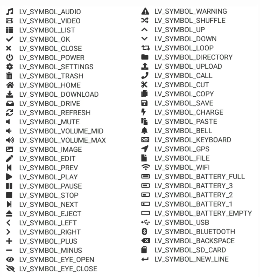
LVGL extends built-in fonts with FontAwesome icons (such as check marks, WiFi symbols, play buttons, etc.), which can be used directly via the LV_SYMBOL_XXX constants:
- Used alone:
lv_label_set_text(label, LV_SYMBOL_OK); - Concatenate with text:
lv_label_set_text (label, LV_SYMBOL_OK " Confirm"); - Concatenating multiple symbols:
lv_label_set_text(label, LV_SYMBOL_OK LV_SYMBOL_WIFI).
2.16.3 Built-in Fonts
LVGL provides multiple types of built-in fonts, which need to be enabled via lv_conf.h using the LV_FONT_… macros, and are mainly divided into two categories: "ordinary fonts" and "special fonts":
2.16.3.1 Regular Font (Montserrat Family)
Based on the Montserrat font, it covers ASCII characters, the degree sign (U+ 00B0), bullet point (U+ 2022) and built-in symbols, offers 19 sizes ranging from 12px to 48px, and follows the naming convention of LV_FONT_MONTSERRAT_<size>(for example, LV_FONT_MONTSERRAT_16), which corresponds to the global variable lv_font_montserrat_16.
2.16.3.2 Special Font
| Constant name | Feature | Applicable scenarios |
|---|---|---|
| LV_FONT_MONTSERRAT_28_COMPRESSED | 28px, 3bpp + compressed storage | Large screens with low memory |
| LV_FONT_DEJAVU_16_PERSIAN_HEBREW | 16px, supports Hebrew / Arabic / Persian | Middle Eastern language interfaces |
| LV_FONT_SIMSUN_16_CJK | 16px, includes 1000 common CJK characters | Basic CJK (Chinese, Japanese, Korean) interface |
| LV_FONT_UNSCII_8/16 | 8/16px, pixel style, ASCII only | Retro pixel-style UI, low-memory devices |
2.16.4 Special Rendering Features of Fonts
2.16.4.1 Bidirectional Text (BiDi) Support
Supports rendering for left-to-right (LTR) and right-to-left (RTL) languages (such as Arabic and Hebrew), as well as mixed-direction text:
- Enable:
lv_conf.hturn onLV_USE_BIDI; - Basic direction: It can be configured via
lv_obj_set_base_dir (obj, dir)for any widget, and child widgets automatically inherit the direction setting from their parent; - Core constants:
LV_BASE_DIR_LTR(default),LV_BASE_DIR_RTL,LV_BASE_DIR_AUTO(auto-detection); - Effect: In RTL mode, the control creation position, Tab bar, checkboxes, etc. will automatically adapt to the right-to-left layout.
2.16.4.2 Arabic / Persian Character Support
The character forms of such languages vary depending on their position (isolated/initial/medial/final), and LVGL enables LV_USE_ARABIC_PERSIAN_CHARS to support this rule, but there are 3 limitations:
- Only static text display such as Label is supported, while Text Area for text input is not supported;
- Only dynamic text (
lv_label_set_text ()) is processed, while static text (lv_label_set_text_static ()) is not processed; - The returned result when retrieving the text is the processed form.
2.16.4.3 Subpixel Rendering
By leveraging the RGB sub-pixel layout of screen pixels, the horizontal resolution is tripled, resulting in smoother font edges:
- Enabling condition: check "Subpixel"(for online converter) / add
--lcdflag (for command line) when generating fonts; - Memory cost: The memory usage of the font increases by approximately 3 times;
- Adaptation: It is necessary to match the screen sub-pixel order (RGB/BGR), which can be configured via
LV_SUBPX_BGR.
Serial No. | Functions | Description | Enabling / Configuration Method | Restrictions / Notes |
1 | Bidirectional Text (BiDi) Support | It supports left-to-right (LTR) and right-to-left (RTL) languages (such as Arabic and Hebrew), and also supports mixed-direction text rendering. | Enable | In RTL mode, the control creation position, Tab bar, checkboxes and other elements will automatically adapt to the right-to-left layout. |
2 | Arabic / Persian character support | It supports the character forms of such languages that vary according to their position (isolated / initial / medial / final). | Enable | Only supports the display of static text such as |
3 | Subpixel Rendering | By leveraging the RGB sub-pixel layout of screen pixels, it improves the horizontal resolution to make font edges more delicate. | When generating fonts, check the "Subpixel" option (in the online converter), or add the | Font memory increases by approximately 3x; it is necessary to match the sub-pixel order (RGB / BGR) of the screen. |
4 | Subset Font | Compresses font bitmaps to reduce memory usage, making it suitable for large-sized fonts. | Check the "Compressed" option in the online converter; this feature is enabled by default in the command line, and you can use | The rendering speed is approximately 30% slower; it is recommended to only compress large-sized, infrequently used fonts; the compression effect is more significant for large-size / high-bpp fonts. |
5 | Kerning | Adjust the spacing between specific character pairs (e. g., "AV", "Ta") to enhance the visual appeal of typesetting. | Generated by the online converter by default; add | FreeType integration is not supported for the time being; Tiny TTF supports GPOS/Kern tables. |
2.16.5 Font Extension (Custom / Dynamic Loading)
Serial No. | Functions | Description | Implementation / Configuration | Restrictions / Notes |
1 | Add New Fonts (Core Extension Method) | LVGL does not natively support vector fonts such as TTF and WOFF, which need to be converted into bitmap fonts before use. | ① Online converter: Configure dimensions, bpp, and character range, then generate a C file to add to the project; ② Offline converter (Node.js): Suitable for batch and local generation; ③ Built-in Font Script (Python): Generates Montserrat fonts with custom dimensions and character ranges. | It must be converted to a bitmap font before use; the font size increases significantly with the dimensions and character set. |
2 | Add New Symbol | Extend custom symbols (such as USB, battery icons) based on FontAwesome. | ① Obtain the Unicode ID of the symbol; ② Import FontAwesome in the online converter and specify the corresponding Unicode; ③ Generate the font file; ④ Define and use constants after converting Unicode to UTF-8. | Ensure that the corresponding Unicode characters are included in the font, and different encoding formats are converted correctly. |
3 | Load fonts at runtime | Supports dynamic font loading from files or memory (not embedded at compile time). | Enable the LVGL file system; ① File loading: ② Memory loading: | The font needs to be converted to |
4 | Custom Font Engine | Replace the LVGL built-in bitmap font engine (e. g., integrate FreeType to render TTF). | Implement two core callbacks: ① ② | It features high implementation complexity, and requires handling issues such as caching and Performance optimization on your own. |
5 | Font Fallback | When the primary font lacks certain characters, it will automatically render them using a fallback font, which is suitable for multi-language and multi-symbol scenarios. | Settings: | Excessively long fallback chains will impact performance; it is necessary to properly plan the font coverage. |
2.16.6 Core Constant Table
2.16.6.1 Basic Direction Constants (BiDi-related)
| Constant name | Value / Meaning | Applicable scenarios |
|---|---|---|
| LV_BASE_DIR_LTR | 0, left to right (default) | Chinese / English / European languages |
| LV_BASE_DIR_RTL | 1, right to left | Arabic / Hebrew / Persian |
| LV_BASE_DIR_AUTO | 2, auto-detect | Mixed-direction text |
2.16.6.2 Built-in Common Font Constants (Montserrat Family)
| Constant name | Size (px) | Constant name | Size (px) |
|---|---|---|---|
| LV_FONT_MONTSERRAT_12 | 12 | LV_FONT_MONTSERRAT_30 | 30 |
| LV_FONT_MONTSERRAT_14 | 14 | LV_FONT_MONTSERRAT_32 | 32 |
| LV_FONT_MONTSERRAT_16 | 16 | LV_FONT_MONTSERRAT_34 | 34 |
| LV_FONT_MONTSERRAT_18 | 18 | LV_FONT_MONTSERRAT_36 | 36 |
| LV_FONT_MONTSERRAT_20 | 20 | LV_FONT_MONTSERRAT_38 | 38 |
| LV_FONT_MONTSERRAT_22 | 22 | LV_FONT_MONTSERRAT_40 | 40 |
| LV_FONT_MONTSERRAT_24 | 24 | LV_FONT_MONTSERRAT_42 | 42 |
| LV_FONT_MONTSERRAT_26 | 26 | LV_FONT_MONTSERRAT_44 | 44 |
| LV_FONT_MONTSERRAT_28 | 28 | LV_FONT_MONTSERRAT_46/48 | 46/48 |
2.16.6.3 Transparency /bpp Related
| Constant name | Meaning | Font bpp options |
|---|---|---|
| LV_OPA_TRANSP | Fully transparent (0) | 1/2/4/8 |
| LV_OPA_COVER | Fully opaque (255) | - |
2.17 Image
The "image" in LVGL is essentially a combination of bitmap data and metadata. The metadata contains key information such as dimensions and color format, and its core design revolves around "lightweight storage", "format adaptability" and "high-performance rendering" to adapt to the memory and hardware constraints of embedded scenarios.
2.17.1 Core Fundamentals: Image Storage Methods
LVGL supports two image storage formats, which are respectively adapted to the scenarios of "fixed resources" and "flexible update":
| Storage method | Storage location | Core carrier | Advantages | Disadvantages |
|---|---|---|---|---|
| Variable storage | Internal memory (RAM/ROM) | lv_image_dsc_t struct | Linked into the program at compile time, resource usage is controllable; no extra IO needed for rendering | Changing an image requires recompiling the project |
| File storage | External storage (SD card / SPI Flash) | LVGL file system driver | Images can be updated independently without rebuilding the main program | Must be loaded into RAM before rendering, IO takes time; low resource friendliness |
lv_image_dsc_t Core Structure (Variable Storage Foundation)
This struct serves as the core encapsulation of memory images, with the following key fields:
header.cf: Color format (determines the storage rule for image pixels);header.w/h: Image width / height (max. 2048px);data: Pointer to the bitmap data;data_size: Byte length of the bitmap data.
2.17.2 Core Foundation: Color Format (Underlying Rules for Image Rendering)
The color format determines the encoding method of image pixels. LVGL divides them into two categories: "built-in formats" and "raw formats", which are the key to adapting images to hardware:
2.17.2.1 Built-in Color Formats (Directly Supported for Rendering)
| Format category | Specific type | Core features | Applicable scenarios |
|---|---|---|---|
| Native format | LV_COLOR_FORMAT_NATIVE | Stores RGB data at the color depth configured in LVGL | Ordinary color images, matching the hardware's native color depth |
| Native with Alpha | LV_COLOR_FORMAT_NATIVE_WITH_ALPHA | Native format + one Alpha byte per pixel | Color images with transparency |
| Indexed color format | LV_COLOR_FORMAT_I1/I2/I4/I8 | Palette mode (2/4/16/256 colors), each pixel takes 1/2/4/8 bits | Images with low color depth and few colors (such as icons) |
| Alpha-only format | LV_COLOR_FORMAT_A1/A2/A4/A8 | Stores only Alpha values, color is determined by style.img_recolor | Single-tone images whose color can change dynamically (such as font-type bitmaps) |
2.17.2.2 Byte Storage Order in Native Format
Under different color depths, LV_COLOR_FORMAT_NATIVE the byte arrangement rule is as follows:
- 32-bit color depth: Byte 0 = Blue → Byte 1 = Green → Byte 2 = Red → Byte 3 = Alpha (when Alpha is included);
- 16-bit color depth: Byte 0 = lower 3 bits of green + 5 bits of blue → Byte 1 = 5 bits of red + upper 3 bits of green → Byte 2 = Alpha (when Alpha is included);
- 8-bit color depth: Byte 0 = 3 bits for red + 3 bits for green + 2 bits for blue → Byte 2 = Alpha (when Alpha is present).
2.17.2.3 Original Format (External Decoder Required)
For common formats such as PNG and JPG that are not directly supported by LVGL, it needs to be used with the "image decoder":
LV_COLOR_FORMAT_RAW: Basic raw format (e. g. pure PNG/JPG);LV_COLOR_FORMAT_RAW_ALPHA: Raw format with an Alpha channel.
2.17.3 Adding and Using Images
2.17.3.1 Two Methods for Adding Images
- Online Converter (Recommended): Upload BMP/PNG/JPG files, configure the name, color format, and output type (variable / binary), then generate files for direct integration; the generated C file will contain all color depth data, but only the part matching
LV_COLOR_DEPTHwill be linked; - Manual creation: Construct the
lv_image_dsc_tstruct at runtime, or dynamically generate an image using the Canvas widget.
2.17.3.2 Core Logic of Image Usage
Render via the lv_image control, simply set the data source:
- Variable storage: bind the
lv_image_dsc_tpointer; - File storage: Specify the file path (you need to register the file system driver first).
2.17.4 Image Decoder
LVGL natively only supports indexed color, native color, etc. , and external decoding libraries need to be integrated for PNG/JPG formats:
- Core: Implement 4 callbacks, namely info (obtain image information), open (decoding), get_area (optional, regional decoding), and close (release resources);
- Mechanism: Multiple decoders can be registered, which will be automatically matched by LVGL; the built-in decoders only support indexed color, RGB565 and RGB888.
2.17.5 Image Post-processing
Adjust the image data after decoding (such as alpha premultiplication and row alignment) to adapt to hardware requirements; mark the processing status to avoid repeated operations.
2.17.6 Image Cache (Performance optimization)
- Purpose: To avoid repeated decoding/reading of PNG/JPG files and improve efficiency;
- Configuration: Set the cache size via LV_CACHE_DEF_SIZE (default: 0), evict entries based on decoding time consumption + usage count; cache needs to be manually invalidated upon file modification;
- Customizable caching algorithms are supported.
2.17.7 Core Constants
| Category | Constant / Macro | Core meaning |
|---|---|---|
| Color format | LV_COLOR_FORMAT_NATIVE | Native RGB, ordinary color image |
| NATIVE_WITH_ALPHA | Native RGB+Alpha, color image with transparency | |
| I1/I2/I4/I8 | Indexed color, low color depth image | |
| A1/A2/A4/A8 | Alpha only, single-tone image | |
| RAW/RAW_ALPHA | Needs decoding, PNG/JPG (RAW_ALPHA has transparency) | |
| Cache | LV_CACHE_DEF_SIZE | Default cache size (0, disabled) |
| PTR/FILE | Cache source: memory pointer / file path | |
| Decoder return value | LV_RESULT_OK | Operation succeeded |
| LV_RESULT_INVALID | Format not supported |
Version Record
Version Number | Modifier | Time | Content |
v1.0 | Li Zisheng | 2026/03/23 | Initialize the document. |
v1.1 | Li Zisheng | 2026/04/07 | Fix the table issue. |