Contents
An Object is a unified abstraction of all UI elements in LVGL and serves as the fundamental building block for constructing GUIs; together with the mechanisms of layout, scrolling and layers, it collectively defines the structure and spatial relationships of the interface.
1.1 Object Foundation (Objects)
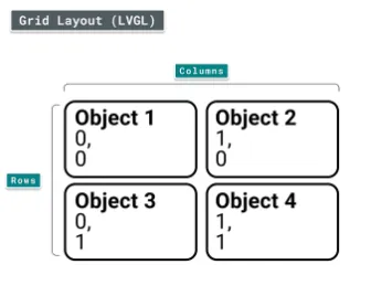
- Core Properties: All objects share common properties (position, size, visibility, etc.), and use Parts to break down internal structures (e. g., the background/text area of a button), and States to describe interaction states (normal / pressed / disabled / focused, etc.).
- Working Mechanism: Objects are organized in a tree structure, supporting screen management and snapshot caching to provide fundamental capabilities for interface switching and state preservation.
- API Support: It provides a unified interface for object creation, destruction, and property read/write operations, serving as the lowest-level operation entry for GUI development.
1.1.1 Core Definition of an Object
All UI elements in LVGL (such as Button, Label, Image, Slider, Chart) are referred to as Objects, and are also commonly translated as "Widgets".
1.1.2 Attributes of the Object: Basic + Exclusive
The attributes of an object are divided into "basic attributes shared by all objects" and "exclusive attributes of specific controls", which correspond to two distinct sets of API designs.
1.1.2.1 Basic Attributes
| Core Basic Properties | Description |
|---|---|
| Position | Object coordinates within the parent container (relative position) |
| Size | Object width and height |
| Parent | Parent object (container) |
| Styles | Style (visual appearance) |
| Event handlers | Event handler (interaction response) |
1.1.2.2 Exclusive Attributes
Different types of controls have their own specific attributes, for example:
- Slider: minimum value, maximum value, current value;
- Switch: On/Off status;
- Chart: data series, axis ranges.
1.1.3 Working Mechanism of Objects
1.1.3.1 Parent-Child Structure
The core rules are as follows:
- Every object (except the screen) has exactly one parent object;
- A parent object can contain any number of child objects;
- A parent object can be understood as a "container", and all the position and display logic of a child object depend on its parent object;
- There are no mandatory parent/child type restrictions, but there are common design conventions (e. g., Button is commonly used as a parent container, and Label is commonly used as a child element).
The core features are as follows:
- Linked Movement - Child Objects Move with Parent Object: The coordinates of a child object are local coordinates relative to its parent object, not absolute screen coordinates. If the position of the parent object changes, all child objects will move synchronously;
- Parent Inner Visibility - Child Objects Beyond Parent Area Are Hidden by Default: If a child object partially or completely exceeds the bounds of its parent container, the exceeding portion will be "clipped"(invisible); clipping can be disabled by adding a flag:
1.1.3.2 Creation and Destruction of Objects
LVGL supports dynamically creating and deleting objects at runtime, and only "currently existing objects" occupy RAM, which is a core design for memory saving on embedded devices.
1.1.4 Screens: Special Top-Level Objects
A screen is a top-level object with no parent object. Each display always has an "active screen", which serves as the ultimate container for all UI elements.
We can create, activate and load, and bring up animated loading screens.
1.1.5 Parts: The "stylable components" of an object
Parts are "sub-modules" split by LVGL for widgets, similar to "pseudo-elements" in CSS, designed to enable fine-grained customization of the visual style of widgets.
LVGL has the following built-in general widgets (all controls are built by combining these components):
| Part Enumeration | Purpose | Example scenario |
|---|---|---|
| LV_PART_MAIN | Main body of the widget (background rectangle) | Button background, slider base |
| LV_PART_SCROLLBAR | Scrollbar | Scrollbar of a list or text box |
| LV_PART_INDICATOR | Indicator | Slider progress bar, switch toggle block, checkbox tick box |
| LV_PART_KNOB | Draggable handle | Slider knob, volume control handle |
| LV_PART_SELECTED | Selected state marker | Selected list item, selected option in a dropdown |
| LV_PART_ITEMS | Repeated child elements | Table cells, list items |
| LV_PART_CURSOR | Cursor / marker | Text box input cursor, chart value cursor |
Different styles can be set for different parts of a control via components, for example:
- Set a gray background for the slider's
LV_PART_MAINpart; - Set a blue
LV_PART_INDICATORof the slider to display a blue Progress Bar; - Set a red circular handle for the slider's
LV_PART_.
1.1.6 States: The "interaction state identifier" of an object
An object can be in multiple "states" at the same time. LVGL automatically switches states based on user interactions, and also supports manual state modification. States serve as the core basis for style switching in different interaction scenarios.
The predefined states are as follows:
| State Enumeration | Meaning | Trigger Scenarios |
|---|---|---|
| LV_STATE_DEFAULT | Default state | Initial state when the widget has not been operated |
| LV_STATE_CHECKED | Checked / toggled state | Switch turned on, checkbox checked |
| LV_STATE_FOCUSED | Focused state | Selected by keyboard / encoder, touched / clicked by mouse |
| LV_STATE_PRESSED | Pressed state | Touch / mouse is held on the widget without release |
| LV_STATE_DISABLED | Disabled state | Widget is not interactive (grayed out) |
| LV_STATE_SCROLLED | Scrolled state | List / text box is being scrolled |
| LV_STATE_USER_1~4 | Custom state | Business extension (such as "Favorited", "Expired") |
LVGL automatically updates its status based on user operations, for example:
- Touch and press the button → Auto add
LV_STATE_PRESSED; - Release the button → Automatically removed
LV_STATE_PRESSED; - Keyboard-selected button → Auto-add
LV_STATE_FOCUSED.
We can also manually set / clear states via code (supports bitwise OR of multiple states |).
1.1.7 Snapshot: The "Screenshot Function" of Objects
It can generate a snapshot image (e. g. PNG/BMP) containing the object and all its sub-objects, which is commonly used for:
- Save the screenshot of the current interface;
- Convert complex controls into image caches to improve rendering performance.
1.2 Layout and Space Management
The positioning, sizing and layout design of LVGL draw heavily on the core logic of CSS (with lightweight adaptations for embedded scenarios), and serve as the core capability for controlling the arrangement of UI elements.
- Position and Size: Supports absolute positioning and relative positioning, and can dynamically adjust the size and coordinates of objects via styles or code to adapt to different resolution.
- Layout System: Built-in layout algorithms including flow, grid, and flexbox, which automatically arrange child elements to eliminate manual position calculation and improve interface adaptation efficiency.
- Transformation and Translation: Support object transformations such as translation, scaling, and rotation to achieve dynamic visual effects.
- Scrolling Mechanism: Provides scrolling capability for objects whose content exceeds the display area (such as lists and long texts), supporting manual scrolling, automatic scrolling, and scrollbar style customization.
1.2.1 Core Overview
The position/size/layout system of LVGL has the following core features (a CSS subset adapted to embedded resource constraints):
- Styled Storage: Attributes such as position, size, and layout are ultimately stored in the object's style (which can be configured via the style API or the simplified API in mpy);
- Size constraints: support
min-width/max-width,min-height/max-heightto limit the extreme values of the object's dimensions; - Multi-unit support: pixel, percentage, content Self-Adaptation (LV_SIZE_CONTENT);
- Coordinate reference:
x= 0; y= 0represents the top-left corner of the parent object's content area (the parent object's padding + border width shall be superimposed); - Box Model: follows the CSS
border-boxmodel (width and height include borders and padding); - Layout Support: Built-in Flexbox (flexible layout) and Grid (grid layout) to cover the vast majority of UI arrangement scenarios.
1.2.2 Core Units
LVGL supports three units, which are the basis for setting positions and dimensions, and can be passed directly in mpy via the corresponding method:
| Unit Type | Description | Example (mpy) |
|---|---|---|
| Pixel | Absolute pixel value; an integer represents pixels by default | obj.set_x(10) → set the object's x coordinate to 10 pixels |
| Percentage | Relative value (based on the parent object's content area size); requires conversion with lv.pct() | obj.set_width(lv.pct(50)) → width is 50% of the parent object's content area |
| Content-adaptive (LV_SIZE_CONTENT) | Special constant; the object size automatically fits all child elements (similar to CSS auto) | obj.set_width(lv.SIZE_CONTENT) → width adapts to child elements |
1.2.3 Boxing Model
LVGL follows the CSS border-box model, where an object's "size box" consists of 4 components (which determine the calculation logic for position and size):
| Core Enumeration (mpy) | Meaning |
|---|---|
| lv.ALIGN_TOP_LEFT | Top-left corner of the parent object |
| lv.ALIGN_TOP_MID | Top center of the parent object |
| lv.ALIGN_TOP_RIGHT | Top-right corner of the parent object |
| lv.ALIGN_BOTTOM_LEFT | Bottom-left corner of the parent object |
| lv.ALIGN_BOTTOM_MID | Bottom center of the parent object |
| lv.ALIGN_BOTTOM_RIGHT | Bottom-right corner of the parent object |
| lv.ALIGN_LEFT_MID | Left center of the parent object |
| lv.ALIGN_RIGHT_MID | Right center of the parent object |
| lv.ALIGN_CENTER | Exact center of the parent object |
The key rules are as follows:
- The border is drawn inside the "bounding box" of the object;
- The coordinate reference of a child element is "the top-left corner of the parent object's content area"(i. e., the top-left corner of the parent object + padding + border);
- The outline is drawn outside the bounding box and does not affect the size or layout of the object.
1.2.4 Important Notes
- Delayed coordinate calculation: For performance reasons, LVGL does not immediately calculate coordinate or dimension modifications, and only marks the object as "Dirty Data" for unified refresh before screen redraw; if you need to obtain the latest value immediately after modifying the position or dimension, you need to manually trigger the refresh.
- Impact of style removal: The simplified APIs for position/size (such as
set_x/set_width) essentially write attributes to the "local style" of the object; if you remove all styles of the object (such asobj.remove_style_all ()) or remove the style of the main part (LV_PART_MAIN), the already set position/size will be cleared at the same time.
1.2.5 Location Settings
1.2.5.1 Location Settings
In mpy, settings can be configured directly via a simplified API, with the coordinate origin set at the top-left corner of the parent object's content area.
1.2.5.2 Alignment
Flexible alignment is achieved by modifying the "alignment origin", the core of which lies in the lv.ALIGN_XXX enumeration, which can be used directly in mpy.
We can align it to the parent object:
| Feature | Translation | Transformation |
|---|---|---|
| Position / size | Changes the real position | Visual scaling only; the real size is unchanged |
| Layout Impact | Affects layout / scrollbar | Does not affect layout / scrollbar |
| Purpose | Position offset during interaction | Visual scaling during interaction (no layout interference) |
You can also align it to any reference object:
Implemented via align_to, which supports the "external alignment" enumeration (LV_ALIGN_OUT_XXX). mpy example:
# Align the label to the top center of btn, offset upward by 10 pixels
label.align_to(btn, lv.ALIGN_OUT_TOP_MID, 0, -10)
External Alignment Core Enumeration (mpy):
lv.ALIGN_OUT_TOP_LEFT/OUT_TOP_MID/OUT_TOP_RIGHTlv.ALIGN_OUT_BOTTOM_LEFT/OUT_BOTTOM_MID/OUT_BOTTOM_RIGHTlv.ALIGN_OUT_LEFT_TOP/OUT_LEFT_MID/OUT_LEFT_BOTTOMlv.ALIGN_OUT_RIGHT_TOP/OUT_RIGHT_MID/OUT_RIGHT_BOTTOM
1.2.6 Dimension Setting
1.2.6.1 Location Settings
In mpy, by simplifying API settings, it supports pixels, percentages, and LV_SIZE_CONTENT:
# Set width/height separately
obj.set_width(200)  # Width 200 pixels
obj.set_height(100) # Height 100 pixels

# Set width and height at once
obj.set_size(200, 100)

# Percentage example: height is 100% of the parent's content area (fills the parent's height)
obj.set_height(lv.pct(100))

# Content-adaptive example: width fits all child elements
obj.set_width(lv.SIZE_CONTENT)
1.2.6.2 Content Area Dimensions
Directly set the width and height of the "content area"(the actual width and height of the element = width and height of the content area + border + padding):
# Set content area width to 50 pixels (actual width = left padding + 50 + right padding)
obj.set_content_width(50)
# Set content area height to 30 pixels
obj.set_content_height(30)

# Get size (mpy)
w = obj.get_width()          # Get bounding box width
content_w = obj.get_content_width()  # Get content area width
1.2.6.3 Minimum / Maximum Dimensions
Set size extremities via style configuration to solve the issue of "percentage / Self-Adaptation size exceeding expectations", an mpy example is as follows:
# 1. Create a style and set max-height
style = lv.style_t()
style.init()
style.set_max_height(200)  # Maximum height 200 pixels (lv.pct(50) is also supported)

# 2. Add the style to the object to limit its height
obj.set_height(lv.pct(100))  # Originally fills the parent's height
obj.add_style(style, lv.PART_MAIN)  # Limit height to no more than 200 pixels
1.2.7 Style Control Position / Size
The simplified API for position and dimensions is essentially "syntactic sugar for styling", and directly using style settings offers the following advantages:
- Batch Setting: A single style can be applied to multiple objects to uniformly control their size and position;
- Stateful Configuration: Set different positions/sizes for different states (e. g., pressed, focused);
- Transition Animation: Smooth animations for size/position changes can be achieved via style transitions;
- Layered Overriding: The base style is set with default values, and child styles only override the properties that need to be modified.
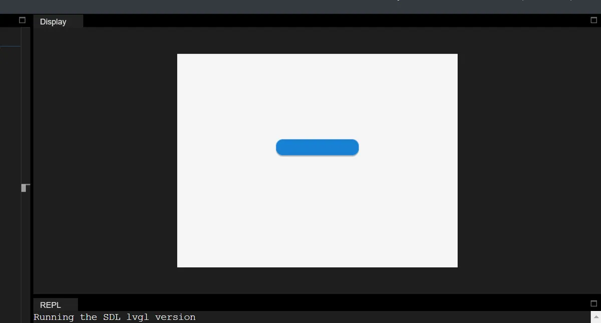
mpy example (the width increases when the button is pressed):
# Initialize

import display_driver
import lvgl as lv

# Create a button with a label

lv.init()
scr = lv.screen_active()

btn = lv.button(scr)
btn.align(lv.ALIGN.CENTER, 0, 0)

# 1. Create the default state style
style_normal = lv.style_t()
style_normal.init()
style_normal.set_width(100)  # Default width 100 pixels

# 2. Create the pressed state style
style_pressed = lv.style_t()
style_pressed.init()
style_pressed.set_width(120)  # Width 120 pixels when pressed

# 3. Add styles to the button
btn.add_style(style_normal, lv.STATE.DEFAULT)
btn.add_style(style_pressed, lv.STATE.PRESSED)

lv.screen_load(scr)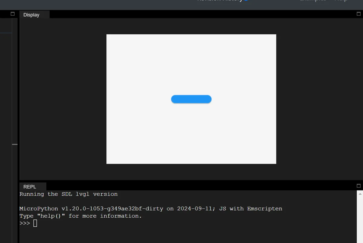
1.2.8 Translation
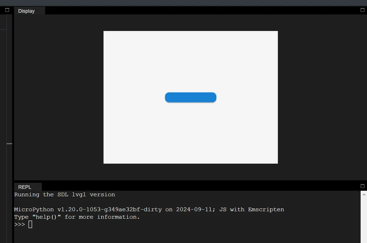
Relative offset based on the object's current position, which solves the problem that "objects with different initial positions offset by the same distance during interaction"(e. g., moving up when a button is pressed), mpy example:
# Initialize

import display_driver
import lvgl as lv

# Create a button with a label

lv.init()
scr = lv.screen_active()

btn = lv.button(scr)
btn.align(lv.ALIGN.CENTER, 0, 0)

# 1. Create the default state style
style_normal = lv.style_t()
style_normal.init()
style_normal.set_width(100)  # Default width 100 pixels

# 2. Create the pressed state style
style_pressed = lv.style_t()
style_pressed.init()
style_pressed.set_width(120)  # Width 120 pixels when pressed
# Create the pressed state style, set y-axis translation to -20 pixels (move up 20)
style_pressed.set_translate_y(-20)

# 3. Add styles to the button
btn.add_style(style_normal, lv.STATE.DEFAULT)
btn.add_style(style_pressed, lv.STATE.PRESSED)

lv.screen_load(scr)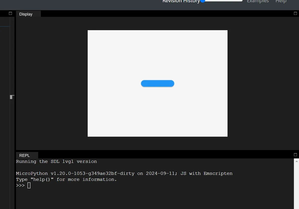
In addition, there are two key features:
- Percentage support: The percentage for translation is based on the object's own dimensions (not the parent object). For example,
set_translate_x (lv.pct (50))→ offset to the right by 50% of the object's own width; - Layout Compatibility: The translation takes effect after layout calculation, which does not affect the layout, but will trigger the recalculation of scroll bars / content Self-Adaptation (actually changing the position).
1.2.9 Transformation
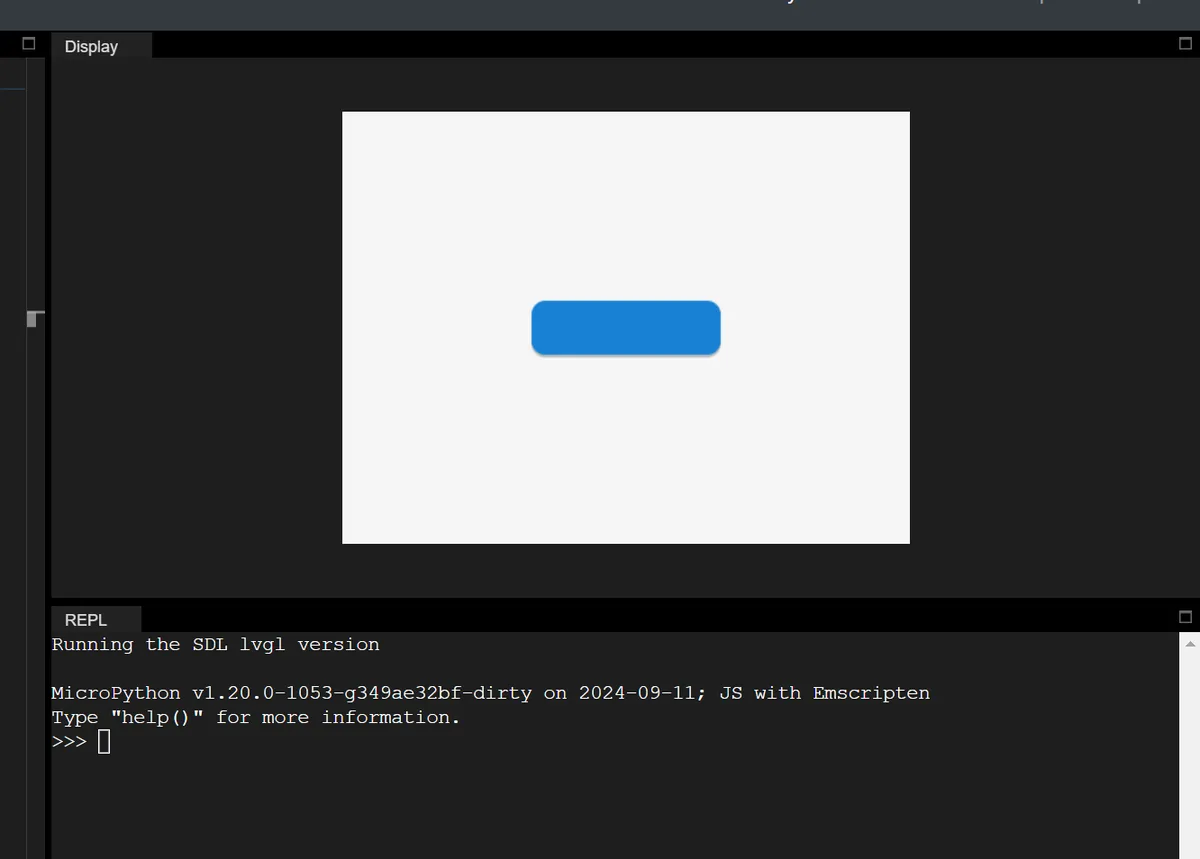
"Visual scaling" based on the object's current size only changes the display effect, without affecting the actual size (the layout, scroll bars, and content Self-Adaptation will not perceive it). mpy example (enlarge when the button is pressed):
# Initialize

import display_driver
import lvgl as lv

# Create a button with a label

lv.init()
scr = lv.screen_active()

btn = lv.button(scr)
btn.align(lv.ALIGN.CENTER, 0, 0)

# 1. Create the default state style
style_normal = lv.style_t()
style_normal.init()
style_normal.set_width(100)  # Default width 100 pixels

# 2. Create the pressed state style
style_pressed = lv.style_t()
style_pressed.init()
style_pressed.set_width(120)  # Width 120 pixels when pressed
# Expand width/height outward by 10 pixels each (visually +20 in width, +20 in height)
style_pressed.set_transform_width(10)
style_pressed.set_transform_height(10)

# 3. Add styles to the button
btn.add_style(style_normal, lv.STATE.DEFAULT)
btn.add_style(style_pressed, lv.STATE.PRESSED)

lv.screen_load(scr)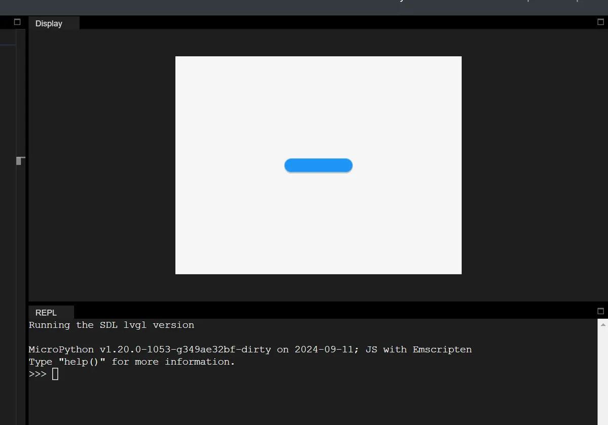
| Layout Type | Main Purpose | Key Features |
|---|---|---|
| Flexbox (lv.LAYOUT_FLEX) | Arranges child objects in rows / columns | Supports wrapping, adaptive expansion, alignment, and spacing adjustment |
| Grid (lv.LAYOUT_GRID) | Arranges child objects in a two-dimensional grid | Fixed rows and columns, cell merging, adaptive proportions |
1.2.10 Layout System (Layout)
The layout automatically calculates the position and size of child objects (overriding manually set x/y/width/height), which is enabled via set_layout in mpy:
# Enable Flex layout on the parent container
container = lv.obj(lv.screen_active())
container.set_layout(lv.LAYOUT_FLEX)
1.2.10.1 Built-in Layouts
LVGL has two built-in core layouts (inspired by CSS), which are the most commonly used layout methods in mpy:
| Flags (mpy) | Purpose |
|---|---|
| lv.OBJ_FLAG_HIDDEN | Hidden objects are ignored by the layout |
| lv.OBJ_FLAG_IGNORE_LAYOUT | The object is completely free of layout control (position / size set manually) |
| lv.OBJ_FLAG_FLOATING | Equivalent to IGNORE_LAYOUT, and is ignored by LV_SIZE_CONTENT |
1.2.10.2 Layout-related Flag Bits
Control the behavior of child objects in the layout via flags, which in mpy are set using add_flag / remove_flag as follows:
| Feature Name | Core description | Key controls (flag / event / API) | Additional notes |
|---|---|---|---|
| Scrollability control | 1. Removing the specified flag disables container scrolling (scroll actions can still be passed to the parent container); 2. Can restrict the container to scroll only in specific directions (/ direction combinations) | 1. Disable scrolling: remove LV_OBJ_FLAG_SCROLLABLE; 2. Direction restriction: lv_obj_set_scroll_dir(obj, LV_DIR_...) | Supported directions: LV_DIR_TOP/LEFT/BOTTOM/RIGHT/HOR/VER/ALL, can be combined (e.g. `LV_DIR_TOP、LV_DIR_LEFT`) |
| Scroll chain | When a child container reaches its scroll limit, the scroll action is passed up level by level to the parent container (child → parent → grandparent), and the parent scrolls instead | Enable / disable: LV_OBJ_FLAG_SCROLL_CHAIN_HOR (horizontal) / VER (vertical) | With the flag off, the scroll action ends at the current container and is no longer passed up |
| Scroll momentum | Simulates physical inertia: after the user releases a swipe, scrolling decelerates slowly, restoring a realistic interaction feel | Enable / disable: LV_OBJ_FLAG_SCROLL_MOMENTUM | - |
| Elastic scroll | When scrolling past the boundary, the content slightly exceeds the edge, then automatically bounces back to a valid position after release, improving the interaction experience | Enable: LV_OBJ_FLAG_SCROLL_ELASTIC | Under normal conditions the container cannot scroll beyond its content |
| Snapping | When scrolling ends, child objects automatically align to a specified position in the container, making scrolling more orderly (e.g. carousel / list item alignment) | 1. Child object can snap: LV_OBJ_FLAG_SNAPPABLE; 2. Alignment rule: lv_obj_set_scroll_snap_x/y(obj, LV_SCROLL_SNAP_...) (NONE/START/END/CENTER) | After the scroll is released, the momentum end point is calculated first, then the nearest snap point is found and scrolled to with animation |
| Scroll one | When enabled, each scroll switches only one snappable child object (e.g. a carousel moves one page per swipe) | Enable: LV_OBJ_FLAG_SCROLL_ONE | Prerequisite: the child objects are snappable, and the container's snap alignment is set to something other than NONE |
| Scroll on focus | When focus moves to a child object outside the container's visible area, the container automatically scrolls to bring that object into view | No specific control flag; a built-in LVGL feature | Supports recursive scroll adaptation for nested containers and across tabs (tabview) |
| Manual scrolling | 1. Active trigger: scroll by an offset / to specified coordinates; 2. Real-time retrieval: scroll offset coordinates | 1. Trigger API: lv_obj_scroll_by/to/to_x/to_y(); 2. Coordinate retrieval API: lv_obj_get_scroll_x/y/top/bottom/left/right() | Can be used for saving the scroll position, updating the UI dynamically, etc. |
| Self size | 1. Self size is the actual size of the object's content area (as opposed to its displayed size); 2. Scrolling is triggered when self size > displayed size (scrolling is possible even without children) | Custom self size: handle the LV_EVENT_GET_SELF_SIZE event | Typical scenario: table widget (many rows make the self height much larger than the displayed height) |
mpy Example:
# Child object ignores the layout; position is set manually
obj.add_flag(lv.OBJ_FLAG_IGNORE_LAYOUT)
obj.set_pos(10, 10)  # Layout will not modify this position
1.2.10.3 Custom Layout
In MPY, custom layouts (for advanced use cases) can be implemented by registering layout callbacks, with the core logic as follows:
- Register the layout update function;
- Calculate the position / size of the sub-object in the callback;
- Set a custom layout identifier for the container.
1.2.11 Scroll
The scrolling system of LVGL is the core mechanism for implementing interactive browsing when content exceeds the container in embedded GUIs, featuring an intuitive design that aligns with user expectations and supporting a rich set of customization features.
1.2.11.1 Core Principle of Scrolling
The trigger logic of scrolling in LVGL is extremely intuitive:
- When a child element extends beyond the "content area" of its parent element — the area obtained by subtracting the parent element's padding from its dimensions —
pad, the parent element automatically switches to a scrollable state, and the scrollbar will be displayed according to the configured settings; - Any type of LVGL object (buttons, images, meters, ordinary containers, etc.) can serve as a scroll container;
- Scrolling only supports horizontal/vertical unidirectional (e. g. only horizontal, only vertical), and diagonal scrolling is not supported.
1.2.11.2 Scrollbar: A Visual Indicator for Scrolling
A scrollbar provides intuitive feedback of the scrolling status, and supports flexible display and style control:
- Display Mode: The display logic of the scrollbar can be controlled via configuration, and the core modes include:
- Off (OFF): Never display the scrollbar;
- Always Show (ON): The scrollbar is displayed regardless of whether scrolling is required;
- Show while scrolling (ACTIVE): Only displayed when the user swipes the container;
- Auto (AUTO): Display only when the content exceeds the container.
- Style Customization:
- The scrollbar is an independent component
LV_PART_SCROLLBARwhose styles (e. g. background color, width) can be configured separately; - When the container is in the "scrolled" state (
LV_STATE_SCROLLED), you can set a dedicated style for the scrollbar (e. g., change its color while scrolling); - You can adjust the spacing between the scrollbar and the container via padding (
pad), and control the thickness of the scrollbar through thewidthproperty; if the container is configured with RTL (right-to-left) text direction, the vertical scrollbar will automatically move to the left side (it is on the right side by default).
- The scrollbar is an independent component
1.2.11.3 Scroll Events: Monitor Scrolling Behavior
LVGL provides three types of core events for capturing the entire lifecycle of scrolling:
Core Event | Meaning of Core Events |
LV_EVENT_SCROLL_BEGIN | Triggered when scrolling starts, the parameters of the scrolling animation (such as animation duration and easing curve) can be modified; |
LV_EVENT_SCROLL_END | Triggered when scrolling ends, which is suitable for executing the final logic after scrolling (such as loading more content and updating status); |
LV_EVENT_SCROLL | Triggered during scrolling (on every position change), suitable for real-time monitoring of scroll position (e. g., dynamically updating UI elements, recording scroll offset). |
1.2.11.4 Rolling Core Expansion Features
LVGL provides a rich set of scroll enhancement features covering both interactive experience and functional control:
| Method (mpy) | Purpose |
|---|---|
| obj.move_foreground() | Move the object (and its children) to the top layer of the parent container |
| obj.move_background() | Move the object (and its children) to the bottom layer of the parent container |
1.3 Layer Management (Layers)
The layers in LVGL essentially control the rendering hierarchy of UI elements (i. e., "which element appears on top of another"), and there are two core hierarchical systems:
- First, the default hierarchy of ordinary objects based on the "creation order";
- Second, there are special system layers (top/sys/bottom) that are globally visible.
To be precise:
- Hierarchy Rules: Objects are stacked by default in the order they are created, and the hierarchy can be adjusted manually to achieve overlay effects such as pop-up windows and floating windows.
- Special layers: The top/sys layers are used to display global pop-ups and status bars; the bottom layers are for background elements to ensure a clear hierarchy of priorities.
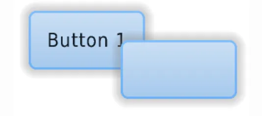
1.3.1 Creation Order: Default Hierarchy Rules
LVGL follows the default "later-created objects on top" principle: newly created objects (and their child objects) are drawn on top of older objects (and their child objects), which may cover the display area of the older objects.
# Initialize

import display_driver
import lvgl as lv

# Create a button with a label

lv.init()
scr = lv.screen_active()

# Create the first button (created first, lower in z-order)
btn1 = lv.button(scr)
# Position (x=60, y=40)
btn1.set_pos(60, 40)
label1 = lv.label(btn1)
label1.set_text("Button 1")

# Create the second button (created later, higher in z-order, covers the overlapping area of btn1)
btn2 = lv.button(scr)
# Position (x=60, y=60)
btn2.set_pos(60, 60)
label2 = lv.label(btn2)
label2.set_text("Button 2")

lv.screen_load(scr)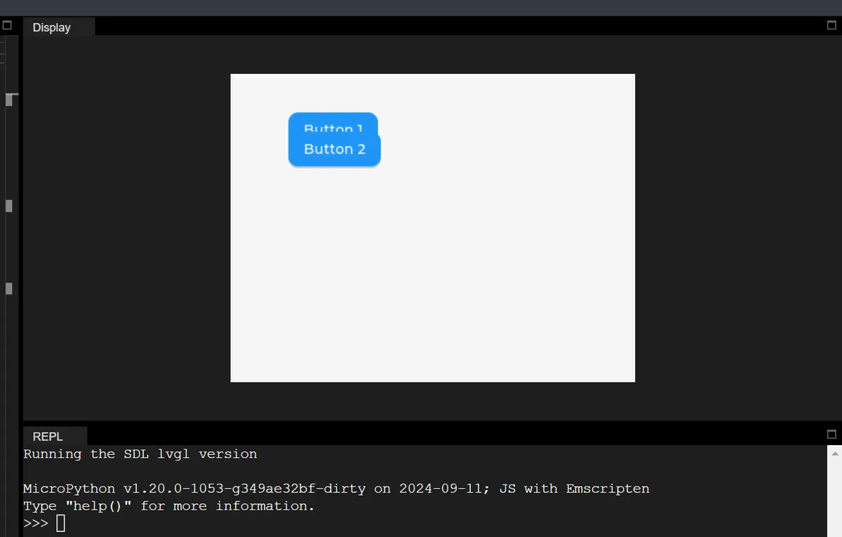
1.3.2 Modify Hierarchy: Proactively Adjust the Display Order of Objects
When the default creation order fails to meet requirements (e. g., moving a low-level button to the top layer), LVGL provides 4 explicit methods to modify the layer order, which can be directly invoked via the corresponding object methods in MicroPython:
1.3.2.1 Pin to Top / Pin to Bottom (Most Commonly Used)
| Method (mpy) | Purpose |
|---|---|
| obj.move_foreground() | Move the object (and its children) to the top layer of the parent container |
| obj.move_background() | Move the object (and its children) to the bottom layer of the parent container |
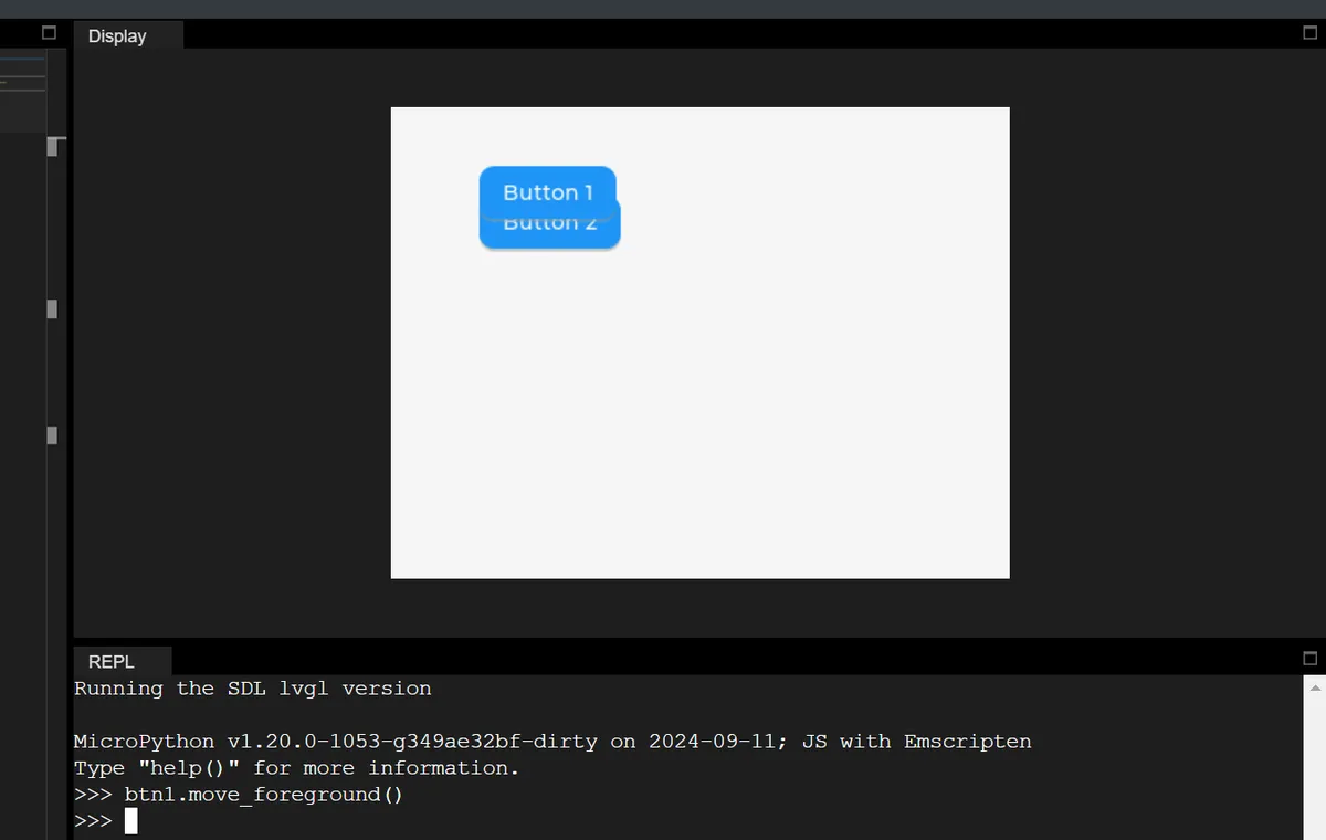
mpy example: Bring the previously created btn1 to the top layer (to cover btn2)
# Move btn1 to the topmost layer of the parent container (scr)
btn1.move_foreground()
1.3.2.2 Move to the specified index position
Each child object of a parent container has an "index value", which determines the hierarchy:
- Index
0: the bottom layer of the parent container; - Index
Number of child objects + 1: the upper layer of the parent container; - Negative indices: count backwards from the top level (e. g.,
-1= top level,-2= the level immediately below the top level).
mpy core method:
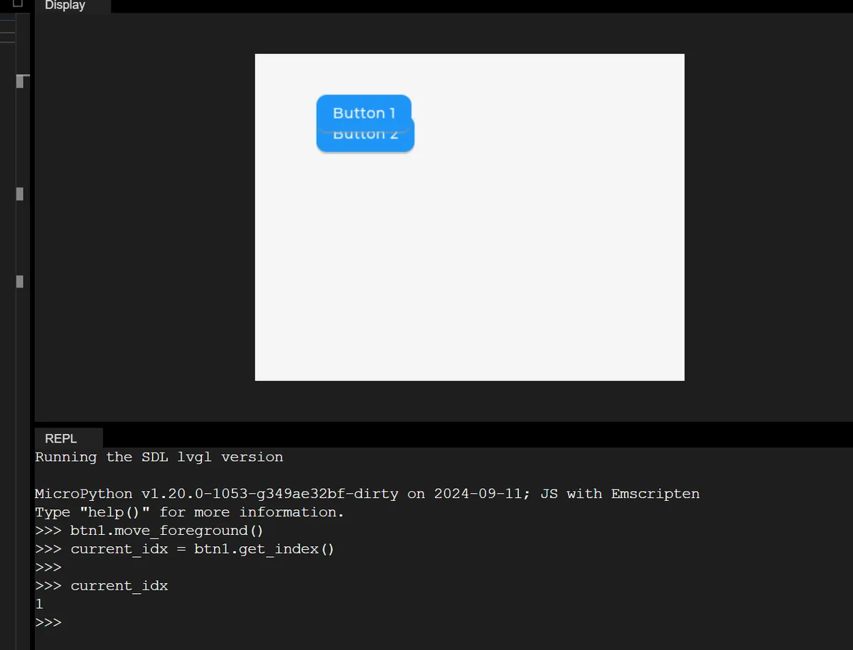
# 1. Get the object's current index
current_idx = obj.get_index()

# 2. Move to the specified index (e.g., move up 1 level)
obj.move_to_index(current_idx + 1)

# 3. Move directly to the bottom layer (index 0)
obj.move_to_index(0)
mpy example:
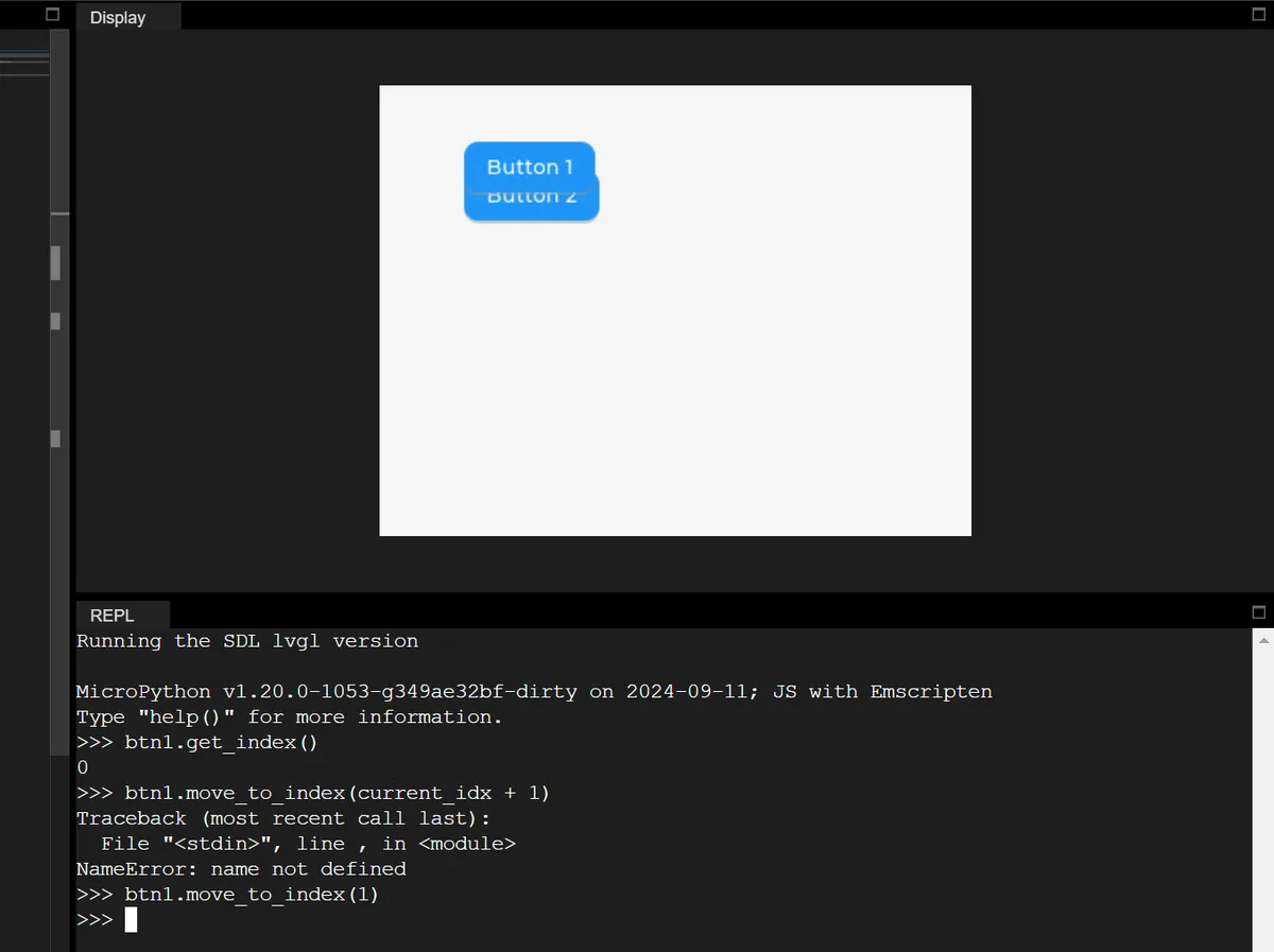
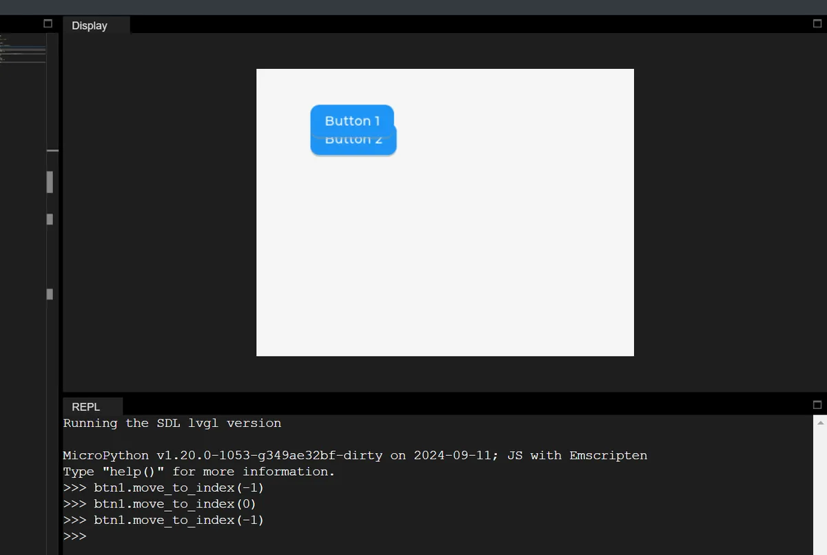
1.3.2.3 Hierarchy Impact of Changing the Parent Object
When you modify the parent container of an object via obj.set_parent (new_parent), the object will automatically become the topmost child object of the new parent container.
# Change btn1's parent to btn2; btn1 becomes the topmost child of btn2
btn1.set_parent(btn2)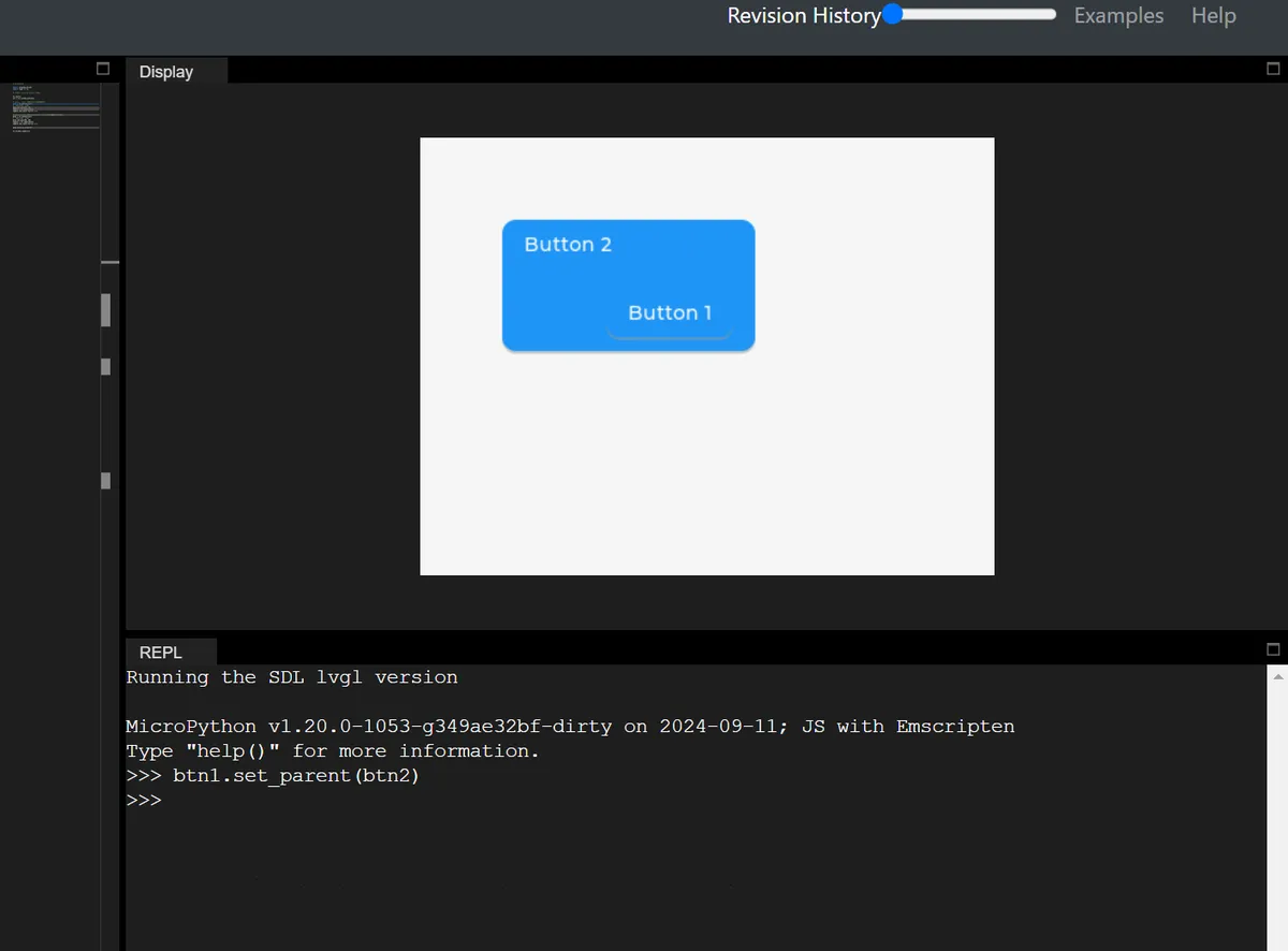
1.3.3 Top Layer and System Layer (Top & Sys Layers)
LVGL provides two globally visible special layers (shared by all screens, not shared across different displays) for each physical display, which are hierarchically higher than all objects on ordinary screens:
layer_top(top-level layer): at the topmost layer of the currently active screen (lv.screen_active ());layer_sys(system layer): Located at the very top oflayer_top, it is the highest hierarchy of the entire display.
Many beginners are confused about LVGL's layer_top / layer_sys / layer_bottom, and the core reason is that they fail to understand the essential difference between "ordinary screen objects" and "global special layers":
- Ordinary objects (such as buttons and pop-ups) belong to a specific screen and will disappear when you switch screens;
- A special layer is a "display-level global layer": no matter which screen you switch to, the content on this layer remains visible at all times, and its hierarchy is fixed to be above or below all regular screens.
显示器最终显示效果 = 最顶层往下叠加
├─ layer_sys(系统层,最顶层)→ 比如鼠标光标,永远在所有内容上面
├─ layer_top(顶级图层)→ 比如全局弹窗、悬浮窗,覆盖所有屏幕
├─ 当前活跃的普通屏幕(屏幕A/屏幕B)→ 普通按钮/标签都在这一层
└─ layer_bottom(底层图层)→ 比如全局背景图,在所有屏幕下面
1.3.3.1 layer_top (Top-level Layer): Globally Visible "Floating Window / Modal Pop-up"
Similar to the "floating window" or "system pop-up window" on a mobile phone: no matter which APP (corresponding to a regular screen in LVGL) you switch to, the floating window remains displayed; when "modal mode" is enabled, the underlying content cannot be clicked (for example, a mobile phone pop-up window blocks operations on the APP).
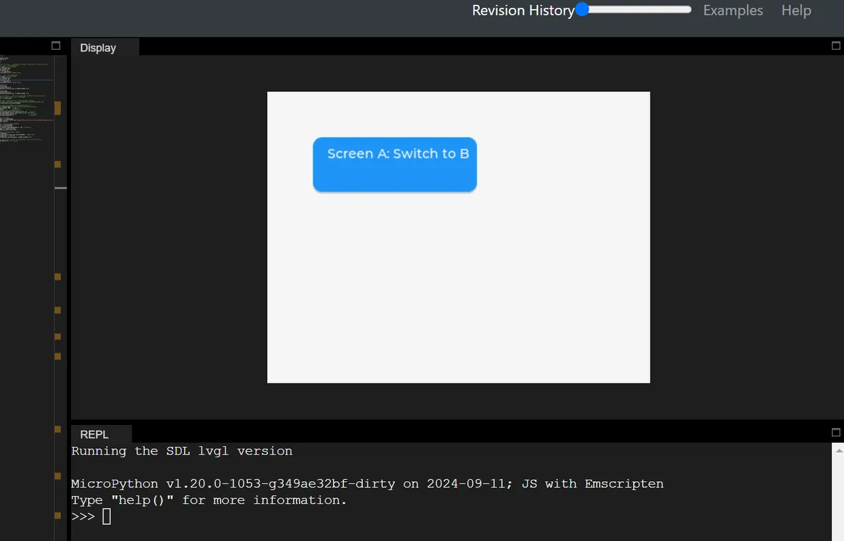
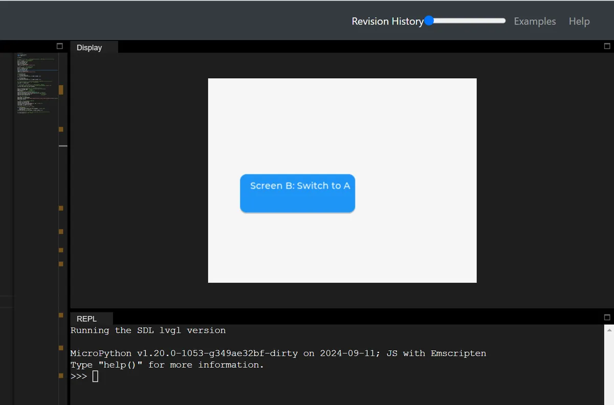
In the following code, two regular screens that can be switched between each other are created, and a globally visible modal popup is generated on layer_top. This popup is similar to the "system-level popup" on mobile phones: it does not disappear when switching between screens, and will block the interaction of the underlying screen. The underlying buttons can only be used normally after the popup is closed.
# Initialize

import display_driver
import lvgl as lv

lv.init()

# ===================== Step 1: Create two normal screens (for switching test) =====================
# Screen A: add a button; clicking it switches to screen B
scr_a = lv.obj()  # Create normal screen A
btn_a = lv.button(scr_a)
btn_a.set_size(180, 60)
btn_a.set_pos(50, 50)
label_a = lv.label(btn_a)
label_a.set_text("Screen A: Switch to B")

# Screen B: add a button; clicking it switches to screen A
scr_b = lv.obj()  # Create normal screen B
btn_b = lv.button(scr_b)
btn_b.set_size(180, 60)
btn_b.set_pos(50, 150)
label_b = lv.label(btn_b)
label_b.set_text("Screen B: Switch to A")

# Bind the screen switching event
def switch_to_b(e):
    lv.screen_load(scr_b)
btn_a.add_event_cb(switch_to_b, lv.EVENT.CLICKED, None)

def switch_to_a(e):
    lv.screen_load(scr_a)
btn_b.add_event_cb(switch_to_a, lv.EVENT.CLICKED, None)

# ===================== Step 2: Create a global modal popup with layer_top =====================
# 1. Get the display's top layer (global layer, shared by all screens)
top_layer = lv.layer_top()

# 2. Add a "click absorb" flag to top_layer → implements modal behavior (buttons below cannot be clicked)
# Principle: when the user clicks the screen, the click event is received by top_layer, and widgets on the underlying screen do not get the click event
top_layer.add_flag(lv.obj.FLAG.CLICKABLE)

# 3. Create the popup on top_layer (globally visible, stays regardless of which screen is shown)
popup = lv.obj(top_layer)  # The parent object is top_layer, not a normal screen!
popup.set_size(300, 200)   # Popup size
popup.center()             # Popup centered
# Set popup style: white background, gray border, rounded corners
popup.set_style_bg_color(lv.color_hex(0xFFFFFF), 0)    # White background
popup.set_style_border_color(lv.color_hex(0xCCCCCC), 0)# Gray border
popup.set_style_border_width(2, 0)                     # Border width 2px
popup.set_style_radius(10, 0)                          # Corner radius 10px

# 4. Add text + close button to the popup
popup_label = lv.label(popup)
popup_label.set_text("Global Modal Popup\n→ Persists across screen switches\n→ Blocks clicks on underlying elements")
popup_label.center()

# Add close button: clicking it removes the modal and closes the popup
close_btn = lv.button(popup)
close_btn.set_size(120, 30)
close_btn.align(lv.ALIGN.BOTTOM_MID, 0, -10)  # Popup bottom center
close_label = lv.label(close_btn)
close_label.set_text("Close Popup")

# Event to close the popup: remove click absorption + delete the popup
def close_popup(e):
    top_layer.remove_flag(lv.obj.FLAG.CLICKABLE)  # Cancel click absorption
    popup.delete()  # Delete the popup
close_btn.add_event_cb(close_popup, lv.EVENT.CLICKED, None)

# ===================== Step 3: Load the initial screen and run the test =====================
lv.screen_load(scr_a)  # Load screen A first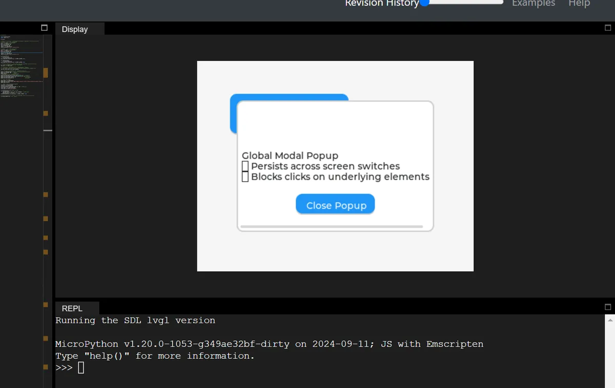
It can be seen that:
- Startup procedure: Screen A is displayed, but is covered by the pop-up window of
layer_top, and clicking the "Switch to B" button on Screen A has no response (modal blocking); - Test operation: Even if you switch to Screen B via other methods (such as modifying the code), the pop-up window will still be displayed on top of Screen B, and the "Switch to A" button on Screen B will also be unclickable;
- Close the pop-up: Click the "Close Popup" button on the pop-up, the pop-up will disappear,
layer_topwill no longer absorb click events. At this point, the toggle buttons for Screen A/B can be clicked normally, and the screens can be switched between each other; - Core Verification:
layer_toppop-up is "global", ordinary screen switching will not affect it, and it can block all underlying interactions — this is exactly the core logic of the "system-level modal pop-up / floating window" on mobile phones.
1.3.3.2 layer_sys (system layer): the topmost "system-level element"
LVGL internally uses this layer to place elements that "must always be on top"(such as the mouse cursor). Even if layer_top has a pop-up window, layer_sys content will still cover the pop-up.
The demo code is as follows:
# Initialize

import display_driver
import lvgl as lv
import time

lv.init()

# ===================== Step 1: Create two normal screens (for switching test) =====================
# Screen A: add a button; clicking it switches to screen B
scr_a = lv.obj()  # Create normal screen A
btn_a = lv.button(scr_a)
btn_a.set_size(180, 60)
btn_a.set_pos(50, 50)
label_a = lv.label(btn_a)
label_a.set_text("Screen A: Switch to B")

# Screen B: add a button; clicking it switches to screen A
scr_b = lv.obj()  # Create normal screen B
btn_b = lv.button(scr_b)
btn_b.set_size(180, 60)
btn_b.set_pos(50, 150)
label_b = lv.label(btn_b)
label_b.set_text("Screen B: Switch to A")

# Bind the screen switching event
def switch_to_b(e):
    lv.screen_load(scr_b)
btn_a.add_event_cb(switch_to_b, lv.EVENT.CLICKED, None)

def switch_to_a(e):
    lv.screen_load(scr_a)
btn_b.add_event_cb(switch_to_a, lv.EVENT.CLICKED, None)

# ===================== Step 2: Create a global modal popup with layer_top =====================
# 1. Get the display's top layer (global layer, shared by all screens)
top_layer = lv.layer_top()

# 2. Add a "click absorb" flag to top_layer → implements modal behavior (buttons below cannot be clicked)
# Principle: when the user clicks the screen, the click event is received by top_layer, and widgets on the underlying screen do not get the click event
top_layer.add_flag(lv.obj.FLAG.CLICKABLE)

# 3. Create the popup on top_layer (globally visible, stays regardless of which screen is shown)
popup = lv.obj(top_layer)  # The parent object is top_layer, not a normal screen!
popup.set_size(300, 200)   # Popup size
popup.center()             # Popup centered
# Set popup style: white background, gray border, rounded corners
popup.set_style_bg_color(lv.color_hex(0xFFFFFF), 0)    # White background
popup.set_style_border_color(lv.color_hex(0xCCCCCC), 0)# Gray border
popup.set_style_border_width(2, 0)                     # Border width 2px
popup.set_style_radius(10, 0)                          # Corner radius 10px

# 4. Add text + close button to the popup
popup_label = lv.label(popup)
popup_label.set_text("Global Modal Popup\n→ Persists across screen switches\n→ Blocks clicks on underlying elements")
popup_label.center()

# Add close button: clicking it removes the modal and closes the popup
close_btn = lv.button(popup)
close_btn.set_size(120, 30)
close_btn.align(lv.ALIGN.BOTTOM_MID, 0, -10)  # Popup bottom center
close_label = lv.label(close_btn)
close_label.set_text("Close Popup")

# Event to close the popup: remove click absorption + delete the popup
def close_popup(e):
    top_layer.remove_flag(lv.obj.FLAG.CLICKABLE)  # Cancel click absorption
    popup.delete()  # Delete the popup
close_btn.add_event_cb(close_popup, lv.EVENT.CLICKED, None)

# ===================== Step 3: Load the initial screen and run the test =====================
lv.screen_load(scr_a)  # Load screen A first

# Get the system layer (topmost layer)
sys_layer = lv.layer_sys()

# 2. Create a small circle (simulates a mouse cursor)
cursor = lv.obj(sys_layer)
cursor.set_size(20, 20)       # Cursor size 20x20
cursor.set_style_bg_color(lv.color_hex(0xFF0000), 0)  # Red background
cursor.set_style_radius(10, 0)                        # Circle (radius = size/2)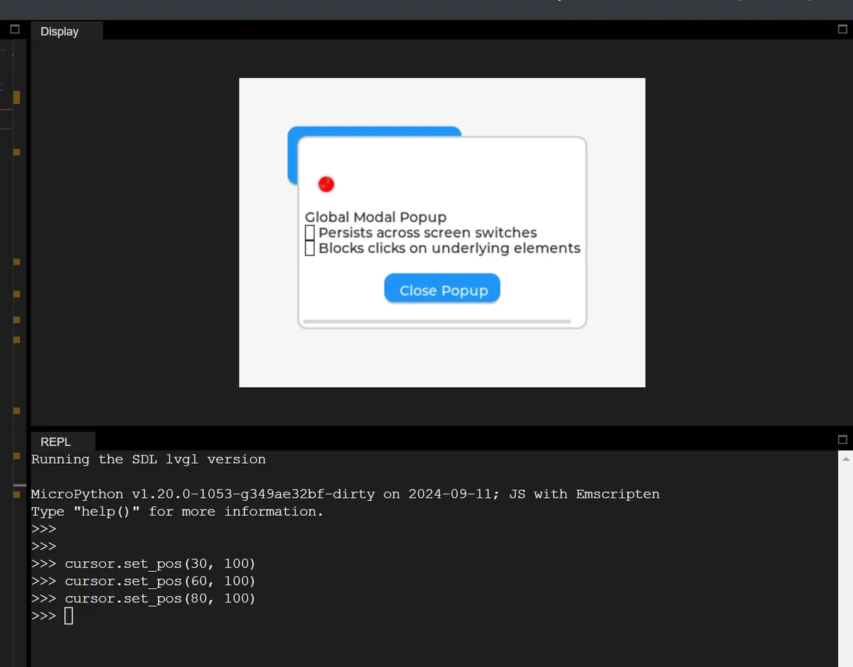
After running, you can see the following:
As we run the command to adjust the ball position in the REPL, the red circular cursor will pass through the pop-up window of layer_top and always stay on the top (it remains visible even when blocked by the pop-up window).
The summary is as follows:
layer_sysis the "ultimate top layer", and no content can override it;- Developers generally do not use
layer_systo avoid interfering with the internal cursor/system elements of LVGL; - Each display has its own independent
layer_sys, which is not shared between different displays.
1.3.4 layer_bottom (bottom layer): Global background image
Set the "background for all screen sharing", such as the global background image of an APP, so that the background remains unchanged no matter which page (screen) you switch to (provided that the screen background is semi-transparent).
In the following code, we set:
- layer_bottom refers to the dark blue global background;
- Screen A features a light gray semi-transparent background;
- Screen B has a background of a different color.
# Initialize

import display_driver
import lvgl as lv
import time

lv.init()

# ===================== Step 1: Create the global background for layer_bottom =====================
# Get the bottom layer
bottom_layer = lv.layer_bottom()

# Global background: dark blue (#1A237E), fully opaque (to highlight the global background)
bg_rect = lv.obj(bottom_layer)
bg_rect.set_size(lv.pct(80), lv.pct(80))  # Fill the entire screen
bg_rect.set_style_bg_color(lv.color_hex(0x1A237E), 0)  # Dark blue (high contrast)
bg_rect.set_style_bg_opa(255, 0)  # Background opaque

# ===================== Step 2: Create two normal screens (semi-transparent background) =====================
# Screen A: semi-transparent background (so the light cyan of the bottom layer shows through)
scr_a = lv.obj()
scr_a.set_style_bg_opa(64, 0)  # Opacity 64 (25%), more transparent
scr_a.set_style_bg_color(lv.color_hex(0xF5F5F5), 0)  # Light gray
btn_a = lv.button(scr_a)
btn_a.set_pos(50, 50)
btn_a.set_size(180, 60)
label_a = lv.label(btn_a)
label_a.set_text("Screen A: Switch to B")

# Screen B: semi-transparent background as well
scr_b = lv.obj()
scr_b.set_style_bg_opa(64, 0)
scr_b.set_style_bg_color(lv.color_hex(0xF5F5F5), 0)
btn_b = lv.button(scr_b)
btn_b.set_pos(50, 150)
btn_b.set_size(180, 60)
label_b = lv.label(btn_b)
label_b.set_text("Screen B: Switch to A")

# Bind the switch event
def switch_to_b(e):
    lv.screen_load(scr_b)
btn_a.add_event_cb(switch_to_b, lv.EVENT.CLICKED, None)

def switch_to_a(e):
    lv.screen_load(scr_a)
btn_b.add_event_cb(switch_to_a, lv.EVENT.CLICKED, None)

# ===================== Step 3: Test the result =====================
lv.screen_load(scr_a)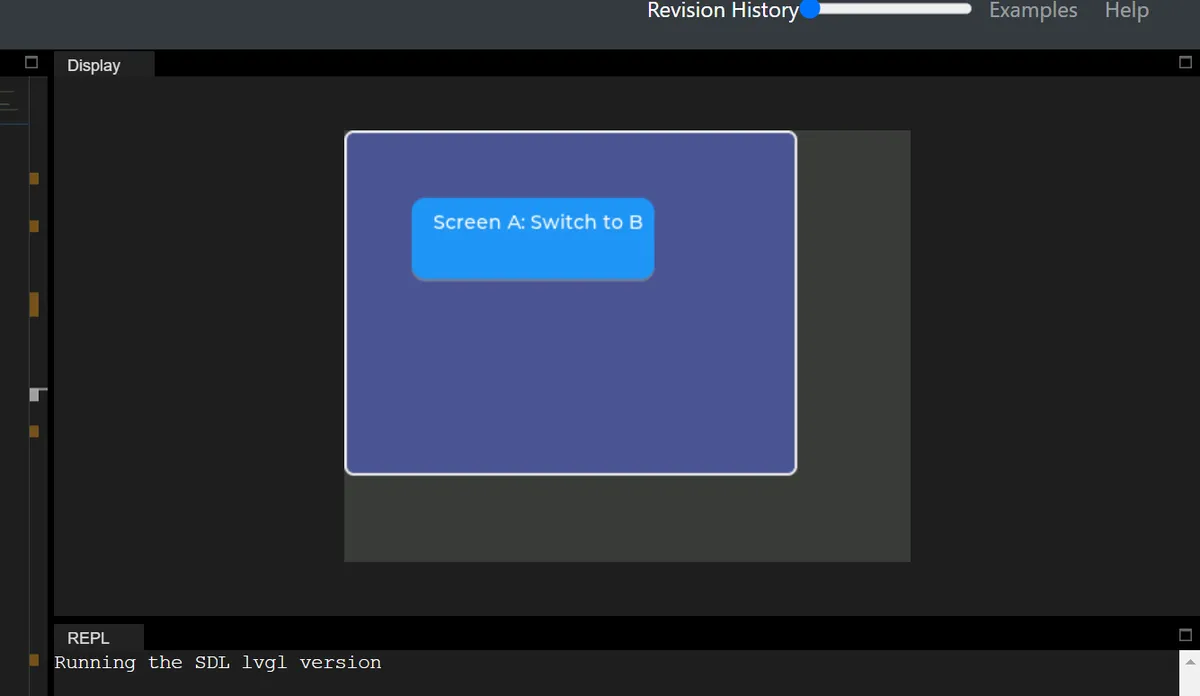
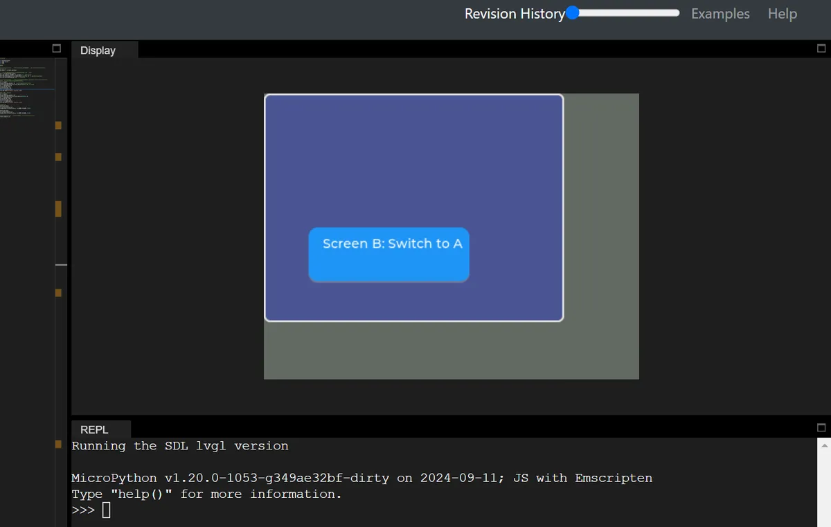
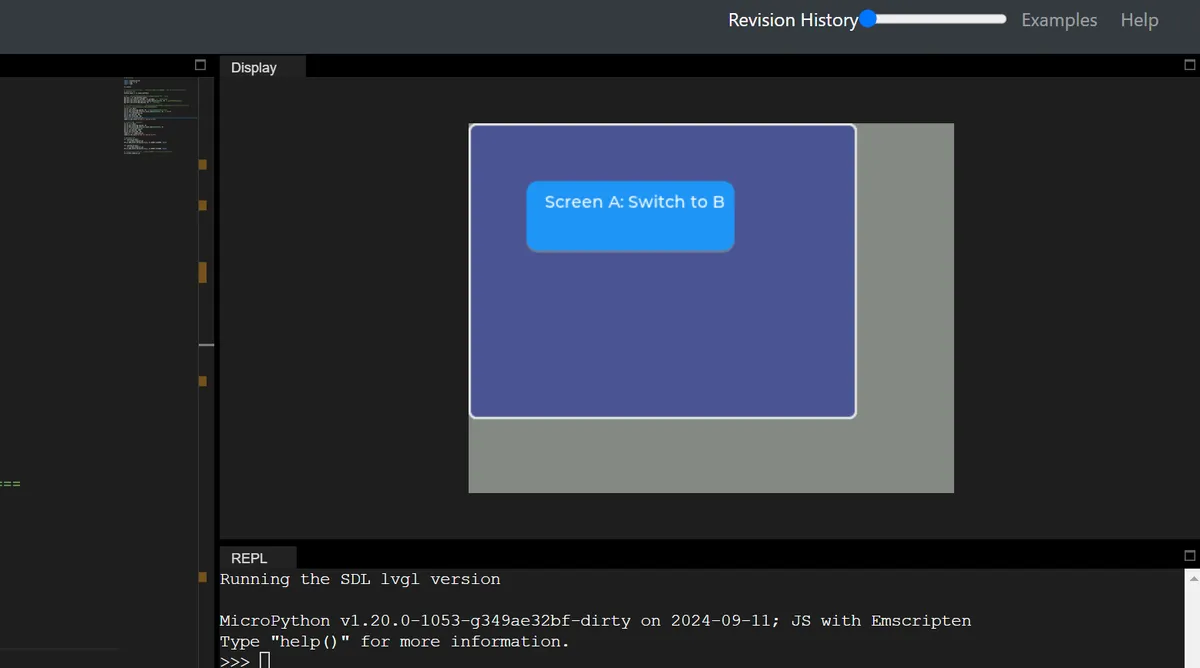
It can be seen that when switching between screens A and B, the dark blue global background remains unchanged at all times, while the light gray screen background changes accordingly with the switch.
Version Record
Version Number | Modifier | Time | Content |
v1.0 | Li Zisheng | 2026/03/23 | Initialize the document. |