
4.1 Box Model
LVGL box model = a 4-layer structure, which from the inside out is in the order of:
Hierarchy | Function | Code Mapping | Effect / Description |
Content Area (Content) | The actual contents placed inside the box. |
| Located at the innermost layer, where text and icons are displayed; it is wrapped by padding and will not directly stick to the border. |
Padding | The blank space between the content and the border. |
| Leave a 15-pixel margin on the top, bottom, left and right sides to keep content away from the edges and create a more polished interface. |
Border | The outer contour line of the box. |
| The padding encloses the content area and forms the boundary of the box. |
Shadow | The projection on the exterior of the box. | Attributes such as shadow width and offset | It is only responsible for visual beautification, does not occupy layout space, and will not affect the size or position of the box. |
Summary | The LVGL box model consists of a 4-layer structure. | Content + Padding + Border + Shadow | Total size of the control = content + padding + border; shadows are not included in the actual layout size. |
The sample code is as follows:
import display_driver
import lvgl as lv

lv.init()
# Initialize screen
scr = lv.screen_active()
scr.set_style_bg_color(lv.color_hex(0x000000), 0)

# 1. Create container (box model carrier)
obj = lv.obj(scr)
obj.set_pos(80, 80)    # Position of the box on the screen
obj.set_size(120, 120) # Total size of the box

# 2. Core: box model styles (simplified, keeping only key attributes)
style = lv.style_t()
# --------- Padding: blank space inside the box ---------
style.set_pad_all(15)       # Uniform padding on all sides
# --------- Background (base color of the content area) ---------
style.set_bg_color(lv.color_hex(0xFF0000)) # Red background
style.set_bg_opa(255)
# --------- Border: the box's border ---------
style.set_border_width(3)   # Border width
style.set_border_color(lv.color_hex(0x00FF00)) # Green border
# --------- Shadow: drop shadow outside the box ---------
style.set_shadow_width(8)
style.set_shadow_color(lv.color_hex(0x00FFFF))
style.set_shadow_offset_x(5)
style.set_shadow_offset_y(5)

# Apply style
obj.add_style(style, lv.STATE.DEFAULT)

# 3. Content area: label (placed inside the box, squeezed by the padding)
label = lv.label(obj)
label.set_text("BOX")
label.center() # Centered inside the box
label.set_style_text_color(lv.color_hex(0xFFFFFF), 0)

# Show interface
lv.screen_load(scr)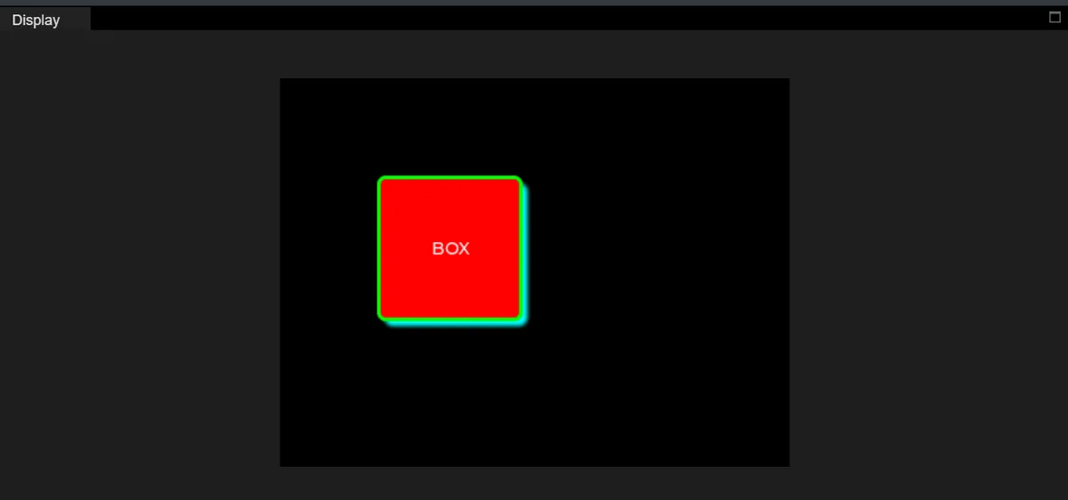
This code transforms the abstract "box model" into an intuitively visible interface by combining a red container, internal labels, and visual layering, which perfectly corresponds to the four-layer structure of LVGL widgets:
- Innermost layer: Content Area
- Corresponding code:
label = lv.label(obj)+label.set_text("BOX") - Screenshot display: white text in the middle of the red background
BOX - Core Meaning: The "content" actually carried by the control (such as text, icons, sub-controls, etc.), which is the innermost layer of the box model.
- Note: The content area will be "pushed" to the center by the padding and will not be directly attached to the border.
- Corresponding code:
- Second Layer: Padding
- Code Correspondence:
style.set_pad_all (15)(add 15px padding around the container) - Screenshot Representation: The area with a red background (the part within the green border and excluding the text)
- Core meaning: the blank space between the content area and the border, which serves to prevent the content from sticking to the border and makes the interface more aesthetically pleasing.
- Intuitive verification: If you modify the code to
style.set_pad_left (30), you will see the text pushed to the right, and the "squeezing effect" of the padding will be more pronounced.
- Code Correspondence:
- Layer 3: Border
- Corresponding code:
style.set_border_width(3)+set_border_color(0x00FF00) - Screenshot performance: the circle of green outline surrounding the red background
- Core meaning: the "outer boundary" of the box, which wraps the padding and content area and defines the visible edge of the control.
- Size impact: The border adds to the visual size of the control; for instance, the 3px border here makes the box appear thicker overall.
- Corresponding code:
- Outermost Layer: Shadow
- Corresponding code:
style.set_shadow_*series attributes (cyan, offset 5px, width 8px) - Screenshot performance: the light cyan blurred shadow at the bottom right of the green border
- Core meaning: the "visual projection" of the box, which does not occupy layout space and only serves as a beautification effect to enhance three-dimensionality and distinguish layers.
- Key Difference: Shadows do not change the position / size of the box, nor do they affect the layout of other controls — they are purely visual decorations.
- Corresponding code:
Version Record
Version Number | Modifier | Time | Content |
v1.0 | Li Zisheng | 2026/03/24 | Initialize the document. |