
Your prototype can show a reading and switch an output. Then someone asks for a settings page, a second sensor and a way to stop the current operation. The display that looked generous in the first demo suddenly feels small. Before choosing a larger screen, or shrinking every button, work out what people need to see and do together.
The useful question for a first control panel is: can a person find the next action without losing sight of the device's state? A browser simulator lets you explore that while the display and enclosure are still easy to change. We ran the layout experiments below with LVGL 9.0 and MicroPython in the LVGL browser simulator. They show layout behavior, not a finished touchscreen product or a user test.
Start with one task, then give it enough room
Suppose a visitor needs to choose an effect and start it. Put those controls together, keep the current state visible, and move rarely changed settings elsewhere. The first sketch only needs to answer where the person starts, what changes after a press, and how they get back. Styling can wait.
This is still a live engineering problem. In a September 2026 development account, an Igalia developer described fitting controls onto a 3.5-inch display, then replacing a scrolling design with tabs because redraws on the real hardware were too slow. A centered test button had also hidden reversed touch coordinates. It is one project's experience, but a good reason to test more than one good-looking first screen.
Our first experiment was a box with a label: 120 by 120 pixels, a 3-pixel border and 15 pixels of padding on each side. That leaves 84 pixels across for content. Padding is room inside the box; it does not create screen space. A shadow extends the appearance without adding room for text.
If a button looks too narrow, check the container's usable space before changing the font. The label, gaps, padding and border all count. A desktop preview also changes apparent size when you zoom it. A 40-pixel-high button is not a promise that a finger can comfortably operate it on the final panel.
Keep related controls together
A container is a parent object; the buttons and labels inside it are its children. Aligning a child within its parent keeps that relationship as sizes change. Aligning a label next to another object expresses something different: this description belongs beside that control. On a product screen, think "value inside its status card" versus "explanation beside its action."
# Keep a child centered in its parent.
child.align(lv.ALIGN.CENTER, 0, 0)

# Place a separate label below a reference control.
label.align_to(ref_btn, lv.ALIGN.OUT_BOTTOM_LEFT, 0, 10)
Placing objects by absolute coordinates is fine for learning. It becomes tedious when several labels and buttons must stay aligned as their text changes. That is what layout rules are for.
Flex works well for a row of actions or a vertical list of settings. We placed three 70 by 40 buttons in a horizontal container and four in a vertical one, with 10-pixel gaps. The buttons must be created as children of the container for its rule to apply.
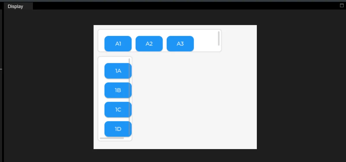
Those scrollbars are a reason to revisit width and padding, not a sign that the layout is finished. A button press in this setup printed a message from the event callback. That confirms the callback ran in the simulator; it does not establish touch accuracy, a completed hardware action or a comfortable control size.
Grid gives each control a cell, which suits a stable set of equally important choices. We used three 80-pixel columns, two 50-pixel rows and 10-pixel gaps in a 280-pixel container. Three columns plus two gaps already take 260 pixels before the container's own padding and border.
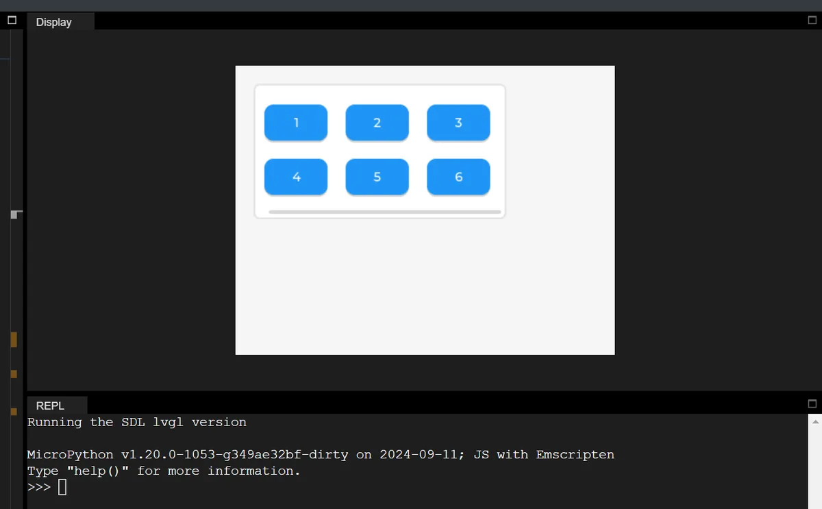
Choose the arrangement that matches the task. A grid helps someone compare six choices at once; a column handles descriptions of different lengths. Neither makes a crowded screen usable on its own. Try the longest real labels, an unavailable option and a missing reading before you approve the screen dimensions.
Decide what is allowed to scroll away
We put ten 180 by 30 buttons, spaced 40 pixels apart, inside a 200 by 150 window. Only part of the list is visible at once. The important choice is what you allow to disappear. A list of optional settings can scroll. If the person needs the current state or a stop control throughout an operation, keep it outside that list. That is a design proposal to test with your own task, not a safety function.
container.set_scroll_dir(lv.DIR.VER)
container.set_scrollbar_mode(lv.SCROLLBAR_MODE.AUTO)
Direction and scrollbar appearance are separate settings. Hiding the bar does not disable scrolling. AUTO shows a bar when content overflows, ACTIVE shows it while scrolling, ON keeps it visible and OFF hides it. Check the LVGL 9.0 scrolling reference rather than relying on memory; these modes are easy to mix up.
Menus also get confusing when their contents change. In a March 2025 LVGL forum question, a developer showed how hiding items could leave the user looking at an empty part of a scrollable container. That report used LVGL 8.3.11, so treat it as a test case, not proof of identical behavior in every version. Try it on purpose: scroll to the bottom, remove an option, and check what remains visible. Scroll-begin and scroll-end events help you observe these transitions, but they describe scrolling, including animated scrolling, not a finger touching or leaving the panel.
Show a press without moving the target
We compared default and pressed styles, including an upward translation and a width change. Feedback helps, but a button that jumps into another control or slides out from under a finger makes the next action less predictable. One of our transformation tests changed the declared width as well as the transform properties, so it did not isolate a purely visual effect. Change one property at a time if you want to know which one affects neighboring controls.
A clear pressed state and an explicit result are enough for a first prototype. Whether a tap starts, pauses or requests an operation belongs in the application logic. An animation does not confirm that the operation happened.
Put a confirmation on top, and test closing it
When objects overlap, later siblings normally draw over earlier siblings in the same parent. That is a local ordering rule within one parent, not a single list covering every object. (When we tested reordering, a NameError in the console came from an undefined index variable in our script, not from the reorder method.)
A popup on LVGL's top layer stays above screen content, and a clickable top layer intercepts input behind it. The close action must remove the popup and release that blocking state. Otherwise the interface can look normal while refusing every touch.
Take one realistic task onto the real panel
Use the simulator to settle the first screen, the necessary settings, the feedback and the route back. Then put that task on the intended display with representative text and live state changes. Ask someone unfamiliar with the build to complete it without coaching, and watch where they hesitate and what they press twice.
Check touch alignment in the corners as well as the center. Try rapid taps, scrolling while values update, long labels, and closing a popup after a screen change. Test inside the proposed enclosure opening: an edge control that is easy with a mouse can be awkward beside a bezel. Record the display, firmware version and conditions with each result.
The simulator gave us visible layout behavior and a vocabulary for changes. It did not give a measured refresh rate, a touchscreen usability study or a validated enclosure. Those are the next things to collect before treating the interface as ready for users.