
Your prototype now has more controls than fit comfortably on one screen. You could add tabs, a scrolling list or another page, but the important question comes first: what does the user need to find, and how will they get back?
For a founder or designer preparing a connected device for user testing, navigation should make the main task easier. A person checking a reading should not have to guess whether tapping a tab changes the view or changes how the device operates.
We tried LVGL's list and tab view widgets with MicroPython in the LVGL browser simulator: grouping items, identifying the selected tab and changing labels. Below we use those small experiments to plan a navigation structure, keeping simulator behavior separate from untested hardware controls.
Organize tasks before adding pages
Write down the few things a first-time user needs to do. For a monitoring prototype these might be checking current readings, reviewing recent activity and changing settings. "Readings," "History" and "Settings" make good tab names because they describe destinations. (That is an example; we did not build a monitoring product here.)
A list works differently. It groups a larger set of related entries under headings, with each row leading to a detail or an action. Our list test was 300 by 200 pixels with two headings and six buttons, A1 to A3 and B1 to B3, labeled simply so the grouping was easy to check in code. The LVGL 9.0 list reference explains the difference between text entries and button entries.
We then gave each button a click callback that read its text, changed it to a "(Clicked)" version and printed the before-and-after values:
before = list_obj.get_button_text(btnA1)
list_obj.set_button_text(btnA1, "A1 (Clicked)")
We only checked that one in code, not on screen. In a product, a changed label must tell the user something useful. "Clicked" is fine development feedback, but it does not confirm a setting was saved or a physical action completed. Keep navigation labels recognizable, and put progress or device feedback somewhere its meaning is clear.
Give each tab a clear destination
Our tab test created tabs A, B and C and put a label inside each tab's container. With C selected, the content area read "tabview C." That is the relationship to keep when you replace test labels with product language: the selected destination and the displayed content must agree.
A second test set tab index 2 as the starting selection and printed the active index from a VALUE_CHANGED callback. Indexes start at zero, so 2 is the third tab. The console logged each change as we moved between tabs.
Choose the starting page on purpose. A status-oriented device might open on current readings; a first-run prototype might open on the unfinished setup step. Those are different entry conditions, not a reason to make the interface remember whichever tab happened to be open during development.
Also keep a tab inside a view separate from a separate top-level screen. Each tab here holds its own content container. Switching between whole screens, or driving more than one physical display, needs an explicit application structure that these tests did not cover.
Use dynamic labels sparingly
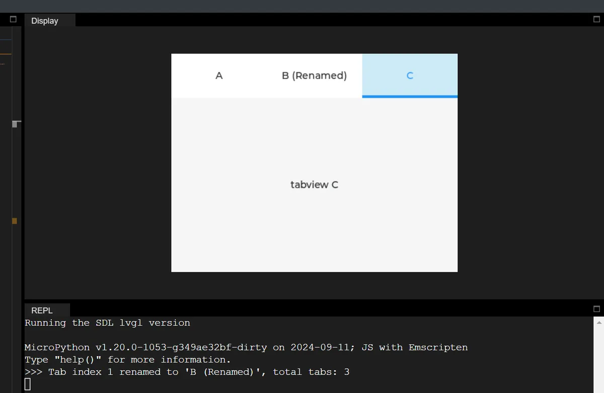
In another test we renamed B to "B (Renamed)" the first time index 1 became active, with a flag so it happened only once. The console confirmed there were still three tabs.
The rename call changes a label, not the user's task. Showing a connected device's name can be a good reason to rename. Changing a familiar destination just because someone visited it makes navigation harder to follow. Test final labels with someone who did not build the prototype.
We also tried moving the tab bar to the bottom with a 50-pixel height after C was selected, and changing the bar's background to gray. Both are useful for learning the API. Neither should become product behavior by default: moving navigation during use changes where the user has to look and tap, and color can mark regions but cannot replace clear labels and a visible selected state. For a first user test, pick a stable bar position and check how much content area remains.
Test dragging across controls, not just tapping tabs
The LVGL 9.0 tab view documentation describes two ways to change tabs: tapping the tab buttons or dragging horizontally across the content. The second matters as soon as a page has its own controls. A user may be trying to move to the next page, not press the button under their finger.
In a Home Assistant community thread from March 2025, an ESPHome user reported that swiping across a button also switched a light. The thread discusses alternative handling and a separate tab-dragging issue. It shows a real interaction problem; it does not prove our simulator setup has the same defect, or that one workaround fits every configuration.
Before linking navigation to anything consequential, try slow drags, short taps, and movements that start or end on a control. Decide whether you need drag-to-change-page at all. The official tab view examples show scrolling disabled on the content container; that is a setting to evaluate in your binding, not a hardware fix we have verified.
Keep the task understandable on the real display
A TrailCurrent build log from September 2026 describes redesigning interfaces for vehicle displays of different sizes and using desktop simulation to iterate. It is one team's account, not independent validation, but it shows the same workflow at a larger scale.
The practical question for a smaller prototype is the same: will the navigation make sense with the screen mounted in its enclosure and operated by a finger? Check the real viewing position, the available space and the longest labels. A browser simulator makes changes easy to inspect; it does not measure reach, touch accuracy, or whether a user notices a destination.
Ask a participant to find one setting, return to the main view and explain what changed. Then repeat from a different starting page. If the path is unclear, simplify the organization before adding animation. After that, connect a small number of well-understood screens to real device behavior and test the full task.