
You have a small screen, several useful functions and very little room for labels. Replacing the words with icons makes the prototype look cleaner. But will someone seeing it for the first time know whether a circular arrow refreshes a reading, repeats an action or resets the device?
For a design team preparing a controller or interactive exhibit for user trials, the decision is about the action people expect, not just whether the graphic renders correctly. Start with the tasks a visitor needs to perform, then choose symbols and labels that describe those tasks.
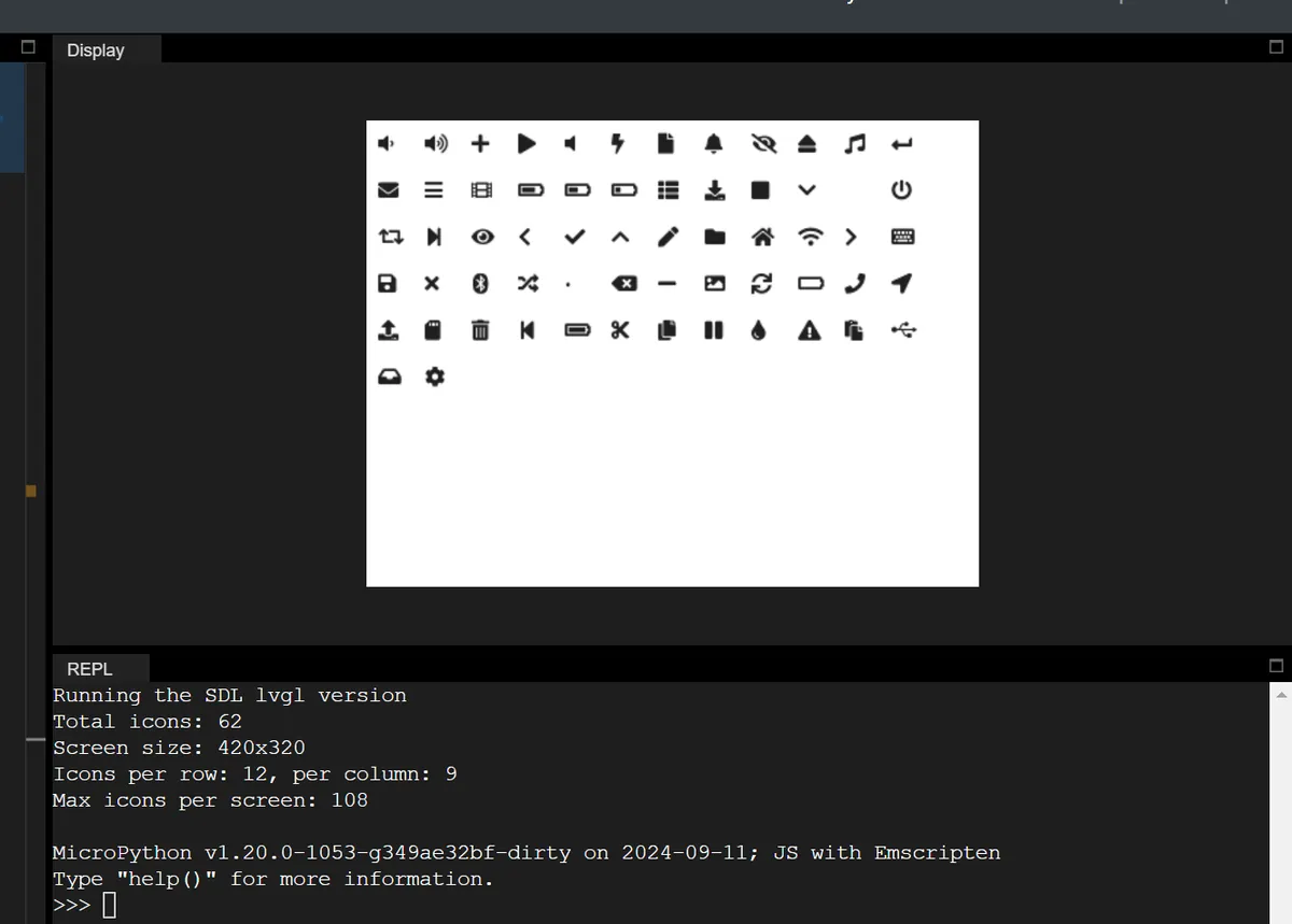
We started from LVGL's built-in symbol set, running under MicroPython in the LVGL simulator. Our test program drew every available symbol: the console reported 62 symbols on a 420 by 320 display. That shows what this build can draw. It does not show that anyone understood the icons, or that such a dense layout suits a physical touchscreen.
Give each action a meaning before choosing its symbol
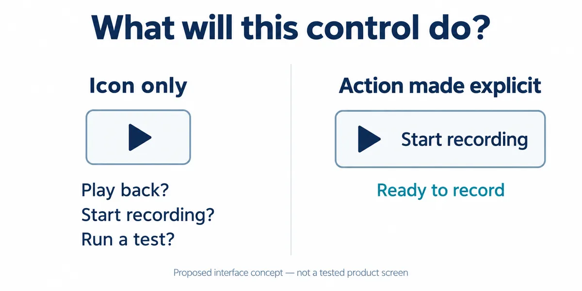
A recognizable drawing can still have an unclear purpose. Nielsen Norman Group's icon-usability guidance separates recognizing a shape from understanding its function in context, and recommends visible text labels to reduce ambiguity. On a touch device, a label hidden behind mouse hover is especially unhelpful.
For a recording prototype, separate actions such as Start recording, Save recording and Clear session before looking through the symbol set. A play triangle may suit starting an operation, but a visitor may read it as playback. The nearby words and the current screen state have to settle that. These are proposed design choices, not findings from a user test.
Use the symbol catalog as a reference, not a ready-made control panel
Our program collected the uppercase names from lv.SYMBOL, created an image object for each one and placed them in rows until the calculated screen capacity was reached. That is a way to inspect the symbols available in a given build. It attaches no actions, provides no button states and tests no touch behavior.
One sizing detail in that code is easy to misread. An ICON_SIZE = 24 constant set the size of each image object's box. It is not a command to draw a 24-pixel glyph. The LVGL 9.0 font reference explains that symbols are included in fonts and can be combined with text; the chosen font and widget determine how the glyph is drawn.
That distinction has confused other developers. An LVGL forum thread running from 2020 to 2024 discusses changing a symbol's size versus changing the object around it. Its code targets version 7, so treat it as background, not as version 9 instructions. Making a widget wider does not make its icon larger or easier to recognize.
Build one complete action before filling the screen
In a compatible LVGL 9 MicroPython environment, a labeled control can be a button with a child label:
# Structural example only; use your build's display initialization.
button = lv.button(lv.screen_active())
label = lv.label(button)
label.set_text(lv.SYMBOL.PLAY + " Start recording")
label.center()
This fragment only describes presentation. It does not start a recorder, check storage space or confirm that data is being saved. The application has to connect the action to those checks and then show the resulting state. A press might start recording, or it might reveal that storage is unavailable; the same icon should not hide those different outcomes.
Check the finished control at the intended display size. A desktop simulator view, especially with browser zoom, can make small details look comfortable. On the real assembly, confirm that the label fits, the glyph is legible and the touch area covers the whole intended control. Keep the working font configuration with the firmware so another unit shows the same symbols.
Watch the first attempt before explaining the interface
For the next prototype trial, ask someone unfamiliar with the design to start a new recording, stop it and find what was saved. Watch their first choice and ask what they expected the control to do. Do not name the button in the task; that gives away the interpretation you are trying to assess.
Record confusion as a specific mismatch. "Expected playback, started recording" is more useful than "the icon was unclear." Change the wording or the grouping of controls, then repeat the task with a new participant. This is a proposed evaluation, not evidence that a particular label works for every audience.