
A moving graph can make a prototype look ready before its readings mean anything to a user. What is being measured? How recent is the number? Does a flat line mean the value held steady, or that the device stopped receiving data?
If you are turning a sensor experiment into a device someone else will use, answer those questions alongside the visual design. A number, table or chart should help the reader make a specific decision, such as checking the current state or seeing whether something changed.
We worked through LVGL's chart, table, label and line widgets with MicroPython in the LVGL browser simulator. All the graphs used random or fixed test values. Nothing below is a sensor measurement.
Choose the view for the question
A large number suits someone who needs the current reading. A line chart shows how a value changed over a defined sequence. A bar chart compares named items. A table keeps a name, an identifier and a state together when several items need checking.
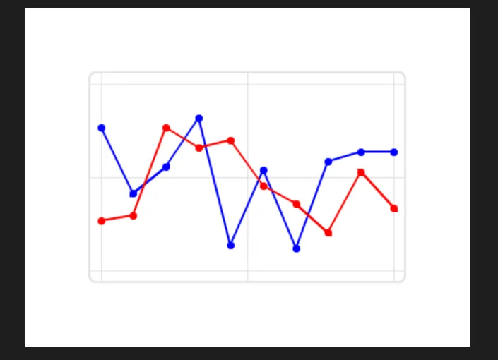
Our line chart had two series of ten points on a 0 to 100 scale. A timer set to 500 ms pushed random values into each, using SHIFT mode so new values enter on the right and older ones move left. That proves the chart updates. It gives the lines no physical meaning, no units and no sample times. Before reusing it for a sensor, name each series and decide what the horizontal spacing represents. A 500 ms timer setting is not a measurement that each point arrived 500 ms after the last.
Keep the data separate from the drawing
The test callback generated a value and sent it straight to the chart with chart.set_next_value(series, value). For a real integration, feed it an accepted reading instead, and keep whatever timing and validity information the application needs somewhere other than the screen. The display should not be the only record of when a sample arrived. We have not connected a sensor driver or logger to this.
A beginner hit exactly this step in an LVGL forum thread from December 2022: a static chart example made sense, but adding incoming temperature readings periodically did not. The discussion separates the stored sample sequence from the code that refreshes the chart, which is the right way to think about it.
Do not make "no reading" look like zero
Our test initialized both series to zero. That is fine for a drawing exercise, but in a monitoring device zero can be a real and meaningful value. Drawing invented zeroes while waiting for the first sample suggests a change that never happened.
The LVGL 9.0 chart reference documents a "no point" value that skips drawing that point or segment. Check how it works in your MicroPython binding, or show a clear waiting state until enough samples exist. We have not tested either.
The same choice applies after an interruption: keep the last value with an age indication, leave a gap, or replace it with an unavailable state. Never silently repeat an old reading as if it were new.
Use bars and XY plots for the right relationship
Our bar chart used two fixed arrays of six values each. For a real comparison screen, label both the groups and the units; otherwise a user sees that one bar is taller without knowing what is being compared. If two series measure different quantities, do not let their shared bar height imply a comparison the data cannot support.
The XY test drew three clusters of random coordinate pairs in SCATTER mode with circular updating. A code comment said "shift" while the configured mode was CIRCULAR; the two are not interchangeable, so check the mode, not the comment. The rendered points were joined by lines, which says nothing about a real path. If you plot positions, decide whether joining consecutive samples represents an actual trajectory and how a missing position should appear.
A table makes identity and state easier to read
Our table had a header row (ID, NAME, STATE) and three rows of fixed device names with ON or OFF. That makes relationships explicit in a way an unlabeled curve cannot. Querying the layout returned four rows and a column width of 100, which are layout checks, not evidence that three devices were found or monitored.
Cells hold text, as the LVGL 9.0 table documentation explains, so format units and precision deliberately when a cell shows a reading. A fixed "ON" also needs a defined meaning before it becomes product status: a requested state and a confirmed state are not the same thing.
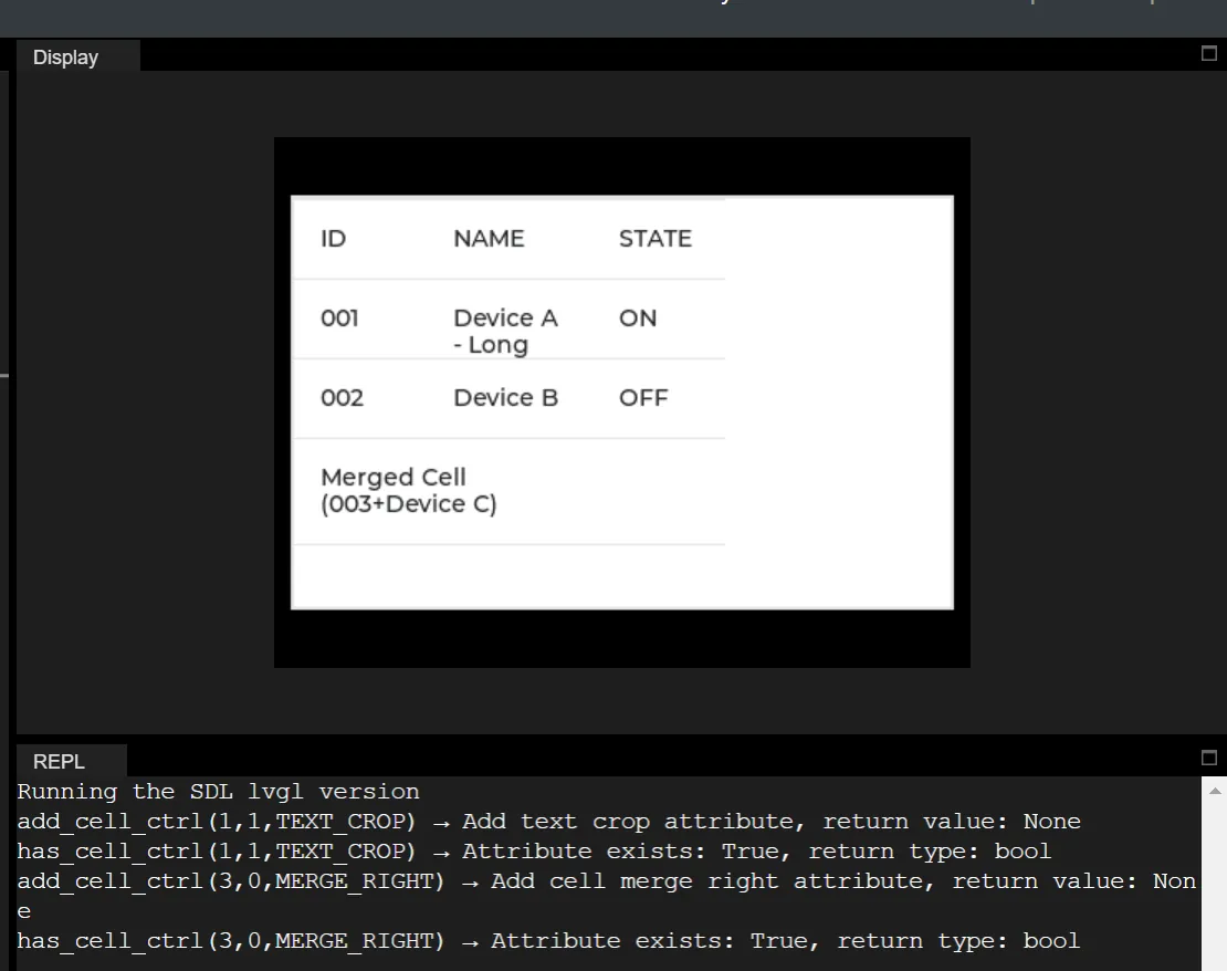
We then entered a deliberately long name and tried text cropping and merging cells. Without cropping, the long entry wrapped over several lines and pushed lower content to the table edge. With cropping and merging set, the console confirmed both attributes, but the name still occupied two lines. Setting a flag does not guarantee a neat single-line row. Review the layout with the longest expected names and translations. Cropping can save space while hiding exactly the part that tells two devices apart; if that matters, give the column more room or offer a way to see the full value.
Keep the explanation readable too
Our label tests compared circular scrolling, wrapping, back-and-forth scrolling, ellipsis and clipping in a 100 by 20 pixel region. Those choices decide whether a user sees the whole message at once, has to wait for it to move, or never sees part of it. In the clipping test, part of the string simply disappeared.
Wrapping still needs vertical room. The LVGL label reference notes that a fixed height can clip wrapped text. A short warning or stale-data message must not lose its key words because the label box was small. After switching to a larger font (Montserrat 24 in our test), check the visible region again.
Listing attributes that start with font_ returned Montserrat 14, 16 and 24 along with type and helper names, so that filter alone is not a reliable list of usable fonts. We also compared text colors. Color can support a message, but the text itself should say when a reading is unavailable.
A drawn line is not a measurement chart
The line widget draws a polyline from literal screen coordinates. Our two captures of a Y-inversion test did not show a clear before-and-after difference, so we do not claim it as a verified transformation. A line can be decoration or a diagram. To make it a data display, the application must also define how values map to positions, what the scale means and where the data came from.
Move to a real reading with one acceptance test
Pick one quantity and make it understandable before filling the screen. Show its name, unit, current value and freshness. If a trend matters, use a defined time window and make interruptions visible. Then compare the screen with the recorded input during startup, normal updates and a missing-data condition.
LVGL's CoreStack showcase describes teaching that ties sensor work to display projects. It is a vendor showcase, not independent validation, but it makes the same point: the interface becomes useful when its numbers are connected to real inputs. Our experiments stop at the simulator.