
Imagine handing someone a controller with a green button. They press it, it changes color, and then it changes back. Did the device reject the request, or was that just touch feedback? Before polishing a prototype's colors, decide what each visible state should tell the person using it.
A real integration discussion shows how easily appearance and behavior get tangled. In a July 2026 Home Assistant community thread, an ESPHome user wanted black text on green buttons when outputs were on, and changing the styles also shifted the alignment. They reported a fix after separating button styling from label placement. It is a useful example of the problem, not a configuration to copy.
We worked through LVGL's style rules and a set of basic-object styling experiments with MicroPython in the LVGL browser simulator. The rules explain how states and parts combine; the experiments make their effects visible. None of it is a test of a finished controller.
Distinguish a press from a lasting selection
A press is an interaction happening now. A checked state can be a selection that stays after release. Focus marks which control a keypad or encoder is targeting. Disabled means unavailable. One button can need several of these at once.
For a mode selector, write down the visible behavior before the styling code. An unselected option shows its ordinary label. Touching it gives immediate feedback. After selection, a check mark and the mode name stay visible. If the device cannot accept a change yet, say why instead of only dimming the color.
The LVGL 9.0 style documentation supports combined states. Review the selected button while it is being pressed, not only before and after, or a default pressed look can hide the selection at the exact moment the user is interacting with it.
Give the engineer both the part and the state
LVGL separates a widget's parts from its states. A slider has a track, an indicator and a knob, and styling one says nothing about the others. A button may also contain a separate text label. "Make it green" is incomplete until it says what changes and when. A small handoff table for each control helps:
| Situation | What the person should see | What to check |
|---|---|---|
| Available | A readable action label | Meaning is clear before touching |
| Pressed | Immediate visual feedback | Text stays readable during the press |
| Selected | A lasting mark and selected label | Still clear after release and refocus |
| Unavailable | A reason or a useful next step | Appearance matches actual behavior |
Try the visual rules on one simple object
We started with a plain 100 by 100 pixel red square on a black screen, with a two-pixel green border and a small green shadow. Then we changed the screen background, moved the square from (100, 100) to (150, 150) and enlarged it to 120 by 120. Position, size and surroundings are separate decisions; describe them separately when asking for a revision.
We added "Test Label" as a child of the square and called label.center(). With ten pixels of padding on every side, the label sat in the middle. Then we made the padding uneven: 20 pixels left, 1 right, 1 top and 30 bottom.
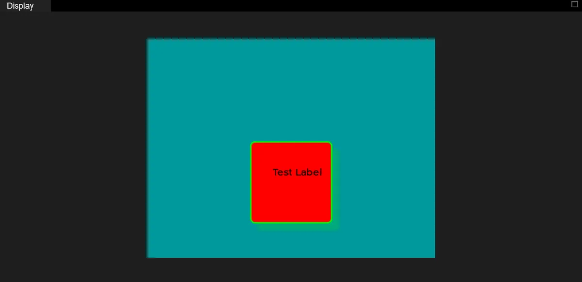
center() call, uneven padding: the label is centered in the remaining content area, not in the square.The label moved toward the upper right even though the code still said "center." That matters when a selected control gets a different border or padding: the text appears to jump and a simple state change looks like a layout bug. Compare the content area in both states before nudging text by hand. Centering a label object and aligning text inside a wider label are also different operations, as a 2022 LVGL forum question shows.
Check fill, border and shadow separately
Reducing the background opacity from 255 to 100 made the red fill blend with the screen while the border stayed as it was. That shows the property; it does not make a faded control unavailable. We then tried a black fill, a cyan border, a five-pixel border width and a border opacity of 160. In a few of those captures the text color changed too, which our short code changes did not account for, so treat them as visual examples rather than a strict one-change-at-a-time sequence. For a selected control, pick an edge treatment that stays clear next to its label instead of relying on a stronger color alone.
A border is also not a focus outline. When removing an unwanted focus frame, the property to change is the outline, not the border. Whatever you change, keep a usable indication of focus for keypad or encoder users.
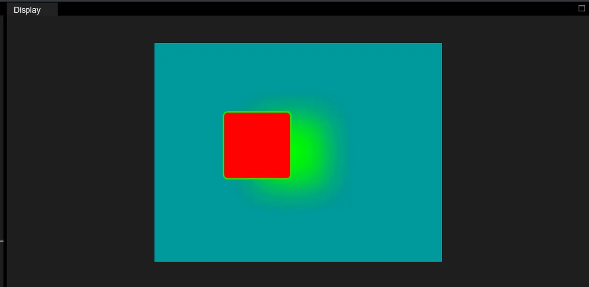
The exaggerated shadow shows why shadows need room around a control. It does not enlarge the object or its touch target. Review the actual clickable area separately, especially on a small screen behind an enclosure window.
Keep one source of visual rules
Shared styles suit several controls that need the same spacing or text treatment. Local changes suit exceptions, but many scattered exceptions make later changes unpredictable.
Matching follows rules too. A style added later does not win in every state; a more specific state match can still decide a property. Text properties can be inherited from a parent and overridden by an explicitly styled child, so when a label looks wrong, inspect its own style as well as the button's. Changing a shared style's data and making every affected object redraw are separate steps. Use the API of the LVGL and MicroPython build you actually run, not a C signature or an editor stub.
Make words carry the important meaning
Color can reinforce a state, but words or a recognizable mark should carry the essential information. The W3C guidance on use of color is written for web content, but it is a sound principle for a device screen too (following it is not a claim of compliance). Pair a selected fill with a check mark and the mode name. If a connection fails, show "Disconnected" rather than only switching green to red. Check the screen on the intended display under realistic lighting, because a desktop preview cannot show how text reads through an enclosure window.
Choose the actual words and units early and confirm the font contains them. UTF-8 encoding does not supply a glyph for every character; the LVGL 9.0 font documentation describes enabled fonts, symbols and character coverage, and a custom font needs its own coverage and licensing check. A symbol being in the library does not mean users understand it, so pair unfamiliar ones with a short label.
Review the whole interaction, not one screenshot
Walk through each control from startup: available, pressed, selected, revisited and unavailable. Ask a tester what changed and what they expect next. For a real output, show the device's confirmed state instead of assuming a successful press means the command succeeded. Keep the visual rules small enough to explain, apply them consistently, and test the result on the intended device.