
Your prototype has a screen and its buttons respond. Now someone outside the development team needs to change a setting. Can they tell which option is active, whether the change has reached the device, and what will happen after a restart?
For a designer or founder preparing a first user test, those questions matter more than a large collection of widgets. A switch, a checkbox, a drop-down list and a roller can all look finished while leaving the user unsure what they just changed.
We worked through these four controls with LVGL and MicroPython in the LVGL browser simulator, recording screen states, event callbacks and console output. Everything below stays inside that evidence: an interface in a simulator, not a control panel wired to physical equipment.
Start with what the user is choosing
A switch fits a two-state setting people expect to turn on or off. A checkbox expresses a separate optional choice. A drop-down saves space when the user picks one named option. A roller keeps neighboring choices visible while the user moves through an ordered list.
These are starting points, not rules. A roller might help someone pick a weekday on a compact scheduling screen, but that does not give you a clock, a stored schedule or an action on that day. Those are separate parts of the product.
Before choosing a control, write one sentence describing the action: "Turn notifications on," "Select an operating mode," "Choose the day." Then ask a test participant what they expect to happen after using it. If their answer differs from the intended behavior, changing the label may help more than changing the widget.
Make an on/off state readable
Our switch test started with a callback that checks the CHECKED state and prints the result to the console. The next version added a label whose text and color change with the switch, which made the state visible on the screen itself. Our test labels read "Switch is OPEN" and "Switch is CLOSE." A specific label such as "Notifications: On" tells a user far more.
We also restyled the switch's track and knob. That is useful for learning how the control is drawn, but styling should follow a clear state model. A custom color does not tell anyone whether "on" means a command was requested or the hardware has actually started.
Keep those meanings apart. A screen can show a requested state immediately while the device is still starting or has rejected the request. If the difference matters to the user's next action, show it in words, such as "Starting" followed by "Running," rather than treating the switch position as proof. Our simulator tests did not include any device feedback.
Checkboxes need visible feedback too
We increased the checkbox label to 24-pixel white text on the dark background, which was noticeably easier to read in the simulator than the default. We did not run a user study on it.
We then linked a checkbox event to an lv.led object: checked turns the drawn LED on, unchecked turns it off. That indicator is drawn by LVGL; there is no GPIO operation or physical LED here. If you build a real device on this pattern, add the hardware action and decide what the indicator represents: a requested output, a confirmed output, or just the checkbox state.
Set the initial state on purpose, too. Our callback synchronizes the two objects when an event arrives, but nothing explicitly set the drawn LED before the first event. Initializing both from the same application setting matters most when the device restores saved preferences at startup.
Use a drop-down for one clearly named choice
Our first drop-down test printed the selected option's numeric index; the next one retrieved its text. That distinction matters in debugging, because index 2 only means something relative to the current list.
idx = dd.get_selected()
options = dd.get_options().split('\n')
if 0 <= idx < len(options):
    selected_text = options[idx]
The LVGL 9.0 drop-down documentation describes these APIs. The text helps during a prototype, but a product needs a stable meaning for each option, so renaming or reordering a visible label cannot accidentally select a different operating mode in the device logic.
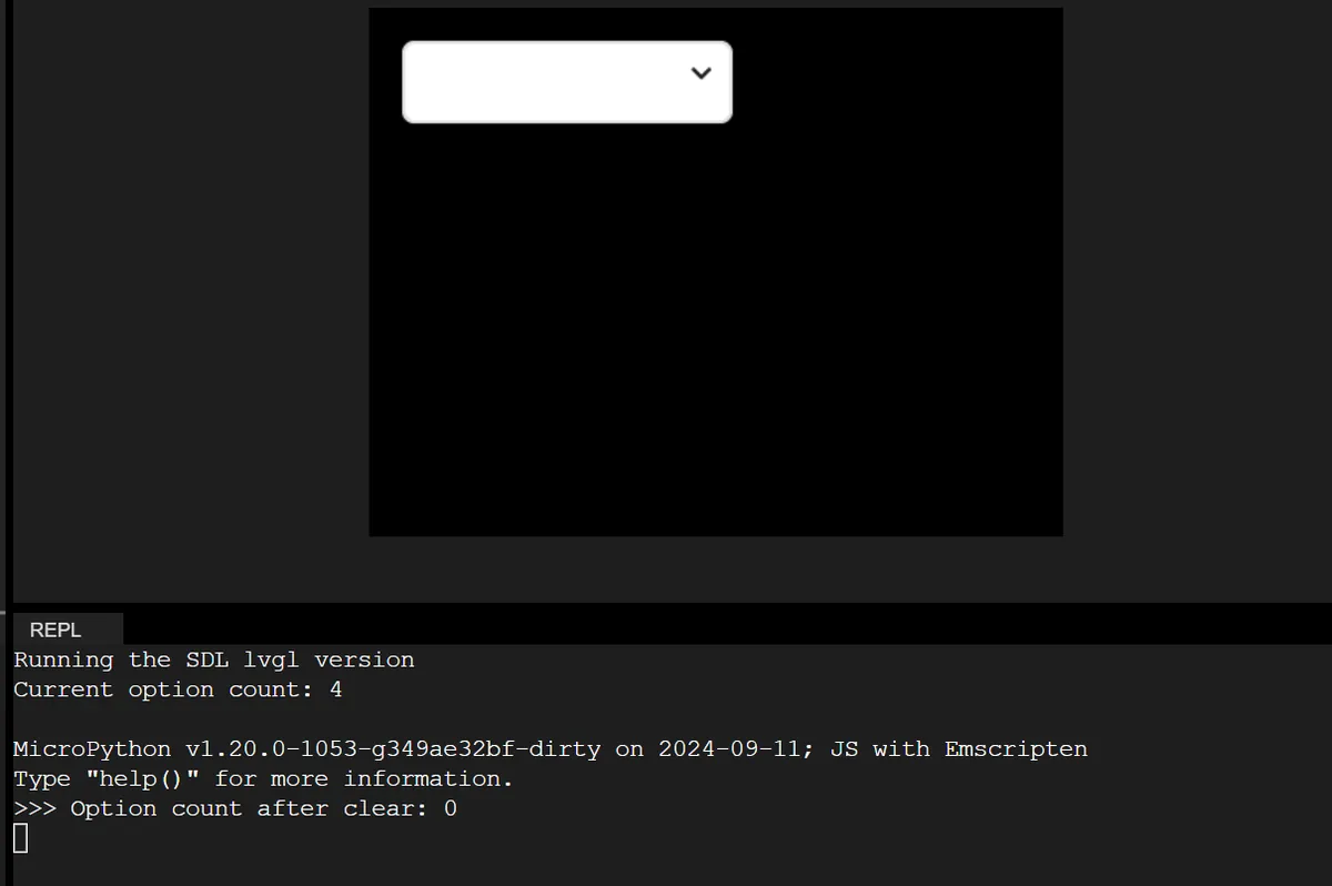
We then added Wi-Fi, Bluetooth and Ethernet options at runtime (labels only; no networking). Because the list had been initialized with an empty string, the console reported four options, then zero after clearing. Check both the rendered list and the option count after changing a list. Supplying the whole newline-separated list at once, or clearing before adding, are changes to verify in your binding; we have not run them yet.
We also added a separate button to open and close the list, and updated the button's text inside its own callback. If the user closes the list by choosing an option instead, the button label can fall out of step unless that path is handled too. Test opening, selecting, dismissing and reopening, not just pressing the same button repeatedly.
Input hardware adds another layer. In an April 2023 LVGL forum question, a developer using LVGL 8.2 with a rotary encoder had trouble keeping edit focus while repopulating a list. That does not prove a defect in the version we used, but it is a good reason to test the actual knob, keys or touch input before calling the interaction finished.
Rollers show nearby choices but still need a clear selection
We placed weekday and month rollers side by side. The weekday roller used normal mode, with a start and an end; the month roller used infinite mode and wrapped around. Both showed five rows, and a later test showed six. The LVGL 9.0 roller documentation explains how the modes work and how visible-row sizing depends on text style. Judge the fit on the real target screen; two 200-pixel rollers in a wide simulator scene say nothing about a smaller physical display.
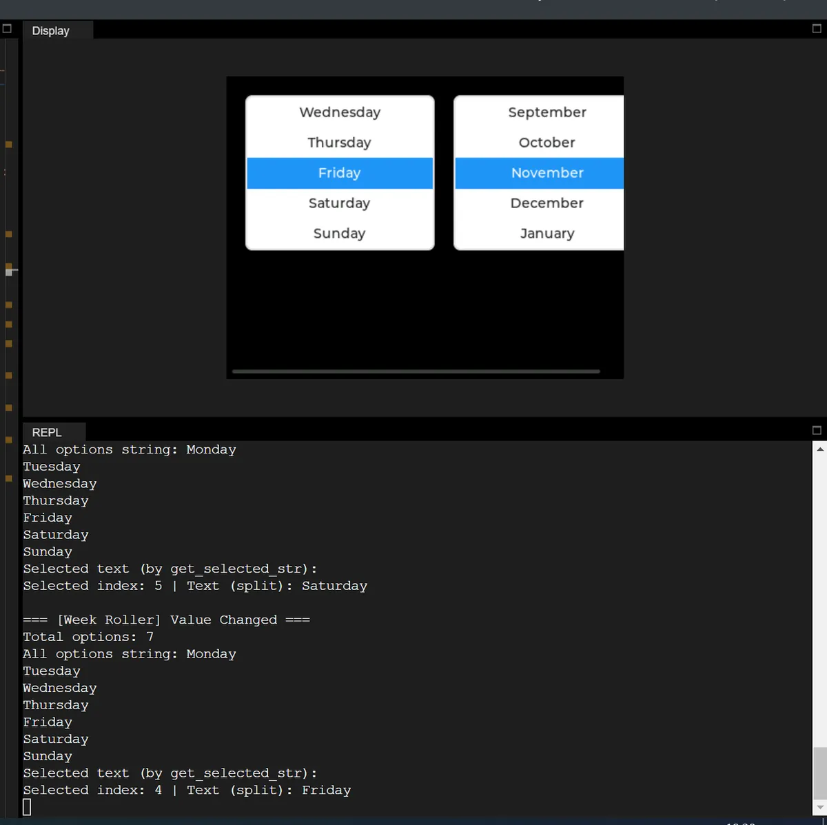
Reading the selection gave a useful comparison. get_selected_str printed an empty result, while splitting the options and using the selected index printed Friday. We had passed an empty Python string to that buffer-style call; the official C example uses a writable character buffer, so it should not be copied mechanically into a MicroPython binding. The index-and-split path is the one we have shown working. Verify your binding's supported buffer form if you need the other API.
Decide when a setting takes effect
These tests show selection and visual response. They do not show a choice being applied to hardware or saved across a power cycle. Before a user test, decide: does each action take effect immediately, or does the user review several changes and press Apply?
With an Apply step, keep the edited values separate from the values in use. With immediate controls, decide how a failure or delay will appear. Either can work if the screen tells the truth about what the device is doing.
Then test a few complete tasks: start the device, change a choice, leave and return to the screen, and restart. Include a failed or unavailable hardware action if the prototype has one. Watch whether the participant can explain the current state without looking at a console.